 While photos are often the catalyst for a scrapbook page, other times there are stories you’d like to tell even though you don’t have photos to go with them. Paula Gilarde wrote about the 5 approaches she uses for replacing photos, and now our Creative Team shares their ideas for making photo-less pages.
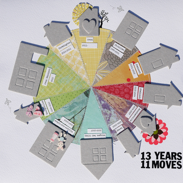
Marie-Pierre Capistran says, “This page is a list of all the places we lived in since we are together my husband and I. We moved 11 times in the past 13 years so it’s getting hard to keep track of that!”
“I didn’t want to use photos because I wanted the focus to be the number of moves we’ve made and not the houses themselves. That being said I still wanted to highlight the places where some important milestones of our life happened so I decorated these houses with baby accessories for example to represent when my daughters were born. Because this is a topic this is pretty sad for me, I used bright and happy colours–to put myself in a positive state of mind when I see it.”

13 years 11 moves | Supplies: Cardstock: Bazzill; Patterned Paper: Bella Blvd.; SU!; American Crafts – Amy Tangerine; Authentique; Magenta; Basic Grey; Imaginisce; Sasafrass Lass; Chipboard Houses: Maya Road; Rub-ons: American Crafts, Basic Grey; Stickers: Bunny Pink; Others: sewing thread.
Adryane Driscoll says, “This page is a tiny peek inside my thoughts on creating. I like color, ink, paint, and doodling, all of which have found their way onto this page. A photo would have detracted from my goal of having this page be about what goes on in my head. I think the design works without a photo when you read the words on the page. This type of page provides a great way to use lots of elements that I love but might not otherwise find a place on one of my pages.”

create by Adryane Driscoll I Credits: Anna Aspnes: SkinnyLined Overlays No.2, ArtPlay Palette Science, MagicSprinklez No.5, MagicSprinklez No.3, Distressed KornersNEdges No.8, ArtPlay Palette Wander, ArtPlay Palette Great Outdoors, ArtPlay Palette Wild, SkribbleSun No., SkribbledBlooms No.1, EdgeTransfers No.1, ArtPlay Palette Metro Graffiti, and White Paint No.1; Holliewood Studios: Art Box No.2, Art Journaling No.2 and ArtJournaling No.3; Katie Pertiet: Painted Wings
Christy Strickler says, ” A few weeks ago, our cats escaped out the back patio door.We were looking all over the neighborhood, concerned because they are indoor cats and not used to being outside. My son was upset and I was too busy looking for them to even think about photos. I later decided to scrapbook the night’s events by creating a little scene from embellishments and packaging. I layered patterned paper under plastic packaging, then added die cuts, a car and other elements to set a neighborhood scene on top. I turned the chevron paper on its side to represent us running back and forth through the street. I doodled a cat silhouette to represent our cats.
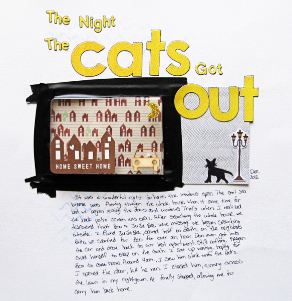
The Night the Cats Got Out by Christy Strickler Supplies| Cardstock: Colorbok; Patterned Paper,Die Cut: American Crafts; Alphas: Basic Grey, Sassafrass; Marker: Ranger; Sticker: My Little Shoebox; Wood Veneer: Studio Calico; Other: Button, electrical tape
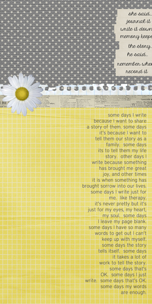
Tara McKernin says, “I wanted to make a layout that focused on my words and why I create layouts: to tell stories. Theirs, mine, ours. I kept everything clean and linear. The text is all right justified to draw my viewer’s eye across the page and back again.”
Katie Scott says, “When I get in a rut, I like to use my Word Up Pinterest board to find motivational quotes and sayings. I’ve found putting them on a scrapbook page lifts my mood and outlook. On these types of pages, I include few or no photos so that I can look at the page and gain inspiration. Without photos, the layout and its advice seems more timeless. I used Project Life journal cards to house the Pinterest pictures and my notes here.”
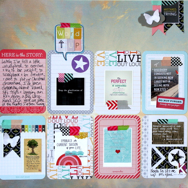
Word Up by Katie Scott | Supplies: Pinterest: Pictures from my Word Up Board; Project Life Clementine Journal Cards; KI Memories Letter Stickers; Martha Stewart Butterfly Punch, Quickutz circle with star die; sharpie; Smash washi tape and stickers; DCWV and Thomas Kinkade Patterned Papers.
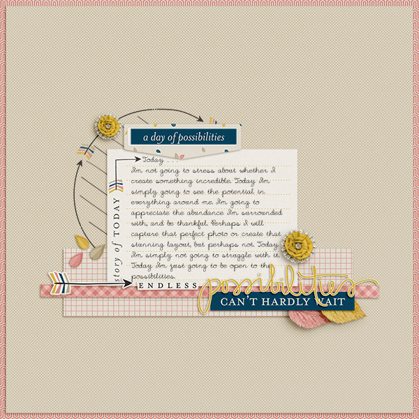
Barb Brookbank says, “I go through periods where I don’t like any of my creations. Nothing seems good enough, and then I get stuck. Trying to be perfect is a huge obstacle to being creative.”
“As a solution, I let my thoughts be the focus of this page and left photos off. The journaling reads: Today…I’m not going to stress about whether I create something incredible. Today I’m simply going to see the potential in everything around me. I’m going to appreciate the abundance I’m surrounded with, and be thankful. Perhaps I will capture that perfect photo or create that stunning layout, but perhaps not. Today I’m simply not going to struggle with it. Today I’m just going to be open to the possibilities.”
Amy Kingsford says, “Rather than try to fit random photos from over the years of all of our pets on a page I decided to use product to create a fun scene that illustrates the story. When I know I’m not going to include photos I find a strong element or two to anchor the page. Here, I used a bird post card, a chipboard house and a cat sticker to add image to the page. I love the addition of the feathers for their texture and for how they support the story.”
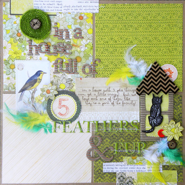
Feathers & Fur by Amy Kingsford | Supplies: SEI: Entrada Collection, Feathers, Field Notes Tear Apart Sheet, Green Puff Alpha, Corrugate Cardboard Alpha; Ranger: Terra Cotta Ink Pad; Autumn Leaves: Scribble Alpha Stamps; Misc: Buttons, yarn.
Terry Billman says, “This layout is about a child reminding us to be thankful every day for the blessings in our lives. No photos were needed to emphasize the powerful message in the statement from this eleven year old child. Since I wanted to focus on the message of being thankful, I placed the word art, big and bold, on the wood canvas frame to take center stage. The fall coloring of the multimedia leaves were used to represent the time of Thanksgiving. The placement of the leaves moves your eyes to the journaling and through the word art.”
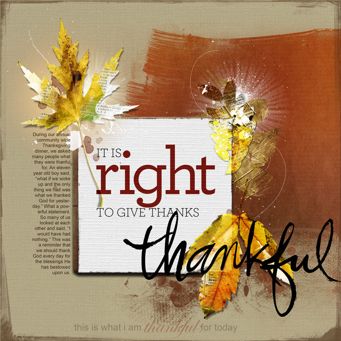
Thankful created by Terry Billman| Maplebrook Studios: Just Linens 48; Val C. Designs: Just 1 Book; Anna Aspnes: Foto Squared Template Album 1, MultiMedia Leaves 1, MulitMedia Leaves 3, Gold Leaves 2, 12 x 12 Artist Edge 6, 12 x 12 Edge Overlay 5; Ali Edwards: Painted Thanksgiving Words, This is the Day; CZ Design: Thankful 3
Leah Farquharson says, “My life has been a lot about doing this past year. I wanted to make a layout that included journaling about about not sitting around and wistfully chatting about what I wanted to do ‘some day.’ There’s value in just getting out there and doing it.”
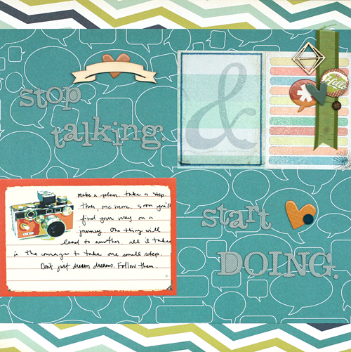
Stop Talking. Start Doing. by Leah Farquharson | Supplies: patterned paper, journaling cards, chipboard shapes, wood veneers, flair: Studio Calico. Ribbon: making memories. Letters: American Crafts
[current]

