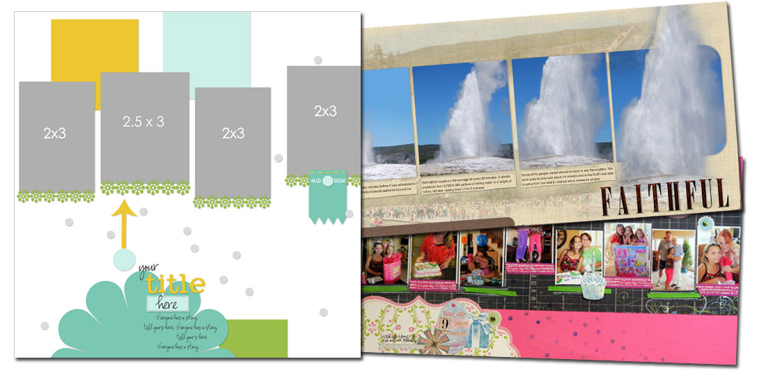
See how scrapbookers Katie Scott, Terry Billman and Brenda Becknell used a one-page sketch/template from Amy Kingsford’s Scrap Like Doris Sander Bundle on their two-page layouts.
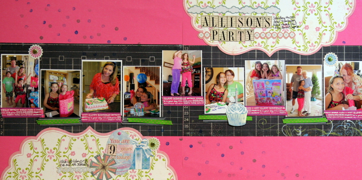
Katie Scott stuck fairly close the to the design of the sketch and chose to mirror and flip it in the second page. She also brought the series of photos down lower on the canvas.
“I wanted to get my daughter’s 9th birthday celebration documented right away. I loved making this sketch into a 2-page layout because it helped me to incorporate a lot of photos in a easy and fun way.”

Allison’s Party by Katie Scott | Supplies: Girl’s Paperie, Sassafrass, Stickers from Heidi Swapp and Sassafrass; ribbon, cardstock, brads ink and a pencil eraser (for the confetti look).
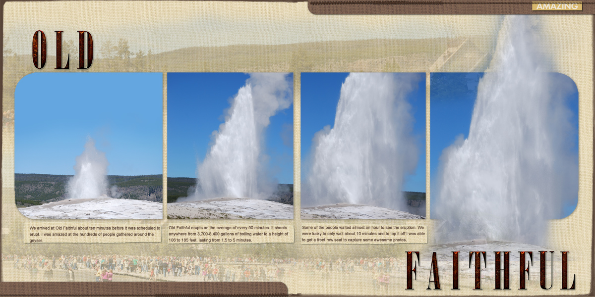
Terry Billman says, “This layout is a series of photos showing the eruption of Old Faithful. This template was perfect for showcasing a series of photos across a two-page spread. I enlarged the photo spots to fill two pages. Since I wanted to show the height of the eruption, I placed each of them at the same level. I blended a photo of the mountains in the background and a photo of the crowd underneath the photos. I finished it off with journaling labels under the photos and brown strips and stitching at the top and bottom of each side of the layout.”

Old Faithful created by Terry Billman| Katie Pertiet: Duncan Solids, Duncan Word Strips; Anna Aspnes: Distressed Overlay 9; Mask the Mask Label Set 1; Stitched by Anna Brown; Mommyish: 52 Inspirations week 38 alpha
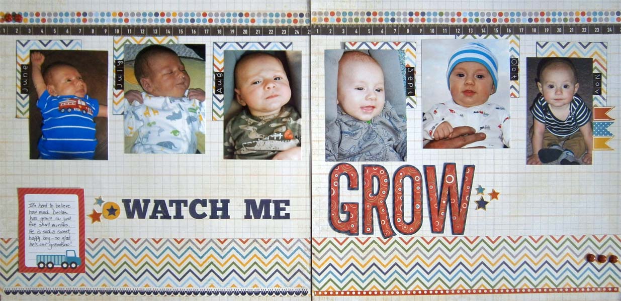
Brenda Becknell says, “I used a series of monthly photos to show how my grandson has grown and changed since birth on this page.”
“To make this sketch into a two-page spread, I flipped the sketch horizontally for the right side. Since the right side had the large title word “grow” in red, it seemed weightier than the left page, so I added the red bordered journaling block to the left page to balance things out.”

Watch Me Grow by Benda Becknell | Supplies: Patterned paper: Echo Park, Alphabet stickers: Echo Park & Doodlebug, Stickers: Echo Park; Diecut letters: Cricut “Boys will be Boys” cartridge, Ink: Ranger
[lovesketches]


