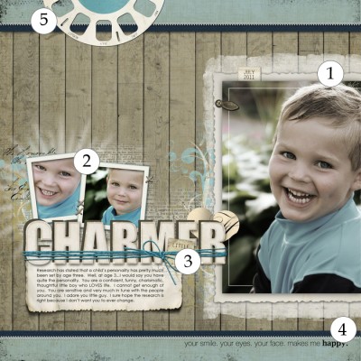
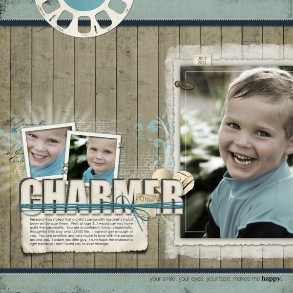
 It’s the accumulation of well-chosen and carefully crafted details that create a masterful scrapbook page. Check out 5 details on “Charmer” by Jana Morton and see if one or two of them can inspire your next page.
Jana Morton says, “I love this photo of my son Quinn. We were hanging out in the front yard. He was sitting on a rock and had the giggles, and I started clicking away with my camera.”
“I wanted the photos to be the most important aspect of the page and used my favorite color palette of blue and brown to create a soft background. I softened the colors of the photos because his shirt was bright, and I wanted the viewer’s eye to be drawn to his facial expressions rather than his clothing.”
1. Bleed a large photo off page edge
When you run an image off the page edge, the viewer perceives that there is more to it, and the image seems bigger. The image becomes a more active part of your design. (Check out Compositions that Go To the Edge.) Jana’s crop here is important. She cropping close-in and trimmed off a bit of his back. If she’d left the surrounding greenery on that side, the crop would lose its impact.
2. Repeat same or similar photos
In 4 Ways to Use Repeated Photos Jana said, “I have discovered that one of my favorite scrapbooking techniques is repetition of a photo. Yes, I mean using the same or very similar photo on a page more than once.” The two small tight crops of her son’s face give us a sense of the focal photo existing as a part of a longer interaction and give Jana a way to record multiple expressions.
3. Embellish your title.
While a scrapbook page title isn’t essential, just a couple of words can go a long way toward immediately conveying page subject, setting tone, and even cueing deeper page themes and meaning. Jana’s “Little Charmer” tells us this is a page about her son’s personality — and that the personality is, indeed, charming.
Designwise, your title can draw the eye and be a part of page flow. Embellishing your title is a great way to give it the appropriate weight on the page. Jana incorporated strong contrast in her title with “little” rendered small and on a tag which is tucked into the string corralling the much larger “charmer.” For more title embellishing ideas, see 9 Embellishing Perk-ups for Your Scrapbook Pages.
4. Add meaningful wordart to support title and journaling.
The phrase “Your smile. Your eyes. Your face. Makes me happy.” is rendered in eye-catching typography and placed below the focal point photo. It emphasizes everything else on the page–the photos, the title, and the journaling–to strengthen the message about Jana’s son’s personality.
5. Embellish at page edge to create balance.
The slide-reel bleeding off page edge at top left provides entry into the page and balances the other elements. It’s a third point in a visual triangle of focal point photo, small photo and title cluster, and slide reel.

Katie Pertiet: Letterbox Simplicity Paper Pack No. 01, Watery Bookshelf: Flakes No. 01, Powder Mountain Kit, Winter Artistry Kit, Alandia Noces Collection, Stitching Holes Brushes and Stamps, Artistry de Blanco Kit, Zipper Pull Dates No. 02, Coastal Kit, Flagged Sentiments No. 01, Painted Flourishes; Pattie Knox: A to Zoo Kit;
Andrea Victoria: Autumn Honey Paper Pack; Lynn Grieveson: Worn Page Edges
[jmorton]
[getinspired]

