See subway art ideas and printables collected on the Get It Scrapped Pinterest boards. Click here.
Blocked arrangements of related words or quotations rendered in multiple fonts are a trendy look.
Called “subway art” for its relationship to typographic art created on subway walls, this trend is fueled by the ready availability of fonts and printing capabilities.
DIY-ers are decorating their homes with subway art. Bloggers are providing free printable subway art in the hopes of racking up Pinterest links. Brides and grooms are decorating their “indie-styled” weddings with it. Scrapbookers are using it on their pages.
Let subway art inspire your title
Inspired by subway art, Amy Kingsford‘s “Give Thanks” makes use of typography to convey her message. She says, “The thing I love about subway art is that it often displays a powerful message in a way that jumps out at you. That’s what I tried to accomplish on this page. I used a variety of fonts, digital alphas and word art to give my over-sized title a subway art feel and then bracketed my much smaller framed silhouette stamps with it so that they weren’t lost on the page.”
“This message is special to me because though we may “celebrate” our blessings in the month of November, I give thanks for my two wonderful boys every single day.”
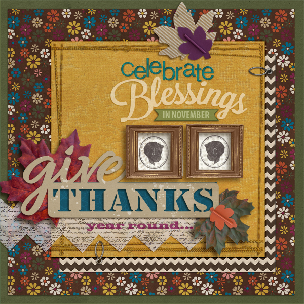
Give Thanks by Amy Kingsford | Supplies: Sahlin Studio: Darkroom Papers, Retro Mod, Fresh Collab (with One Little Bird); Sara Gleason: Autumn Leaves, Petals No. 3; Shawna Clingerman: Creative Bliss Elements; Anna Aspnes: Kriss Kross Stitches No. 1, Art Play Palette Pumpkin Patch; Jenni Bowlin Studio: Give Thanks Cut Files; One Little Bird: Sweater Weather; Pink Reptile Designs: Love Me Alpha; Vinnie Pearce: Make It Meaningful; Simple Scrapper: Summer 10 Free Template; Fonts: Myriad Pro, Ostrich Sans Round, Wide Latin.
Embellish your scrapbook page with printable subway art.
Tara McKernin scrapbooked her family’s rituals for getting ready for the Christmas season with bold holiday subway art shared on the Landee See Landee Do blog. The subway art fits into one part of her blocked design, with photos, title, and journaling each getting a blocked out area.

The Christmas Rituals by Tara McKernin | Supplies: Template no. 109 by Cathy Zielske (altered), Subway Art from Landee See, Landee Do blog.
Add hand-lettered subway art to your scrapbook page.
Michelle Houghton made a retirement gift for her father, a scrapbook page celebrating his relationship with her. She says, “I used art journaling techniques to create the base, created a “subway art” band that holds words that are significant to the two of us and then added three older photos of us together. The heart was made with oil pastels on watercolor paper. The subway art was made with Sharpie and Faber Castell markers-click here for a detailed how-to on getting hand-lettering on your scrapbook page.
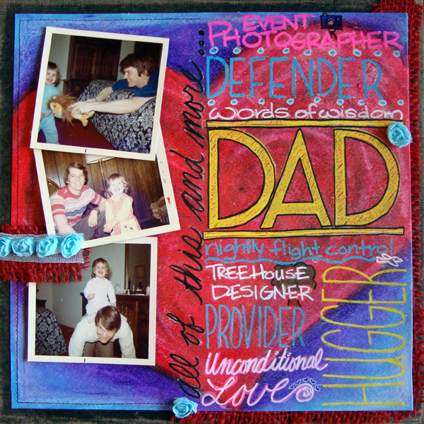
Dad by Michelle Houghton | Supplies: Cardstock – Core’dinations
Watercolor paper – Strathmore; Oil pastels – Portfolio; Gel medium – Golden; Ink – Sharpie and Faber Castell; Other – fiber and rose ribbon and thread
Use fonts to add subway art to your scrapbook page.
Meghann Andrew says, “I love the subway-art look in which a mixture of fonts is used to create a bold graphic statement. Here, the words along the left side are the focus: all the nicknames we have for my dog, Toby. The photo is a secondary part of the page. Because so much is happening visually with the subway art, I kept my embellishments simple.”
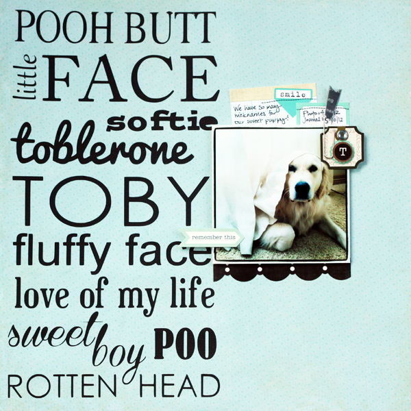
Toby’s Nicknames by Meghann Andrew | Supplies: Cardstock- Bazzill; patterned paper- Echo Park; tags- Elle’s Studio; stickers & die-cut shapes- Echo Park; paperclip- Studio Calico; die-cutting machine- Silhouette Cameo; fonts- Times (‘pooh butt’), Gabriola (‘little’), Adobe Caslon Pro (‘face’), Postino Std (‘softie’), Pacifico (‘toblerone’), Century Gothic (‘Toby’ & ‘rotten head’), Arial (‘fluffy face’), Euphorigenic (‘love of my life’), Coneria Script (‘sweet boy’), Bernard MT Condensed (‘poo’)
Chris Asbury says, “I designed this page with typography inspired by subway art and the goal of it looking like a poster or a wine label for a new wine release from one of our local wineries. I took this photo at a local winery and edited it with Photoshop.”
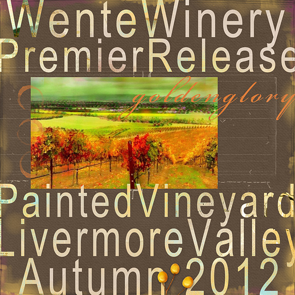
Wente Winery by Chris Asbury | Supplies: Anna Aspnes Designs:
ArtPlay Palette Ablaze, ArtPlay Fall No. 1_12x12 Overlay, Light Textured Neutrals No. 1, Layered Tissue Autumn Paperie
ArtPlay Fall No.2_Overlay, ArtPlay Autumnal No. 1, Scanty Journal Lines No.2_5 Dripped Stains No. 5, ArtPlay Palette Golden Glory;
Fonts: Arial Narrow, Bickham Script Pro
Make your own subway art with fonts and a favorite quote.
Vicki Walters made a scrapbook page that is subway art, using a favorite quote by Peace Pilgrim. The fonts she used are listed in the supply list below and you can make a dotted frame in Photoshop with the Brush tool (how-to here).
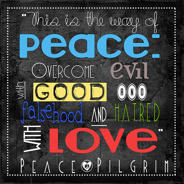
Subway Art by Vicki Walters | Supplies: Fonts: Hippy Stamp,cafe & brewery, Blake, Blackout, Console, Freeze, Lemon Drop, and Smargana; Monoblendz Schwartz No 1 Paperie by Anna Aspnes @ Oscraps.
Use mist and alpha stickers for negative-space subway art.
Jennifer Matott made a negative-type subway-art poster for her page. She says, “I laid out the text with sticker and plastic alphas (American Craft Thickers and Heidi Swapp plastic letters). I also masked off the framed edges for the wordart, and then sprayed ink over it all. Once dry, I removed the stickers and letters to reveal the paper underneath. It’s time consuming to arrange but I love the look and it’s worth the extra effort to me.”
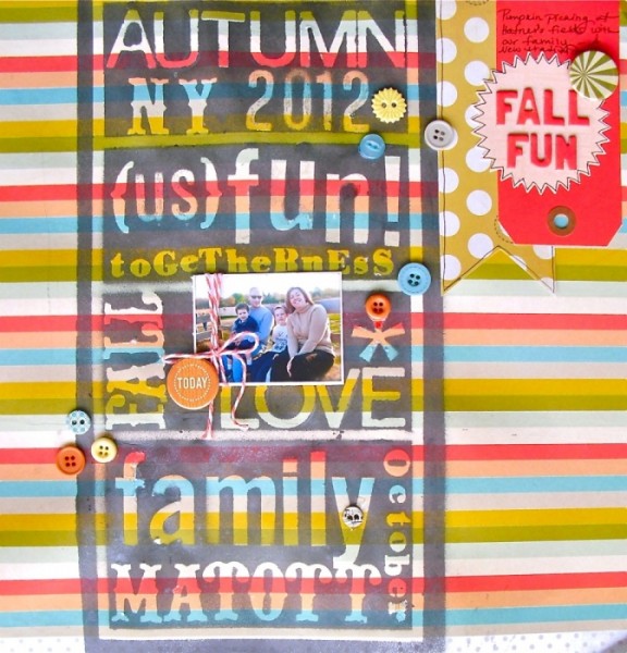
Fall Fun | Supplies: Patterned Paper: Tim & Beck for Studio Calico, My Mind’s Eye; Buttons: My Mind’s Eye; Alphabet: Heidi Swapp, BasicGrey, American Crafts; Twine: My Mind’s Eye; Flair: Studio Calico; Pen: Faber-Castell Design Memory Craft PITT Artist Pen; Spray ink: Tattered Angels Glimmer Mist in Cinder.
Die-cut subway art with your personal cutter.
Adriana Puckett says, “This is simple layout that showcases my feelings for my husband. I love experimenting with negative space and my Silhouette die cutter.”
“For this layout, I cut out a subway art design that I purchased from the Silhouette store, and then backed the “I Love You” in mint green to make it stand out from the rest of the languages, which are simply laid over the white cardstock background. I also enlarged and cut the decorative mat and turned it into a journaling spot by layering part of it behind the photo, and then writing my journaling on it. The photo’s colors clashed with this springy palette, so I converted it to black and white and printed it out 5″ x 7″.”
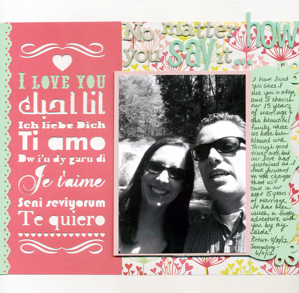
I Love You by Adriana Puckett | Supplies: Love Subway Art design and decorative bracket from the Silhouette store; We R Memory Keepers cardstock and patterned paper, Be My Valentine Line; American Crafts Thickers (2 types) for title; American Crafts Memory Marker for journaling; Stampin’ Up border punch.
Amanda Jones cut an oversized quote, in the style of subway art, with her die-cutting machine. She says, “I made it large enough to fill most of my page and left a gap in the bottom right corner to be able to add my photo and a few embellishments.”
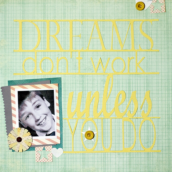
Dreams by Amanda Jones | Supplies: Patterned paper – My Mind’s Eye, Crate Paper; Embellishment – Girls’ Paperie; Cardstock – Bazzill; Other – Buttons, Silhouette Cameo
[getinspired]

