 Here are 5 approaches that work with common crop and size combinations for scrapbooking 6 photos:
- grids
- blocks
- 5 + 1 arrangement
- layered cluster
- two-page layout
1. Arrange 6 photos in a grid
Crop photos to common height and/or width and arrange in either a 2 by 3 grid or a 3 by 2 grid.
Ashley Horton says, “I find that using photo strips is an easy way to include lots photos on a single page. This is a great way to get those Instagram photos off your phone and onto a layout. I pulled my photos from my Instagram file on Facebook. I arranged them into two photo strips in Photoshop Elements, printed them, and cut them out.”
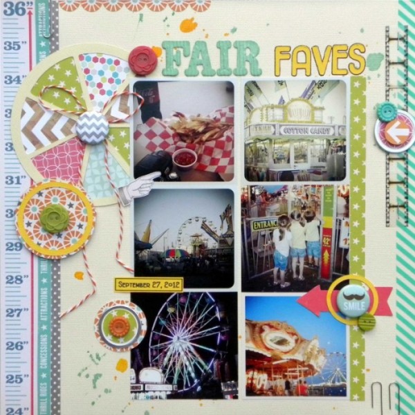
Fair Faves by Ashley Horton | Supplies: Cardstock: American Crafts; Patterned Paper: October Afternoon & Echo Park; Buttons: October Afternoon; Thickers: Pebbles; Font: Fitzgerald; Washi Tape: Love My Taps; Flair Buttons: A Flair for Buttons & Bluebirdchic.com; Film Strip: Tim Holtz; Baker’s Twine: The Twinery; Spray Mist: Studio Calico; Other: Metal Tags & Paper Clips
Adryane Driscoll says, “I learned something as I made this page. Once I used more than 4 photos, I had to switch to a very linear design to feel ‘comfortable’ with the design. I tried staggering the photos, overlapping them, varying their size, and I always came back to this very linear look. All of these images are from the internet.”
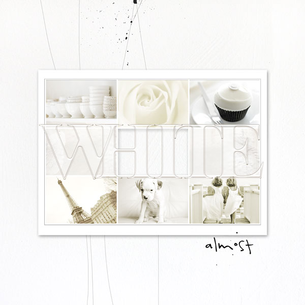
White by Adryane Driscoll | Credits: Anna Aspnes I 365 Days Template No.3 (modified), ArtPlay Palette Sweet Pea (background), Acrylic Alpha&Number Set No.1, SkinnyLined Overlays No.2, and 4 x 6 Artsy Kardz Wild
Vicki Walters says, “The photos on this page are six highlights from our beach vacation in July. I included the house we stayed in and the Ocean Isle Beach sign. There are so many really cool beachy type supplies to choose from and it’s always fun to mix little elements from different artists to make it your own.”
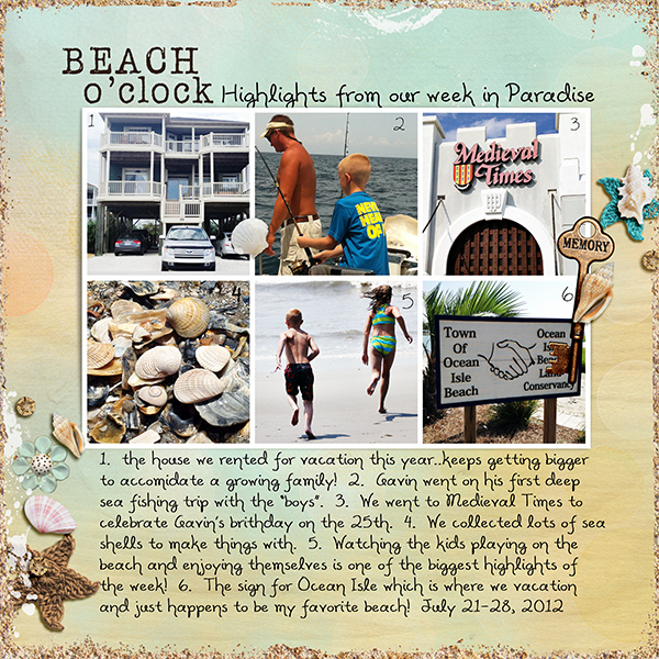
Beach o’Clock by Vicki Walters | Credits: Font: Alisha; Anna Aspnes: ArtPlay Palette Sunshine, Bouquet and FotoWallets no 3, Studio 68: Border Madness; Paula Kesselring Word Keys.
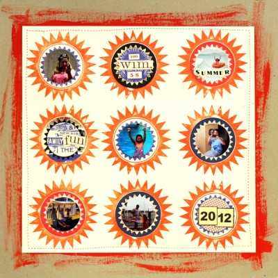
Katie Scott says, “This grid of nine circles provided lots of spaces for photos; I used three of the circles for embellishments and words and the other six for photos. I used photos that had very small subjects. This was a fun and easy way to wrap up a summer page.”
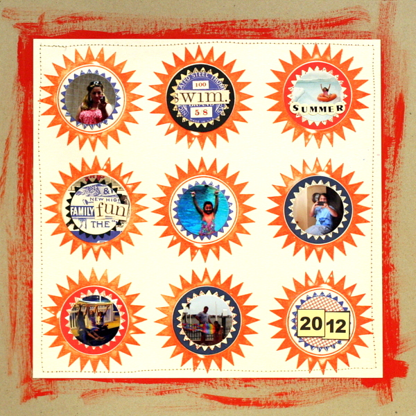
Summer Starbursts by Katie Scott | Supplies: Jenni Bowlin stamp and papers; Spellbinders & Sizzix: pinking circle and circle die cuts; machine stitching, paint, cardstock.
2. Arrange 6 photos in a blocked arrangement
When your photos don’t easily crop to common height or width, combine them with other elements to block out the page.
Marie-Pierre Capistran says, “These are old photos taken with an APS camera and, therefore, they have awkward sizes (4×6, 4×7 and 4×11) and are pretty big! I had to think twice to crop them and bring them to fit on my 12″ x 12″ canvas. I machine stitched around each photo and the canvas and sewed little tags on each photo to incorporate story details. A bigger tag tells the bigger story since the smaller ones bring all the little details to the story.”
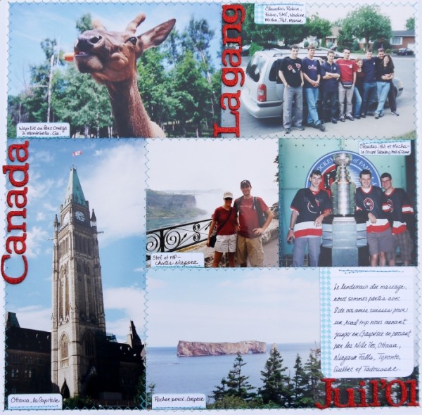
Canada by Marie-Pierre Capistran | Supplies: Cardstock: Bazzill; Journaling card: Elle’s Studio; Stamps: October Afternoon; Ink: SU! Bermuda Bay; Thickers: AC Reindeer; Other: blue thread.
Stefanie Semple says, “My weight has been an issue for many years and my latest battle of the bulge involves the Dr Atkins Diet. I have been taking photos of my food (can we say obsessed?) as I am trying so hard to be good and not cheat and make my meals interesting yet still tasty. This layout is just a part of the way I document our everyday lives.”
“I chose patterned papers that contained the same colours as my kitchen counter, with the orange scallop as a beware of making the right choices, and the green scallop as a “keep up the good work” encourager. I didn’t add many embellishments bar the visual triangle created with the flowers. The thin string and slim leaf cutouts are my reminder of my goal of being leaner and healthier.”
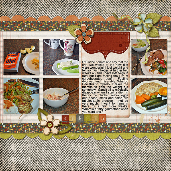
Atkins by Stefanie Semple | Supplies: Kit: Affirmation by Elise’s Pieces and Template: Photo Mania v.1 by KeepScrappin Designs.
3. Use a “1 + 5” cropping formula
Emphasize one photo and use five similarly-sized photos to support your story. Notice that the one photo of a different size can be bigger than the other or smaller. Just be sure that difference is noticeable.
Brenda Becknell wanted to scrapbook photos from her motorcycle trip along the Natchez Trace Parkway, but only had some “so-so” photos. She says, “I printed the best of them at 4″ x 6″ and then printed the others at 1.5″ x 2”. By printing the photos are a smaller size, they appear a little clearer than they would if larger, and they still convey the idea of a scenic road trip. I mounted them on a strip of black cardstock and then used a border punch to create the film strip effect.
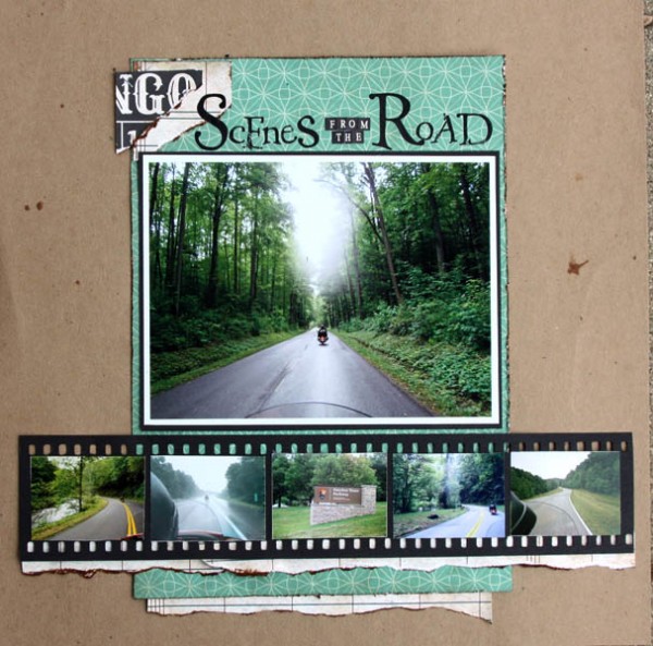
Scenes from the Road by Brenda Becknell | Supplies: Patterned Paper: Echo Park; Kraft Cardstock: Paper Studio; Alphabet stickers: AdornIt; Alphabet Rubons: Art Warehouse; Tim Holtz tiny staples; Vintage Photo distress ink
Audrey Tan combined one portrait with 5 outtakes on “Perfect Shot” enlarging the best and arranging the outtakes in a series of five. She says, “My good friends and I couldn’t find anyone to take our photos so we stood in front of a mirror and snapped ourselves. After a few trials and errors, we got the perfect shot. That perfect shot is blended on the page while the ‘mis-shots’ are displayed in a strip.”
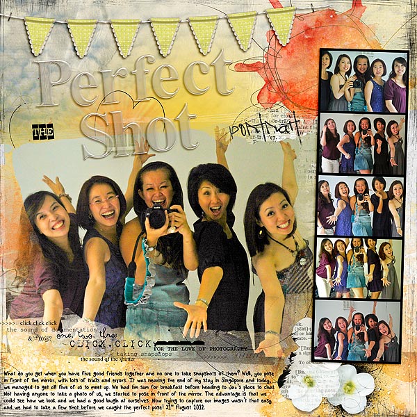
The Perfect Shot by Audrey Tan | Supplies: Anna Aspnes: ArtPlay Palette Bask, Artplay Palette Bicycle, Warm Glows1, Heart LoopDaLoop No2, Foto Word Transfers No1, MultiMedia Flowers No2, Foto Wallet No2, Foto Word Mix No1, 12×12 Sand Scratched Overlays No1, Acrylic Alpha Number Set No1; Julianna Kniepp & Captured Visions: Love Is All You Need; Julianna Kniepp: Fall In Love; Fonts: Xerography & Tangie AJF Oysters
4. Arrange 6 photos in a layered cluster
Shake up the grid and overlap and tilt, take things off off the grid line and create a cluster of photos.
Adryane Driscoll used a template to make a cluster of 6 photos — really there are 7 photos here, but one photo is actually cut into two photos so we’ll keep it here. Adryane says, “I used a template and ‘Viola!’ a six-photo, nonlinear page.”
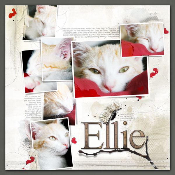
Ellie by Adryane Driscoll | Credits: Anna Aspnes I FotoBlendz Album Template C (modified), ArtPlay Palette Epic (dark background paper), ArtPlay Palette Globe Trotter, ArtPlay Palette Sweet Baby (transfers), ArtPlay Palette Retro Holiday (branch), MultiMedia FlutterBys No.2, Watercolor FotoBlendz No.1, StraightLine Stiched White No.3, Stitched Loops White No.1, WoodShop Alpha&Number Set No.1, Dripped Stains No.3, Painted Hearts No.2, Kreased Transfers No.2, and ArtPlay Science (tape)
5. Combine approaches and make a 2-page layout with 6 photos
Use one or more strategies above to make a two-page layout.
Debbie Hodge grouped three photos of bocce ball play in a vertical series, clustered two photos to the left and added one photo to the top of her journaling block on the right.
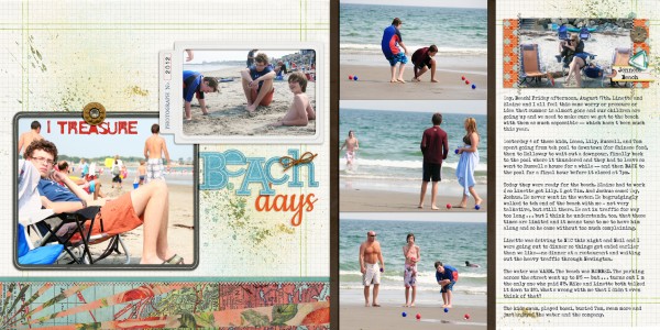
I Treasure Beach Days by Debbie Hodge | Supplies: You Are Here, An Additional Very Small Alpha by Allison Pennington; Meadowlark, Fresh, Retrouvailles, Shadow Like Me by One Little Bird; Krafty Alpha 2, Cold Springs Element Pack by Katie Pertiet; Eilon Elements by Maplebrook Studios; Stitched by Anna Cream by Anna Aspnes; Limerick by Piccolina Desings; Resotration by Gina Cabrera
Debbie Hodge divided her two-page canvas into four columns. She arranged two series of three photos each in columns, giving her journaling a column, and filling the final column with patterned paper
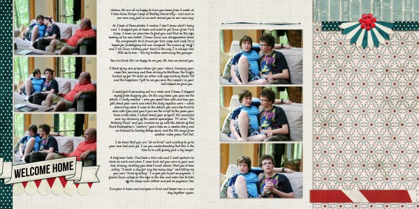
Welcome Home by Debbie Hodge | Supplies: Country Carnival by Celeste Knight and Robyn Meierotto; Country Fair by Dana Mogstad; Bebas Neue; Andrea Script II fonts
Notice the elements on this two-pager by Debbie Hodge that are lifted from the two layouts above. Again, the right side of the layout is divided into two columns. The far right is filled with patterned paper as on “Welcome Home.” The other column on the right holds photo and journaling — just as on “Beach Days.”
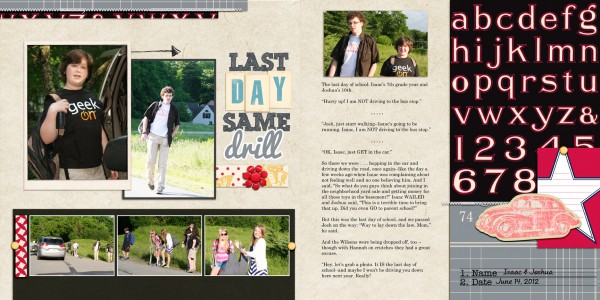
Last Day Same Drill by Debbie Hodge | Supplies: The Traveler by River Rose; Geek Like Me by Little Butterfly Wings; Mercantile Mix 2, Classic Borders by Jenni Bowlin Digital; Vintage Flash Mini Alpha Blue, Classic Cardstock In the Night by Katie Pertiet; Straight Line Stitched White by Anna Aspnes; Country Fair by Dani Mogstead; Life Composition by ViVaArtistry; Brad Bonanza by Pattie Knox; Scribble Box, Pacifico, Century Gothic alphas
[current]

