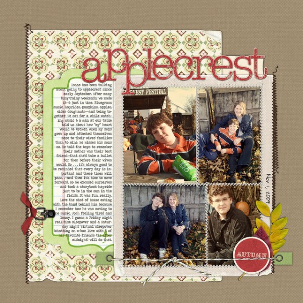
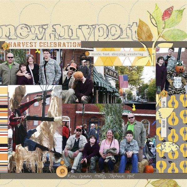
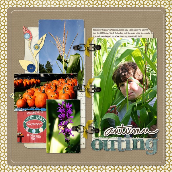
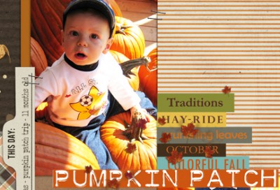
 Scrapbooking a fall outing? Take a look at these pages from our creative team and MSD teachers, and pay attention to:
- colors
- products
- photo crops
- layout design, and
- embellishment
And then check out quotations and word art for scrapbooking autumn.
Doris Sander says, “I remember being a bit disappointed in these photos from my son’s first grade field trip to the pumpkin patch, because they were slightly blurry and a bit blown out. Now, two years later, my perspective is entirely different. Now all I see is that sweet snaggle-toothed smile and how little he was. I think nostalgia is the best photographic filter there is.” Doris cut leaf shapes from the canvas and backed them up with painterly brushstrokes in fall colors.
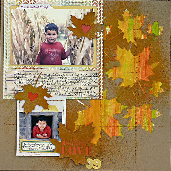
Autumn Love by Doris Sander | Supplies | diecuts – JBS Mercantile Exclusive, patterned paper – My Mind’s Eye, Studio Calico, cardstock – Bazzill, stickers – Jillibean Soup, October Afternoon, paint – Jenni Bowlin for Ranger, mist – Maya Road
Debbie Hodge agrees with Doris Sander that nostalgia makes a great photo filter — and second to that would be the warming and partially desaturated effects she added to these grainy photos from her cell phone. She printed them small to avoid emphasizing photo quality and then grouped them in a block for impact. This left plenty of room for journaling.
Orange is a favorite color for Vicki Walters. She says, “Just for fun the main photo here is “double framed” to appear to be stacked. It’s just one photo with the other elements “tucked” around.
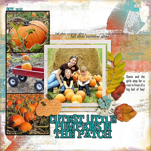
Cutest Little Pumpkins in the Patch | Supplies: Anna Aspnes ArtPlay Palette Autumnal No 1, ArtPlay Palette Autumnal No 2,and ArtPlay Palette
Pumpkin Patch
Chris Asbury finds the changed colors of fall to be “as pretty as a painter’s palette.” These photos are from a local winery where she goes for a view of the color in the vines and the Boston Ivy. She digitally blended her photos into the canvas and added the image of a paintbrush in the foreground to present the idea of the colors being “painted.”
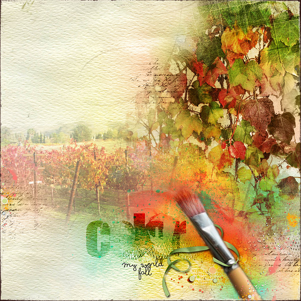
Color Me Fall by Chris Asbury | Supplies: Anna Aspnes Designs:
ArtsyLayered Template No. 39, ArtPlay Palette Seafoam, ArtPlay Palette Viaggio, ScriptTease Fall No. 2, WarmGlows No. 1, White Paint, SprayPaint No.1, WordBlendz Fall No. 1; Kitty Designs: Touch of Magic Sweet Awaits; Maya De Groot:Midsummer Night’s Dream; Font: soymilk
Debbie Hodge got lots of photos onto the one-pager from an outing to a harvest celebration with extended family by collaging them in a band across the canvas. The easiest way to do this is to place photos, abutting them as you can, and then filling in empty spots with patterned paper. She mixed a pear-print pattern with argyles and stripes in fall colors.
Amy Kingsford scrapbooked her son’s favorite moments at a local harvest festival where there were corn mazes, spook houses and a giant hill slide. She says, “His favorite part was an obstacle course made of hay, which included a slide, a hay jump and a giant pirate ship. She used a sky-print paper as her canvas and says, “It sets the scene for the photos. I accented the page with artsy leaves choosing them to create an earthy fall palette.”
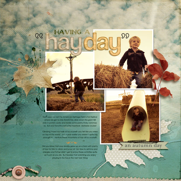
Having a Hay Day by Amy Kingsford | Supplies: Template from Simple Scrapper’s Premium Collection (Sept. 2012); Anna Aspnes: Wander ArtPlay Palette, Pumpkin Patch ArtPlay Palette, Gold Leaves No. 1, Burlap Scraps No. 1; One Little Bird Designs: Sweater Weather; Lynn Grieveson: Paper Bag Alpha; Fonts: Oil Can, Century Gothic and Alfredo Heavy
While she had many more photos from this fall outing, Tara McKernin focused on two of them. Tara set up a 2 by 2 grid and placed photos diagonally from one another. One of the quadrants holds her journaling and the final one holds a series of word clips. Tara embellished with small leaves and glitter. She says, “I’m not one for dark layouts but this feels like fall, earth tones, and warm and cozy.”
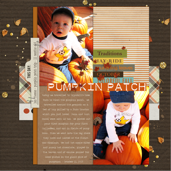
Pumpkin Patch by Tara McKernin | Supplies: Template no. 16 Layered Looks Simply Tiffany Studios; Sahlin Studios Whispers: Fall, Snippets: Fall, and Autumn Moon.
Jennifer Matott loves watching her kids pick out pumpkins, running around, comparing each one. She cropped circular photos and scattered them around the page with patterned paper circles. She says, “I love the pops of orange that are from the title and the photos.”
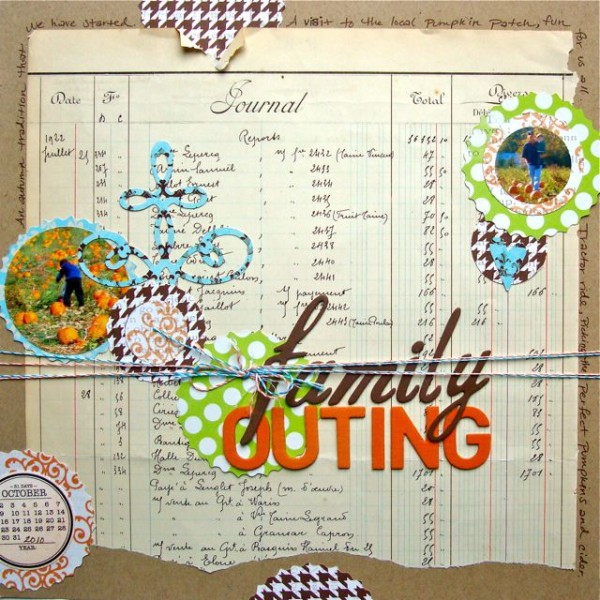
Family Outing by Jennifer Matott | Supplies: Cardstock: Bazzill
Patterned papers: LilyBee, Journal/ledger paper, Twine: Pink Paislee, Die Cutter: Slice, Letters: American Crafts Thickers, Pen: Faber-Castell PITT artist pen in Nougat
Cindy Liebel‘s inspiration for Autumn Sweetness comes from the texture of the leaves in the photo and burst of pink in her daughter’s jacket. She used a Slice digital cutter to make the white leaves layered and peeking out in the background of the page for an embossed layered look. Colorful felt leaves add touchable texture and decorate the series of banners.
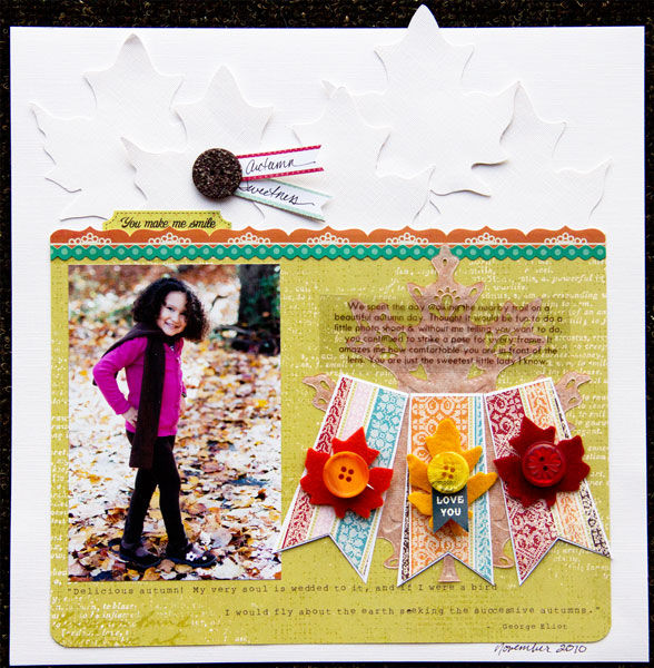
Autumn Sweetness by Cindy Liebel | Supplies: Pattern Paper by Little Yellow Bicycle; Farmhouse Border Stickers by Crate Paper; Doily Leaves, Felt Leaves, Slice Die-Cut Machine by Making Memories, Calendar Design Card by Making Memories
Debbie Hodge scrapbooked her 8-year-old son’s journey through a corn maze with blow-by-blow photos including the group looking grumpy at the “you’re lost” sign. She chose a geometric lattice-work patterned paper in fall colors to support the subject. Flower punched from brown paper bags and run through a crimper make a great fall embellishment.
Deborah Wagner got a great shot of her daughter at the apple orchard with the bag of apples in one hand and her cell phone in the other. She says, “I wanted to document the beauty of the orchard, and find humor in her constant texting.”
“I extracted her from the background, and duplicated the extraction. I used a sepia action on the top extraction, and a layer mask to bring back the bright color of the apples. To give the photo of the orchard more depth and color, I applied a poster edge filter and increased the saturation. I typed text abbreviations and blended them into the background paper and photo. For the finishing touches I blended a bit of the photo into the bottom of my page behind the word art. I erased part of the word art and replaced it with “teenager.”
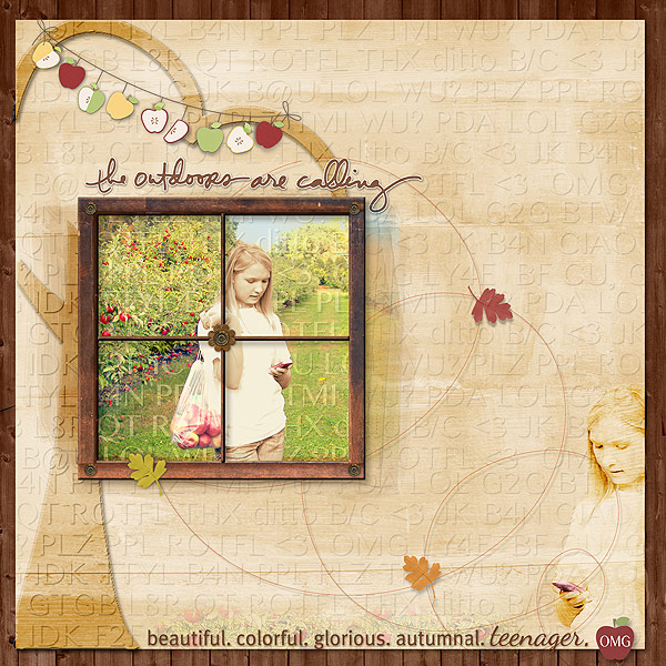
The Outdoors Are Calling by Deborah Wagner | Supplies: Designer Digitals: Katie Pertiet – Fine Line Borderlines No. 8 Autumn, Woodshop Papers No. 1, Printer Trays No. 3, Lifted Leaves No. 2, Spring Twist No. 1, New Growth No. 6, Email Inspiration 8-5-12, Wooden Flowers No. 1; Pattie Knox – Apple A Day Kit, Ali Edwards – Go Outside Brushes & Stamps; Cassie Jones – Bending Shadows
Michelle Houghton says, “I used traditional fall colors for this simple layout about our fall outing to the pumpkin patch.” Her dark green background has a vine motif that she created with a stencil and sanding block.

Pumpkin Place by Michelle Houghton | Supplies: Carstock – Core’dinations, Patterned Paper and stick pins – Little Yellow Bicycle, Flowers – Prima, Brads – Pink Paislee, Buttons – The Paper Studio
Debbie Hodge passes this farm several times a week, and it changes with the seasons. She’s also learned that even when you think there is plenty of time to get your pumpkins, it’s best not to wait too long. The purpose of this page is to record the place more than a particular event since it’s been a destination for fall hayrides and corn maze tours since her children were young. Thus, the one photo with her son does not show him with holding a pumpkin (even though she did get those shots) but, rather, walking around with the farm around him.
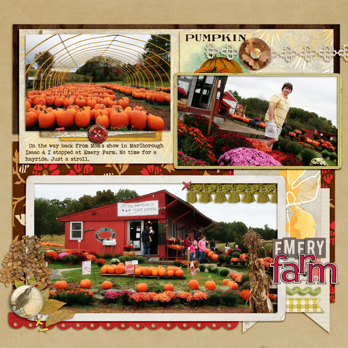
Emery Farm by Debbie Hodge | Supplies: Artplay Sunflower, Artplay Woodland ArtsyKardz Sunflower by Anna Aspnes; Fairest of All, Retro Mod, Typeset Alpha by Sahlin Studio; Townsquare Collection, School Days Alpha by Jeni Bowlin Digi; Color Study Flair Brown, Artistry deSol, Vintage Frames No 26 by Katie Pertiet; Handpicked Flowers by Lynne-Marie; Sunshine ATC by Tangie Baxter; Banner Journal Cards by Robyn Meierotto; Big Ideas by One Little Bird; Bohemian Typewriter font.
Debbie Hodge scrapbooked photos from the same venue shown above but a few years earlier with a different approach, focusing on details and showing a close-up of her son in the corn maze. She embellished with a leafy stem cut from vintage paper and embellished with gems and buttons.

