by Debbie Hodge
Here are 4 approaches that work with common crop and size combinations for scrapbooking five photos:
- series (row or column)
- grids and blocks
- 4 + 1 arrangement
- layered cluster
1. Arrange 5 photos in a series
When your photos are of similar size and the same orientation, putting them in a row or column is a quick way to get started. You can do many things to “shake it up” and keep this configuration from looking the same all the time: tilt a photo or two, take things off center, or stagger photos to begin with.
Katie Scott‘s photos are from the last day of school. She says, “I used Debbie Hodge’s Received as a starting point for the page. I’ve also had the concept of “full bleed” on the brain since the article about it here at Get It Scrapped, so I arranged my 5 photos in a series across the page in a full bleed way. The photos going to the edge of the page in a series hints at the fact that this activity is ongoing.”
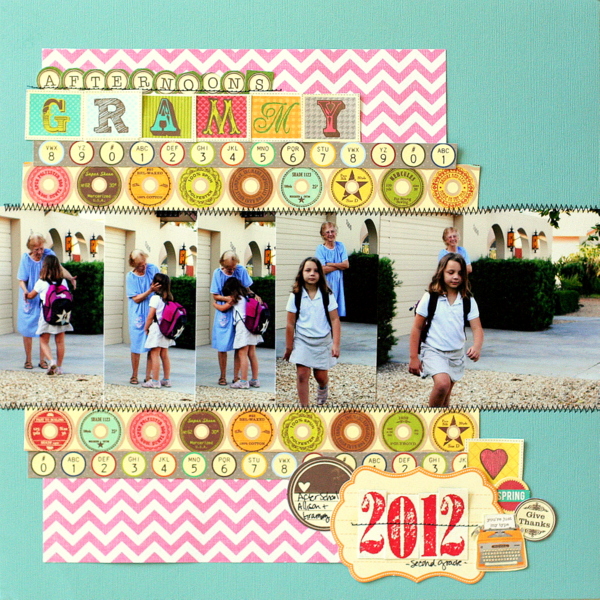
Afternoons with Grammy by Katie Scott | Supplies: Jillibean Soup, Recollections, Margie Romney Aslett’s line (numbers), machine stitching.
Terry Billman says, “The all American family is often stereotyped as living in a middle class neighborhood, complete with a fence, a dog and a couple of children, and that subject inspired my page. To highlight the dog in each photo, I converted the photo to black and white and used selective coloring on the dog (thus, the backround is still in black and white). These digital stuffed frames made a perfect border behind the embellishing fence. I like the movement provided by the layering and different angle of the frames and how it spans the entire width of the layout.”
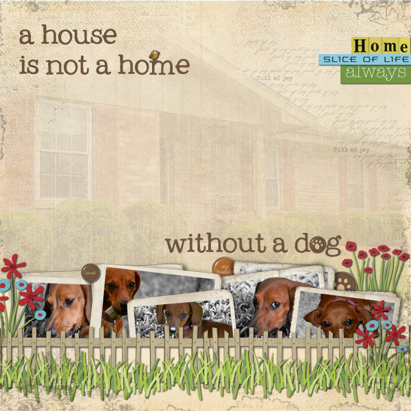
A House Is Not a Home…by Terry Billman | Anna Aspnes:
Art Play Find My Way, Vintage Evergreen Overlay; Katie Pertiet
Worth Repeating Expressions No. 2, Drawn Blossoms, Pet Pebbles
Dog Park Kit, Cut Ups Summer, Cut Ups Photography, Stuffed Edge Photo Frame No. 3; Patti Knox: Victory Garden; Ali Edwards
For the Love of Words.
2. Arrange 5 photos in grids and blocks
Grids are always a great starting point for a page. With 5 photos, you know you’re going to have to shake up photo sizes or fill at least one block with something other than a photo.
Brenda Becknell printed a series of 3″x4″ photos and arranged them on the page in two rows with tilts and overlaps. The arrangement of photos defines a 3 by 2 grid, and the top right spot holds the title–which extends out of the grid and adds energy that a straight-up grid would not.
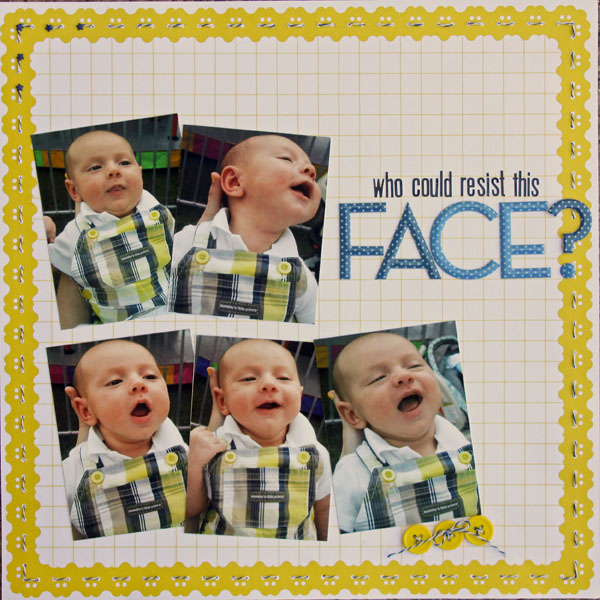
Who Could Resist This Face by Brenda Becknell | Supplies: Patterned Paper: American Crafts Neapolitan line (Sea Breeze); Alpha stickers: Lily Bee & Making Memories; Misc: buttons and bakers’ twine
Tara McKernin‘s grid of photos from a day at the park spans two pages. She’s kept the lines straight with four distinct columns. Photos are of varying sizes and patterned paper plus journalers fill the spots lacking photos.
Tara says, “I kept my elements supper simple and was able to crop the photos in closer to pull out the details of our day.”
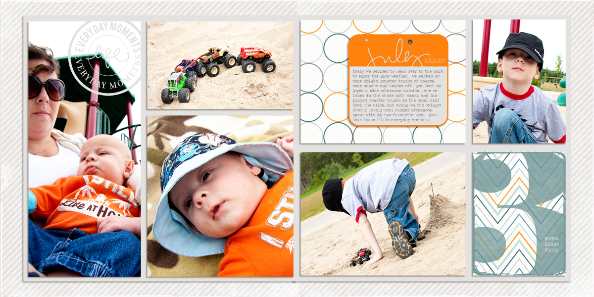
Everyday Moments by Tara McKernin | Supplies: Today boy’ish papers, Life Recorded Elements and Jumbo numbers from Karla Dudley, Simplified 7 photo Template Scrapbook Lady, Font Travelling Typewriter.
Katie Scott scrapbooked five after-shopping photos in a blocked design with precise edges. To fill out the entire block or grid, she cropped photos to differing sizes but kept three of them to the same height and two of them to another common height for rows.
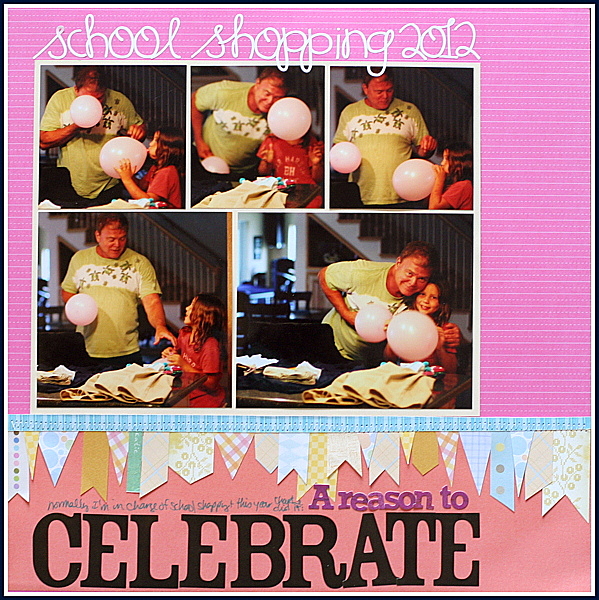
A Reason to Celebrate by Katie Scott | Supplies: American Crafts letters, cardstock, random patterned paper scraps for the banner and machine stitching.
Sue Althouse has 5 photos in 4 different sizes. A loose blocked design is a great approach for handling this kind of variety, with journaling, titlework and embellishing filling empty spots. You can even leave some spots empty as long as you’ve got strong flow and balance on the page. Sue says, “I settled on this arrangement because I like the strong horizontal and vertical lines.”
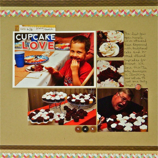
Cupcake Love by Sue Althouse | Supplies: Cardstock: Bazzill
Patterned Paper: Echo Park, Bo Bunny; Alphabets: American Crafts, Jillibean Soup; Tools: EK Success Square Punch, Fiskars Border Punch; Tag: Elle’s Studio; Brad: My Mind’s Eye; Buttons: miscellaneous; Floss: We Are Memory Keepers
Amy Kingsford says, “A freestyle grid was the perfect approach for displaying five photos (which is quite a lot for me) while conveying the “chaos” of our morning routine. This particular configuration was inspired by a display photo I saw on Pinterest. You can read more about the inspiration and download a sketch inspired by this page here.” Papers and embellishments fill out the empty spots in the loosely blocked arrangement.
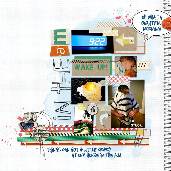
In the A.M. by Amy Kingsford| Supplies: Sahlin Studio: Sketch Pad Papers, Grandma’s Dresser Papers and Elements, A Wonderful Day Papers and Elements by Sahlin Studio, Key to My Heart Elements; Michelle Godin: Sloppy Stencils 2; Anna Aspnes: Foto Blendz Masks, May 2012 Template A by Amy Kingsford.
3. Use a “1 + 4” cropping formula
Emphasize one photo and use four similarly-sized photos to support your story. Notice that the one photo of a different size can be bigger than the other or smaller. Just be sure that difference is noticeable.
Jana Morton emphasized the posed shots of her girls with their “make-up artist” before an ice-show performance and then supported it with a series of four photos showing the preparations.
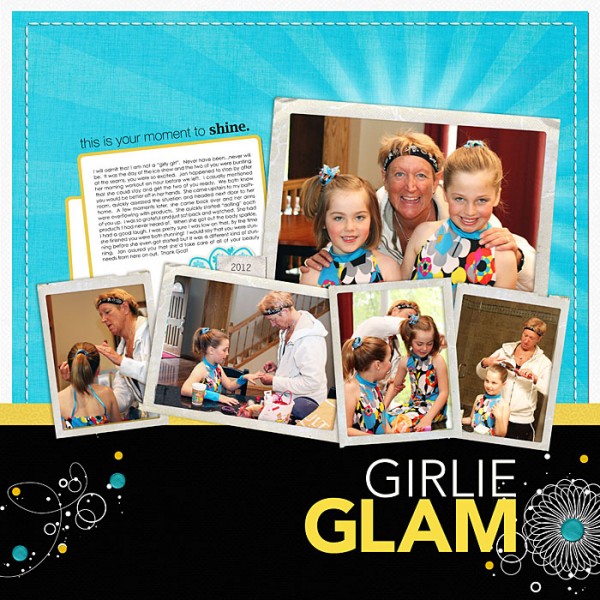
Girlie Glam by Jana Morton | Supplies: Lynn Grieveson: Wild Weekend Kit; Katie Pertiet: Classic Cardstock: Into the Night, Fine Lines Border Lines Brushes and Stamps, Crowning Affair: Vibrant Kit, Pocket Cards: Rainbow Sentiments No. 02, Twisted Clusters Brushes and Stamps No. 01, Photo Clusters No. 33, Messy Stitched Borders: White No. 01, Star Glows Brushes and Stamps No. 02; Cathy Zielske: Typesets Girlie No. 02 Brushes and Stamps
Debbie Hodge emphasized a group shot of her son and friends on a boat with a larger crop and then added in small shots of individuals getting off the boat. If you take a look at this design, the photos are actually in a blocked arrangement, with the tilts and backup layering giving it a casual feel.
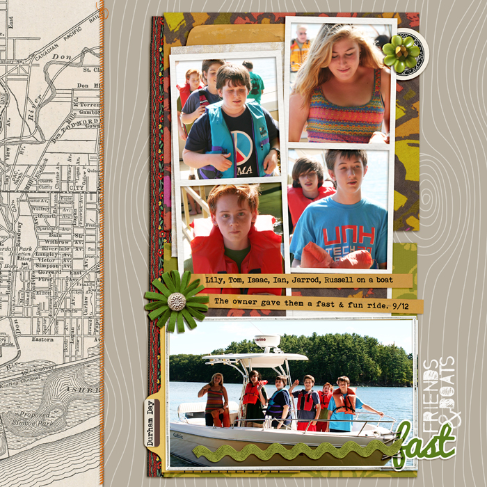
Fast Friends & Boats by Debbie Hodge | Supplies: Retro Mod by Sahlin Studio; Autumn Blooms by Karen Funk; Straight Line Stitched Orange by Anna Aspnes; A Very Small Alpha by Allison Pennington; Wanderlust by Pink Reptile Designs; Pacifico, Bohemian Typwriter fonts
Debbie Hodge cropped a series of four photos to the same width but with differing heights and arranged them in a vertical series along the left of the page. A smaller photo sits beneath journaling and title.
4. Arrange 5 photos in a layered cluster
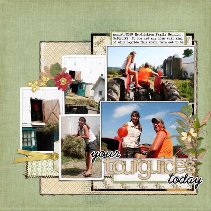
Shake up the grid and overlap and tilt, take things off off the grid line and create a cluster of photos. With 5 photos, a mix of two photos at one size and three photos at a second size makes it easier to put together a cohesive design (see “Tourguides” below).
The cluster on Debbie Hodge’s “Tourguides” is a structured one, with two same-sized photos stacked and three (yet same-sized) photos layered to the left. Notice that the larger photos are both landscape crops and the three smaller photos are all portrait crops. These things add to the orderly feel of the cluster.
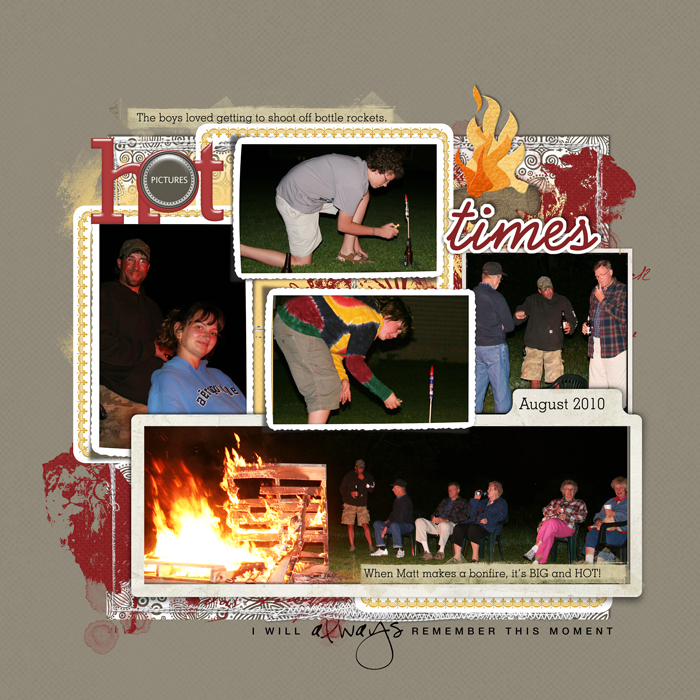
The cluster of photos on “Hot Times” is a more casual grouping, with photos in varying sizes and nothing lined up. The white frames on each of the photos, keep the photos separate from one another and add to the clarity of this full page.
[current]

