The symmetry of the Taj Mahal is one of the things that make it beautiful. Learn more about symmetry in our Design Principles for Scrapbook Pages.
by Debbie Hodge
In a symmetrically balanced visual design, elements on either side of a central axis balance one another.
The act of riding a bike requires the balancing of physical weight on either side of a vertical axis. The act of creating a symmetrical visual design requires balancing visual weight on either side of a vertical axis.
formal balance
Symmetrical balance is also known as “formal” balance: it’s based on a form or a formula. The resulting design is organized and formal looking (think classic architecture). Our brains like things that are symmetrical (think about the love babies have for the human face).
approximate symmetry
When symmetry is found in nature it’s not exact. Consider leaves and faces and butterflies: the elements on either side of their vertical axes mirror one another, but if they are folded in half, the match won’t be perfect. On a scrapbook page a symmetrical design will have elements that mirror one another in size and shape and visual weight on either side of a central axis.
as opposed to asymmetry
Symmetrical designs are straightforward and, perhaps, predictable. Thus, many visual designs–and scrapbook pages–are designed with asymmetry and the resulting dynamic white space.
Who says symmetry has to be boring?
Take a look at these designs for an idea of how to work with symmetrical designs that are not staid or predictable, designs that leverage the mind’s love of symmetry while incorporating details that charm.
Amanda Jones says, “Symmetrical designs are great for conveying stability.”
“Here, I wanted to show the new but already solid relationship between my son and his new baby cousin. I chose a selection of symmetrical stickers and bits and pieces cut from patterned paper, along with a graphic background paper, in order to get started with my symmetrical page design. The grid-style background paper helped with lining everything up nicely! Once I had arranged the embellishments and photo, the page was quite top-heavy. I decided to cut two large flourish designs (I cut one as a mirror image) to add beneath the picture.”

Boy Meets Girl by Amanda Jones | Supplies: Kits – JBS Mercantile, July 2012; Patterned paper – Studio Calico, Cosmo Cricket, My Mind’s Eye; Stickers – Cosmo Cricket; Stamp – JBS Mercantile Exclusive; Other – Ribbon, Silhouette Cameo
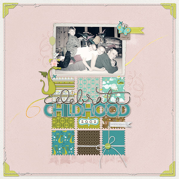
Deborah Wagner says, “The symmetry on ‘Celebrate Childhood’ gives my page a classic, vintage look. To off set the clean lines and symmetry, I added whimsical embellishments. The fanciful embellishing also supported my title of celebrating childhood.”

Celebrate Childhood by Deborah Wagner | Supplies: Designer Digitals: Katie Pertiet – Dragon Trainer Kit, Little Layette Kit, You & Me Kit, Photo Corners No. 3, Messy Stitched Borders White No. 2, Powder Mountain Kit, Painted Swirls, Watery Banners No. 1, Crowning Affair Kit, Cut Ups Birthday, Editorial Inspiration 1-31-11; Ali Edwards – Layered Template No. 20, Kids Are Cool Hand Drawn Brushes
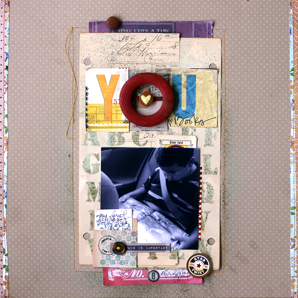
Doris Sander says, “I don’t work from sketches, but I like to use a variety of designs on my layouts and still have them all follow strong design principles.”
“To this end, I have a variety of layout styles that I pull from when starting a page. Bilateral symmetry is a fun one to employ when I’m looking to change things up a bit. On this layout I started with strong symmetry down the middle of the page with the photo, photo mat, title (with the dominant red embellishment), and red papers at the top and bottom of the design area. After laying this strong foundation, I then broke up the symmetry a bit by scattering my embellishments down the page in a loose Z-flow. This gives the page a bit more movement while the strong underlying symmetrical structure gives it stability.”

You {heart} Books by Doris Sander | Supplies | patterned paper, journaling spots, brad, sticker, pocket – Basic Grey, cardstock – Bazzill, buckle, buttons, heart, card – vintage, stencil, stamp – JBS Mercantile Exclusive
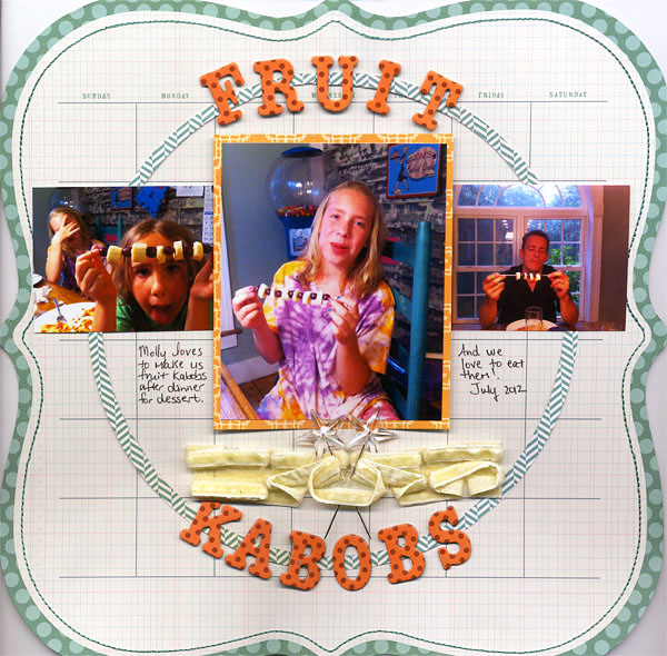
Adriana Puckett says, “Working with symmetrical design was not easy for me. I rely greatly on asymmetrical designs to bring tension and impact to the layout, and found that creating this page was more difficult when I didn’t have that tool.”
“The use of grid paper helped me create this symmetrical design, though. I cut the center out from the circle and added that as a major design feature around which the rest of the layout was placed. The center photo is matted and pop-dotted to create depth and texture.”

Fruit Kabobs by Adriana Puckett | Supplies – Paper:KI Memories (shaped) and scraps; Ribbon:Maya Road; Star
pins:Maya Road; Title:American Craft Thickers.
Briana Johnson says, “I’ve recently starting making layouts with complete symmetry. For the longest time I wouldn’t let myself do that. I had a teacher in college who was teaching the basics of design and she did not like symmetrical designs and definitely no bullseye. She really drilled that notion into my head. As a result, I was afraid a symmetrical design it wouldn’t guide the eye through the page well.”

You Are My Sunshine by Briana Johnson | Supplies: Cardstock: Bazzill; Stickers: Basic Grey; Die Cutting Machine: Silhouette Cameo; Die Cut: “Artisan Flourish”circle from the Silhouette Store; Metal: Vintage; German foil trim: Vintage; Patterned Paper: Basic Grey; Stencil: JBS Mercantile; Spray Mist: Studio Calico; Kit: JBS Mercantile August 2012
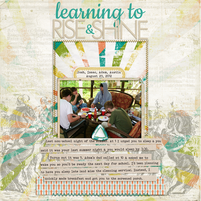
Debbie Hodge made “Learning to Rise & Shine” with the explicit goal of creating a symmetrical composition–a design approach she rarely takes.
“I began with my photo and a nearly symmetrical burst (like the sun) rising behind it. I purposely put the photo and burst at horizontal center and worked from there to build this page, which I’m loving because, in it’s formality, it’s so different from the pages I usually make. I arranged the foreground elements in a pyramid of sorts, with a wide base at page bottom supporting my “tower” of elements. Finding this paper with circus horses rearing up on either side was a great boon to the design, and it occurred to me that I could take any print that faced in one direction, duplicate, and flip to get a similar effect on other pages.”

Learning to Rise and Shine by Debbie Hodge | Supplies You Are Here by Allison Pennington; Circus by Ashlee Wall; Retro Mod by Sahlin Studio; Painted by Robyn Meierotto; Journaling Strip Masks by Katie Pertiet; PageKraft by One Little Bird; Darling Dear by Creashens; Glitter Thread Stitches, Fall Festival, Distressed Solids 3 by Lynn Grieveson; Cookie, Bohemian Typewriter fonts
Have you made any symmetrical designs? We’d love to see them. Link us up below and tell us about your preferences when it comes to considering symmetry (or the lack of symmetry) in your page compositions.

