Embellishments are those details on a page that do things like add charm, deepen meaning, and guide the eye. It’s the photos and/or the story we’re told should be most important.
Every now and then, though, shouldn’t you just GO BIG and use an oversized embellishment? We think so and have round-up of pages showing you just how we did it.
Amber Ries says, “Grandma always brings presents when she comes to visit. The summer of 2009, she brought a teeny silicon star cake form and a cake mix, then she baked with the kids.” She scrapbooked the photos of her kids in the process of eating, ahem, FROSTING their star cakes with an oversized star cookie-cutter with supports the story and draws the right into the center of her page.
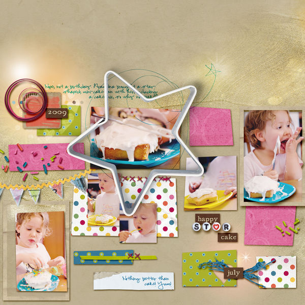
Happy Star Cake by Amber Ries | Supplies: Karah Fredricks: Bring on the Cake | Valorie Wibbens: Topography No. 9 | Micheline Martin: Bead Factory | Anna Aspnes: loopdaloops star, gold paint overlays & warmglows
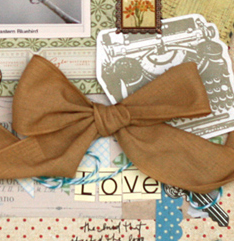
“Logo” is the story of what inspired the design of Leah Farquharson‘s business logo and it includes several big embellishments.
Leah says, “I’ll admit it. This was a bit of a tough one for me. These embellishments may not even look oversized to others, but I tend to scrapbook with a “whitespace” look that uses smaller elements clustered together.”
“Normally, I would have taken one look at any of these big items–the large tag, the typewriter diecut, or the bow–and laid them aside. They definitely stretched me! I do really love how this turned out when I took the time to work with it and get them into my design.”

Logo by Leah Farquharson | Supplies: patterned papers: Basic Grey, 7 Gypsies, My Mind’s Eye. Element stickers: Basic Grey. Buttons, Twine:My Mind’s Eye. Wooden Embellishments: My Mind’s Eye, Basic Grey. Paper Clip:Studio Calico. Flower: Prima.Clip: TIm Holtz. Ink: Ranger. Chipboard letter: American Crafts. Letter Stickers: Jenni Bowlin. Ribbon: May Arts.
Katie Scott‘s father-in-law and neighbor feeds water birds like great blue herons and cranes every evening, so there is an abundance of feathers at her house. She dipped the tip of it into some paint and used it as the oversized embellishment on a page about how she’s related to one of the signers of The Mayflower Compact.
Katie says, “I have had an account with ancestry.com for a couple of years and I did a bunch when I first signed up but haven’t in a while; until this weekend. I totally immersed myself in my family history and traced my Great-Grandma Maude Allen’s line all the way back to the Pilgrims. Well sort of, we actually arrived in 1635 which was 14 years after the first Thanksgiving in 1621. But I kept on looking and did find that we are related to, but not descended from, Peter Browne – who lived right next to the Common House in Plymouth Village and who signed The Mayflower Compact in 1620.”

Common Good by Katie Scott | Supplies: Supplies: DCWV paper; images of The Mayflower Compact etc. from an internet search; Sassafrass and American Crafts Letters Stickers, paint and a giant bird feather (from the backyard)
Kim Watson played up the theme of this page about her son’s love of drawing “Tiki” art inspired by the movie “Lilo and Stitch” with an oversized sun and cut-out tiki embellishments. Her canvas is full and while these embellishments are big and colorful, placement of her photo at a sweet spot and the title on an arrow keeps the story central to the page.
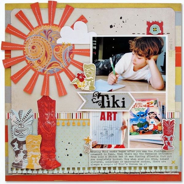
Supply list: Cardstock: American Crafts; Patterned paper, Chipboard, Die Cuts, Filters, Alpha Stickers, Buttons: Fancy Pants Designs, Ink: Clearsnap; Punches: Fiskars, Die Cutter: Silhouette SD
Michelle Houghton says, “For my husband’s birthday my girls decorated the entire house. We woke up to little signs everywhere and streamers and balloons. They also made a crown for John to wear and he was a fabulous sport and donned it for the morning. I loved it so much I wanted to include it on my layout. I cut a simple crown out of a red patterned paper and added the blue rhinstones so that the feel of the girl’s creation was still there. The heavy red crown is balanced by the two stacked photos of John in his crown and John with his girls.”
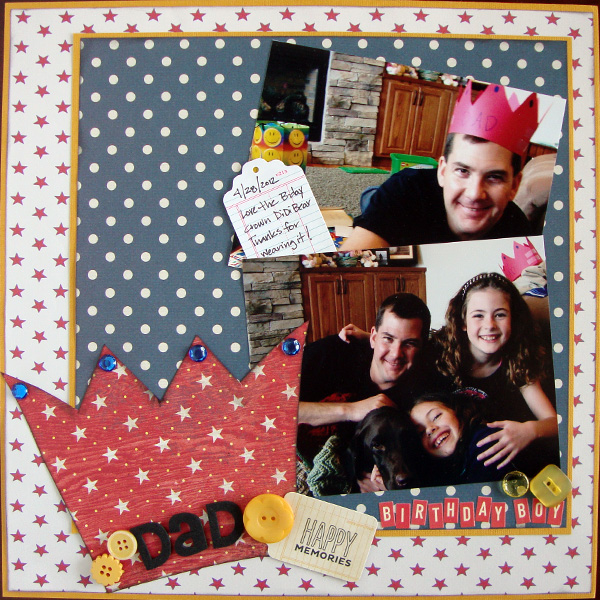
Birthday Boy by Michelle Houghton | Supplies: Cardstock – Bazzill;
Patterned paper – Jenni Bowlin and Basic Grey; Rhinestones – Darice; Tags – American Crafts (Amy Tangerine); Buttons – Crate Paper; Letters – American Crafts (Thickers) and October Afternoon
Adryane Driscoll says, “I knew I’d have use for this photo some day, and adding an oversized mustache embellishment turned out to be a great way to scrapbook it.” Adryane took this photo at a 4th of July festival and her subject is the man who won the best mustache contest there.
“To balance the mustache, I went with a large bold font (Impact) for the title, a play on the “got milk?” advertising campaign in the U.S. in which the characters have white mustaches from drinking milk. I tried to find stitching that was ‘ripped out’ right near the point of the mustache to emphasize how unruly this man’s facial hair was … and I made a quick ruler in Photoshp to balance the journaling.”
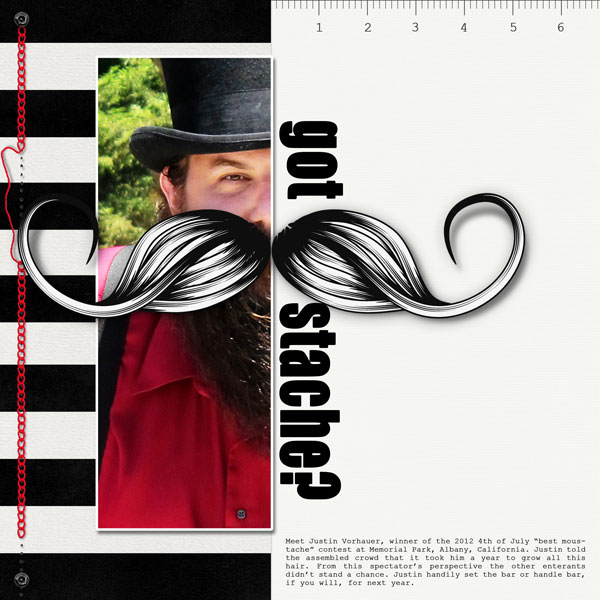
Got Stache? by Adryane Driscoll | Supplies: Anna Aspnes: ArtPlay Palette Sophistica; Syrin: Amy’s Stitching; Holliewood Studios: Art Journaling No.2.
Meghann Andrew says, “I love clustering embellishments, so for this layout, I challenged myself to make my biggest cluster yet!”
“The layout celebrates my four-year wedding anniversary and includes a photo that I took of us (in the mirror!) on that evening before going out to dinner. Because I only had one photo, I had plenty of room for my embellishment cluster, which is mainly made up of the number ‘4’ cut with my digital cutter. I also raided my stash for any other smaller ‘4’s.”
When mixing and matching so many embellishments together, it’s important to limit your color choices. I used kraft, pink, yellow and teal and only used pieces that had a ‘4’ on them, or had something to do with love. I added small and versatile embellishments, like brads, and I cut out pieces of patterned paper, adding little touches like glitter, and used these as embellishments too. Because my embellishment cluster runs along the right side of the paper, I wanted to ensure that the left side was balanced, so I used a wide photo-mat in a bright color to get that balance. This resulted in one of my favorite layouts to date!”

4 Years by Megahnn Andrew | Supplies: Patterned paper: My Mind’s Eye, Studio Calico; Cardstock: Bazzill Basics (kraft); Punch: Martha Stewart (pinked circle), EK Success (circle); Cardstock tags: Elle’s Studio (pink frame, ‘4’ with grid, yellow ‘4’, ‘true love’ pennant), Pebbles (kraft ‘love’ tag); Die cut shapes: Jenni Bowlin Studio (butterfly), My Mind’s Eye (layered butterfly); Wood veneer shape: My Mind’s Eye (‘love you’ pennant); Brads: My Mind’s Eye (turquoise ‘love’, turquoise ‘4’), The Girl’s Paperie (black ‘4’); Rub-on: Basic Grey (birds); Baker’s twine: My Mind’s Eye; Letters: American Crafts; Stamp: Studio Calico; Pearls: Doodlebug Design; Ink: Stampin’ Up!; Journaling tag: Elle’s Studio; Spray ink: Studio Calico; Glitter: Stickles; Other: Silhouette Cameo
Katie Scott embellished “You Can Do Anything You Want” with “found items” origami creations her daughter made. Katie says, “We have gazillions of origami bits all around the house – so I thought it would be fun to use a few on a scrapbook page about my daughter.” A boat edges its way onto the page from bottom left and a series of colored heads run down the left side.
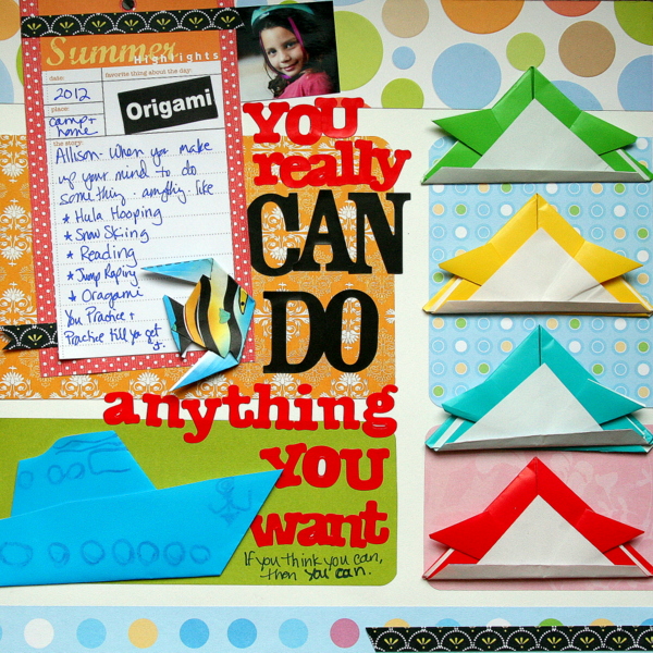
You Really Can Do Anything by Katie Scott | Supplies: DCWV & KI Memories Papers; American Crafts & Making Memories (from 1997!) letter Stickers; Little Yellow Bicycle journaling spot.
Chris Asbury anchored the photo on “Sunny” with a large flower. The flower with its branches breaks up the rigid lines of the photo frame. Chris says, “To further support the framed photo, I added oversized tape to the right side and layered the title on top of the tape. I completed the page by adding soft color glows and brushes to compliment the pink hues of the sweet pea branch and to add to the vintage feel.”
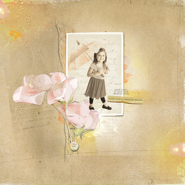
Sunny with a Chance of Showers by Chris Asbury | Supplies: Anna Aspnes Designs: ArtPlay Palette Cuisine, ArtPlay Palette Genuine, ArtPlay Saffron Villa, ArtPlay Palette Sweet Pea, AntiquatedFrame No.1, ArtPlay Palette Gather, WaterColor FotoBlendz No.1, ArtPlay Palette Bask, ArtPlay Palette Blossom, Textured Overlays No.7, MultiMedia Leaves No.1, WarmGlows1, NakedTape; KittyDesigns:Touch of Magic (Sweet Awaits); Font: Remington Typewriter
Kelly Purkey used an oversized clock on her page about having ice cream late at night. Kelly says, “Stamps are a fun way to create your own custom embellishments that can be the focus of your page. I used alphabet stamps to create backgrounds my own clock. A fanned circle gives the clock even more emphasis, and I repeated teh fan folds on the other smaller embellishments.”
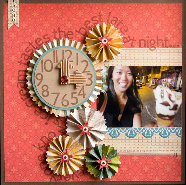
Ice Cream by Kelly Purkey | Supplies: Cardstock – American Crafts; Patterned Paper – Studio Calico, 7 Gypsies; Basic Grey, Crate Paper; Stamps – Studio Calico; Stickers – Crate Paper, Making Memories, Jenni Bowlin; Arrows – Maya Road; Jewels – Making Memories; Stapler – Ranger
An oversized ampersand embellishment is the foundation for Amy Kingsford‘s “You & Me” which features a photo of her holding hands with her husband.
Amy says, “The template I used for the ampersand offered a fun way to introduce plenty of soft colors and romantic patterns. I love how it so easily tied everything together and directed the flow of my design. Because of its size and shape, I knew right where I wanted to put my photo, title, and secondary embellishments.”
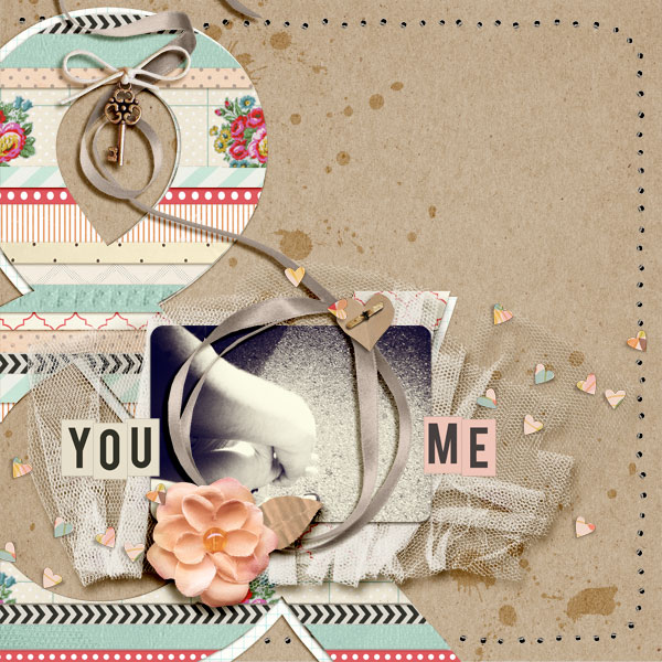
You & Me by Amy Kingsford | Supplies: Sahlin Studio: Key to My Heart Papers, Key to My Heart Elements, Typeset Alphas No. 1 & No. 2, Paper Pierced Holes (Basic); Nettio Designs: I Love Paper Templates.
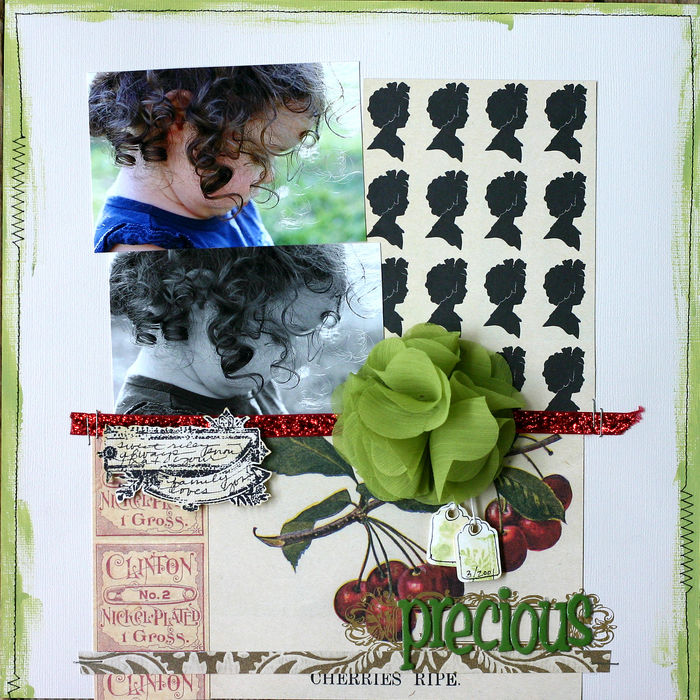
The oversized fabric flower on Doris Sander‘s “Precious” anchors the entire composition, grounding the photo cluster emphemera, and ribbon strip to the canvas. Its green is repeated in paint strokes around canvas edges and the title alphas. This oversized embellishment gives the page both focus and flow.

