Floral prints can range from pretty and delicate to big and bold. Each has its own personality. Floral prints are, thus, a great tool for any visual storyteller.
You’ll find patterned papers for scrapbooking in four general types. These same four patterns are prevalent in decorating: floral, geometric, motif, and pictorial. We’ve got an extensive article on these patterns with tips for mixing.
Go “small, bright and sparse” for a whimsical tone
On Kiki Kougioumtzi‘s “May 1,” plenty of white ground shows through the pink, purple and green blossoms and adds to the playful tone set by the photo.
Kiki says, “We have a tradition of making a flower wreath on May 1st. The upper half of the page is occupied by my photos full of flowers. I wanted to mirror these flowers in the lower half of the page so I chose a floral print paper. To accompany the floral pattern I chose an abstract motif that reminds me of a pergola or a garden’s fence.”
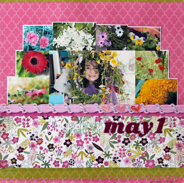
May 1st by Kiki Kougioumtzi | Supplies: Patterned paper: Basic Grey, Echo Park; Rub-ons:American Crafts; Sticker borders:Basic Grey;Bakers’s twine: My Mind’s Eye; Paper punch:Fiskars; Alphabets:Basic Grey, American Crafts.
DebbieHodge scrapbooked a fun moment from her son’s birthday party with lots of prints. The bright floral print frames the page at top and bottom, and the blossoms’ small scale and sparse placement make them pop on the white background.
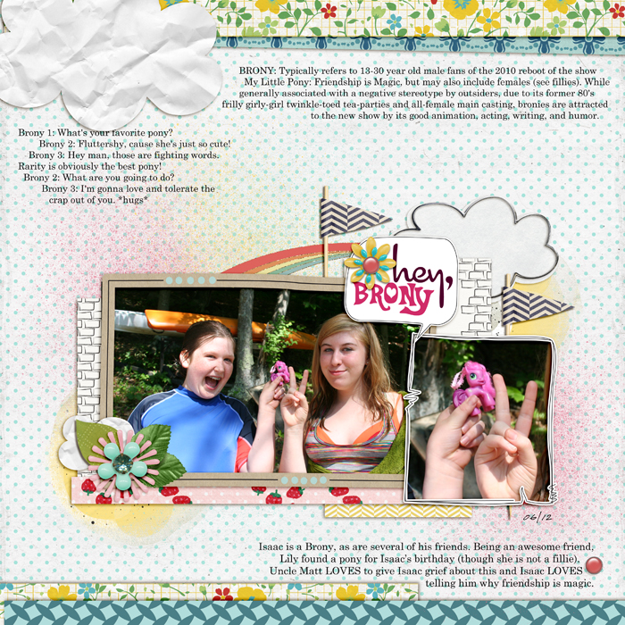
Comic by Enkay; Fresh by One Little Bird and Sahlin Studio; Art Play Play Out by Anna Aspnes; Never Forget by Erica Zane; Country Fair by Dani Mogstead; Reminisce by Leora Sanford; Seas the Day by Julianna Kneipp; True Colors by J Labre; Courier, Celestia, Cocktail fonts
Lynnette Penacho mixed several bright prints in horizontal strips on “A Daring Adventure.” She has geometric and abstract prints along with one floral print. The floral print is small scale and sparsely placed on a white ground. The result is playful and whimsical.
Lynnette says, “This quote from Helen Keller has unofficially become my life motto at the moment and so it seemed only fitting to use it as inspiration for a layout. I knew I wanted it to act as a big and bold title as well as journaling, so I went with a patterned paper horizontal stripe design to really make the text pop. This was one of those layouts that came together amazingly fast so I guess it was meant to be!”
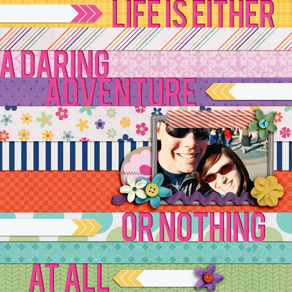
Life Adventure by Lynnette Penacho | Supplies: Life’s An Adventure by Penny Springmann and Becca Bonneville, Font is Bebas. Inspiration Source: Quote by Helen Keller
Use large and simply-styled florals for a modern look
Ern Clayton filled two of the blocks in her grid-design on “Becoming Mama,” with large-scale florals that are simple in their rendering and that give her page a clean and modern look.
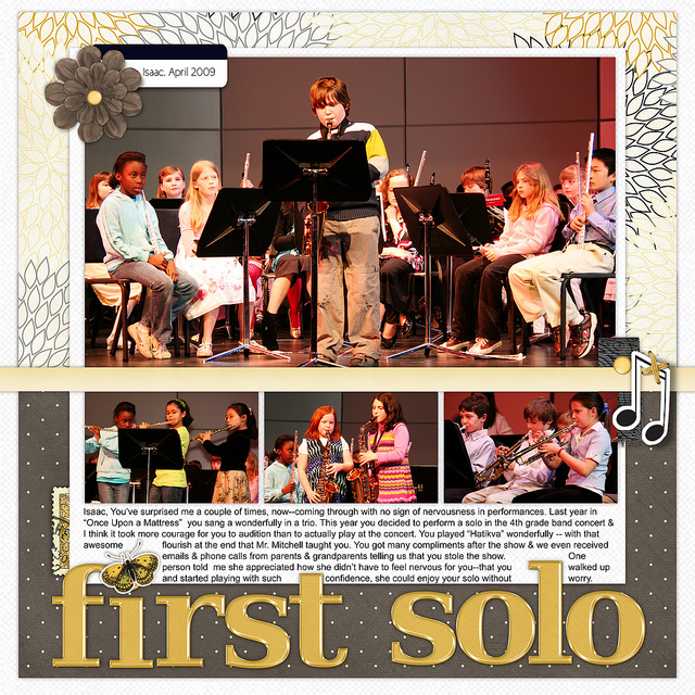
Simple florals are the perfect complement to Debbie Hodge’s page recording her son’s first band concert solo. Again, these large-scale flowers with simple lines create a sophisticated look.
Use small-scale neutral prints for a formal look
Debbie Hodge and Doris Sander both used the same white-on-black floral print on their pages featuring quite different photos. Both of these pages have a reverent or awe-filled tone, Doris’ for her cats and their nine years with her and Debbie’s for her son who has dressed up of his own accord to go see a play.
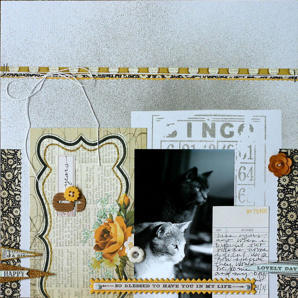
9 Years by Doris Sander | Supplies: patterned paper, buttons, chipboard elements by My Mind’s Eye, Mist by Jenni Bowlin for Ranger, Stencil by The Crafter’s Workshop, Journaling Spot by American Crafts, Alphabet by Jillibean Soup
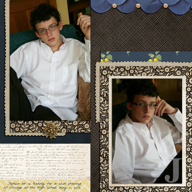
J by Debbie Hodge | Findings by Jenn Allyson; Petals by Sara Gleason; Alpha Set 5, Burlap Scraps, ArtPlay Snow Fun by Anna Aspnes; Chasing Fireflies by Paislee Press; Bollywood Dreams by ViVa Artistry
Use large-scale repeating florals for a vintage look
The large-scale roses on “Recieved” are reminiscent of old wallpapers, drapes, and upholstery, especially with their sparse placement and repeating design. They were, thus, well-suited to Debbie Hodge’s page about family treasures passed down through the generations.
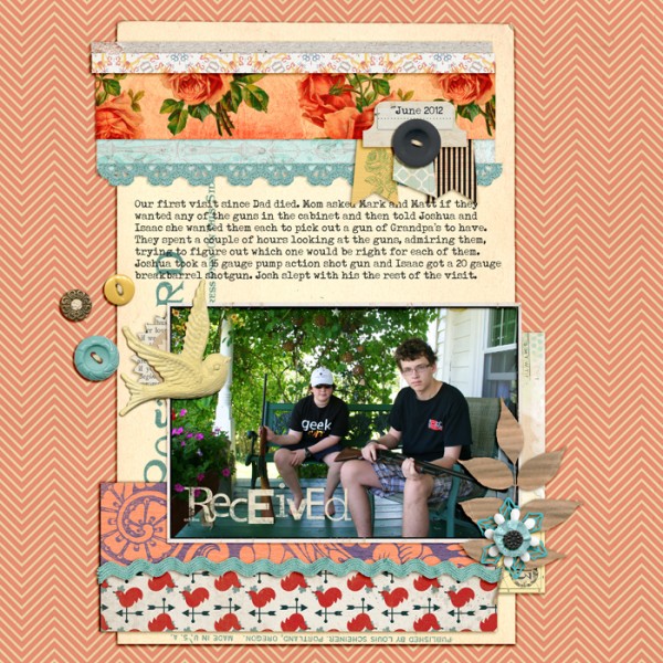
Love is a Verb by Ju Kneipp; Smart Cookie by Lynn Grieveson; ArtPlay Bloom, ArtPlay Concerto by Anna Aspnes; Postcard Journalers, Rimmed Framers, Krafty Cuts Leaves by Katie Pertiet; A Mixed Up Alpha by Lisa Sisneros; Maritime by One Little Bird; Everything Starts as Somebody’s Daydream by Tracy Martin; Lil Miss Sassy Pants by Mari Koegelenberg; Strike a Pose by Amy Wolff; Country Carnival by Celeste Knight; Pure Happiness by Designs by Anita; Typenoksydi font.
Use tone-on-tone florals for backgrounds
Tone-on-tones are always a safe choice for large swaths of patterned paper.
Barb Brookbank says, “When I use floral patterns, I tend to use very light ones. I love this kit by Sue Cummings. It’s soft and soothing. I converted the photo to black and white and adjust the levels to make it a bit blown out. I like clean, linear designs so the three paper rectangles were all I used to ground and frame the photo and journaling. The stitches and text brushes add a bit of interest and seem to tie the two sides together as they seem to wrap behind the layout.”
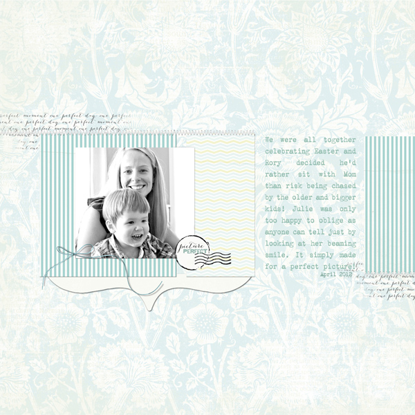
Picture Perfect by Barb Brookbank | Supplies: One Perfect Day by Sue Cummings, ArtPlay Palette Fall (stitching), Font: Vintage Typewriter
Emily Pitts used a tone-on-tone pink floral print as the perfectly-appropriate backdrop for “Happy Girls are the Prettiest.”
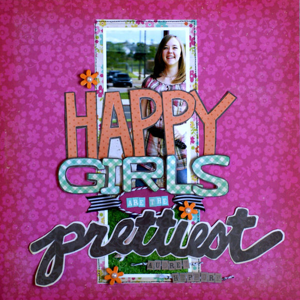
Happy Girls by Emily Pitts | Supplies: Patterned Paper: Simple Stories, Chipboard: Maya Road, Embossing Powder: American Crafts, Ink: Tsukeniko, Mist: Maya Road, Ribbon: Maya Road, Pearls: KaiserCraft, Twine: Maya Road, Thread: Coats and Clark
Use large-scale florals in small doses
Vicki Walters blended a photo of her granddaughter into a floral print paper.
Vicki says, “This is one of my favorite old pictures of Kyndal–I think she is just beautiful when she’s pouting! She was 8, almost 9, in this picture and we were at a ballgame and it was hot and she was miserable! This floral paper was perfect to blend the photo in to. I like to make an overlay with a white fill and erase with a water brush until it’s blended. I change the opacity of the brush gradually as I go further from the center. Also, to make the word art stand out after coloring it to match the colors in the page, I add a large glow brush behind it.”

Children by Vicki Walters | Supplies: Anna Apsnes: FloralArt Paperie no 2, Children Quotes WordArt no 2, FotoGlows no 4, Flutterby Stitched LoopDaLoops no 1, Textured Overlays no 7; Tracy Ann Digital Art: Frippery Fancies (flower heart).
Kayleigh Wiles‘ “Keep Calm” includes a wide expanse of solid blue bordered by narrow, torn strips of patterned paper along the right edge of the canvas. One of these is a colorful print with oversize flowers that could overpower used in a large amount. This torn strip, though, is perfect for adding an edge of energy against a sea of calm.

Keep Calm | Supplies: Lucious Kit by Maplebrook Studios; Vintage Photo Frames No. 25, Basic Polka Dot Ribbons No. 01 and Tabbed Dates by Katie Pertiet; Hint at it No. 08 Brushes by Lynn Grieveson; Easy Curled Edges No. 01, LoopDaLoop Artstrokes No. 04 BrushSet, ArtPlay Palatte Special One & Seafoam by Anna Aspnes; Painted Christmas Words Brushes and Stamps by Ali Edwards
Accent with fussy-cut flowers
Ashley Horton converted her colorful photos to black and white so she was free to choose any color scheme. She says, ” Since these photos were from our daughter’s Ballet Recital, I wanted to create a very pretty and girly feel to this layout. One of my favorite ways to achieve this effect is with floral patterns. I cut a 3.5×5 piece of abstract patterned paper with ornaments that look like flowers to match the size of my photos. Then I fussy cut three flower shapes from the extra paper and added pop dots for dimension. I also fussy cut several flowers from a different patterned paper to create embellishments.”
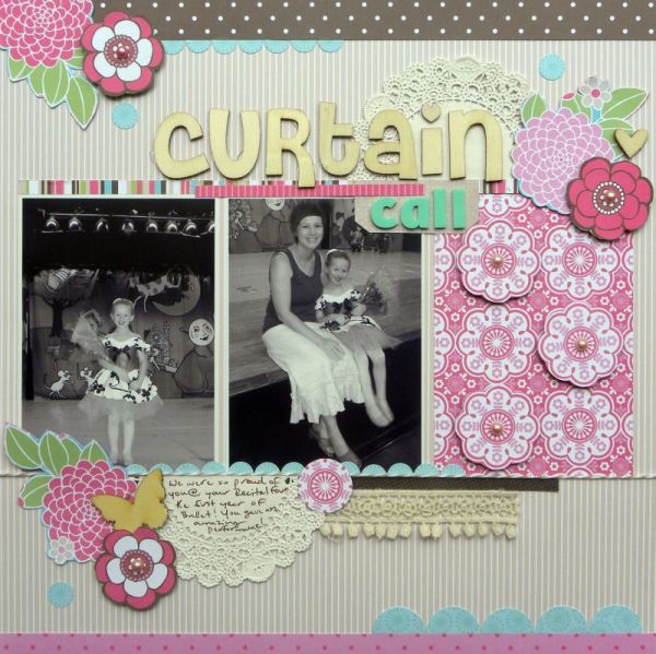
Curtain Call by Ashley Horton | Supplies: Patterned Paper: GCD Studios; Pearls: Recollections; Wood Veneers: Studio Calico; Wooden Alphas: Pink Paislee; Thickers; American Crafts; Doily: Hobby Lobby; Trim: Webster’s Pages; Baker’s Twine: The Twinery; Punch: Marvy
Unite florals with other patterns using a common color
Kayleigh Wiles mixed two abstract prints with a floral on “Where is she?” Each of these prints is in shades of pink with some neutral grays and whites.

Where is She? by Kayleigh Wiles | DesignerDigitals: Studio Double-D Girly Clusters No. 01; Tabbed Dates, Chronicles: Butterflies Brushes and Stamps No. 01, From My Bookshelf Blendables No. 01, Assorted Messy Stitches: White, Twisted Stitches No. 02, White and Grey Tab Alphabet, Messy Stamped Alphabet No. 02 & Numbers and Extras Brushes and Stamps, Stitching Holes Brushes and Stamps, File Labels: Love, Hinge Pack, Seek Word Art Brushes and Stamps No. 02, Lovely Damask Paper Pack, Little Hearts Element Pack, Little Hearts Add On Paper Pack and Rounded Corner Clipping Masks Brushes by Katie Pertiet; Rosa Paper Pack and Just Linens Paper Pack No. 20 by Maplebrook Studios
Mix prints by balancing scale
Meghann Andrew combined large-scale flowers on woodgrain with a small-scale abstract lattice-work pattern.
Meghann says, “This layout is about life in my shoes lately, and I was going for a vintage look. I chose a woodgrain-floral patterned paper and accent colors of tomato-red, yellow and light teal, taken from the other colors in my photo. Because my background and the woodgrain paper were very neutral, I thought that the accent colors would really need to make the layout ‘pop.’ I used all patterned paper here, but made sure to vary the scale of each paper chosen from the others. To bring emphasis to my photo, I arranged my embellishments (in both neutrals and in the accent colors) along a diagonal line which goes straight through my photo.”
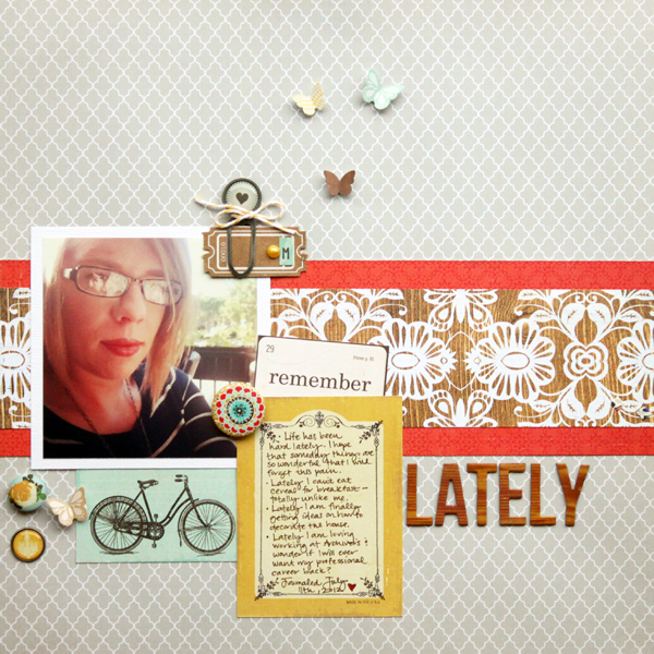
Lately by Meghann Supplies: Cardstock: American Crafts, Patterned paper: Studio Calico (grey, floral woodgrain), Crate Paper (red, yellow card, bicycle card), Echo Park (‘remember’), Cardstock ticket: Maya Road, Chipboard alphabet: American Crafts, Paperclip: My Mind’s Eye, Badge: Basic Grey, Brads: Crate Paper (rose), My Mind’s Eye (yellow chandelier), Twine: Divine Twine, Pearl: Kaiser Craft, Cardstock letter stickers: Studio Calico (‘M’ and butterflies)
Kelly Purkey balanced her large scale floral with crosshatch and music-motif prints that both have a smaller scale than the florals. The three prints make a busy and lively backdrop for this page showing Kelly having fun with a friend in New York City.
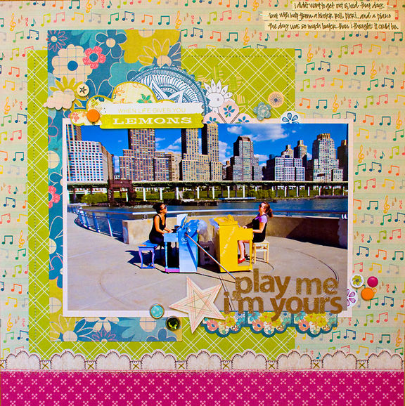
Play Me by Kelly Purkey | Patterned Paper: Sassafras, American Crafts; Stickers: Sassafras, American Crafts; Brads: American Crafts; Pen: American Crafts
Mix prints by balancing density
The sparsely-packed, small flowers on Leah Farquharson‘s “Shoe Love” reveal a repeating pattern and the result is a feminine feel to the page — perfect for a scrapbooking a favorite pair of shoes. The herringbone pattern is more densely packed and mixes well with the floral print
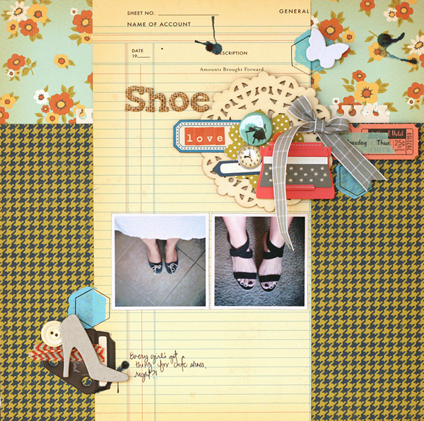
Shoe Love by Leah Farquharson | Supplies: patterned paper, diecuts, stickers, brads, flair, chipboard shoe, letter stickers: October Afternoon. Stencil: JBS MErcantile special release. Paint, button: Jenni Bowlin. Wooden Doily:Maya Road. Canvas Butterfly: Studio Calico. Tapes: American Crafts, October Afternoon. Typewriter, chipboard letters: American Crafts.
On “Living Large,” Debbie Hodge layered a scallop of sparsely packed blossoms on top of the very dense and repeating rows of blossoms on a pink ground. Debbie was going for a vibrant tone and a country look and these florals were perfect for that goal.
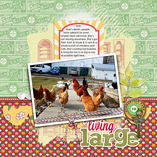
Living Large by Debbie Hodge | Homespun Papers, Homespun Journaling Cards, Soda Water Papers by Jenni Bowlin; Relocate by ViVa Artistry; Bakers’ Twine 2 Katie Pertiet; Architectural Brushes by Artypants; Mod Grunge Fotoblendz, White Paint, Scissored Hearts 2, Scissored Scallops, Artplay Chevron Girl Craze by Anna Aspnes; Flair Box 3 by Paula Kesselring; Expedition by Lynn Grieveson; Key to My Heart by Sahlin Studio; Lavanderia, Rockwell fonts
Do you use floral prints on your page? What kinds of florals do you prefer and how have you used them in the past — and once you’ve thought about that, tell us how you’re going to use them in a new way on an upcoming page.


