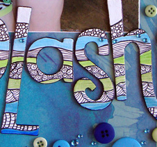
 While a scrapbook page title isn’t essential, other times a few emphasized words can go a long way toward immediately conveying page subject, setting tone, and even cueing deeper page themes and meaning.
Designwise, your title can draw the eye and be a part of page flow. Embellishing your title is a great way to give it the appropriate weight on the page.
Here are 9 ideas for embellishing scrapbook page titles.
1. Doodle across all of your alphas
Michelle Houghton painted chipboard letters white and doodled horizontally across all of them to create a horizontal pattern. (She’s got a great self-paced class if you want to learn a bunch of doodling patterns).
Michelle says, “I got this great photo at the water park of my two girls so decided to play it up and create a layout just for this photo. I loved the bright vibrent colors of the Basic Grey paper and wanted to use the same colors on my title so I painted my chipboard letters white, lined them up how they would sit on my page, added doodling, colored in some of the areas and inked the edges black. I made a point to keep my doodling pattern running horizontally while my patterned paper runs vertically to help the viewer see all the peices and not get overwhellmed with so much color and pattern on one page. It is still a lot to look at but the energy suits the photo and the feel of the day.”
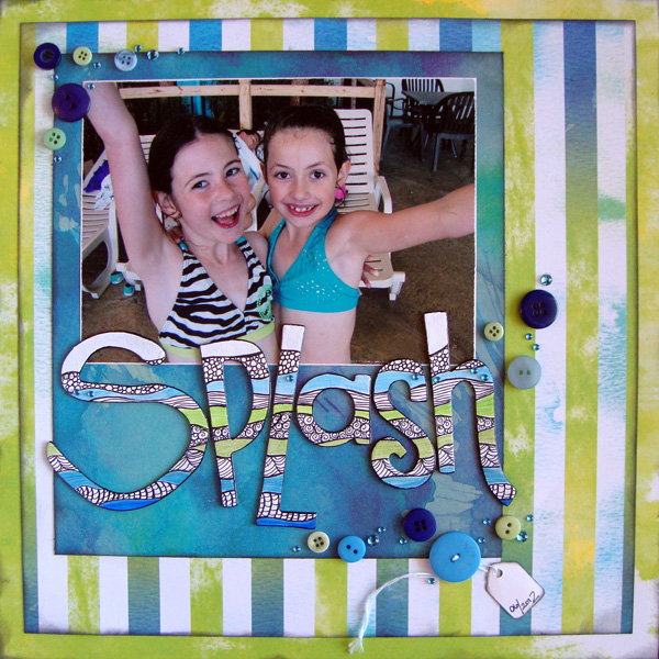
Splash by Michelle Houghton | Supplies: Patterned paper – Basic Grey, Chipboard letters – Regal, Acrylic Paint – Liquitex, Ink pens – Copic Sketch and Multiliner, Ink – Tsukineko, Gems – Mark Richard’s, Buttons, jewlery tag.
2. Replace “o”s with circular embellishments
Stefanie Semple replaced the two “o”s in her title, “Some Books,” with a fitting replacement: the side-by-side lenses of a pair of glasses.
Stefanie says, “I love using white space and incorporated it here with asymmetrical balance of two photo clusters.”

Some Books by Stefanie Semple | Supplies: Well Read by Elise’s Pieces and Cluster T vol 3 Template by Mye De Leon.
3. Wrap your title with a ribbon
Barb Brookbank overlapped her title letters and wrapped them with a ribbon on “Family” to echo the idea of the close-knit ties of this family.
Barb says, “I placed my title alpha close to the part of the photo that I wanted to emphasize (mom holding son up in air with everyone watching). The embellishments in the upper and lower corners of the layout combined with the ‘love’ word art, the alpha title, and the journaling all draw the eye diagonally through the page.”
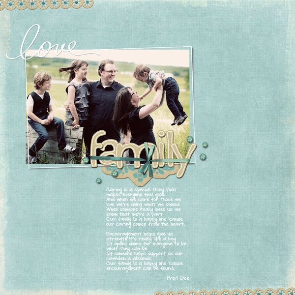
Family by Barb Brookbank | Supplies: Love of Family by Eva Kipler included with the Photoshop Elements 10 Costco CD; Font: DJB Carly Sue Got Married by Darcy Baldwin; Photo: Tere; Poem: Fred Gee
4. Tie a bow around one letter in your title
Debbie Hodge tied a bow around one letter in her title.
Debbie says, “I wanted to unite the two pages in this spread with a visual triangle of embellishments that each had a bit of brown and orange. That small tie was the perfect accent, providing a touch of brown and drawing the eye to the title.”
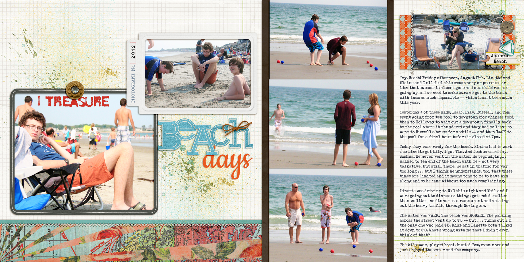
I Treasure Beach Days by Debbie Hodge | Supplies: You Are Here, An Additional Very Small Alpha by Allison Pennington; Meadowlark, Fresh, Retrouvailles, Shadow Like Me by One Little Bird; Krafty Alpha 2, Cold Springs Element Pack by Katie Pertiet; Eilon Elements by Maplebrook Studios; Stitched by Anna Cream by Anna Aspnes; Limerick by Piccolina Desings; Resotration by Gina Cabrera
5. Fill your title with patterned paper
Chris Asbury clipped a patterned paper with strong colors to her title on “Paris.”
Chris says, “We just got back from a trip to Las Vegas where we stayed in the Paris Hotel. I love their charming recreations of outdoor cafes and street life in downtown Paris. I used a sketch technique on this photo with several layers to adjust color and light. To embellish the title and also make it blend with the photo, I clipped a paper with strong colors (from Anna Aspnes’ ArtPlay Palette Metro Graffiti). I also clipped a light glow (from Anna’s WarmGlows No.1) to the title to boost contrast.”

Paris by Chris Asbury | Supplies by Anna Aspnes Designs: ArtPlay Palette Epic (bg paper), WarmGlows No.1, WarmGlows No.3, Different Strokes No.1, ArtPlay Metro Graffiti (brad, paper), Textured Overlays No.7; Font: Paris by Moshik Nadav Typography.
6. Fill stencil openings with glitter
Doris Sander backed up the stencil alphas on “Sparkle & Shine” with glitter that goes with her niece’s personality.
Doris says, “My camera and I are completely captivated by my little neice. She has a vivid personality that I constantly try to capture on film. I thought this combination of photos expressed her effervescent character and I wanted the title to instantly express that too. I backed the stencil letters with glitter and scattered several rhinestone stars across them to reinforce the idea of her sparkle and shine.”
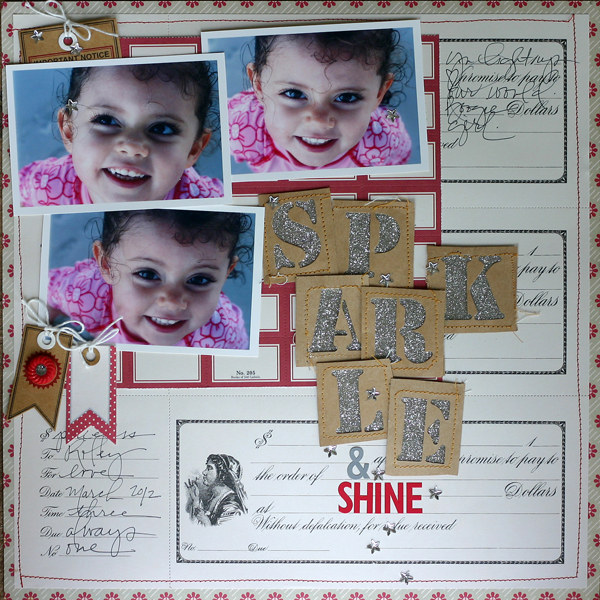
Sparkle & Shine by Doris Sander | Supplies: patterned paper, perforated paper, tags, rhinestone brad. letter stickers, rhinestone stars – Jenni Bowlin Studio, other – glitter
7. Layer themed embellishments with your title alphas
Stefanie Semple layered sea-themed embellishments with her alphas on this page from Marine World.
Stefanie says, “I wouldn’t ordinarily embellish the title as much as I did here because it can become a limelight stealer, but I decided to stick with solid papers from the kit and used plenty of photos. I really love the number of photos I can cram into a blocked design like this.”

Ushaka by Stefanie Semple | Supplies: Chelle’s Creation’s – Something Fishy and Block it vol 2 templates by Mye De Leon
8. Incorporate your title into an embellishment cluster
Leah Farquharson began her glittery title on the canvas and then continued it right into an elaborately layered embellishment cluster.
Leah’s says, “Every girl loves a cute pair of shoes, right? It was fun taking this title and making it pretty by adding the main cluster of embellishments to the page right at that point – and then leading a bit of the title right on to them!”
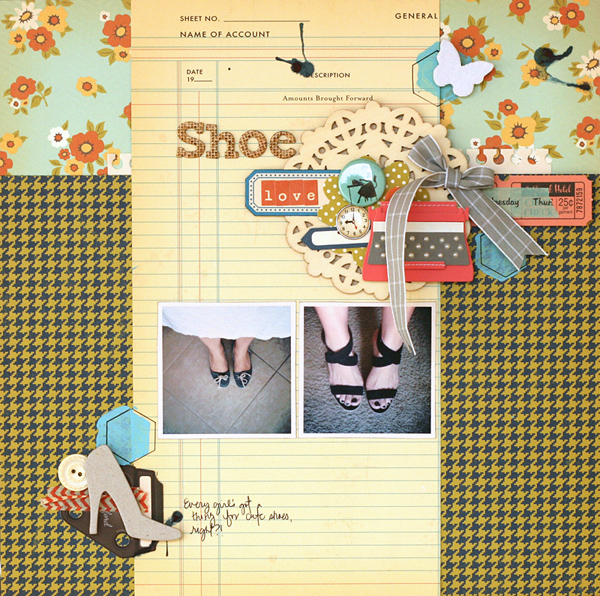
Shoe Love by Leah Farquharson | Supplies: patterned paper, diecuts, stickers, brads, flair, chipboard shoe, letter stickers: October Afternoon. Stencil: JBS MErcantile special release. Paint, button: Jenni Bowlin. Wooden Doily:Maya Road. Canvas Butterfly: Studio Calico. Tapes: American Crafts, October Afternoon. Typewriter, chipboard letters: American Crafts.
9. Frame your title with brackets
Amy Kingsford framed part of her title in the opening of a wire bracket.
Amy says, “Because I chose such an eye-catching technique for the background of “Summer Shag,” I used embellishments to draw the eye to my title which provides the context for this photo of my son’s shaggy summer ‘do.’ I included a bracket to frame part of my title and a flower which draws the eye with its vivid color.”
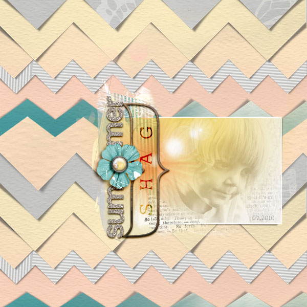
Summer Shag by Amy Kingsford | Supplies: Vitality ArtPlay Palette by Anna Aspnes, Scissored Chevron Clipping Masks No. 1 by Anna Aspnes, Brackets No, 1 by Anna Aspnes, Warm Glows No. 1 by Anna Aspnes, Silver Glitter Alpha by Anna Aspnes.
[current]

