Using a grid structure for organizing your photos, title, journaling and embellishments is a great way to start a page. That very same grid that holds your elements on one page, though, can become the backdrop for your elements on another page.
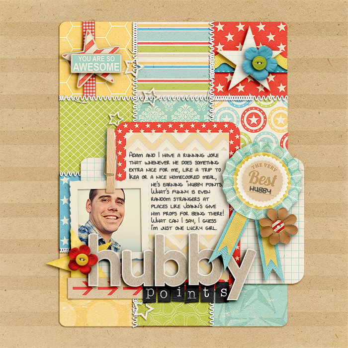
Lynnette Penacho says, “My favorite trick for creating the foundations of my layouts is to create a grid of patterned papers. Once the grid is in place, I start building my page up, layer by layer, until I have a completed layout. The great thing about this technique is that by simply varying the size and shape of the grid, you can get a totally different look on each layout.

Hubby Points by Lynnette Penacho |
Supplies: Award Winning by Kristin Cronin-Barrow, StraightLine Stitched No 2 White by Anna Apnes, Alpha from Isn’t She Lovely by Zoe Pearn, Teeny Type Alpha by Zoe Pearn (retired), Font is DJB Lynnette by Darcy Baldwin
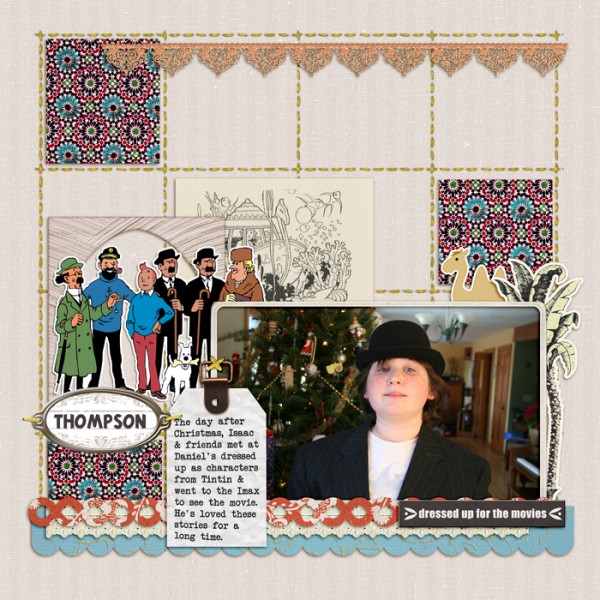
Debbie defined a 4 by 4 grid of squares with stitching on “Thompson.” She filled three squares with patterned paper (to create a visual triangle), and then layered on her photo, title, journaling and embellishments in a cluster at the base of the grid.

Thompson by Debbie Hodge | Supplies Taste of Morocco by Sahlin Studio and Britt-ish Designs; She’s a Doll by Vinnie Pearce, Glitter Thread Stitches by Lynn Grieveson; Oiselet Rouge Elements, Collageables No 1, Flossy Stitches Yellow, Vintage Frames No 26 by Katie Pertiet; Libris by ViVa Designs; Tintin and Another Typewriter fonts
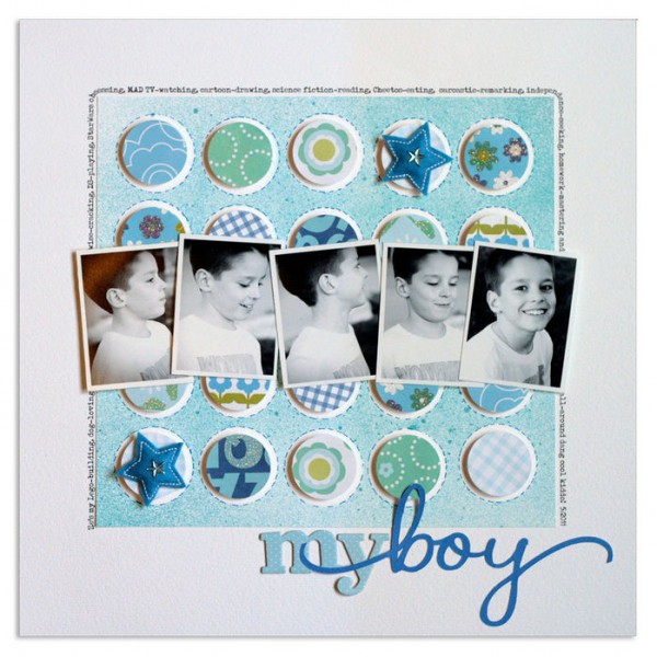
Lisa Dickinson masked a 5 by 5 grid of circles and misted over them for the base on “My Boy.” Once the mist dried, she removed the circle masks, penned on faux stitching around each one and filled them with slightly smaller punched circles and embellishments.
This grid is the foundation for a series of black and white tilted photos. Her title sits below the grid and journaling flows around it on three sides.

My Boy | supplies: Bazzill cardstock (White, Mediterranean) + KI Memories patterned paper, chipboard letters, and star Puffies + Creative Memories circle punch + Studio Calico mist + Silhouette die cut machine + Creative Memories pen + Typenoksidi font
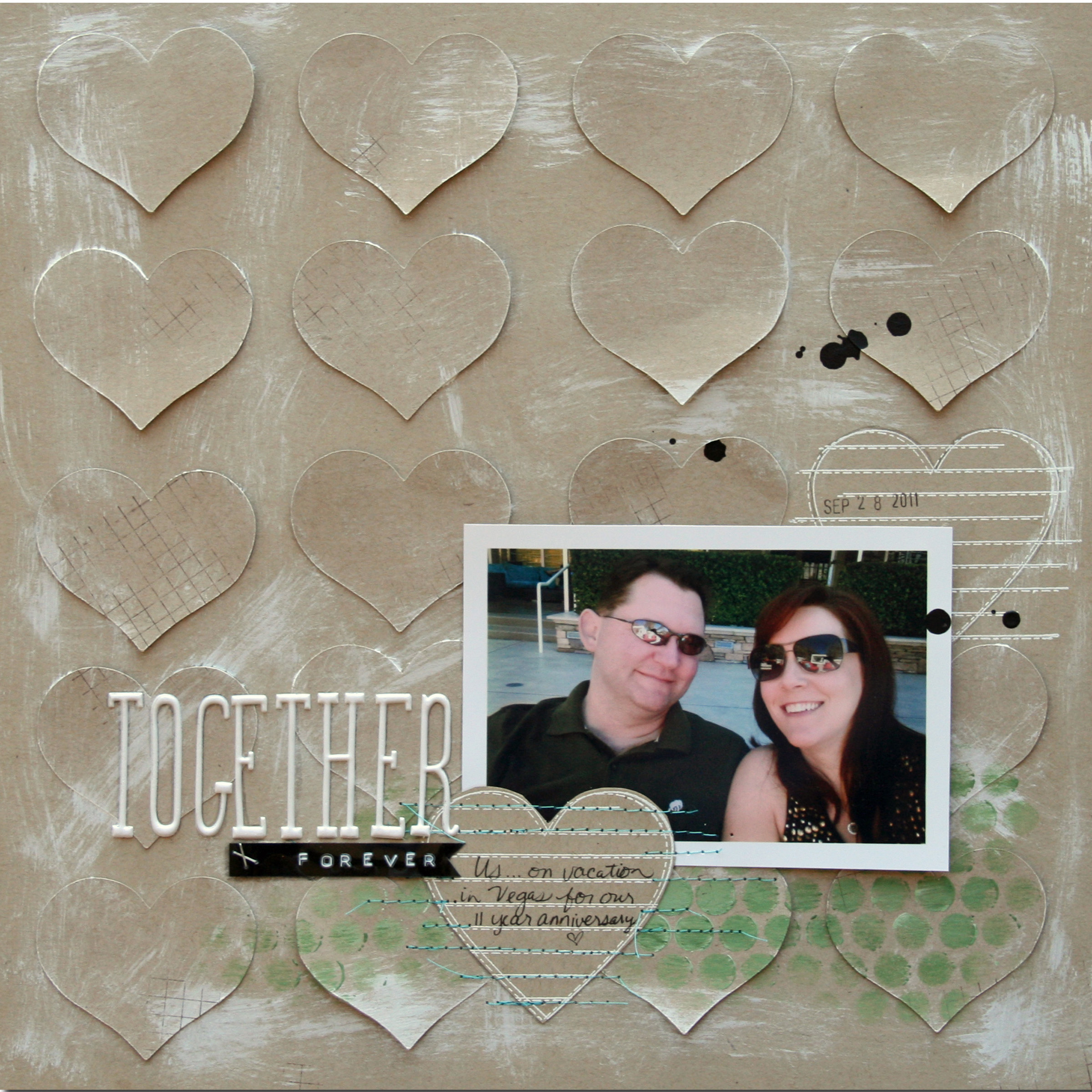
Erin Bassett punched twenty hearts from kraft paper and mounted them in a 4 by 5 grid on another piece of kraft paper then roughed up the base and splattered it before layering photo, journaling, title and embellishments in a cluster at bottom right.

Together Forever by Erin Bassett | Supplies: Cardstock – Stampin Up!, Stamp – Unity, Hero Arts, Acrylic Paint – Delta Ceramcoat, Liquitex , Mask – Crafter’s Workshop, Label – Dymo, Letter Stickers – American Crafts, Die-cut hearts – Cricut Expression, India Ink – Speedball, Thread
Take a look at your own grid pages and think about how you could use that grid design as the backdrop for your other page elements.
[designclass]

