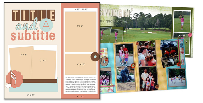
We’re reviving our column on two-page layouts — and giving it a twist based upon a reader suggestion that we show you how to modify one-page sketches (and layered templates) for use on two-page spreads. Read on to see how Terry Billman and Michelle Houghton used this sketch/template from our Bundle #86 on their two-pagers.

Find this sketch and layered template in our Bundle #86
Stretch it out and use a photo background
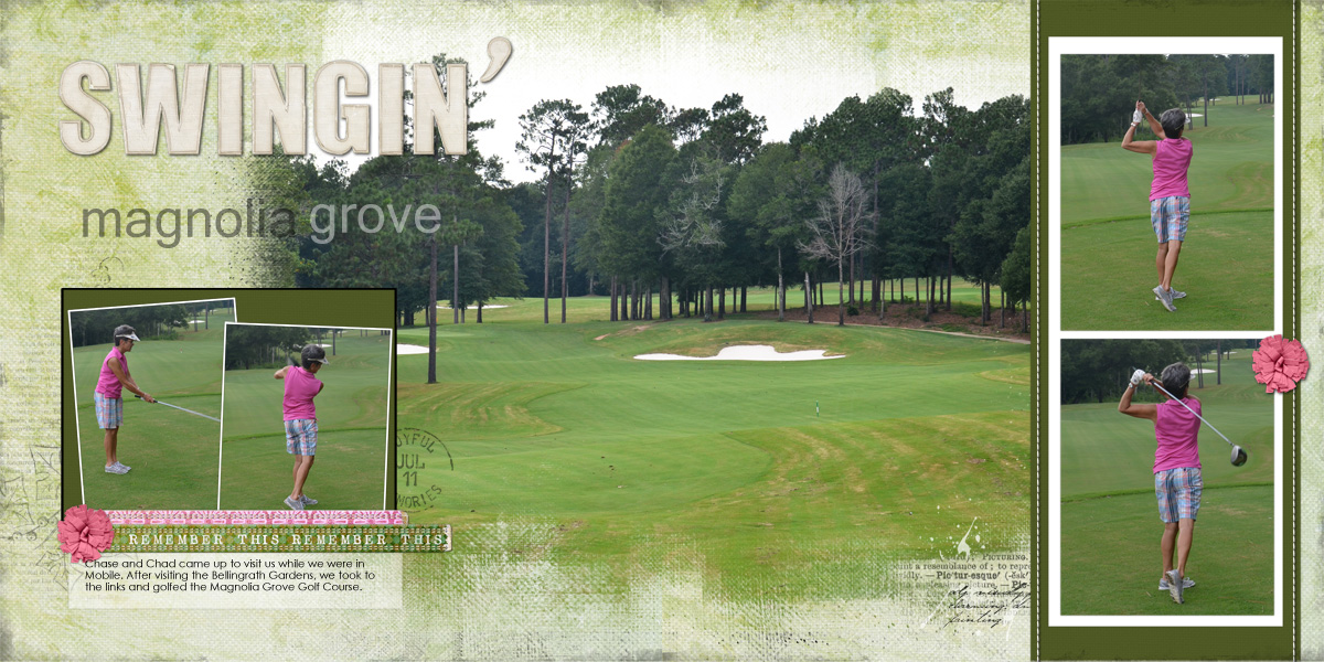
Terry Billman says, “This sketch was perfect for highlighting four action photos and incorporating the large photo in the background giving the viewer the entire setting of the golf course.”

Swingin’ by Terry Billman | Supplies: Katie Pertiet: Cherished Artistry No. 2, Bookshelf Clusters No. 1, 2011 Postmarks Made with Paper Flowers No. 3, Edge Overlay No. 4; Lynn Grieveson: Worn Strips No. 6, Worn Strips No. 5, Today Alpha; Anna Aspnes: Descriptive Word Transfers No. 1, Stitched by Anna Cream; Maplebrook Studios: Just Linens No. 8.
The details:
- The large photo was positioned about 6″ in from the left edge to give the effect of the wide band in the sketch.
- Terry kept the two photo groupings — but separated them with a large photo blended into her page background.
- Terry removed the journaling block from the band on the right so she could include two same-sized photos.
- Instead of using the strips under the tilted photos at left, Terry used ribbon and put the journaling on a block which was recolored and given lowered opacity for a vellum effect.
- To keep the look in the sketch of a mat beneath the two photos, Terry added a white digital strokes around the photos.
- She polished the page off with the two pink flowers leading the eye from left to right and following the sequence of the photos.
Repeat: with variety
While Terry stuck with the same number of photos on the sketch, Michelle Houghton took a different approach, using the sketch “as is” on the left side of her spread and letting it inspire the layout on the right.

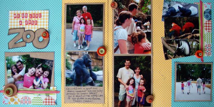
We Do Love a Good Zoo by Michelle Houghton | Supplies: Cardstock – Kraft Patterned paper – Lilly Bee Designs Letters – hand cut and October Afternoon buttons and twill
The details:
- The left side of the layout sticks with the original sketch, making good use of the spots for 4 photos, journaling, and title — which means the 2nd side can hold even more photos.
- Michelle’s 2nd page is divided into 2 columns just like the sketch. Notice that she continued the yellow dotted paper from center left over to center right. On the far right she repeated the blue dotted paper from far left.
- Michelle repeated the idea of “columns” of photos on her second page — but with variety. The first column holds two portrait-oriented photos that bleed off page top and page bottom. The second column holds a cluster of tilted photos grounded with ribbons (a repetition of the tilted cluster at far left — but with a 90 degree counter-clockwise rotation). The square photo echoes the title grouping on the opposite page.
- Stacked button clusters embellish and lead the eye across the two pages.
Now it’s time for you to .and make a little two-page magic.
[lovesketches]

