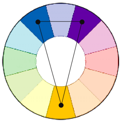
In a split complementary scheme, use the colors to either side of your base color’s complement.
by Debbie Hodge
A split-complementary color scheme uses a base color and then the two colors on either side of its complement (i.e., the color across from it on the color wheel). With this scheme your page will have contrast but with more nuance and less tension than with a straight complementary color scheme.
Think about it this way — you’re using two (almost) analogous colors with one contrasting color. Because analogous colors sit near one another on the color wheel, it’s easy to get harmony with these two colors. The third color provides the contrast and energy on the page.
Lynnette Penacho‘s summery page about her favorite things in August is presented on a neutral woodgrain print. She’s paired blue-green with its split complements of orange and pink. The result is a fun page with bright spots that’s still harmonious enough to present lots of journaled details.
Michelle Clement has scrapbooked the blues in her photos with orangey reds and yellows on “Oh, How Does My Garden Grow.” A white canvas with off-white foundation layers makes the bits of colored papers and the photos pop. The page has energy — but it’s a sweet and playful energy resulting from the split-complementary color scheme.
The dominant color in Kelly Purkey‘s “Ice Cream” is an orangey-red, and it’s paired with split complements of blue and yellow-green for a warm and happy page.


