Is your title adding value to the page? Content and design are the keys.
by Debbie Hodge
A successful scrapbook page captures the viewer’s attention, controls the eye’s movement, conveys information, and evokes emotion. The title is one of the tools you have for achieving these ends.
Just as every sentence in a story should either deepen character or advance the action, every item on your scrapbook page should be pulling its weight. Every element you add to a scrapbook page should either deepen meaning or advance visual design.
Are you using titles this way? Make sure you’re not just slapping a title on a page because you think you should. Not every page requires a title. Read on for 4 ways you can use titles to make your scrapbook pages better.
1. Use scrapbook page titles to cue subject
There are times when your focal point and or scrapbook page photos don’t immediately help the viewer understand what the page is about.
“10 Things in July” is a text-heavy page with a photo that represents just one part of the topic being covered. The title is what makes it clear from the get-go that this is a list of 10 things on my mind in July, 2011.

10 Things in July | Supplies: Just Linens No 1 by Maplebrook Studios; Flossy Stitches Yellow by Katie Pertiet; Shutterbug Collaboration by The Digi Chick Designers; Yesterday Alpha by Lynn Grieveson; Journey Back Collection, Apple of My Eye Collection by Vinnie Pearce; Artsy Fotoblendz No 1 by Anna Aspnes
2. Use scrapbook page titles to set tone
Both the content of your title as well as the materials and styling you use for rendering it can set page tone, which makes the page more immediately accessible to the viewer.
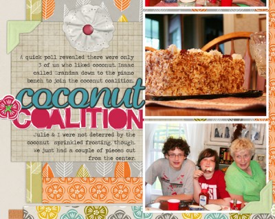
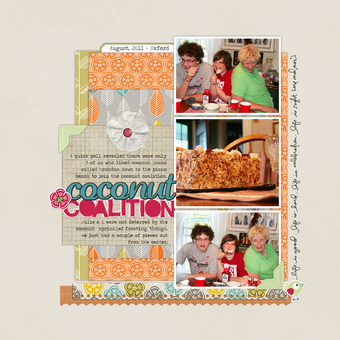
The title “Coconut Coalition” paired with photos of my sons and mom fooling around at the table and eating cake tells the viewer there’s a story here that goes beyond just eating cake. The brightly colored alphas and casual fonts help the viewer understand that the story is a fun one. The result? The viewer is more likely to enter into the page, its journaling, and photos to understand just what was going on.

Coconut Coalition by Debbie Hodge | Supplies: Artistry de Blanco Element Pack, Rubber Alphabet No. 02, Flossy Stitches: Green, Photo Corner Colors No. 02, Notebook Paper Pack No. 03, Oiselet Rouge Element Pack, Scallop Strip Masks, Doodled Block Alpha Brushes and Stamps, Pick Me Up Rub Ons, Labelled Journalers No. 02 by Katie Pertiet; Brad Bonanza No. 03: Digital Fasteners by Pattie Knox; Everyday Sentiment Strips Brushes and Stamps by Ali Edwards
3. Use scrapbook page titles as a path to deeper meaning
Great fiction tells us two stories: the story of the incidents at the surface and the deeper story of why these characters and their situation matters. Scrapbook pages can also tell two stories, and your title is one of the tools you have for getting at the deeper story.
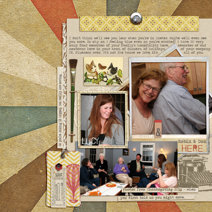
“Here” is the story of a Thanksgiving gathering and of finding out friends are planning to move. It is also the story of why these characters living HERE in this place matters so to the narrator (me!). “Here” as a title, rather than “Thanskgiving 2011,” emphasizes where the real meaning is.

Here by Debbie Hodge | Supplies: The Daily Details by The Digi Chick Collaboration; Restoration by Gina Cabrera; Speech by Paula Kesselring; Flossy Stitches Brown, Journaling Strip Masks, Art Time Elements, In Words Brushes by Katie Pertiet; A Very Small Alpha by Allyson Pennington; Traveling Typewriter font
4. Use scrapbook page titles to strengthen visual design
A well rendered scrapbook page title contributes to the goals of catching and guiding the viewer’s eye in order to convey information and evoke emotions. Consider each of the 6 basic principles of visual design and see how to apply them with your titlework.
The title on “Finally Snow” immediately tells the viewer that there has been a wait for the snow featured on the page. The “snow” part of the title stands out because I’ve used the principles of contrast and emphasis to make sure it catches the eye. Repetitions of white at two other spots create a visual triangle that includes the title and creates flow through the page.

Finally Snow by Debbie Hodge | Supplies: 11:30am, 11:00am by Amy Wolff; Vintage Tickets by Quirky Twerp; Woodgrain Alpha by Crystal Wilkerson; Oh Joy by Paislee Press; Messy Slab ALpha by Cathy Zielske; Handcut Snowflakes by Valerie Wibbins; In the Loop 4 by One Little Bird; Words and Pictures Paper Pack, Woodsy Trees by Katie Pertiet
From low-key and descriptive titles to elaborate word-plays filling half the page, guest teachers Doris Sander, Karen Grunberg, Kayleigh Wiles, and Aaron Morris give you ideas and help for coming up with and designing titles you’ll love.4 webinars (with recordings), 40+ page pdf idea book, focused lessons, and annotated galleries. Click here.


