by Debbie Hodge

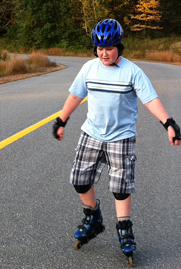
Seeing the grain of the asphalt beneath rollerblading feet triggers memories of how the wheels feel moving over it as well as their sound, rolling down the road.
Texture refers to the surface characteristics of a material: is it rough or smooth, matte or shiny? Dimension refers to extent to which something lifts off the page.
Adding texture and dimension to your scrapbook pages engages another sense in addition to sight: touch.
What’s more: texture can quickly evoke memories and emotions. Thus, you can convey feelings about your page subject with your texture choices. What does velvet connote to you? Do worn wood, corduroy, or slate trigger memories?
Seven ideas for adding texture and dimension to your paper and digital scrapbook pages follow.
1. Use bulky elements
Amy Kingsford advises: “Before passing on an element because you think it has no place on your page or because you think it’s too bulky–challenge yourself to look at a variety of everyday items with an open mind. If it truly is too bulky, try cutting it in half, trimming it down, or devising some other plan to help you get it onto your page!” She’s incorporated silk flowers with lots of small petals lifting up off the page as well as pearl, resin, and ribbon embellishments on “Amber.”

Amber by Amy Kingsford | Supplies: JBS December Main Kit and Artisan Add-On.
Bulky items aren’t just for paper scrapbookers. With the right technique, you can get visual dimension on digital scrapbook pages. Peppermint Granberg says, “I really loved these 3-dimensional nautical elements so I let them shine by leaving the rest of the page flat. I set them off with deep drop shadows so they pop off the page, like little trinkets glued to the paper.”

Seasick by Peppermint Granberg | Supplies: Scrib Scrub by Vinnie Pearce
2. Use patterned papers that have texture
Visual texture is created by combinations of light and dark. There are patterned paper designs that can instantly add texture to a page, and the text print backing up Cindy Liebel’s page is one of those. Cindy says, “The type-print patterned paper I used for the background here is an all-time favorite of mine, and I love how it adds texture and interest.”

Images of You by Cindy Liebel | Supplies: Pattern Papers by Lily Bee Designs. Chipboard by Lily Bee Designs. Index Journaling Card by Lily Bee Designs. Jeweled Pin by Maya Road. White Flower by Maya Road. Banner Chipboard by Maya Road. Flowers & Circle Punches by EK Success
3. Capture visual texture in your photos
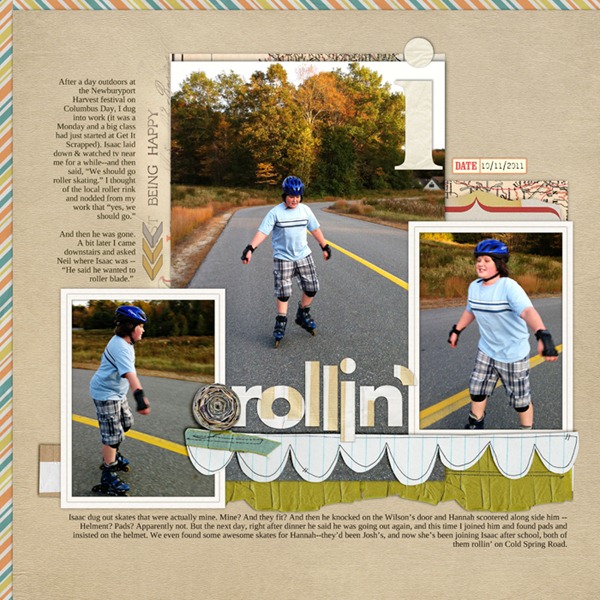
The three photos on my layout “Rollin'” show of my son rollerblading on our road. I refrained from zooming in tight on him when I cropped the photos, since the surface beneath your feet is an important part of any rollerblading experience. I liked how the yellow lines guided the eye through the three photos. But, more than that, I loved being able to see the grain of the asphalt. When I look at the expanse of paved road, I recall the feel of asphalt passing beneath the skate wheels from my own skating experiences, as well as the sound the wheels make rolling over it.

Rollin’ by Debbie Hodge | Ransom Paper Pack by Vicki Stegall; Color 2 Labels by Crystal Wilkerson; Alpha and Number Set No 2 by Anna Aspnes; Junk Mail Alpha by Michelene Martin; Wonky Trims No 2 by Lauren Reid; La Belle Vie Kit by One Little Bird; Storyteller, Photobooth by Paislee Press; Ransom Journalers, Ransom Paper, Ransom Basics by Vicki Stegall; Just Juicy by Lynn Grieveson; From My Bookshelf No 4 by Katie Pertiet; Rock the Shadows Styles by Tracy Stroud.
4. Use technique and textured mediums
May Flaum says, “This layout is 100% texture and dimension!” She began by adding mists to the background then crumpling it, sprinkling with embossing powder and heating from underneath to add metallic raised splatter.” See complete tutorial on May’s blog. “I used all kinds of inks, embossing, glitters, and other mediums to add texture, feel, and mood to this page. It’s one of my all-time favorites,” says May.

Pirate Love by May Flaum | Supplies: All paper and supplies are by Tim Holtz, except thread (DMC floss) and embossing powder (UTEE by Ranger)
5. Layer
Michelle Clement loves layering up all kinds of elements Her best tips for layering include:
- Try not to measure: just cut basic shapes to speed things up.
- Crumple paper edges in your hands to add texture.
- To make stickers more dimensional, stick them to plain white computer paper and cut them out; now adhere them and curl the edges up between your fingers, if needed.
- Sew some of the bottom layers: it adds a lot of depth to see stitches peeking out.
- Don’t put adhesive right to the edge of an element if you want it to stick up a bit
- Foam dots are magical for adding dimension to everything!

Stroll by Michelle Clement | Supplies: Patterned Paper, Buttons, and Stickers by Sassafras Lass. Letter Stickers by Making Memories. Walnut Ink by Creek Bank Creations. Letter Stamps by Hero Arts. Embroidery Floss by DMC. Masking Tape. Acrylic Paint. Staples. Vintage Cards.
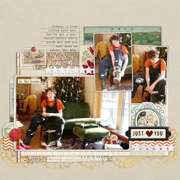
I made my digital page, “Just Love You,” inspired by Michelle’s approach to layering. I stacked up a variety of papers and elements to create a base for my photos — and I made sure to add realistic shadowing to everything.

Just Love You by Debbie Hodge | Supplies: Brad Bonanza 3, Brad Bonanza 2 by Pattie Knox; Epic Kit by One Little Bird, Biograffiti, Paislee Press; Airtime Kit by One Little Bird; Vintage Frames No 26, Collageables 6 by Katie Pertiet; Dripped Stains No 4, Artplay Palette Rockstar by Anna Aspnes; Duly Noted Kit (doily mask) by Leora Sanford; Photobooth Kit by Paislee Press; Rock the Shadows Styles by Tracy Stroud
6. Add light to create “space” between your layers
Jana Morton loves to layer elements on her digital scrapbook pages. “I also like to add ‘breathing room’ in between my layers,” says Jana, “by adding a burst of white brushwork. In the layout below, I used a large white brush and added brushwork behind the focal photo. Check out the difference between the before and after versions.
Paper scrapbookers can get this same effect with a bit of white paint.

"Before"

"After" Super Sweet by Jana Morton | Supplies: Classic Patterned Finest, Classic Cardstock: Finest Paper Pack, Vintage Photo Frames No. 18, Slide Reels No. 01, Dog Park Kit, Littlest Farmer, Stitched Journal Strips No. 03, Whimsy Words No. 06, Little Shores Kit, Tabbed Dates, Hinge Pack, Word Labels: Love, Yarn Swirls No. 03: Neutrals by Katie Pertiet; Stitched by Anna Borders No. 03 Spackle Textured No. 01 BrushSet, FotoGlows No. 04, ArtPlay Palette Mist, ArtPlay Palette Poppy by Anna Aspnes
7. Use tone-on-tone layering for an embossed (or debossed) effect
One of Cindy Liebel’s favorite ways to add texture and dimension to scrapbook pages is to layer elements of the same color. Cindy says, “These tone-on-tone effects create the illusion of embossing (when an area of your paper or cardstock is raised up in a shape). It’s a fun way to use cardstock and to play with a variety of colors.” On “Hand-Picked,” Cindy layered a piece of kraft from which rows of flowers had been cut. It sits atop a paper of the exact same color. Now the tone-on-tone layering creates a debossed (rather than embossed) effect.

Hand-picked by Cindy Liebel | Supplies: Flower punch by Martha Stewart, Work In Progress July 2011 Project Kit
Which of these layouts has you inspired? Add it to your pinterest boards for quick reference when you get ready to scrapbook.
These are a sampling of the layouts and ideas in Masterful Scrapbook Design Texture and Dimension issue which includes 40-page pdf seminar, 5 live webinars (with video and audio recordings for download), 7 focused articles, and 2 annotated galleries. Click here for more information.


