by Tami Taylor
Need a kick in the mojo? The design approaches that are used in handmade cards can give you starting points for fantastic layouts.
Try applying these 8 card-making techniques drawn from Tania Willis‘ “Beautifully Handmade Cards,” in your scrapbook layouts.
1. Pledge to edge
I love cards that have an edge. A change from the standard rectangle adds interest.
This “Friends” card by Tania Willis has a fun edge where the action is. It makes you want to grab it and open it.
Her edging on the layout “Donate Life” provides a frame for the subject of the page. It makes you want to take a look at what’s being framed. Try spicing up your scrapbook pages by giving the edges a rip, shape or if all else fails; just ink the tar out of them!
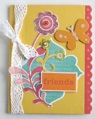
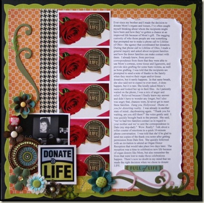
“Friends” and “Donate Life” by Tania Willis.
2. K.I.S.S. Keep It Simple Stupid
That’s one of my father-in-law’s favorite lines: sage advice. You don’t need to go crazy with lots of paper and embellishments to catch someone’s eye. Sometimes simplicity is a huge statement.
Take Betsy Veldman’s “Happy Birthday” Card; it’s a simple, beautiful card. The simplicity of the color scheme, minimal use of embellishments and a perfect amount of white space make this card eye-catching.
How about this layout “First of Fourth” from Celeste Smith? It has the same principles: simple color scheme, minimal use of embellishments and a perfect amount of white space.
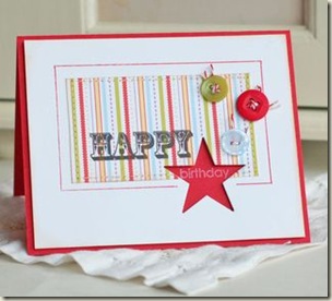
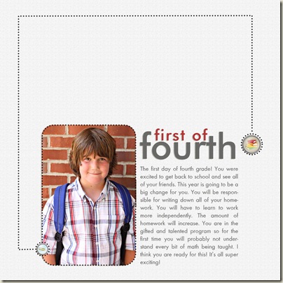
“Happy Birthday” by Betsy Veldman. “First of Fourth” by Celeste Smith.
3. Paper Rock.. Stickers!!
Stickers have a bad rap, but, hey!, didn’t Robert Downey Jr. have a bad rap for awhile too? Now look he’s Iron Man! Well stickers in my opinion are the super hero of the scrapbooking world. They swoop in fast and easily provide just the perfect touch for many card, and layout! Today’s sticker isn’t the same stickers you collected in grade school. Stickers have come a long way; now available on cardstock weight paper, layered with embellishments and even printed on clear sheets!
Check out these SRM stickers on Tanis Giesbrecht’s “Hello” card. Or look at Tania who used six stickers on this gorgeous layout “The Great Adventure.” It looks like they took a ton of time stamping letters, but I bet it was more like 20 seconds to stick a couple stickers. You have time to try that!
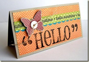
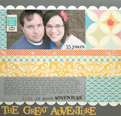
“Hello” by Tanis Giesbrecht. “The Great Adventure” by Tania Willis.
4. You’re So Punny!
It’s ok to get silly with your cards, so get silly with your pages! Cute titles aren’t just for kids.
Tami Mayberry gave someone a grin with her “Dynomite” card.
Debbie Hodge showed her witty side with her “Hot Times” layout. My advice: have fun, find a pun.
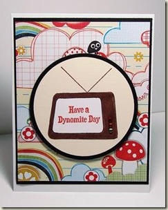
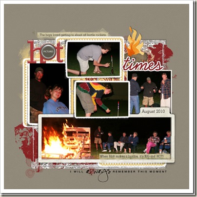
“Have a Dynomite Day” by Tami Mayberry. “Hot Times” by Debbie Hodge.
5. Down to Details.
Harvey Firestone said “Success is the sum of details”. This is just as true in card making and scrapbooking.
This card by Debbie Olsen is beyond beautiful. The small detail of diamonds on the edge lets you know she put thought and heart into her work.
The same can be said of Amber Ries’ thoughtfully layered layout. Layering cute, eye-catching details in visual triangles captures your attention to show you the heart of her layout.
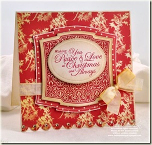
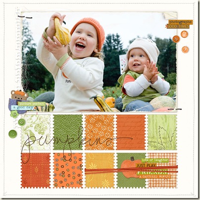
“Wishing You” by Debbie Olsen. “Pumpkins” by Amber Ries
6. Mix It Up
Patterns, patterns, patterns. Card makers are not afraid of mixing patterns. You can look through the cards on this page to see the punch that mixing patterned paper gives.
Try copying Kimber McGray’s fun and bold mix of patterns on “I’ll always {heart} you” or go subtle mix papers in the same hues as Debbie Hodge did on “Cropping Late in Vegas.”
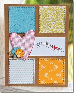
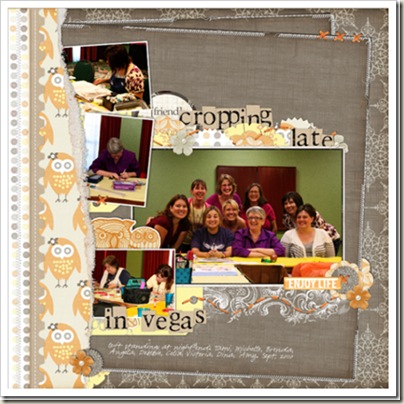
“I’ll always love you” by Kimber McGray. “Cropping Late in Vegas” by Debbie Hodge.
7. Etch a sketch
Using sketches makes designing easier than learning your 123s! First, Jennifer Pohl of Caardvark created a sketch. Second, Tania Willis created a “Hi” card. Third, I made a layout.
Sketches work for cards, scrapbooking or even for vision boards. So go grab a sketch (a new one available here every friday) and get scrapbooking.
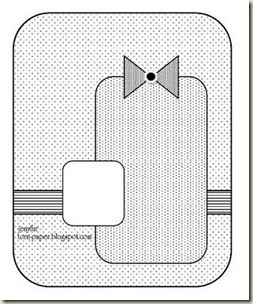
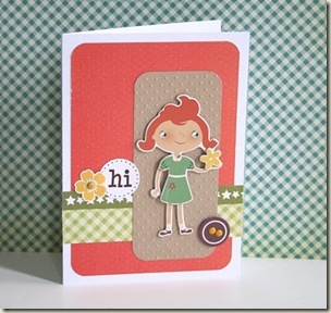
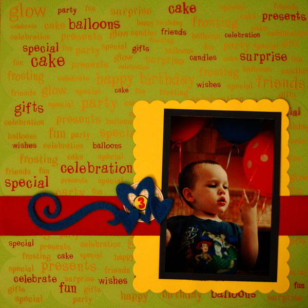
Sketch by Jennifer Pohl/Caardvarks. “Hi” by Tania Willis. “3” by Tami Taylor.
8. Use it or Lose it!
What are you saving them for? Card makers have reigned supreme when it comes to using up bits and scraps of supplies. Take a cue: if you have it use it.
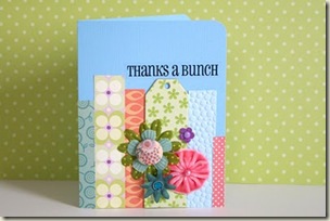
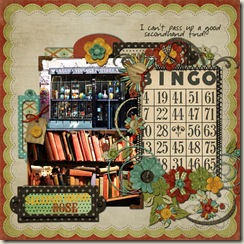
Clusters of embellishments and scraps of paper are beautiful on both Tania Willis’ “Thanks a Bunch” card and the layout “Second Hand Rose” by Amy Kingsford.
“Thanks a Bunch” by Tania Willis. “Secondhand Rose” by Amy Kingsford.
[ttaylor]
[designclass]

