by Debbie Hodge
I love using patterned papers — especially for backgrounds. However, it’s often a little tricky making sure the photos aren’t overwhelmed by the paper. As long as you employ some basic design principles you should be all set. Try the following approaches.
1) be generous
Text patterns are back, and Jennifer Wilson used “holiday-love” themed paper to set the tone for “Love Actually is all Around.” Her photo mat is the key to this successful design:
- The mat is a much lighter color than the patterned paper AND than the photos on it. This contrast allows the mat to stand out from the background and the photos to stand out from the mat.
- Generous margins and tidy narrow gutters give the page order and further set the photos off from the background.
 Love Actually is All Around by Jennifer Wilson of Simple Scrapper
2) lay a foundation
The bright geometric patterned paper on the background of “Hangin’ Poolside” by Alicia Geiss is wonderful for this juicy summer page. The two circular scalloped papers backing up the photo of Alicia’s son act as a foundation to the page’s focal point.
- These scalloped mats ground the other elements to the page – everything sits on or flows through them.
- These mats with their very pale pattern provide resting space for the eyes. They are a buffer between the bold pattern and the photo.
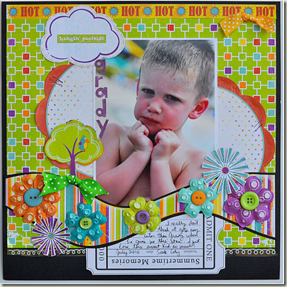 Hanging Poolside by Alicia Geiss for Scrapbooks.com
Foundations is the focus of Lesson #4 in Building Pages.
3) it’s ok to be busy
Aaron wanted to emphasize the Liberty of London fabric pattern of his daughter’s dress, and this paper had a similar look.
- The paper is busy and could be overpowering. With his use of curved edges on the foundation papers backing up the photo, Aaron has created a sense of his daughter in the midst of a garden.
- Two pink-rimmed journaling spots (one a large circle) provide the contrast needed to set the photo cluster off from the background.
- Placement of the cluster smack-dab in the middle gives it additional weight.
- Still, though, Aaron isn’t afraid of that busy paper, layering cut-out flowers with lots of dimension over the focal grouping.
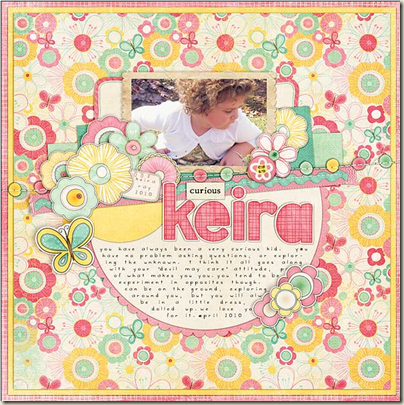 Curious Keira by Aaron of Sir Scrapalot Designs
4) pop it
For her bold and artsy page, Museo Picasso, Dina Wakley began with very a very dark blue dotted patterned paper. She kept to a primary color palette and everything else on the canvas contrasts vividly either in color or value and thus “pops.” (Check out Dots and Stripes for more info on using dotted and striped patterned papers.)
- The light blue band running across the page is a MUCH lighter value than the background. The patterned pennants on this band are small and surrounded with white space. The yellow triangular border to this band is a dark value (like the background), but it works well because its color contrasts so vividly with the blue.
- The red hearts and white titling stand out vividly on the dark background.
- Yellow splatters lead the eye diagonally down and through the page elements. See repetitions of yellow in the scallops on the hearts and the border on the blue band. (Check out how to use “diagonal draw” in the flow lesson of Where Scrapbook Ideas Come From.)
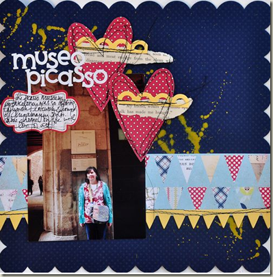 Museo Picasso by Dina Wakley for Jenni Bowlin Studio
5) know where you’re coming from
This “burst” pattern with its radiating bands isn’t the kind of paper I usually gravitate to (I like old-fashioned and small patterns), but I’m so glad I did use it for “Stay Late.”
- The close-up of my son and his friend is positioned at the center of this burst and, thus, becomes the focal point. The burst emphasizes and even creates energy.
- The strip of photos is set off from the patterned background with a shared rectangular mat that connects them AND provides a buffer from the paper.
- Subtle white masking (this is a digital page—you could use paint on a paper page) backs up the vertical band of photos AND the horizontal collage of patterned papers to further set them off.
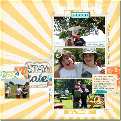 Stay Late by Debbie Hodge for DesignerDigitals.com
6) go negative
 The wavy patterned paper background on “This Boy” by Dina Wakley is both energizing and restful. It’s so compelling that using it as the canvas background is a risky choice. Dina pulls it off though with contrasts and composition.
- The inner mat or foundation is of pale pink oversized dots. Its distressed and subdued styling and its color all contrast well against the background pattern.
- The shape and placement of the inner mat creates a dynamic composition. It’s a rectangle on a square canvas. What’s more, it bleeds off the right side of the page. We’re not used to seeing a mat with three margins, and, thus, those three margins take on more interest than 4 would–especially given the eye-catching patterned paper. They function less as background and more as an integral part of the design. (This has to do with figure-ground tension which I cover in Lesson 9 of Building Pages.)
- Generous white space surrounds the framed photos. Vividly colored frames, paper strips, titling and paint drips “pop” against the background ensure that the focal point of this page is right her in this bold cluster.
 This Boy by Dina Wakley for Kitschy Digitals
Has one of these layouts inspired you to do something in particular on your next page? Do tell! [patternedpaper]

