by Debbie Hodge
This column is all about understanding design strategies and approaches for two-page scrapbook layouts.
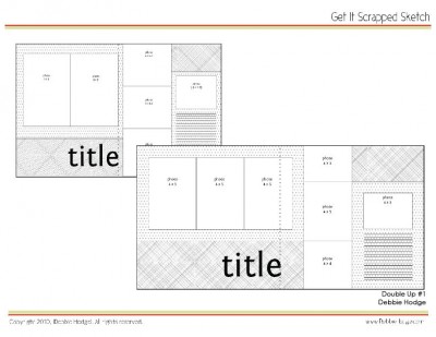
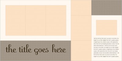
In each Double Up, I’ll share: a two-page layout (or even several!), design analysis of what makes this two-page design work, page sketch with measurements, and a layered template. (I’d love to feature readers’ pages in this column, contact me as soon as possible if you’re interested in getting Double Up #3 sketch ahead of time!)
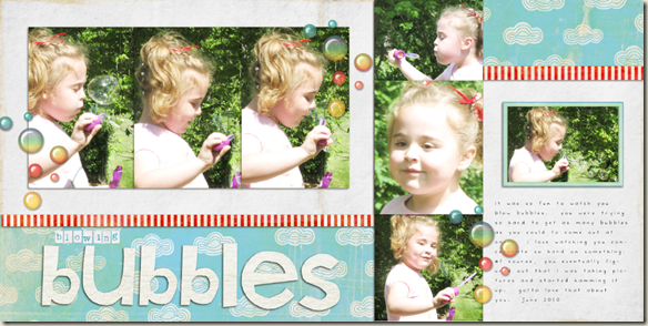 Bubbles by Aaron at Sir Scrapalot Designs
Segment your layout in order to group photos from different parts of an event together. Aaron combine: white paper, cloud-patterned paper, and red-striped paper to define five areas. These 5 areas house photos, title, journaling, and even a little “white” space in the top right corner.
Crop related photos to the same height OR the same width and line them up to get order on your page and make your story clear. On this summer page, Melanie grouped activities photos together in the horizontal grouping and pool photos in the the vertical grouping. Her single small photo shows the child with an ear infection snuggling.
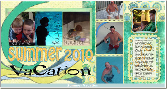 Summer Vacation by Melanie Kiser
Use common matting to reinforce which photos belong together. Barb matted each grouping on a narrow black mat that ties them together.
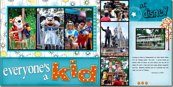
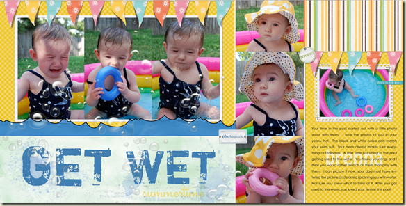
Abut photo edges to create solid blocks of related photos that stand out against a patterned-paper background as Terry has done below.
Use horizontal lines to connect the two pages. Aaron did this above in “Bubbles” with his red-striped strips which divide areas AND draw the eye across the entire page. Terry used a string of pennants running horizontally across the two pages to accomplish this. While these lines break briefly, the eye will connect the two.
Download pdf of sketches with measurements – for 12×12 and 8.5×11
Download layered template – for 12×12 only
[lovesketches]

