by Debbie Hodge
Ah, embellishments! Yes, they are decorations for your scrapbook pages, but they can do a lot more–from supporting theme and meaning, to guiding the eye and offering opportunities for repetitions that build page unity. Your primary tasks when it comes to adding the embellishments to your page are: 1) choosing them, and 2) placing them.
I’ve previously written about Placing Embellishments to Support Scrapbook Flow and Choosing Embellishments for the Scrapbook Page. Here I’m going to show you a round-up of pages from a variety of scrapbookers to give you ideas about where to put embellishments BEFORE you even consider flow or repetition or contrast or variety – these ideas are to give you initial glimmers or ideas.
Put embellishments in a cluster
I love group or clustering several embellishments. It adds interest and lets me combine several items that all reinforce my page subject and theme. On Bubbles, Paula Gilarde has put her embellishments—buttons, word stickers, tags, and even a small bird—in three clusters. the common element in each is a pink button.
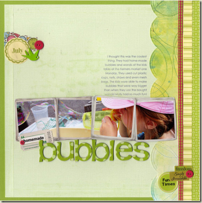 Bubbles by Paula Gilarde
Put embellishments in a grouping of three
The eye likes uneven numbers and especially the number three. In Ladies Man, Celeste Smith has two distinct embellishment clusters—each of them featuring black buttons. At the top left she’s grouped three black buttons – alike because they’re black buttons and yet with variety because of their differing sizes and the differing ways in which they’re stitched to the page.
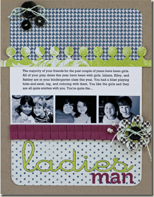 Ladies Man by Celeste Smith
Put embellishments at the corners of photos, blocks, and mats to ground them to the page
On Childhood, Amy Kingsford grounds her photo block to her patterned paper background with lavender flowers and leaves at top left and bottom right.
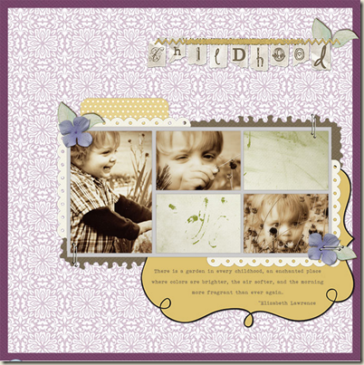 Childhood by Amy Kingsford
While the look on Dina Wakley’s So Cute is much different, there is a similarity in how the embellishments are used. Dina grounds her photo to the canvas with large green stitched butterfiles at top left and bottom right.
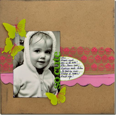 So Cute by Dina Wakley
Put embellishments in a sprinkling
Sprinkle big things or little things. Buttons, brads, gems, and sequins are great choices for a look like Brenda Neff achieved on Blasting Off for Disney Fun. Notice how this sprinkling of small goodies softens up a linear page and simply adds charm.
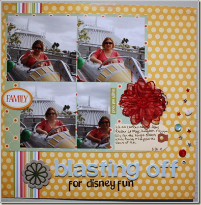 Blasting Off for Disney Fun by Brenda Neff
Not content to sprinkle little embellishments? Doris Sander has sprinkled leaves, butterflies, and flowers cut and punched from several patterned papers on Can You Feel The Love. And, yet — her photos dominate. This is a big sprinkling that takes the viewer all around and into the page. My eye just wants to keep circling the delights here.
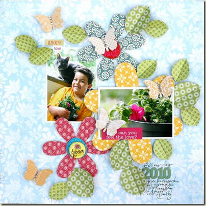 Can You Feel The Love by Doris Sander
Put embellishments in a page corner
Kayleigh Wiles is a master of page embellishment and on Background Fresh a cluster of meaningful and charming embellishments sits in the top left corner of her page. In addition to adding repetitions with variety, reinforcing page subject and contributing to page flow—this little spot is doing one more thing: it is balancing against the focal block.
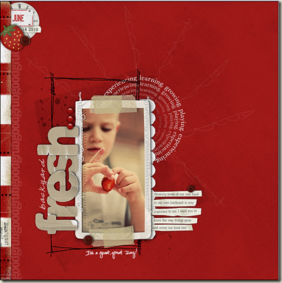 Background Fresh by Kayleigh Wiles
See another “in-the-corner” embellishment cluster on my page Get Around. On Kayleigh’s page the eye will be drawn from the whites in the top cluster down to the white journaling strips. On Get Around the eye will make a similar connection from the orange epoxy heart at top left to the orange epoxy square at lower right. Notice something else similar? Looks like we both thought that isolated spot was a good place for the date.
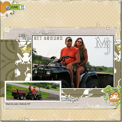 Get Around by Debbie Hodge
Put embellishments in a series
Lining up embellishments is great for both clean, graphic pages AND more free-form designs. Look above at Kayleigh’s Backyard Fresh and notice the three red brads in a vertical line above the title. On Croquet, I cut four medallions from patterned paper and lined them up above (and a bit behind) the focal point photo. Really, the bird is in this line, too.
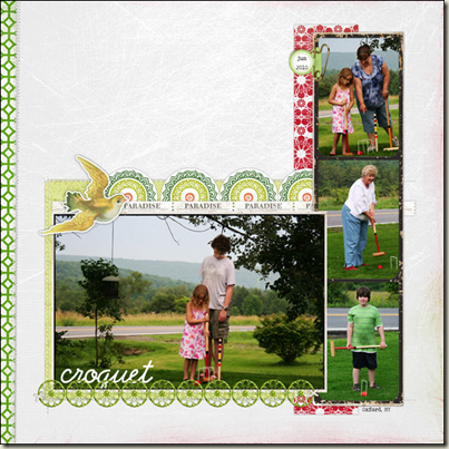 Croquet by Debbie Hodge
That series doesn’t have to follow a straight line. On Love Sharyn Tormanen, fashioned a banner from a series of cut-out triangles placed on an upward curve. This series is topped with another series—one of four blue buttons.
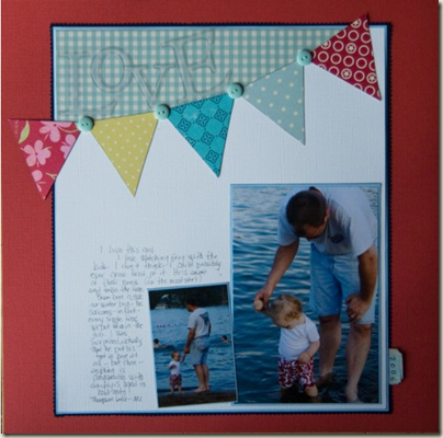 Love by Sharyn Tormanen
Stack embellishments
On Tania Willis’ shadowbox project she’s put several brads on top of a die-cut sun.
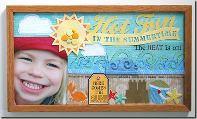 Shadowbox project by Tania Willis
On Really I stacked a goofy yellow epoxy on a felt heart on an acrylic clock on a stamp of radiating lines. Take a look back at Ladies Man by Celeste at the top of this post. On her bottom right cluster, she’s stacked three different flowers, a button, and a tie.
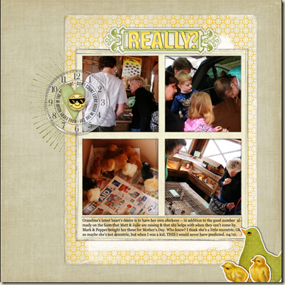 Really by Debbie Hodge
Put embellishments in “compartments”
On Initially Awkward, I put my embellishments into several square compartments. This layout uses a template by Ali Edwards so those spots were ready-made for me. Think about the ways you could set up a grid—of squares, circles, or even another shape. You could use stamps, hand draw them, print outlines to your page, or even punch a series of squares or circles.
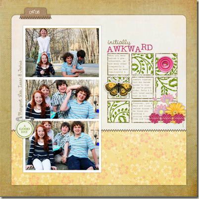 Initially Awkward by Debbie Hodge
Put embellishments EVERYWHERE—do it all
Check out Seven: an eye-catching and fun page by Tania Willis. Can you find: stacked, centered series, grounding, and page corner embellishments? It works and it’s fun to look at. What’s more, I’m guessing it was fun to make.
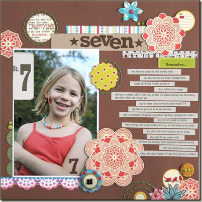 Seven by Tania Willis
So where do you put YOUR embellishments?
I know there are lots more places — because I’ve already got a big list for another article like this. What’s your favorite embellishment treatment? And what are you going to try after reading this?
[current]

