by Debbie Hodge
How do you like your pages? Simple and clean? A little busy? Or filled with layers of paper, images, tags, envelopes, fibers and any embellishments you can find to support your subject?
Do you layer? Wondering why you should layer or how to get more out of your layering? Here are 5 things layers can do for your pages:
Layer to add texture, dimension, and visual interest
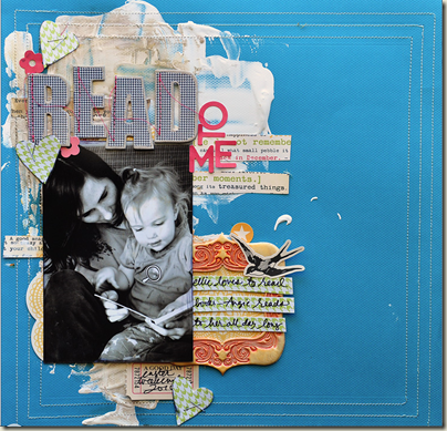
On “Read to Me” Dina Wakley began with border stitching and a layer of thick paint on her blue canvas. She’s used thick pieces, chipboard, stickers, snips of paper, and stapled hearts. I can’t take my eyes off of this page and all of the inspiration it gives me.
Layer to create interesting white space
Doris Sander made “American Tourister” with leftover bits. She asks you to notice how they’re all rectangular shaped and vertically aligned. “Easy peasy little design,” says Doris. Notice also that the grouping of papers, title, photos, journaling and embellishments makes a shape that jigs and jags out into the surrounding canvas – and this equals some appealing and interesting white (in this case black) space.
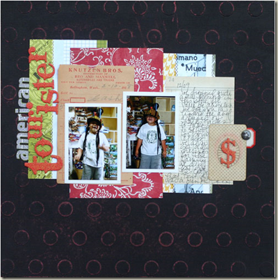 American Tourister by Doris Sander
Layer to incorporate meaningful images and motifs
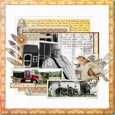
Including images and motifs influences how a viewer sees your page and, what’s more, understands your relationship to the subject being scrapbooked. The images of birds and plants along with the clipped words on “Awesome Sight” are all chosen to create an environment for presenting my father that is in addition to that shown in the photos. He is a man of the outdoors, and, now that he’s ill and unable to move freely, the time he can spend outdoors on his porch, looking at the land he grew up on and farmed recharges his body and keeps him living on. I’ve tried to play up that meaning with these images and words.
Layer to reveal your personal style
“Sweet Snuggle” is a page full of the kinds of touches I’ve come to expect on Kayleigh Wiles’ pages. She tends to used roughed-up edges, stitching, color, and eye-catching and meaningful embellishments in lots of layers.
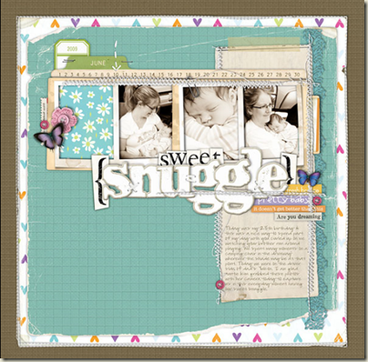 Sweet Snuggle by Kayleigh Wiles.
Layer to have fun and play with interesting patterns, textures, and images
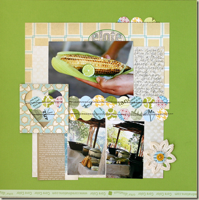
Doris Sander loves adding pattern to enhance theme. She got the idea for the rows of punched circles stitched to the page from the rows of corn kernels in her yummy focal photo—now THAT’S fun!
[current]

