the canvas
The canvas is the piece of paper (or digital background) upon which you build your page. For me, thinking about the canvas means thinking about how I will fill it and what role it will play in the page’s design. This is really my favorite part of making scrapbook pages.
There’s no prescription for this—but the following are the things to think about and ask as you move things around on the canvas and make choices.
foundations
What will your page foundation be? Your foundation is the base that connects the parts to the page. Try one of the following.
an underlying grid
Making “blocked” pages is one of the easiest ways to organize your page parts. In construction terms, “blocking” refers to the horizontal boards placed between wall studs.
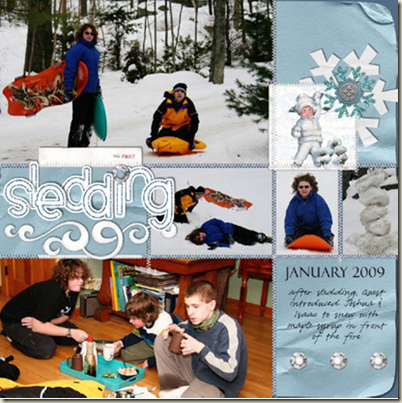
"Sledding" has an underlying grid of three columns and three rows. Photos fill several of the blocks.The title takes up another block (and even overlaps with another a bit, which keeps the page from being overly linear). Journaling fills the bottom right block. Embellishments sit in the top right block.
foundational pieces
A piece of paper (or mat) that houses most of the page elements can serve as a foundation that connects the elements to the page and keeps them from a free-floating feeling.
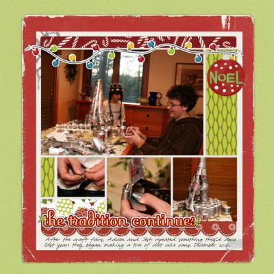
On “The Tradition Continues,” the distressed red cardstock backing up the photos, title, journaling and embellishments is the page foundation.
Your foundational piece doesn’t have to back up all of the page elements: a strong first layer can cover less area than your elements and still ground everything to the page.
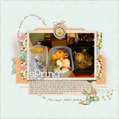
On “Sign of Spring,” the orange textured paper is the first layer. It is the foundational piece though that connects all of the pieces to the canvas.
A “foundation” piece doesn’t have to be a layer of paper. It can be anything that suggests a shape and that grounds the page elements to the canvas.
white space
How will you use white space?
Given a blank canvas, your first instinct may be to fill it up. Open space, though, can make your page and the pieces on it more accessible to the viewer.
White space on scrapbook pages is not always white. It can be any color—it can even be patterned paper.
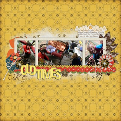
The elements on "Like Old Times' fill about a third of the canvas space. While the canvas here is patterned paper, the empty spots are white space and add interest to the page.
balance
What kind of balance would you like to achieve on your canvas?
A scrapbook page that is appealing to look at has a balance between the elements on it (including the white space).
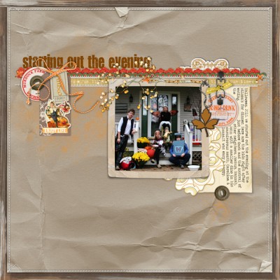
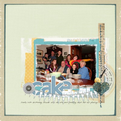
You can balance “visual” weights just as you can take a scale and balance weights. "Starting out the Evening" balances a block of photo, journaling card and embellishments with a much smaller cluster of embellishments and the title. Use of white space and placement of the title above the "shelf" contribute to successful visual balance.
layering
I can’t tell you HOW to add layering to your pages as well as I can tell you the considerations that you should be holding and balancing in your mind as you choose, add, and place elements. It’s not a science. It’s creating and it’s personal and it should be fun.
Ask yourself the following as you work:
- What is your desired focal point? Is it a photo? Journaling? Something else? How will you emphasize it? With size, matting, dimension, contrast, embellishments?
- What space do you plan to fill? How will you use/include white space?
- What’s your foundation piece? Choose it while keeping in mind the answers to the questions above.
- What kind of balance will you incorporate?
- What is the tone or mood you’d like to create? How will you use color and pattern? How much contrast will you incorporate?
- What are the meanings you’d like to explore and, perhaps, reflect with element choices?

