Scrapbooking Ideas & Layout Design
  • Blog
  • Podcasts
  • About
  • Team
    • Running Things
    • Creating Things
    • MSD Teachers
  • Contact
Select Page
Use Color Contrast to Make Art Journaling Pages Pop

Use Color Contrast to Make Art Journaling Pages Pop

by Debbie Hodge | Apr 15, 2011 | Art Journaling, Color, Design Principles, DinaWakley

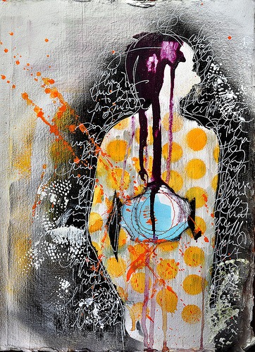
By Dina Wakley I love contrast. If you want a page element to be powerful, contrast it with its opposite and you have mega-impact. Contrast is what makes a piece of art surprising, or interesting, or even just plain good. Contrast is essentially the use of opposites...

Stitched Stories

Read Get It Scrapped

  • How to Scrapbook
  • Scrapbooking Ideas
  • Storytelling
  • Layout Design
  • Subjects
  • Article Directory
  • Facebook
  • X
  • Instagram
  • RSS

Designed by Elegant Themes | Powered by WordPress