Do you have an approach for putting titles onto your scrapbook pages that you use frequently? I know I do. And, I know I sometimes just want to break out of my habit and do something new. I spent this afternoon going through layouts and interviews from teachers at Masterful Scrapbook Design and Get It Scrapped to see what they’ve said about titles.
Take a look below at the favored techniques of ten different scrapbookers, and–while you’re doing this–look:
1) for what you like (and, perhaps, what you’re already doing), and
2) for what you’ve never done but might now try.
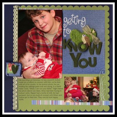
On “Getting to Know You,” there’s evidence of the phase I was in a couple of years ago when loved using my Cuttlebug die-cutter and lots of different materials to make my titles. Have you had any titling “phases?”
hand-cut
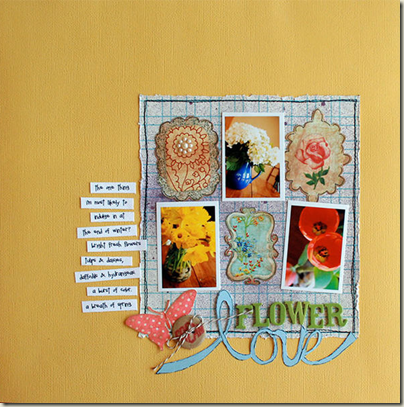
Lisa Dickinson often combines a hand-cut word with purchased alphas that contrast in shape and color to make her titles. She’s done this in the past with fine-tipped scissors, but now that she has a Silhouette cutter, the title-cutting process has become much easier. Here Lisa cut around her hand-lettered outline to give the word “love” more definition.
“Flower Love” by Lisa Dickinson in the Oct ‘10/Layers issue of Masterful Scrapbook Design.
layered
“Skipping Stones” is the perfect example of what Kayleigh Wiles likes to do with her titles. Kayleigh says that her formula for titles includes two alphas (or a mix of alpha + font in similar colours) with a journaling tag or paper piece to ground the grouping. She places the title within the larger grouping of photos/papers/journaling, and she adds extra depth with digital drop shadows to make the letters on the uppermost layers look like they are popping off the page. Kayleigh adds, “I also really like using a visual triangle for flow and placing one embellishment cluster from that triangle close to my title.
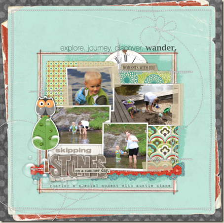
“Skipping Stones” by Kayleigh Wiles in the Feb ‘11/Titles issue of Masterful Scrapbook Design.
wide
While Kayleigh likes to layer her title right in with the other elements on her page, Celeste Smith frequently takes a different approach. Her titles often span the width of her page, creating a border. Other times, Celeste uses smart alignments, and if her title doesn’t span the entire page, it spans the width of a key element, like a photo or her journaling block.
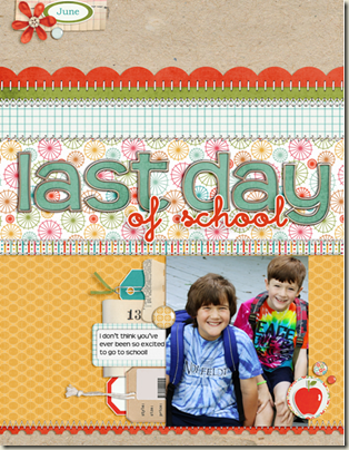
“Last Day of School” by Celeste Smith
contrasting
Dina Wakley said (in the October ‘10/Layering issue of Masterful Scrapbook Design), “I think the key to layering paper is to think about your colors. So you could use papers that are analogous, which means the colors are next to each other on the color wheel. This way you you know they’ll be pleasing and calm together–and, then, throw in a complementary color, (that means a color on the opposite side of the color wheel from your initial colors)—but . . . just a little.
You can see this in the way I approach titles. I will very often purposely contrast my title with this way. You’ll often see that my titles will be in a color hasn’t been emphasized anywhere else. It’s only there for contrast.
the basics
Doris Sander gravitates toward alphas in small, basic fonts. She prefers solids (mostly neutrals) that blend in easily without throwing her design off balance. Here she used a black sticker alpha rendered in a mixed-case font. She subbed in a green “i” for a little interest and to juxtapose that idea of green growth with snow-covered ground.
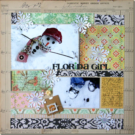
“Florida Girl” by Doris Sander in the February ‘11 issue of Masterful Scrapbook Design
mixed
Aaron Morris says, “My most commonly used title technique would be mixing the alpha I am using with either small word strips, a word spelled out with small snipped alphas, or small fonts for the “supporting” words of the title. There are two or three products that I use to do this, and feel that when I use this technique I am able to put the focus on the important words in the title.”
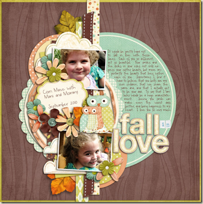
“Fall in Love” by Aaron Morris in the February ‘11/Titles issue of Masterful Scrapbook Design.
long
Of her very-long-titled “I often wish you could talk but even more so in these sad moments”,” Karen Grunberg says, “This is a typical title for me. My titles are generally quite long. I use varying sizes and color and shapes but each word is spelled using the same sized letters so there’s uniformity within a word but not for the whole title. I also often use the tiny alphas on most of my layouts (as I did in the beginning of this title)”
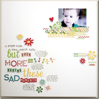
“I often wish …” by Karen Grunberg in the February ‘11/Titles issue of Masterful Scrapbook Design.
hand-drawn
Michelle Houghton likes to use her “handy” skills to make a variety of hand-lettered titles for her pages. She says, “I take for granted the things I learned in high school art class. That is until someone says, ‘Please tell me you did not do that lettering on your own.’ The response is usually, “yes,” and I have Mr. Carlson to thank for it. In high school art we learned block lettering. I have since evolved this basic block lettering into my own handwriting style. I’ve added tricks that I like to use on fonts and for creating lettering for my pages.” (You can check out these trick and techniques in her self-paced class, Hand-Lettering for Scrapbookers, Journalers, and Crafters which is newly available in self-paced form at Get It Scrapped!)
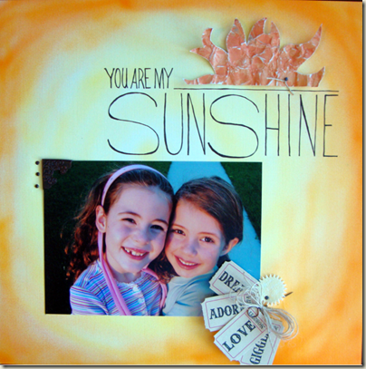
“You Are My Sunshine” by Michelle Houghton inHandlettering for Scrapbookers, Journalers, and Crafters.
graphic
Katrina Kennedy’s titles are very often rendered with word-art or her own type treatment, and, thus, they have less depth. The result is modern-looking pages with a clean and graphic feel.
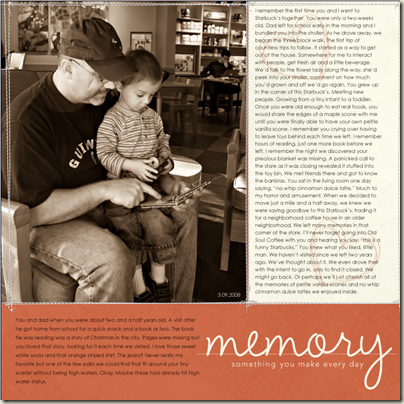
“Memory” by Katrina Kennedy
stamped
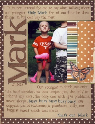 “Mark” by Sharyn Tormanen in Get It Stamped 101
So which of these titles appeals to you? Which approaches gave you ideas for your own titlework?

