Hearts are the perfect way to convey passion, love and affection on your scrapbook pages. Whether you are trying to communicate a love between two people, a love for a particular object, or simply a love for life–hearts are definitely a good place to start. Below you can find out a little more heart associations, while taking away inspiration from the pages below to begin using hearts in creative new ways!
A few interesting facts about love, Valentine’s Day, and other matters of the heart:
- The average human heart will beat over 2.5 billion times during its lifetime.
- Valentine’s Day traces its origins back to Ancient Roman Times. The Romans celebrated on February 14th in honor of Juno—the queen of all Roman gods and goddesses, as well as, the Roman goddess of Marriage and Women.
- Doctors during the 1800’s would prescribe chocolate to those pining for lost love.
- Over 100 million red roses are sold on Valentine’s Day.
- The “X” symbol became synonymous with a kiss back in Medieval Times, when people would sign their name with an “X” and then kiss it to ensure their sincerity.
- The average human heart weighs less than a pound.
- Valentine’s Day was named after St. Valentine, a priest who secretly married couples after the Ancient Roman Emperor Claudius II forbid marriage during times of war.
- Over 1 Billion Valentine’s Day cards are sent out the week of Valentine’s—second only to Christmas.
10 ways to use hearts on your scrapbook pages:
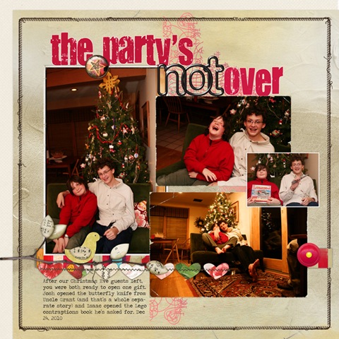
1. Create a heart border to help you showcase your photos.
In her page, “The Party’s Not Over,” Debbie has created this charming stitched heart border with a variety of coordinating papers in subtle prints. As you can see, it creates the perfect stage for her photos to shine on, as well as, creating a sense of unity amongst all of the elements on her page, through the repetition of color.
“The Party’s Not Over” by Debbie Hodge
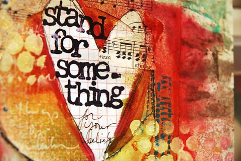
2. Use a mask and spray ink or paints to create heart-shaped journaling.
In Dina’s layout, we see how journaling inside of a shape is not only a fun way to reinforce our layout’s theme, but is also a great way to create some contrast that will make your journaling really stand out.
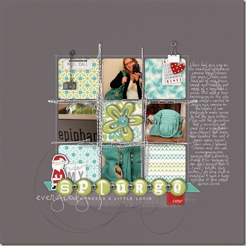
3. Use a small heart embellishment to create a visual triangle on your page.
In Kayleigh’s layout“My Splurge,” she has created a vibrant visual triangle by clipping an adorable dotted heart to the top right corner of her grid, in combination with two other small red elements positioned at opposing corners. The use of the red in this otherwise subtle scheme, creates tension and visual interest, while leading the eye throughout the page. Even the smallest element can make a huge impact when used so brilliantly!
4. Use a hand stitched felt heart to bring some texture, as well as, a home spun feel to your layout.
Doris’ layout “Lovie” is filled with beautiful layers and textures that all center around that charming stitched felt heart and all of it’s perfect little details. It not only reinforces her homespun, vintage feel, but also draws the eye inward to the focal point of this layout, through the contrast it creates with its surrounding layers.
“Lovie” by Doris Sander
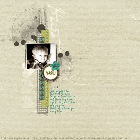
5. Use a subtle heart-shaped brush to create a foundation for your layout’s layers.
In my layout “I Heart You,” I used a series of brushes–including a few subtle heart-shaped ones–to help set the tone for my layout, while creating a dynamic foundation for my layers.
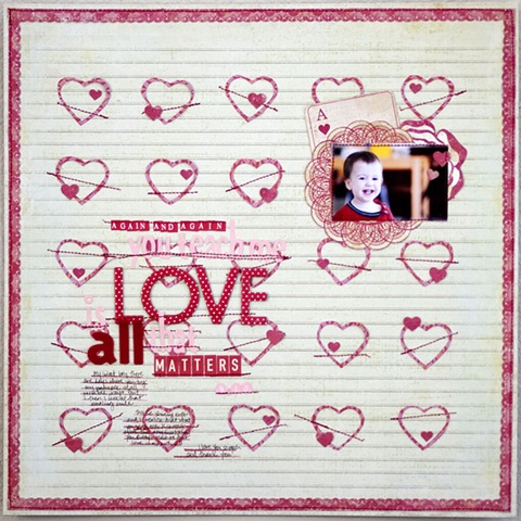
6. Create a beautiful heart textured background by tiling heart shaped cutouts on your page.
Check out the dimension created by this beautiful background texture in Karen’s, “Again and Again You Teach Me That Love is All That Matters.” Creating interest in a Monochromatic layout can be difficult, but Karen manages it beautifully, by creating this interesting tiled-heart pattern on her background paper. She really piles the texture on, with her addition of stitching and heart-shaped brads, making for the perfect background for her other page elements.
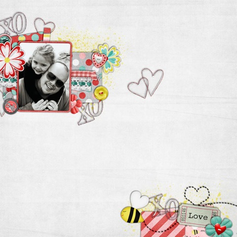
7. Sprinkle your layout with stitched, acrylic and/or wire heart embellishments for a subtle touch of flair.
The use of open embellishments such as the acrylic, wire and stitched hearts that Aaron has used on his page “XOXO,” reinforce his theme and create texture, all while remaining subtle. Because these types of embellishments allow the background to show through, they can easily be sprinkled throughout a layout without being too overpowering.
“XoXoXo” by Aaron Morris (aka Sir Scrap-Alot)
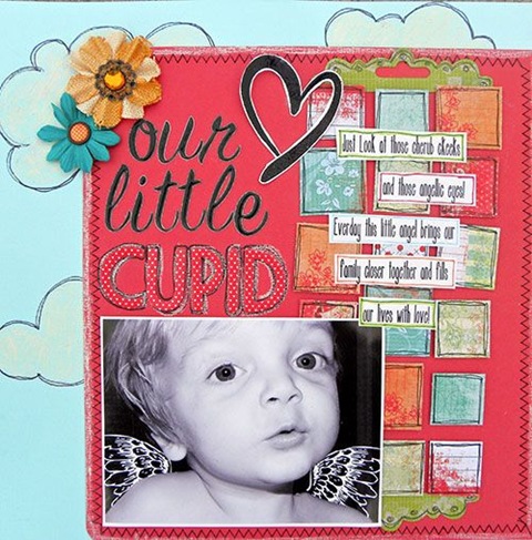
8. Use a stamped heart outline to help create unity throughout your page.
In my layout, “Our Little Cupid,” I’ve used this prominent black stamped heart to tie in the black and white photo, and black outlining throughout this brightly colored page, thereby creating a sense of unity.
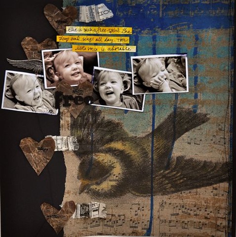
9. Use crumpled paper hearts to bring a grunge effect to your layouts.
Dina’s use of these stitched, crumpled hearts not only create texture and dimension in her layout, “Free,” but they also aid her in creating a beautifully grungy look.
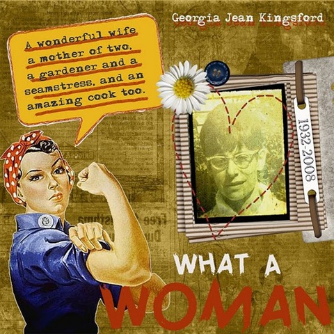
10. Create a stitched heart-shaped photo frame.
Any heart, whether stamped, drawn, or cut out can be the perfect frame from your photos, in my layout, “What a Woman” I framed my grandmother’s photo with a stitched heart. This creates texture and interest, while identifying my focal point.
[akingsford]

