Wondering how to add a little something different to the scrapbook page you’re working on? Try lifting one detail that you love from another scrapbooker—or challenge yourself to work in one of the details I share here that recently caught my eye.
1. Cap it off.
When I interviewed Jenni Bowlin in November, we took a really close look at how she embellishes her pages. It was a ‘Eureka!’ moment for me when she said, “I like to ‘cap things off.’” See how she’s done that here by trimming the scrolled top off a journaler and placing it above her title. She’s also capped things off with star stickers, gems, buttons . . . . and lots of other small treasures.
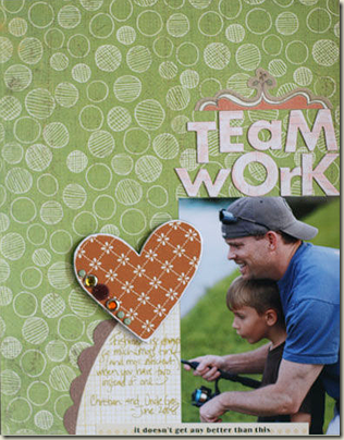 “Teamwork” by Jenni Bowlin in the November, 2010 issue of Masterful Scrapbook Design.
2. Mix staples and bling.
I expect to see the manila tags stapled on this page by Dina Wakley; manila tags and staples are both office supplies—they go together! But the series of three glittery flowers to the right of her photo are unexpected and eye-catching.
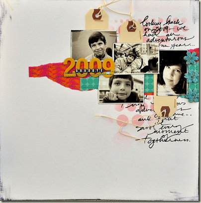
“Goodbye 2009” by Dina Wakley in the January, 2011 issue of Masterful Scrapbook Design.
3. Underline words with stitching
Next month I’ll be interviewing Karen Grunberg about scrapbook page titles, and I know we’ll be talking about her penchant for making looooooonnnnnnnggggg titles. Until then, though, I’m left to study her pages on my own. See how she underlined (or perhaps stitched down) several of the small words in her title. Challenge yourself to incorporate 5 short, horizontal lines of stitching into your next design.
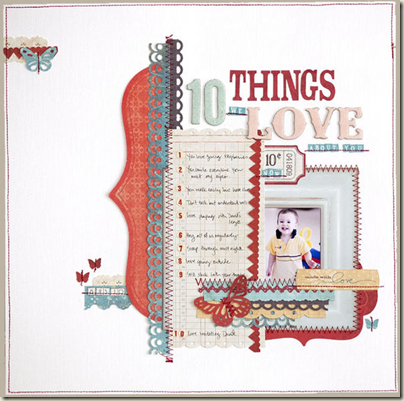
“10 Things We Love About You” by Karen Grunberg in the January, 2011 issue of Masterful Scrapbook Design.
4. Add a tie to the center of a patterned paper flower
It’s always a delight to come across the unexpected on a page. Kayleigh Wiles added a tied bow to the center of a printed flower, and she let the bow spread out and overlap (and, thus, connect) other elements in her grid of photos.
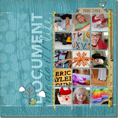
“Me Do It” by Kayleigh Wiles in the February, 2011 issue of Masterful Scrapbook Design.
5. Make an unexpected truncation.
There are actually a whole bunch of things you could lift on this page by Lisa Dickinson, beginning with the series of small chipboard frames that house a variety of patterned papers and moving onto the delicate treasures centered in each. What I’m challenging you to lift here, though, is the idea of truncating an element instead of letting it run off a mat. See how one of the frames runs off the right side of her patterned paper mat, but two other frames are trimmed even with the mat edges.
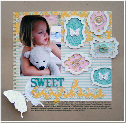
“Sweet Sophia” by Lisa Dickinson for the October, 2010 issue of Masterful Scrapbook Design.
It would be really wonderful if you’d leave a comment and a link to pages you’ve made that incorporate one of these details!
[getinspired]

