by Tami Taylor
Napoleon Bonaparte had it right when he said, “A good sketch is better than a long speech.”
When it comes to managing the time in our life, our scrapbooking time often comes up short. Even if you manage to secure some of that elusive time, it doesn’t always mean you’ll get a lot accomplished. Remembering all those rules of design takes some time and energy. Maybe you’re like me and would rather concentrate on embellishing and having fun with all your goodies than worry about designing the layout. Perhaps you need to speed scrap for a project or quickly catch up with your growing stack of photos. Whatever your situation, I challenge you to use a good sketch.
What is a good sketch?
A good sketch is one that appeals to your eye and accommodates the number of photos you want to get on that scrapbook page. Yes, it’s that easy.
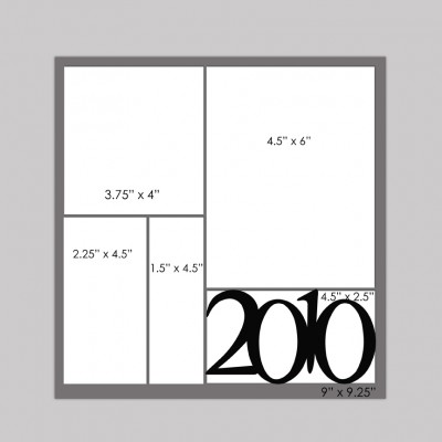
Let’s use this sketch for a reference point as we discuss sketches.
Treat sketches as your inner child would treat a coloring book.
Option 1: Grab your crayons and color inside the lines.
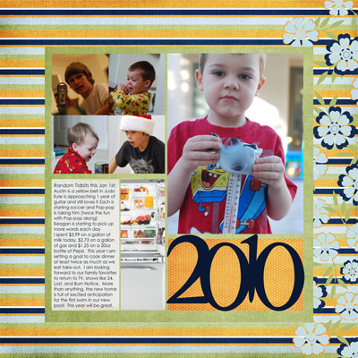
In other words: follow the sketch in size and layout, but go crazy with the possible color combinations and photos you can choose. You will have a great page. It’s ok to just use the sketch. You don’t need to try to be creative and change the sketch. Sketches are starting points and meant to inspire you to get scrapbooking, not to stress you. Some of my favorite layouts are literal translations of sketches.
Option 2: Grab your crayons, but use the lines as a guide only.
Remember that just because a sketch has 4 blank spots doesn’t mean you have to have four pictures. You can have fewer pictures and use pieces of coordinating paper or embellishments to fill any spots. Divide larger areas into smaller areas to incorporate more photos. Merge areas to feature larger photos.
Option 3: Grab your crayons and a friend.
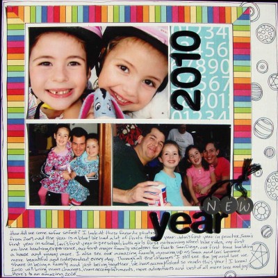
When I would color with a friend as a child, we would lie on the floor face-to-face and color the same page. One of us would be viewing the page upside down, trying rotating your sketch. This is especially helpful if you are doing an album project. It allows you to use the same sketch several times without it being apparent. Mirroring the sketch is fun when you are doing a two-page layout with a one-page sketch. Sharing sketches with friends is the most fun when you share the finished product. You’ll be surprised how unique the layouts look with different pictures, papers, and perspective.
Option 4: Grab your crayons and a sheet of paper.
Use the sketch as inspiration to design your own layout. Perhaps it’s the grid that inspires you or maybe your eye flows to one area first. Use that morsel to start your page. Add your own finishing touches. Just because there isn’t a big pretty flower on the bottom left corner of the sketch doesn’t mean you can’t add one.
The most important thing to remember is a sketch is what you want it to be. So go find a good sketch and lean towards the literal side like me or abuse it like Michelle did (her words not mine). I give you permission to use the sketch any way you want. If anyone gives you grief for how you used a good sketch, send them my way and I’ll give them a long speech.
[ttaylor]


