by Debbie Hodge
Let’s “study” pages by Celeste Smith, Kayleigh Wiles, and Lisa Dickinson
In the audio of the November Masterful Scrapbook Design (MSD) seminar on “Details” I suggested studying pages that you like in order to understand how you might approach your own pages. MSD member Mary Nelson asked how to go about that.
Mary is a woman after my own heart. What DO I mean? How DOES one do this? Since applying analytical skills to creative projects is something I enjoy (like solving a puzzle or cracking a code) here’s a breakdown of how I would go about this.
I’ve chosen three layouts each from three scrapbookers who have different styles/looks. I’m showing them (at first) small so you can get that “squint” look at them and at the bottom of this article, they are shown larger. I’ll use these layouts to walk you through the questions and observations that are helpful for figuring out what a scrapbooker is doing – so that you might do it too!
Examine how a designer includes or uses:
- the 5 parts of a page (canvas, photos, title, journaling, embellishments),
- design principles, and
- product.
(Be sure you’ve checked out our free class: Design Principles for the Scrapbook Page which teaches page parts and page design.)
For each of the designers I chose three layouts that I really like and that have some commonality in design.
Looking at 3 layouts by Celeste Smith
See Celeste’s Two Peas gallery
1) Discover
Here’s what I discover when I look at these three pages by Celeste.
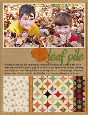
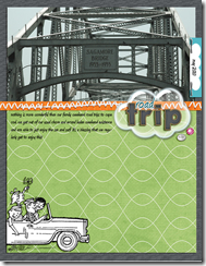
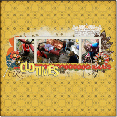
- Celeste prefers a rectangular canvas (as opposed to the 12”x12” square canvas) – even when she works on a 12×12 canvas, she often creates an inner canvas that’s rectangular.
- Celeste often “blocks” her canvas with patterned papers.
- Celeste frequently divides her canvas into thirds – into horizontal bands that are about 1/3 of the height of the canvas.
- Celeste does not use lots of photos on her pages — frequently just one, sometimes two.
- Celeste uses tidy titles (they’re aligned and cut cleanly) that are simply rendered and clear in meaning. She positions them in a “sweet spot” (about 1/3rd of the way from the top or bottom). She uses one alphabet or font. She uses alpha that contrasts strongly with the background.
- Celeste types her journaling and includes it in one spot – spanning most or all of her canvas.
- Celeste puts her embellishments in one spot.
- Celeste places embellishments near her title.
- Celeste’s embellishments are simple and clean.
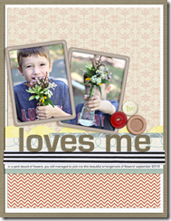
- Celeste often uses a “border” strip – see the white and black ribbon on “Loves Me” and the oranged stitched strip on “Road Trip”.”
2) Use what you like
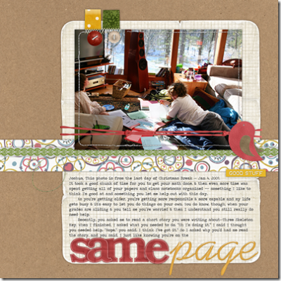
Here’s a page of mine with a lot of “Celeste” in it.
- I’ve got an inner rectangular canvas holding my photo, journaling and title.
- I’ve used one bold photo.
- I’ve put my title all on one strong line spanning my entire inner canvas.
- I’ve used a border strip that runs horizontally across the page.
- My embellishments are simple (for me!) and sit in two spots.
- My journaling spans the entire inner canvas.
Looking at 3 layouts by Kayleigh Wiles
See Kayleigh’s Designer Digitals gallery
1) Discover
Here’s what I discover when I look at these three pages by Kayleigh.
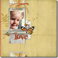
- Kayleigh leaves lots of white space on the page.
- Kayleigh creates one block that contains her photos, journaling, title, and embellishments and then places that off center on her page. The block takes up about 1/3 of the total area of the page—the other 2/3rds is white space.
- The “block” I just described is backed up by brushwork – On two of the layouts here it’s very subtle (tone-on-tone). On “India,” it’s bolder.
- Kayleigh uses page borders.
- Kayleigh stitches things down with long runs of machine stitching.
- Kayleigh’s titles don’t sit all tidy in a line and they’re usually overlapping and going under other elements.
- Kayleigh uses embellishments that “spill” or “trail” or “sprinkle.” See the small beads, the ends of ribbon bows, the berries on a branch.
- Kayleigh incorporates one very strong color in “pint” quantities. (We talked about this in the September Color seminar – using colors in a ration of gallon-quart-pint). See the orange on “love,” the aqua on “those suckies,” and the orange on “India”.”
- On two of these layouts, Kayleigh has put her journaling on a tag or paper that’s layered in with the other elements.
- There is a strong horizontal line or “shelf” supporting the heavy items in Kayleigh’s design. See the dark machine stitching below the photo on “Love” and the white scallop strip with alpha ribbon on “These Suckies.”
2) Use what you like
Here’s a page of mine with a lot of “Kayleigh” in it.
- All of my page parts are gathered in a block that takes up about 1/3rd of the page area.
- The block is backed up by white brushwork – not like Kayleigh’s delicate brushwork, but rather a masked and textured area that looks like paintbrush strokes.
- My embellishments “trail” and “sprinkle.
- My photos set on a strong horizontal “shelf” of paper strips.
- My title is “jumbly” and overlapping other elements.
- My journaling is on a tag layered in with the other elements.
Looking at 3 layouts by Lisa Dickinson
1) Discover
Here’s what I discover when I look at these three pages by Lisa.
- Lisa incorporates generous white space on her pages.
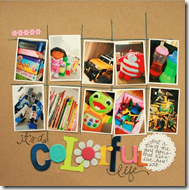
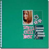
- Lisa’s designs are often based upon a grid foundation. See the 5 x 2 grid on “Colorful Life,” the 3×2 grid on “Flower Love” and the 2×2 grid on “Remember.
- Lisa’s titles are “jumbly” and tilted and she often combines multiple fonts or alphas in her title. Her titles become embellishments. “Remember” is one one broken up into three lines. “Flower Love” uses plastic alphas along with a hand-cut word. For “Colorful Life” all of the alphas in the one word are totally different.
- Lisa hand writes her journaling on cut out journaling strips and labels. She lines up the journaling strips vertically.
- Lisa uses bold colors and contrasts.
- Lisa uses stitches to create her “foundation.” See the grid on “Colorful Life,” the stitched down patterned paper on “Flower Love” and the one outlined block on “Remember”.”
- Lisa likes to make “compartments” to hold various page elements.
- Lisa embellishes with one strong “cluster” on these pages. See the butterfly and button on “Flower Love” and the grouping of three flowers on “Remember.”
2) Use what you like
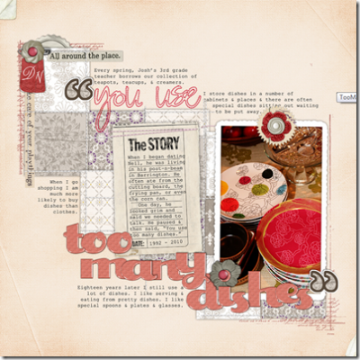
Here’s a page of mine with a lot of “Lisa” in it.
- The foundation is a grid.
- I used stitching to define the grid.
- Each square is a compartment holding a piece of patterned paper – and the some square combine to provide bigger compartments – e.g., “The Story” journaler and the photo on the page are all sitting on top of multiple squares.
- My title uses multiple alphas and sits untidily on the page.
- I don’t use journaling strips, but I do put my journaling in multiple spots.
- The embellishments on the page and the photo are the bold spots of color.
Your turn
Open up a magazine or an online gallery and discover what pages you like – and then take a closer look and see what the designer of the page has done that’s making this appealing to you. Figure out what you’d like to try on your own pages and “go for it.”
See the layouts bigger
Celeste Smith – from her TwoPeas gallery
Kayleigh Wiles – from her Designer Digitals gallery
Lisa Dickinson – from her blog and her posts here in the Sept and Oct albums

