Shapes are often associated with specific meanings and or can create a certain feeling on the page. When we repeat a shape that feeling or meaning is amplified. This is how we can easily reinforce our page’s story thru the use of repeated shapes or motifs.
But that isn’t the only way we can use repeating shapes effectively. Repeating shapes can also contribute to our scrapbook page’s design depending on how we arrange them on the page. By clustering several repeated shapes together you can emphasize certain objects. By arranging the repeated shapes in a grid you create both balance and rhythm on the page.
See below how the Get It Scrapped Creative Team has used shapes on their pages here.
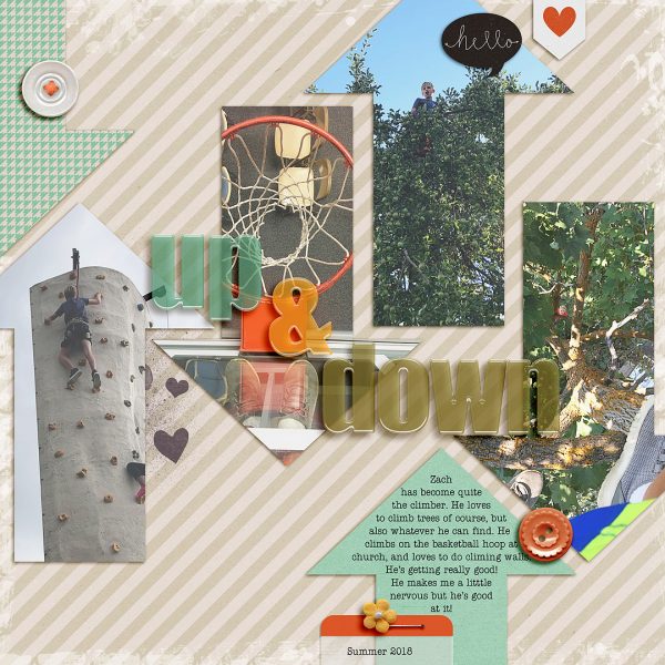
Lynnette Wilkins says, “This page is about my son and his love of climbing things!”
“I chose arrows as my repeating shape. I thought it was a good fit for climbing, representing going up and down and creating movement on the page. I used large arrows that take up most of the space, and I added them in a few ways: some are home to my photos, and the others I used to bring in a bit of color, and one is a spot for my journaling.”
Marcia Fortunato says, “My little granddaughter recently discovered that she loves to be upside down. When my daughter-in-law sent me a picture of her doing this, I remembered that I had a similar picture of my son in the same position when he was a baby. This page shows the two pictures, taken thirty years apart, side by side.”
“On my page I used repeating people shapes, large and small, to represent me, my son (as a child and adult), and my granddaughter. I also used triangles as arrows to lead the viewer’s eye around the page.”
“I used large people to represent me and my son now as the parents, and I used little people to represent my son as a baby and my granddaughter. I grouped them in pairs on the tab next to my title, turning the little ones upside-down since that’s my story. I added two more little people upside-down on the photos to make the triangles into arrows pointing downward.”
“I used repeating triangles and arrows to draw attention to the most important parts of my page, the title and the babies in the photos, and to lead the viewer down through the page, then used two more triangles as labels to identify the babies and further frame them in the photos.”
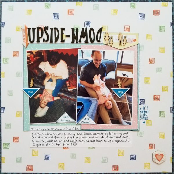
UPSIDE-DOWN by Marcia Fortunato | Supplies: Patterned Paper: Photo Play, Mommyish for Cocoa Daisy, Crate Paper, Echo Park; Cardstock: The Paper Studio; Title: Cocoa Daisy; Stamps: Ali Edwards; Embellishments: lily bee design, Cocoa Daisy; Pen: Sharpie; Ink: Studio Calico Color Theory.
Deborah Wagner says, “This is a photo of my niece hiking at Machu Picchu.”
“I used triangles because they reminded me of the mountains. My photo was duplicated 5 times and clipped to triangles of varied sizes. I also added photo corners. The corners repeat the triangle shape and framed my page.”
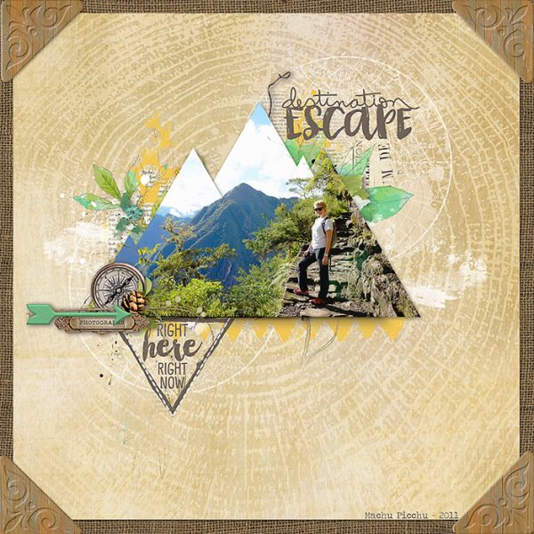
Destination Escape by Deborah Wagner | Supplies: Katie Pertiet – Stitched Geometrics No. 1, Stamped Badges: Travel, Wooden Photo Corners No. 1, Burlap Essentials, Global Brushes No. 2, Adventuring Collection; Studio DD – Readymade Layers Botanical Clusters No.1, Layer Works No. 781
Marie-Pierre Capistran says, “This is a story about how my younger daughter is so good to lift us all up! At 6 years old already, she used to say the words we needed to hear, just as an old sage would.”
“I used the hot air balloon motif to give a sense of her bringing our spirits high. I placed the hot air balloons in a loose line going toward the top of the page as if they were taking flight. I mixed them with the die cut title, You Lift Me Up, and I placed a patterned paper with sky and sun motif at the top of my photo to increase the sense of the balloons going up.”
“I used both white and colored die cuts to mimic some balloons fading in the sky. I used a photo of my daughter looking up, again to give the sense of the balloons taking flight and lifting us all up with them.”
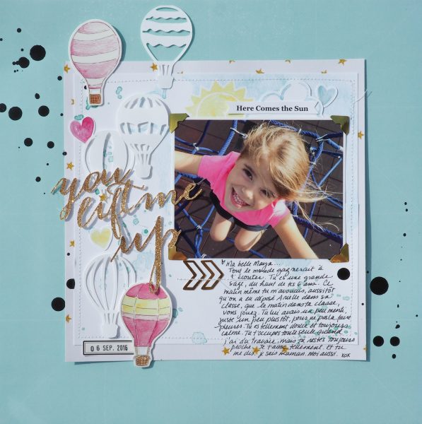
You Lift me up by Marie-Pierre Capistran | Supplies: Cardstock: American Crafts; Patterned Paper: Pretty Little Studio, Cosmo Cricket; Die Cuts: Pretty Little Studio, Just Nick; Stickers: Pretty Little Studio; Others: Ink, Silhouette Cameo
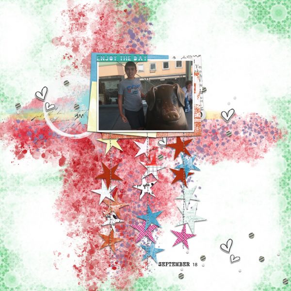
Jana Oliveira says, “This is an everyday photo of a summer day in the city.”
“I have always included stars and hearts in most of my son’s layouts–probably 99% of time. It’s my hidden message to him that he is a star and is loved despite all. These shapes being repeated keeps the page cohesive.”

