 Your scrapbook page canvas establishes a space within which you’ll design–by arranging elements within that space.
As you arrange those elements, it’s important to pay attention to the way your foreground elements define the surrounding “white” space.
A great way to try new approaches to working with space is to look at inspiration pieces and work from them. Our creative team shows you their work with inspiraiton pieces and their own scrapbook pages.
[hr]
Nicole Mackin says, “This layout is about my daughter’s love for all things ocean, especially riding the waves on the boogie board in Maui.”
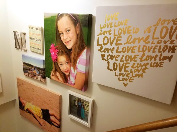
“I used my basement hallway gallery-style wall as inspiration. The arrangement is a modified grid-style design.”
“On both the wall and the page, I was able to use a variety of shapes and textures and still make the overall design fit together.”
“Once the basic grid-style design was created using photos and cards, I embellished in a way that added more layers to provide more interest and to keep it from looking too uniform and boxy. The embellishments also add to the story, similar to the way the decorative signs add context to the photos on the wall.”
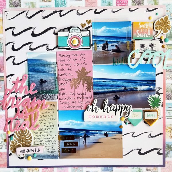
Oh Happy Moments by Nicole Mackin | Patterned Paper: Crate Paper; Cards: Becky Higgins Project Life; Chipboard Stickers: Crate Paper, Simple Stories; Stickers: Crate Paper; Transparencies: Simple Stories, Crate Paper; Cardstock Phrases: Dear Lizzy American Crafts; Enamel Dots: Paper Studio, Simple Stories.
Iris Fox says, “I made this page to include in my daughter’s album of her growing-up years. The journaling is a snapshot of some of the things she said and did often when she was eight.”
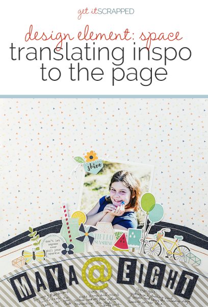
“The inspiration photo is one I took from the roof of a restaurant looking down at my husband in the parking lot. I was drawn to how the space was divided, in the background the crackled asphalt, in the foreground the ledge I leaned on, the sidewalk, and the gutter forming arcs.”
“I translated the space by using a background paper with small overall pattern so that it is clearly separated from the arcs at the bottom which have solid or large patterns. The arcs consist of three layers with high contrast paper and fabric, and stitching to further delineate the layers. The topmost layer, housing the title and journaling, is raised with foam to give it added dimension as the foreground.”
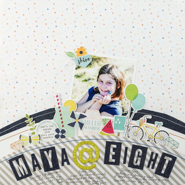
Maya @ Eight by Iris Fox | Supplies: Papers: Cocoa Vanilla Studio, We R Memory Keepers; Ephemera: Cocoa Vanilla Studio, Simple Stories; Alphas: We R Memory Keepers
Dawn Farias says, “The story behind my page involves my son never wanting to let us grab an after-game photo of him in his football uniform. He’s not going to play in high school and so the last game during his 8th grade year was my last opportunity to snap a pic of him. He turned and smiled and gave me half a moment to get my picture. I did and I love the one I got.”
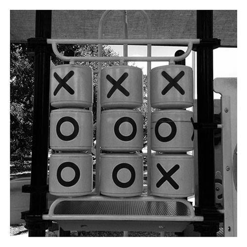
“My photo inspiration was of a picture I took at our park as part of a black-and-white photo challenge. I used the block design to inspire my page. The block design interested me in the photo. I haven’t usually had great success when trying a block design. I somehow get frustrated and give up. However, I really like how this page came out.”
 I purposefully shifted everything to the bottom right corner of the page. I like the bold, clean negative space this created. To soften it up a little bit, though, I added a title to the top right and a few strips poking out at the bottom left.
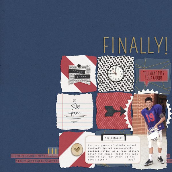
Fianlly by Dawn Farias Looking Sharp Collection; Christmas Time Full Kit; Journalers 1; Better Together Alpha; Collaged 2; On and On Strips; Tender Moments plain papers; all from Dawn by Design at The Digital Press
Marcia Fortunato says, “This scrapbook page is about the Christmas decorating that I’ve done so far this year.”
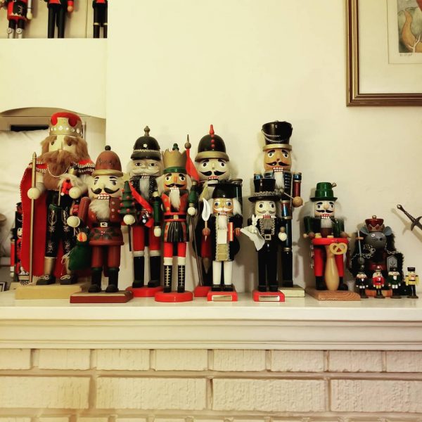
“I used this photo that I’d posted on Instagram as the inspiration for the layout of my page. I was looking through my Instagram feed and this photo caught my eye as one that would translate easily to a scrapbook page.”
“I liked the varying heights of nutcrackers on the mantle and translated that to a grouping of different sized photos on a shelf on my page. I also like the small grouping at the top left corner and the partial artwork at the top right corner. I used the top left for a small cluster of another photo and a few embellishments and moved the spot at the top right down just a bit and used that area for a small amount of journaling.”
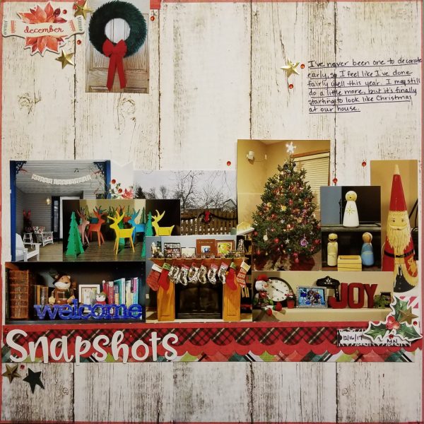
Snapshots by Marcia Fortunato | Supplies: Patterned Paper: Carta Bella, Cocoa Daisy, Bo Bunny; Border sticker: Simple Stories; Title: Doodlebug Designs, Inc.; Embellishments: Cocoa Daisy; Pens: LePen by Marvy, Distress Marker by Ranger.
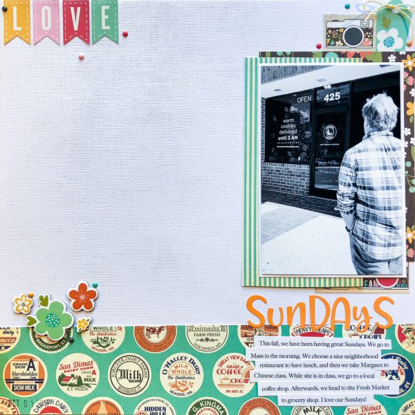
Kelly Sroka says, “This fall my family and I have had a special routine on Sundays. We go to Mass, then have lunch together. We have been trying out several small neighborhood restaurants which we have thoroughly enjoyed. We take my daughter to Chinese class, and then stop at a local coffee shop. When my daughter is done with class, we do the weekly grocery shopping. This day has become my favorite day of the whole week!”
“To design this page, I drew inspiration from a photograph I took on the college campus where my daughter takes Chinese class. I was drawn to the contrast in the picture–the curved lines in the foreground against the straight lines of the building in the background. I also liked the negative space created by the sky in the upper left of the photographs. I could easily see these compostitional elements translated into a scrapbook page.”
“I began my page with a circled patterned paper at the bottom to mimic the curved lines of the walkway in the foreground of the photograph. I added a grouping of chipboard flowers similar to the flowering bushes along the walk. I placed my picture vertically and off the page on the right of the canvas like the building in the inspiration photo. The banners at the top left are symbolic of the clouds in the sky. I left a significant amount of negative space as in the photograph. I love how this photograph so easily became the basis for this page design.”

