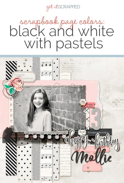
 Pairing black and white with pastels is a currently popular color scheme in interior design, fashion, and even scrapbook page supplies. This color scheme can give your page a clean yet playful tone.
See here how our creative team has used black and white and pastels to tell their scrapbook page stories.
Jill Sprott says, “This past summer, I had a surgical procedure that required that I be put under anesthesia, something that I had never before experienced. Although I tried to be brave, I couldn’t suppress my fears.”
“The color combination is part of the story told on this page. Pastels are known for their sugary sweetness, but combining them with black and white can have a striking effect, enlivening the page. Black and white are the colors of absolutes, bold in their contrast — ideal for a layout dealing with the conflict between fear and courage. The addition of more nuanced, softer pastels is reminiscent of the colors in the hospital, where I not only faced my fears, but also developed the ability to breathe more easily (literally).”
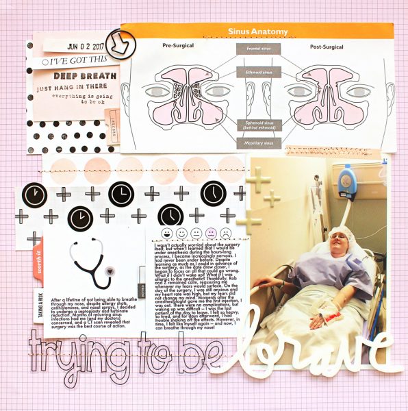
Trying to Be Brave by Jill Sprott | Supplies: Patterned Paper: Studio Calico, Maggie Holmes/Crate Paper, Scraptastic Club, Shimelle/American Crafts; Journaling Cards: Ali Edwards, Elle’s Studio; Tabs: Ali Edwards, Gossamer Blue; Clip: Evalicious; Stamps: Kelly Purkey, October Afternoon; Washi Tape: Studio Calico; Stickers: Ali Edwards, Crate Paper; Letters: Freckled Fawn; Acrylic Word: Ali Edwards
Lynnette Wilkins says, “This story is about the place my husband proposed to me and about us as a couple going back to visit and reminisce fifteen years later.”
“I tried to keep all the colors on my page fairly balanced. I chose a white background with pops of black and color to keep things light and airy. I converted my focal point photo to black and white, while leaving the other two photos in color but edited in a way that softened and brought out similar pastel hues.”
“I think this a perfect color palette for love stories: the black and white lends itself to strong bonds and emotions while the soft pastels make me think of love and happiness.”
“I love this color combo. The black and white contrast so strongly making for a bold look, while the pastels soften everything. It’s very eye catching.”
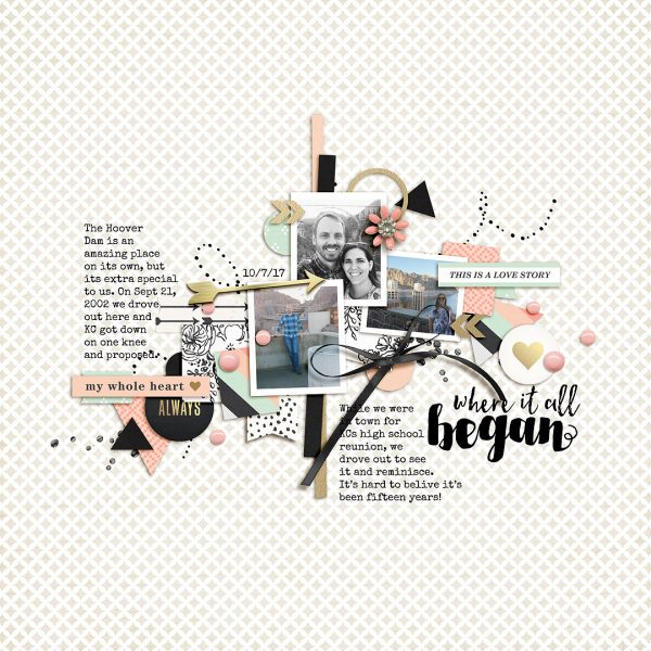
Where It All Began by Lynnette Wilkins | Supplies: Me and You kit by Sahlin Studio; Quick Scraps vol.7 by Anita Designs
Sian Fair says, “This has always been a favourite photo of mine, of my parents’ wedding. When I got married I made sure I had a similar one taken.”
“When I began this page I was going to use turquoise accents because the bridesmaids’ dresses were that shade; but, as always, once I start working my plan changes! There is a little blue in there, but the pink makes the black and white pop. Pastel pinks and blues I think of as 1960’s colors, so I made sure to add the date to emphasize that. I chose a black and white photo so that the only color would be in the embellishments.”
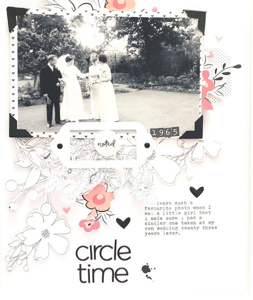
Circle Time by Sian Fair | Supplies: Patterned Paper:, alpha, tag and puffy stickers: Felicity Jane Studio
Kelly Prang says, “I try to take a portrait style photo of each of my children on or near each birthday, and this page was made to show off the birthday photo of my sweet newly-turned teen, Mollie.”
“I loved the confines of just using black and white with a pastel. Having a strict boundary sometimes helps me to be more creative.”
“I found the cake stand embellishment and decided to use pink as my pastel. Then I converted the photo to black and white so that the small bits of pink would pop against all the white and black bits on the page.”
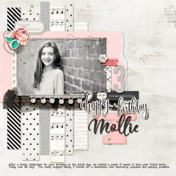
Happy Birthday Mollie by Kelly Prang | Supplies: Sketch- Ready Set Sketch 4 (jen schow/tracie claiborne); Fonts- Flitte (Mollie) and AA typewriter; American Crafts Maggie Holmes- Confetti- papers and elements; Gather- papers and elements; One Little Bird- One for the Album- Glitter Dots; Lynne-Marie- Explore- paper; Pink Reptile Designs- Dreams- messy thread; Createwing Designs- stitching; Allison Pennington- Built for Two- pop-pom trim; October Morning- papers; Forever Joy- Mixtape- tulle; Amber Labau- across the miles- ephemera card; TNP- A Tad Torn Vol 4- torn paper edge
Nicole Mackin says, “This is one of my favorite photos from Halloween 2012.”
“Halloween layouts have always been tricky for me because the costumes my girls are wearing often do not match the typical Halloween colors you find in most paper lines. Combining black and white elements with pastel colors solves my problem! It keeps the layout soft but still lends to the Halloween theme.”
“The product already combined the light purple color, so I looked at the photo and added in some other pastel colors that would help the photo pop.”
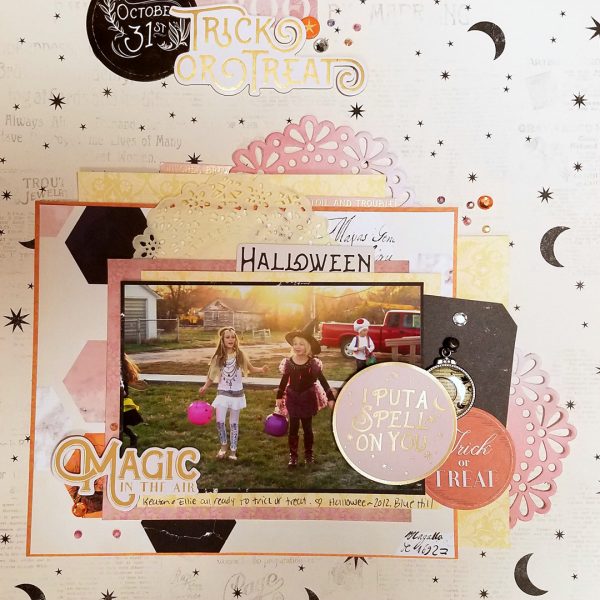
Magic In the Air by Nicole Mackin | Supplies: Patterned Papers: Pink Paislee, Websters Pages; Doilies: Recollections; Charm: The Girls Paperie; Stickers: Pink Paislee; Die Cuts: Pink Paislee; Bling: The Paper Studio, JoAnns.
Karen Poirier-Brode says, “I used this black-and-white-with-pastels scheme to tell the story of our great grandson. He is two and moving from babyhood to being a toddler.”
“The use of black and white and the many diagonal lines on the page emphasize his energy and movement. The soft colors and toy images bring to mind Joseph’s age.”
“Motifs on the page further the ideas I wanted to express: the safari animals, the palm tree, and map-themed flair suggest travel adventure. The banner is festive and with the scattered beads and dots reminds us that the photo was at a family party. The cartoon-like puppy and style of the other animals and the word art strip right now emphasize he is just a little guy at the moment.”
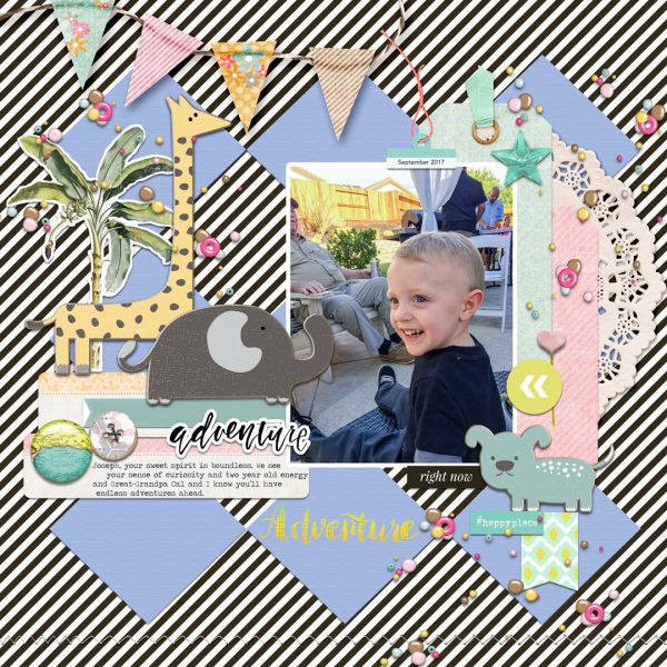
Adventure by Karen Poirier-Brode | Supplies: Kits: Digital Design Essentials_Real Life, lgrieveson_marinadelrey, Little Lam & Co_Hush, The Lily Pad_Life Is An Adventure
Hannah Lemieux says, “This is a layout about the changes in my life this year. I am mostly just talking about this season in general terms, and will journal more about this change on the back of my layout. I like to do this when my journaling is really lengthy or really detailed so that I don’t want to share with everyone looking at my album. I did want to highlight that the changing of our lives this year was good.”
“I used greys and black with a light pink/coral and light greens. I knew I wanted to use a fall photo in a different way, so I edited it and took out most of the saturation leaving an almost pastel color to the leaves. I also used papers and embellishments that were black, white or grey and similar light pastel colors in greens and pink/corals. I used mist sprays with a paint brush to mimic the leaves leaves. I also used my silhouette to cut leaves and sewed them on with my sewing machine adding lots of texture. I also wanted to draw the eye around and inside the layout so I added my journaling around the outside border of my layout.”
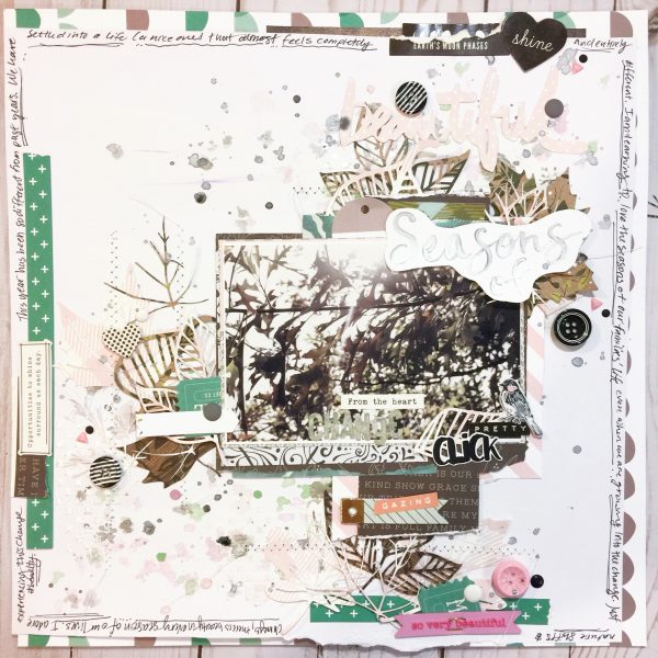
Pretty Click by Hannah Lemieux | Supplies: AC smooth White Cardstock, Digital Cut files from The Cut Shoppe and Wilna I heart Studio, Golden absorbant ground, Various colors of Shimmerz Vibez, Shimmerz Spritz, Shimmerz Creamez and Shimmerz inklingz, Elle’s Studio Live Laugh Love Pennants Paper and die cuts, Maggie Holmes Chasing Dreams 6×6 paper pad, puffy stickers, buttons, chipboard stickers, die cuts and Stickers, Maggie Holmes Carousel 6×8 paper pad and Sprinkles Patterned Paper, Echo Park Summer Park Stencil, One Canoe Two stickers and patterned paper, Simple Stories 6×6 woodgrain paper pad pack, Jen Hadfield Heart of Home Stitched Together, Climbing Ivy, Forest Botanical, Song Bird Patterned Papers, Cocoa Vanilla rubber charm, Shimelle Enamal shapes, AC precison pen, Heidi Swapp Color Shine Tinsel and AC Mini staples.

