 When one element is different from another, there is contrast. The bigger the differences, the greater the contrast. Your title can not only contrast with the other elements on the scrapbook page — it can also have contrast between the parts that make it up. You can add contrasts in color, typeface, size, dimension, styling and more.
See how our creative team has made scapbook pages with high-contrast titles.
Lynn Grieveson says, “We found outselves in this amazing border railway town on the coast between France and Spain. The huge brick railway buttresses and the strange streets (and the street art which I photographed and included on the page) were so amazing we googled the history and found some great old photos which I wanted to use on the page.”
“I went for a bold, sans serif font because I wanted a strong looking title that could hold its own against the busy-ness of the layout. But if it were all huge letters it would overpower the page, so I did the ‘old and new’ in a much smaller size, although I used the same font.”
“It works because it keeps the name of the town (the subject of the page) prominent yet is still a nod to the way I created the page. It adds interest to the top of the page as well, to balance the layout.”
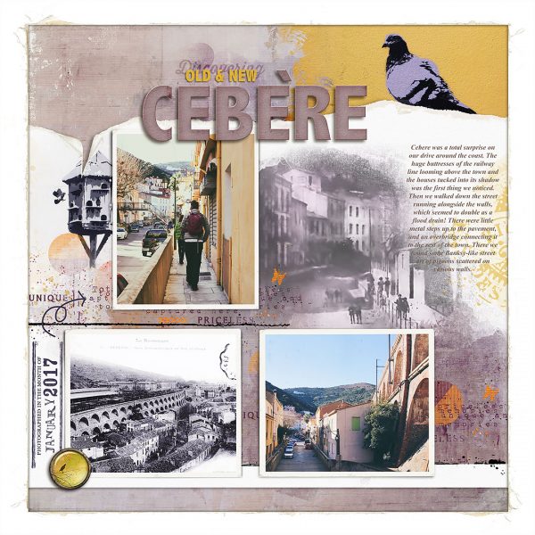
Old & New Cebere by Lynn Grieveson | Fade Out and Torn album No2, Sprout papers, Parisian Dates, Textual Layered Transfers, Mess with Ink2 brushes all from Lynn Grieveson Designs at The Lilypad.
Shanna Hystad says, “This page is about my nephews spending the summer with Grandma and enjoying a local waterpark. I created contrast by adding differently sized letters, as well as contrasting colors. I wanted to add large letters for the word boys which is a contrast to the photograph of the small boys. I added in an interactive element by creating a little booklet that has a photo on the front and inside along with my journaling.”
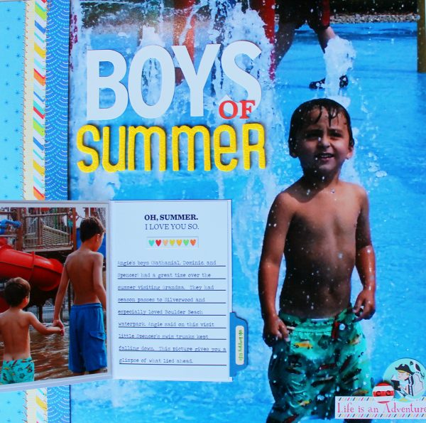
Boys of Summer by Shanna Hystad | Supplies: Paper-Pebbles (America the Beautiful), American Crafts (Shoreline-Pelican Bay), Carta Bella (Beach Day-Summer Chevron), large white letters-DIY Shop, yellow Letters-Thickers (Boardwalk), small orange letters-Simple Stories (Summer Vibes), Stickers-October Afternoon-Treasure Map, Digital Journal Card, Ali Edwards (I Love You So)
Marcia Fortunato says, “I absolutely love fall and fall colors, so I sometimes put duties aside in order to search for the most colorful leaves. This layout is about playing hooky to hike and enjoy the season.”
“In order to create contrast in my title I used letters with the same typeface but different colors. The brown letters stand out while the lighter letters blend into the background. (I outlined the letters in light grey to help them stand out just enough.)”
“In my title I wanted to emphasize that this was play for me. But I also had to admit that I was taking time away from things I should be doing, so I added ‘Hooky’ to the title in the more subtle letters. I added the small smiley face to show that the infraction was not all that serious!”
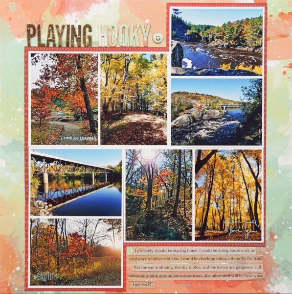
Playing Hooky by Marcia Fortunato | Supplies: Patterned Paper: Mommyish for Cocoa Daisy, One Canoe Two by American Crafts, Maggie Holmes for Crate Paper; Title letters: Cocoa Daisy; Stamps: Ali Edwards, Cocoa Daisy; Ink: Ali Edwards; Font: Palatino Linotype.
Dawn Farias says, “This page is about a Facebook challenge to post seven black and white photos for seven days with no people in them and providing no explanations.”
“I used a digital brush pen to paint a big, messy number seven for my background. The rest of my title, as a group, is in stark contrast to the size of the seven. As individual components, the rest of my title also uses other contrasts in color, size, and type.”
“This approach worked really well because the large seven made a unique element for grounding so many photos. The odd number of photos also made for a good spot to place the remainder of my title and balance out the row of pictures.”
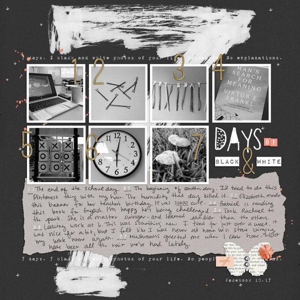
Days of Black and White by Dawn Farias | Supplies: Papers: Black and White, Trick or Treat plains; Alphas: Itty Bitty, Better Together, Frun; Date Stamps; Collaged; Sophisticate elements – all from Dawn by Design at The Digital Press; Fonts: Impact Label & 1942 Report; Pentel Brush pen
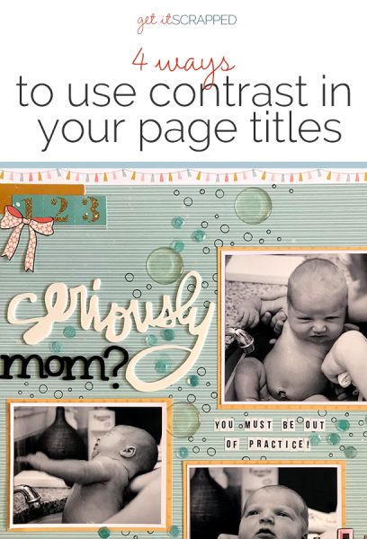
Megan Blethen says, “My husband and I waited four years between having our middle son and our youngest. There were a lot of things that I forgot about having a newborn, and that first bath at home was just really awkward! I love these photos and how you can definitely tell that my son is not liking it. For this reason I wanted the title to reflect the awkwardness.”
“I had the white Thicker word from my Secret Not Secret Kit Club for October and knew it was perfect! From there I knew that using black would help the word ‘mom’ pop. When I look back on these photos or when my son does, I want to laugh. Having the title pop with the use of light and dark creates that contrast that I was looking for on this layout. I even continued that contrast with the subtitle and use of white and black tile letters.”
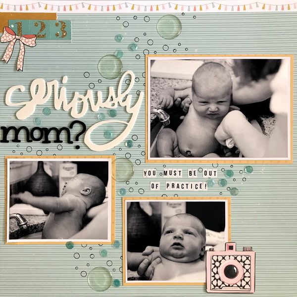
Seriously Mom by Megan Blethen | Supplies: Papers ~ Felicity Jane Caroline Blue lines, Simple Stories Domestic Bliss ‘Domestic Diva’, Recollections White cardstock Embellishments ~ We R Memory Keepers Bubbles stencil , SpiegelMom Scraps Sparkle Power Sequin Mix, 1 inch generic Epoxy stickers, Maggie Holmes Carousel Ephemera camera, bow and numbers, Amy Tangerine word thickers ‘Twin’, American Crafts ‘Eclair’ Thickers, Teresa Collins Signature Essentials Tile Alpha Stickers.
Ronnie Crowley says “Sometimes it’s just fun to scrapbook a silly photo which you snap to catch a moment of fun! I wanted the page to be fun and bright and so chose a super busy patterned paper which I wouldn’t usually use.”
“Using black letters I made them pop off the background by adding the opposite value in white. The stark contrast in values draws the eyes straight to the title which otherwise might be overpowered by the patterned paper.”
Jana Oliveira says, “I took this picture of my son look at the gym floor waiting for class after a week of activities. His schedule is very busy so I used the page to share words of reflection.”
“First I created a subtle background that’s not very colorful, and I rendered his picture in black and white so the title could work. Instead of using one contrasting title, I made many titles and used unique effects with styles for contrast.“
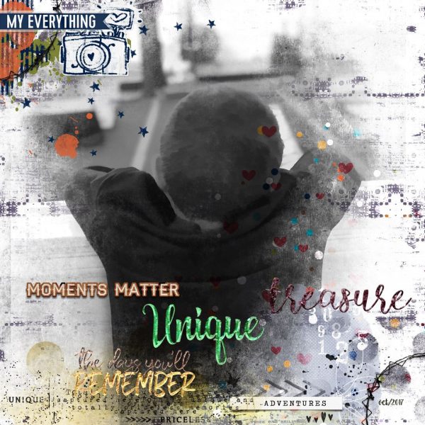
Me Everything… by Jana Oliveira | Supplies: Lynn Grieveson: Busy kit,textual transfers. Urban Fairy: Today is hard mask, Treasured Lillypad collab
Iris Fox says, “This page is one of several I plan to make documenting the many, many hours of fun and bonding spent between my husband and daughters playing video games.”
“To create contrast in my title, I used two fonts that are dramatically different. The first is an all lower-case, handwritten type with lots of rounded edges. The other is all upper-case and pixelated, with shading.”
“At the risk of stereotyping, video games used to be associated with boys and men, but my husband, an avid gamer, has always been the girls’ main playmate, and they have loved playing video games with their dad since they were really young. The juxtaposition of these two fonts supports my story of the of the two little kids (represented by the playful, kid-like type) being video game enthusiasts (represented by the computery font).
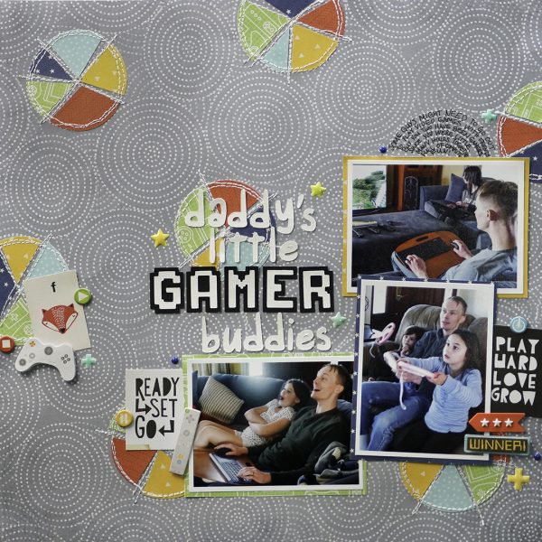
Daddy’s Little Gamer Buddies by Iris Fox | Supplies: Papers: Cocoa Vanilla Studio, Crate Paper, Lawn Fawn, DCWV, Paper Pizazz; Embellishments: Cocoa Vanilla Studio, Crate Paper, KandCompany; Fonts: Game Over Shaded, Orange Juice

