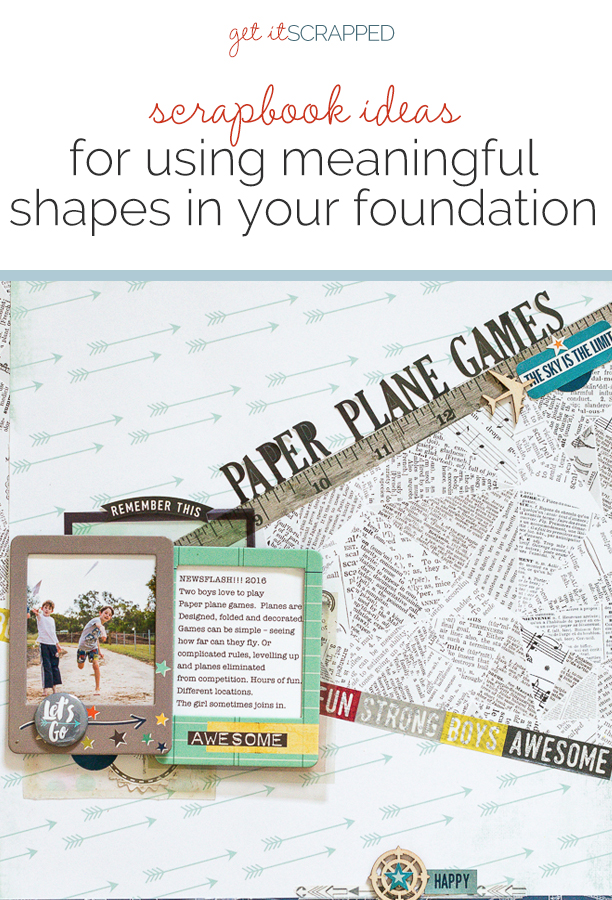
 The first layers you place on your page play an important role in your design’s final look.
These first layers (and their shapes) create visual weight, directional pull and contribute to the balance of the design.
When those first layers are shapes or silhouettes that are relevant to your story, you not only affect the overall design of your page, but you also infuse it with meaning.
Our Creative Team has made pages that show you examples of shaped foundational layers.
CLICK ON THE IMAGE BELOW TO SIGN UP FOR OUR EMAIL LIST AND GET YOUR FREE PAGE GUIDE
Nicole Mackin says, “The story of this layout is about my daughter putting together and filling out her Valentines.”
“I chose the heart shape to focus on the holiday of Valentine’s Day. I traced a template and cut it from two different patterned papers that I layered for depth. It’s placed to bleed off the page edge to add interest. The heart shape automatically becomes the focal point and also creates different lines to work with.”
“I put photo inside the heart, but placed to the bottom right so the viewer can always see that it’s obviously a heart.To balance the weight of the heart cluster, I added an embellishment cluster at top left.”

Love by Nicole Mackin | Supplies: Patterned Paper: Crate Paper by American Crafts; Embellishments: Crate Paper; Doilies; Recollections.
Stefanie Semple says, “We took a roadtrip to a game farm in the Karoo during the winter holidays. I enjoyed taking photos of the different landscapes we encountered through the front window of the car.”
“This shield shape reminds me of roadsigns, and it was my starting point for these photos. The photos worked perfectly in the design, allowing me to showcase five different terrains and times of day. As all of them worked well as background photos, it didn’t matter if the title and elements obscured part of the photo, there was still enough to get the gist of the terrain.”
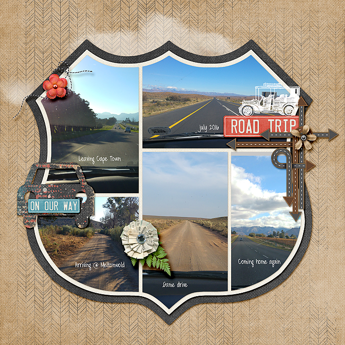
RoadTrip by Stefanie Semple | Supplies: Kimeric Kreations: A Grand Adventure Collection; Scrapping with Liz; Road Trip Templates
Kristy T. says, “My children often create and decorate all different types of paper planes. The boys, particularly, love to invent elaborate games with different rules and levels.”
“I used a triangular shape in my foundation to echo the shape of a simple paper plane and the act of folding paper. I created the shape by cutting the arrow paper diagonally first and then trimming the leftover piece to give the ‘open’ triangular space for the newspaper print paper. I also trimmed the papers slightly so that I could leave pieces of the of the newspaper print paper showing on the lower edge plus left side of the page. This creates a subtle visual triangle and adds a bit more detail to the page. I added emphasis to the lines of the triangle using washi tape and a border strip sticker.”
“The lines of the triangle act as leading lines, so it is a natural choice to place the photograph and journaling where the lines intersect. The triangular space is left open to showcase the folded newspaper print pattern and allow the viewer’s eye to be led upwards along the title–just as a paper plane flies up and into open space. The colors in the washi tape and the embellishments along the base of the page add balance and draw the attention back into the page.”
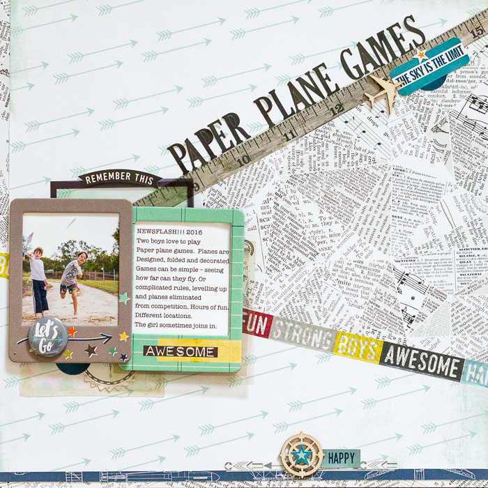
Paper Plane Games by Kristy T | Supplies: Patterned Paper: Echo Park; Stickers: Echo Park; Chipboard Frames: Simple Stories; Washi Tape: MME; Echo Park; Wooden Shape: Kaisercraft; Tin Pin: Coco Vanilla; Clear Frames: Crate Paper.
Audrey Tan says, “This page is about my boys learning how to snowboard for the first time.”
“I used a snowflake shape as my first foundational layer. I created the snowflake on Photoshop, placing a photo on four of its points and reserving the other two points for title and embellishment. Hence, the snowflake became my focus in telling the story via pictures. The center of the snowflake holds the journaling.”

Learn by Audrey Tan | Supplies: Anna Aspnes: ArtPlay Palette Snow Fun, ArtPlay Palette Memorable, ArtPlay Palette Blitzen; Pink Reptile Designs: School’s Cool; Font: Pea Theresa
Christy Strickler says, “This page documents the bond I have with one of our cats. I am pretty much her favorite human.”
“I used two shapes as the foundation for the page: a square and a heart. The square represents the solidity of our bond. I layered a heart overlapping it to represent how much we love one another. The size of the shapes forced me to play a bit with the size and placement of the photos. Both pictures are slightly smaller than 4″ x 6″ in order to fit them within the shapes. Once I had worked out where to place the photos, I was then able to place the title, journaling and other page elements.”
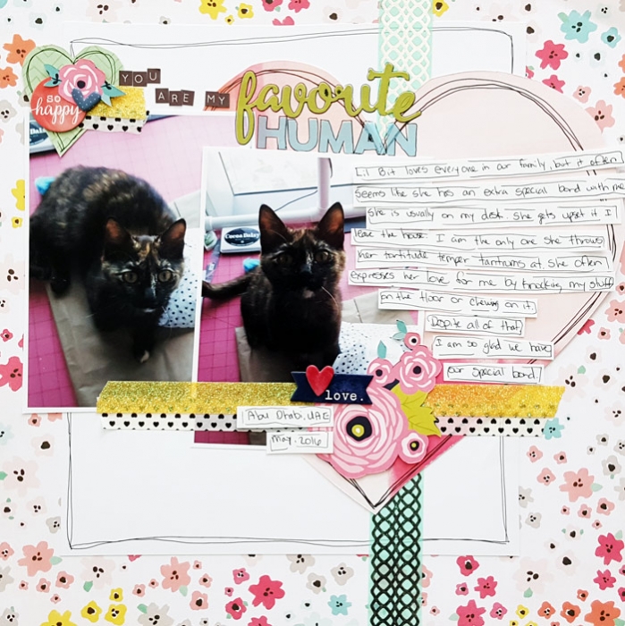
You Are my Favorite Human by Christy Strickler |Supplies Patterned Paper: Pink Paislee,Shimelle, Cocoa Daisy; Letters: Jillibeans Soup, Pinkfresh Studios; Chipboard: Shimelle; Tape: Little B, Glitz Designs, Other; Stickrs: Jillibean Soup, Cocoa Daisy
Jana Oliveira says, “I have a series of layouts that are as much art journal as scrapbook page. This is one of them. On these pages, I play and record messages for myself.”
“In this case, the shapes in my foundation blend together, with each other and with my photo’s silhouette. I applied gradient colors to them to contrast with my shape that is all black. I used a silhouette of my portrait that would mix together with my paper. The kits I used had great graphic shapes which I always love using. As I have a tendency not to use a lot of 3D embellishments, graphic shapes like this help to enhance the page.”
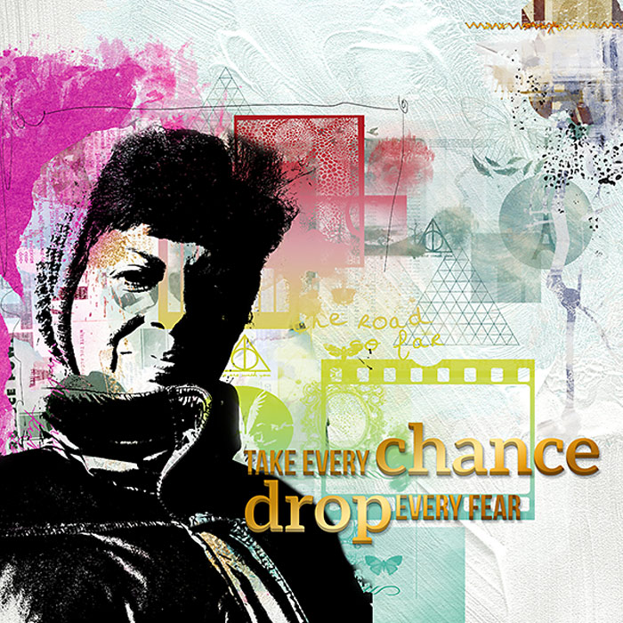
Take Every Chance… by Jana Oliveira | Supplies: NBK Design: Re invent collection, Mini O Quotation, New Beginnings paper, Art Journal Collection

