The shape of white space in a visual design can be ACTIVE or PASSIVE.
Active white is area left open on purpose. It separates content and is a design element itself.
Passive White Space occurs naturally, for example in the area between words on a line or the space surrounding a logo or graphic element.
Use white space in your design to make it easier for the human eye to understand your content: minimizing clutter, creating emphasis, organizing your content, creating groupings.
Here the creative team has made pages with generous and “active” white space and tells you how they did it!
CLICK ON THE IMAGE BELOW TO SIGN UP FOR OUR EMAIL LIST AND GET YOUR FREE PAGE GUIDE
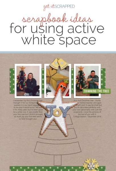
Ronnie Crowley says, “My daughter moved into her own apartment this year and the page is about her first Christmas tree.”
“The addition of the stitched Christmas tree in the large area of the white space below the block of photographs activates it and adds tension to the design. It also provides an anchor for the star embellishment behind the title “Joy” while supporting the theme of the page,”
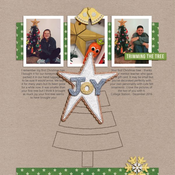
Joy by Ronnie Crowley | Supplies: Dúnia Stella Acauan – This is So Me – Kraft Papers; Etc. by Danyale – Felt Holiday
Mari Koegelenberg – Twenty Five; Sahin Designs – November2016-template
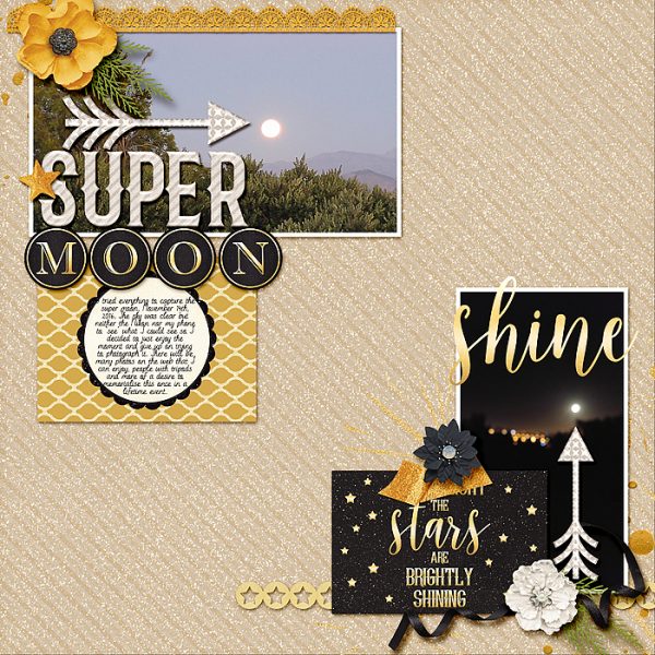
Stefanie Semple says, “My Facebook feed was full of photos of the Super Moon on the nights of the 14th and 15th of November 2016, and this layout features my attempt at documenting it.”
“I used a design with asymmetrical white space running between two clusters to contrast my two photos of the super moon, both blurry but one taken during the evening and the other after dark. The two distinct photo clusters are viewed independently, starting at top left, the light embellishments and yellow flower and journal card highlight the daytime photo. The second photo grouping is darker and at the bottom right so the eye ends up there and then takes in the journal card and views the moon once more. The arrows also direct attention to the two important spots.”
Christy Strickler says, “As a holiday treat, my son and I got flavored coffee and pastries from a local cafe, and that’s the story here.”
“I wanted the focus to be on the photo, so I placed it as a part of a a layered block in the bottom left of the canvas, leaving generouse asymmetrical white space around it.”
To keep the photo block from being perfectly square, I broke into the white space by extending pattered paper bits, journaling strips and the title from the main block. I wanted something around the edges of the layouot, but not a perfect frame, so I used bits of tape to create a sort of broken frame. The tape is striped with some of the striped bits pointing towards the photo.”
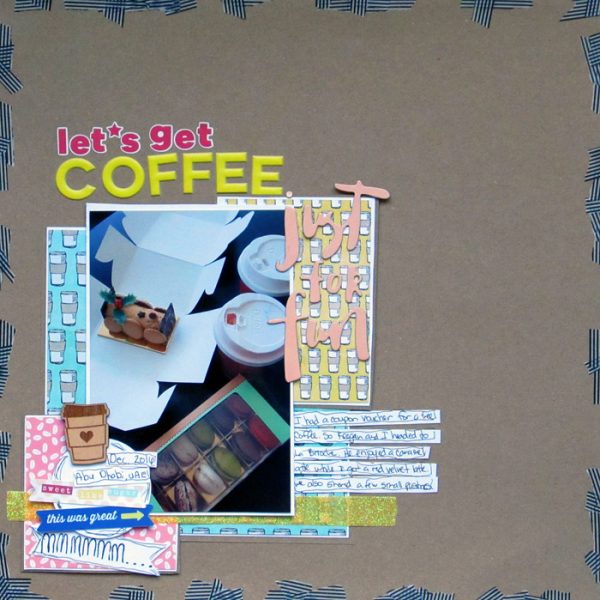
Let’s Get Coffee by Christy Strickler | Supplies: Cardstock: The Paper Studio; Patterned Paper, Wood Veneer, Die Cuts: Cocoa Daisy; Chipboard: Dear Lizzy for American Crafts; Letters: PinkFresgStudio, Evalicious; Other: tape
Jana Oliveira says, “We went to visit my husband in Seattle, and soon we are going to join him there. As we explore the city I love to take pictures of my husband and son from the back as they are walking. I think it’s reflective and signifies their bond and friendship: they are partners, and my son loves his daddy’s company.”
“Behind the photo, on the large open area of the canvas, I added a copy of the same picture but just with an outline effect using an app called iColorama. It is a reflection of the main image. This is a method I use over and over again in my pages, it brings unity when I look at the pages I think make the reader to think about things that were going on when you give a second angle from the picture and makes a nice interaction with the main picture.”
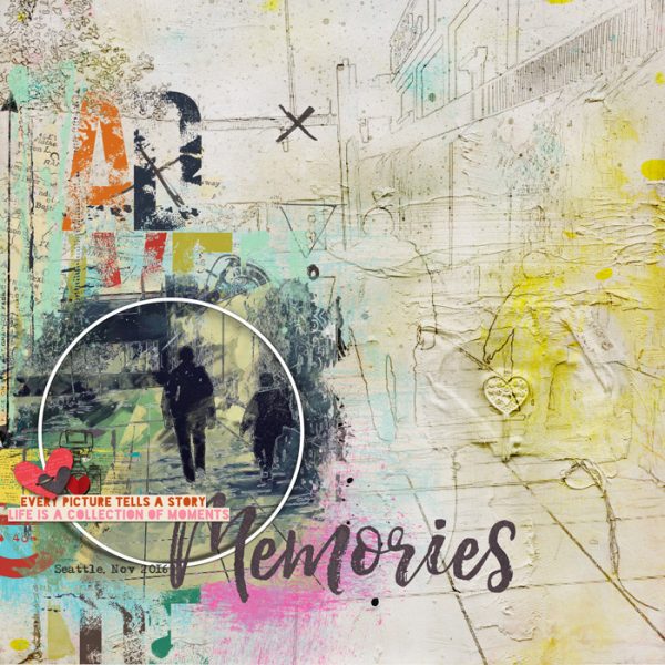
Adventures and Memories by Jana Oliveira | Supplies: NBK Design: She Collection art frame, Art & Journal Brushtool; Studio Basic: just the way your are, little moments big memories, destinations vl7 .
Sian Fair says, “This page is about a collection of souvenir shops and cafes we discovered in Berlin.”
“I started this page by creating two distinct areas: the title spot and the photo spot. Then I used the space in between to draw the eye from one to the other and round the page by adding trailing clusters which shape the white space whilst still leaving the canvas looking uncluttered (I hope!). As the page is about finding relief from the bustling city in a friendly cafe, I liked the idea of my page combining space to breathe with the energy of the trailing plants, just like the ones in the photo.”
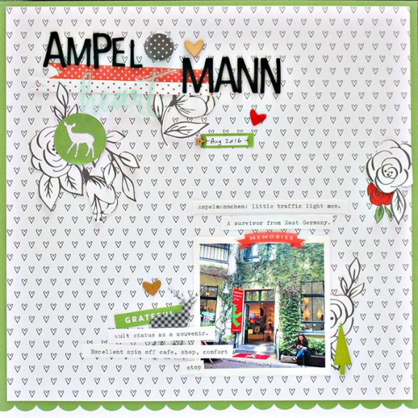
Ampelmann by Sian Fair | Supplies: Patterned Paper, Alphas, wood veneer from a kit by Felicity Jane. Wooden tree: Fancy Pants Designs
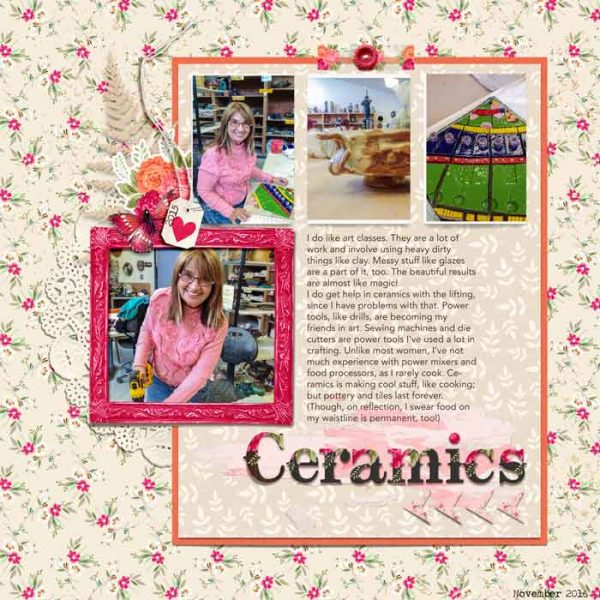
Karen Poirier-Brode says, “My page is about a class in ceramics and how much I like it.”
“I decided on incorporating asymmetrical white space into my background–though that background isn’t necessarily white: rather it’s a patterned paper. I broke the left edge of my white space with my main photo and embellishment cluster to draw attention to the picture of me with the drill in the ceramics lab. I also broke into the white space on top with my small embellishment cluster of washi tape and button. This position gives that group more emphasis, as does its distance from the photo cluster and the title, and this helps balance the page.”

