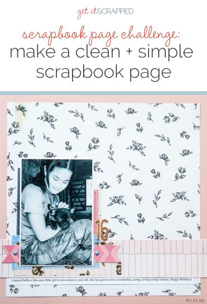
 Clean and simple designs endure and are light on your stash. Our team made their own clean and simple pages here. They used these three guides (or limits) to keeping it simple:
- Keep the focus on the photo(s),
- Incorporate plenty of whitespace, and
- Use embellishments sparingly and purposefully.
Read on to see the team’s pages, and download your FREE guide to making your own clean and simple page, by clicking on the image below.
CLICK ON THE IMAGE BELOW TO SIGN UP FOR OUR EMAIL LIST AND GET YOUR FREE PAGE GUIDE
Kristy T. says, “This page documents the changing relationship between my sons as they grow older and the happiness it brings.”
“Although my style can vary, I frequently use a clean and simple style at the moment, generally with mixed-media touches.”
“By keeping things simple and clean, a page comes together quickly. I always like my photographs to take center stage, and this style makes that easy to do. I also love using white backgrounds. Using only a few embellishments reduces the decisions I need to make too and the time spent looking through my stash!”
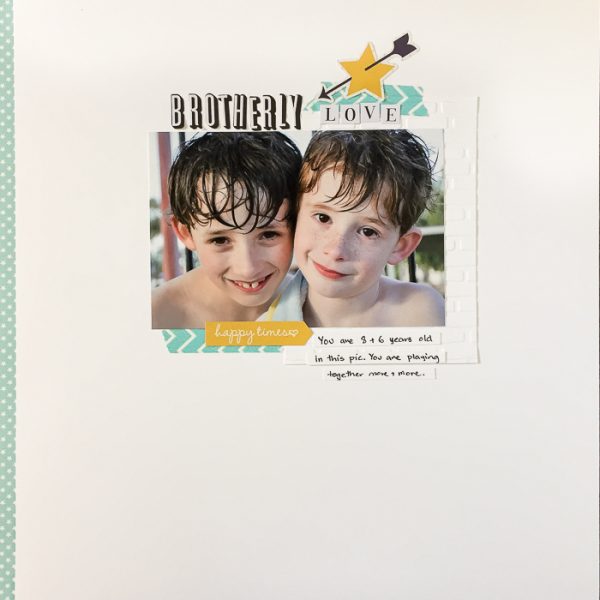
Brotherly Love by Kristy T| Supplies: Card – Artee; Alpha – Teresa Collins; Stickers – Simple Stories; Embossing Folder – Kaisercraft; Washi Tape: Teresa Collins.
Karen Poirier-Brode says, “This page is about a visit to Emerald City Trapeze Arts in Seattle with my friend Cathy. She’d been thinking about trapeze and pole dancing classes there, so we paid a visit. The clean and simple style is different from my usual approach to scrapbooking because I tend to use a lot of patterned paper, and I like sprinkles, splatter, and inked edges.”
“Here the patterned paper is confined to narrow border strips on the top and bottom of the page. I like a lot of embellishments, and here I used two buttons, one small piece of washi tape, two rows of stitching and a metal feather. Cartoon art for one photo a piece of word art for the title complete the decorative elements on the page. I used a piece of vellum for the journaling to make it more readable. I liked this challenge because it forced me to think very carefully about just what I’d use on the page and where I’d place it. I’ll use this approach again when I want a contemporary feel to my next page.”
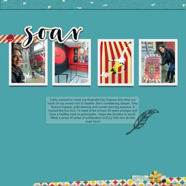
Soar by Karen Poirier-Brode | Supplies: cartoon image – Shutterstock Image ID:457393717, Copyright: Kazakova Maryia; washi tape – kwiniecki, eclectic ; buttons – DDE, Playful; stitching – treed, hello stitches ; Patterned paper – DDE, Playful; word art – blogovesta gosheva, free2beme; feather – feather6 by Stella; flower – TDD, Happy&Fresh
Devra Hunt says, “My son’s best buddy came to visit shortly after we moved away. We kept them busy by touring our new city. It was heartwarming to see them pick up their friendship where they left off.”
“I don’t often use a clean and simple approach when I scrapbook. I found it easier and speedier to design and select product with this appraoch. What I found difficult was leaving the page alone. I wanted to add more embellishments. Many of my designs are simple, but generally, I like to add more product to my pages. I can see myself trying this again, especially if I don’t have a lot of time to create.”
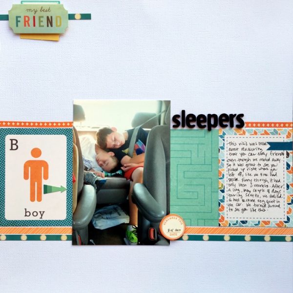
Sleepers by Devra Hunt | Supplies: Cardstock and Alpha-American Crafts, patterned paper-Echo Park, washi tape-Simple Stories, American Crafts, die cuts-October Afternoon, Stickers-Cosmo Cricket, pen-Micron, adhesive-EK Success, Recollections
Deborah Wagner says, “This is an ultrasound photo of my granddaughter. I used smartphone apps to add artistic filters, and enhance the photo with colorful lighting effects, and bokeh hearts.”
“Although I usually use a few more embellishments than are on this page, I enjoy creating photo-centered pages as I’ve done here. The clean and simple approach is great when you have a photo that needs very little showcasing, and is dramatic enough to take center stage.”
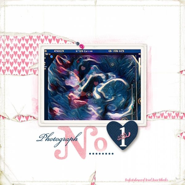
Photograph No. 1 by Deborah Wagner | Suppplies: Lynn Grieveson – Life in Pictures Album, Elise Alpha, Totally Trashed-Love Paper; Kim Jenson – Stapled Sequins 2; PicsArt & Prisma smartphone apps
Terry Billman says, “This layout captures the innocence and beauty of five-day-old Kelsey. Anna Aspnes’ Art Play kits are perfect for creating a simple, clean, artsy layout without much effort or skill. You can simply blend a photo, then add a couple of embellishments and word art, and the layout is complete.”
“The paper here provides a soft artsy background for the blended photo. Minimal embellishing provides movement and direction through the layout. The circular white stroke frames and accentuates Kelsey’s tiny features. I often use the clean and simple design when showcasing one photograph. I like the white space created with a clean simple design accentuating the photograph.”
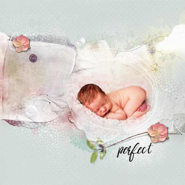
Perfect by Terry Billman | Supplies: Anna Aspnes: Art Play Mini Palette 4 You, Fotoglow Mix 2, Fabulous Word Art Mix 1,Different Strokes 5
Kelly Sroka says, “My daughter recently turned 16, and I wanted to document this milestone in a clean and simple style that reflects her personality.”
“I have always tended to scrapbook in a clean and simple style, so making this page was a joy. I began with a photograph of my daughter with a friend’s dog–a picture that reflects her love of animals. I converted the picture to black and white to put focus on her face instead of the distractions in the background. I used simple patterned papers in soft colors to allow the photograph to stand out. Most of the embellishments are flat and tucked behind the picture. I did use two enamel dots, however, to give a little dimension to the page and ground the photo cluster. As a finishing touch, I used gold letter stickers for the title–just a little flair for the page. I love how the page turned out and will definitely continue using the clean and simple style!”
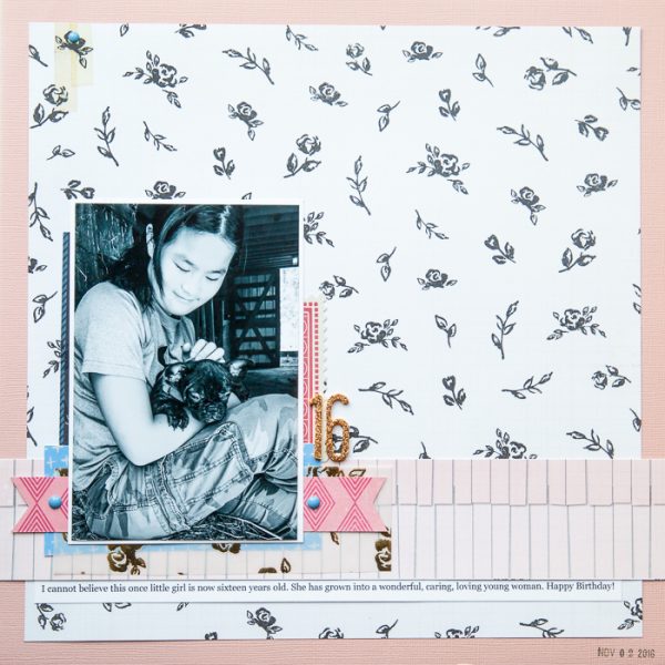
16 by Kelly Sroka | Supplies: Cardstock: Bazzill; Patterned Paper: Citrus Twist Kits and Crate Paper; Die Cuts and Enamel Dots: Basic Grey; Letter Stickers: American Crafts; Vellum: Citrus Twist Kits
Megan Blethen says, “We were visiting my husband’s parents for a few days, and one afternoon the kids were bored so my father-in-law put on funny dog YouTube videos.”
“The clean and simple approach to scrapbooking isn’t too far from my normal style. I love the look I got with this challenge. When I first sat down to make this layout I had a lot of ideas in my head of what to do. I finally decided to go with a really simple grid because of how big my photos are. The journaling posed a problem, but because the layout was a square I was able to write all the way around it–and I love how that turned out. I will definitely be using this clean and simple style in my scrapbooking again.”
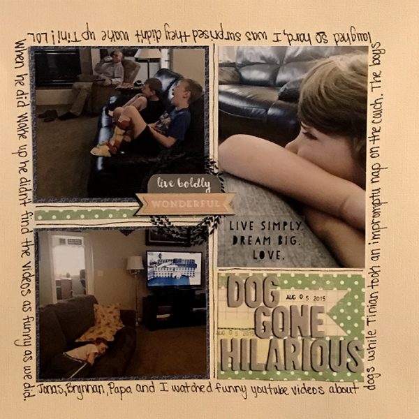
Dog Gone Hilarious by Megan Blethen | Supplies: Patterned Papers; Studio Calico Green Acres, Studio Calico Blue Triangles (real name unknown), Bazzil off white textured cardstock; Embellishments; Studio Calico wood veneer, Clique Kits ephemera, Amy Tangerine Thickers “Match”, Becky Higgins Project Life Rotary Date Stamp, Staz On Jet Black Ink, EK tools .65 mm Journaling Pen

