One way to make color or pattern mixing work is to use proportions in gallon, quart, pint amounts.
Here’s how it works:
- Choose a dominant color or pattern. This is your “gallon.” It will cover 70% of your layout. You can use different tints and shades of this color if you like.
- Choose a secondary color or pattern. This is your “quart.” It will cover 20% of your layout.
- Choose a third color or pattern. This is your “pint.” It will be used on about 10% of your layout.
We cover color and techniques like these extensively in the Get It Scrapped Membership, with two Masterful Scrapbook Design classes devoted to color and a section of the Playful Scrapbooker Learn Track also sharing great color design approaches. Pattern is also covered in multiple ebooks and video lessons.
[hr]
Marcia Fortunato says, “When looking for a lake house two years ago, one of my main requirements was that it have space for our growing family to gather comfortably. This scrapbook page is about how thankful I am that we found just such a home.”
I had this paper by Jen Hadfield which had a subtle dictionary print in the background, which basically acts as a solid cream, and fall leaves printed on the paper. The same brownish fall colors were also common in my photos, so this set up my “gallon” of cream and “quart” of similar browns/oranges/yellows. When choosing embellishments, I kept them in those same brown tones. I then chose a pint of black as my accent color, since I knew it would show up well but not dominate in a small amount.”
“The use of a limited color scheme made it easy to keep the focus right where I wanted it: on the photos and story. Although I wasn’t consciously aware of it, in looking back through my scrapbook layouts, this is an approach I often use. Having a hierarchy of color brings order to a layout that could otherwise become chaotic.”
“One tip for using this approach is to take your cues from your patterned paper, as I did here. Two of the color choices were made for me, and that left only the accent color to choose. Also keep in mind that what catches the viewer’s eye is often not the most plentiful or gallon color, but rather the accent colors that are used more sparingly: these quart and pint colors can be used strategically to bring focus to the most important parts of your page.”
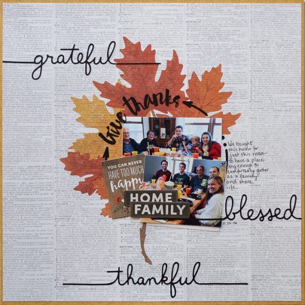
Give Thanks by Marcia Fortunato | Supplies: Patterned Paper: Jen Hadfield, Pebbles; Cardstock: Neenah; Word die cuts: Silhouette Design Store; Embellishments: Jen Hadfield; Pen: Precision Pen (American Crafts).
Karen Poirier-Brode says, “This page is about how much I enjoyed a recent professional meeting and the amazing women who are my friends.”
“For this page, I used triad color scheme of yellow-orange, blue-green and red-violet. I adore patterned paper and lots of embellishments–so keeping to just three colors and mixing them in gallon-quart-pint proportions helped me make choices. Here yellow-orange is my gallon, blue is my quart, and the red-violet is my pint.”
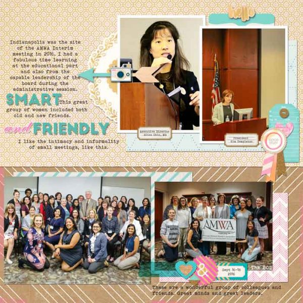
Smart and Friendly by Karen Poirier-Brode | Supplies: Kit – American Crafts, Crate Paper, Craftmarket; Template – Get It Scrapped, Scrapbook Coach 20, Titles & Foundations / Layout 3; Fonts – Bohemian Typewriter, Magesta Script, Big John
Christy Strickler says, “My cat’s personality was pretty defined at the age of four, and I documented it here.”
“I regularly mix colors and patterns in gallon-quart-pint proportions when I scrapbook. It’s especially helpful when you are short on time, as it can direct and speed your choices.”
“I don’t have a set size in mind when I use the formula. Rather, I know one piece of paper will be the largest section( the gallon) one will be medium sized ( the quart) and one will be small (the pint). I find the formula works well with strips of paper, and I let the patterns determine the size of each strip. On this page, the heart pattern felt like it needed a larger representation on the layout with the 2 other prints taking smaller supporting roles.”
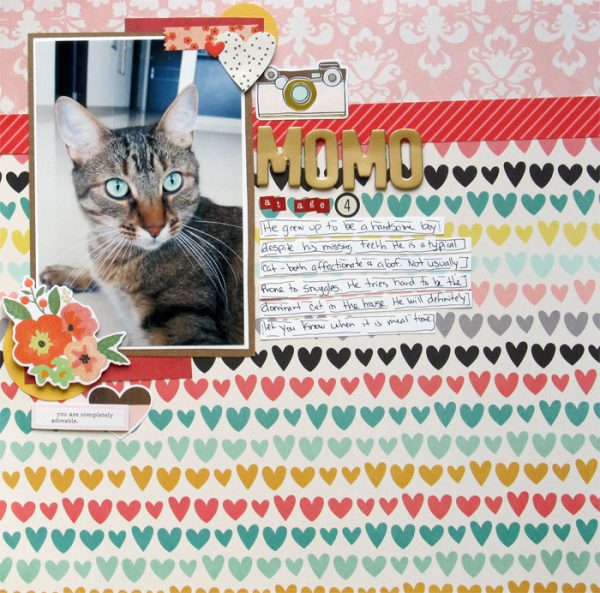
Momo At Age 4 by Christy Strickler |Supplies Patterned Paper,Stickers, Die Cuts: Simple Stories; Letters: Kaisercraft, American Crafts
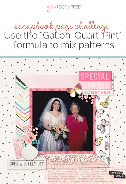
Kelly Prang says, “This page is about my grandmother and all the things I learned from her, as well as how happy I was that she was able to come to my wedding. (My other grandparents did not come to my wedding, as it was too far away for them to drive).”
“I used a gallon of off-white, a quart of peachy-pink and a pint of hot pink for this page–taking the colors from my photos. I picked the off-white from my dress, the peachy-pink from my flowers, and the hot-pink from my grandma’s dress.”
“Because I wanted to page to appear pretty and serene, I used larger amounts of the lighter and calmer colors with the hot pink taking the smallest amount of space. In contrast, if I were making a page about my teenage children, I would probably use the largest amount of the brightest/more saturated photo to go with their personalities right now.”
“I don’t think I’ve ever purposefully used the “gallon, quart, pint” formula while scrapbooking, but I love the results and intend to try it again soon!”
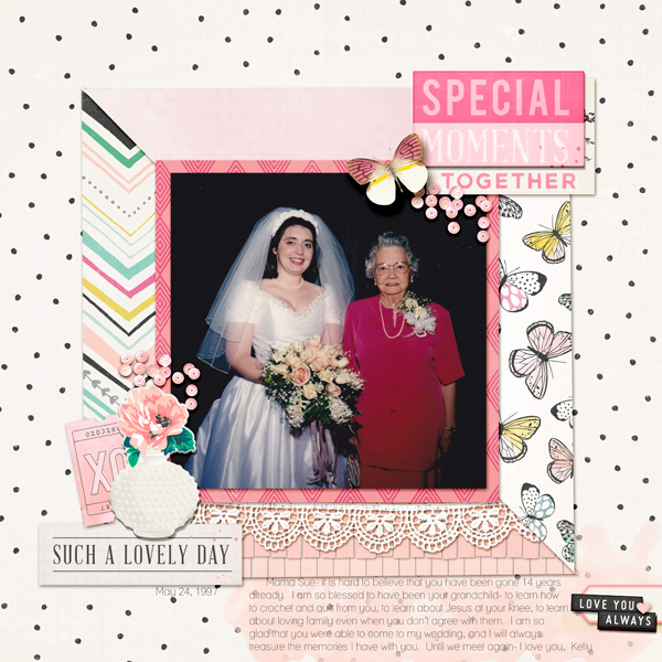
Special Moments Together by Kelly Prang | Supplies: Sketch-Jen Schow/Tracie Claiborne’s Ready Sketch Go vol 3; American Craft Digitals- Maggie Holmes- Bloom- papers and elements; Just Jaimee- Barely There Watercolor Brushes (behind the journaling); Lauren Grier- I Fall For You- Butterfly; Tracie Martin- The Daily Digi Collab- sequins; CD Muckoski- lace trim; Font- Lane
Jana Oliveira says, “From time to time I make layouts for my son to keep reaffirming to him that, despite having special needs, he is awesom and it’s ok to accept who we are and we definitely accept who he is. I always like to make such a page colorful and happy.”
“I used the gallon-quart-pint formula to mix patterned paper here–but, since I’m not a traditional scrapbooker, the way I incorporate the papers is with paints and brushes – to get the look of brushed pattern paper. I used the bigger pattern in the background and brushed smaller chunks of pattern paper in other places of the layout.”
“I like how colorful this approach ended up being, and I think it made me feel more comfortable about using patterned paper. I will use it again for sure!”
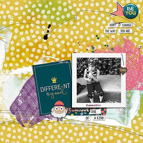
Different Is Good by Jana Oliveira | Supplies: NBK Design: She collection template 20, happy life collection art masks ; Blagovesta Gosheva: Different is good.
Nicole Mackin says, “This is a story about how we were hosting our end-of-year Bible Study Couples Barbecue, and I enlisted the girls to help with the cleaning.”
“Because there were not very many colors in the photo, I could do whatever I wanted to color-wise and my products drove those choices. Looking through my stash, I came cross saw the ‘Sunday Funday’ sticker by Dear Lizzy (American Crafts), and that led me to her collection. I loved the ‘&’ paper because of the girls working together, and I liked the heart paper as well since one of the girls was wearing rain boots and the other pajamas.”
I chose my gallon (peach), quart (navy blue) and pint (aqua) colors by looking at the designs. The navy paper was a busier design, so I chose to use that as my quart: to me it relayed movement which fits the story, but it was too busy to use as the gallon. The ‘&’ paper was perfect as the gallon because the design was larger and not as busy. I just wanted a hint of the aqua: it was in the heart paper, so I wanted some on the page and so chose that as the pint color.”
“I think I often use this approach without realizing it. It is a great way to balance out color and design. My suggestion is to use a multicolor pattern paper as your guide. I used the heart paper to help me choose 3 colors I wanted to have in the layout and then I chose the gallon, quart, pint from there. That way it coordinates and looks cohesive.”
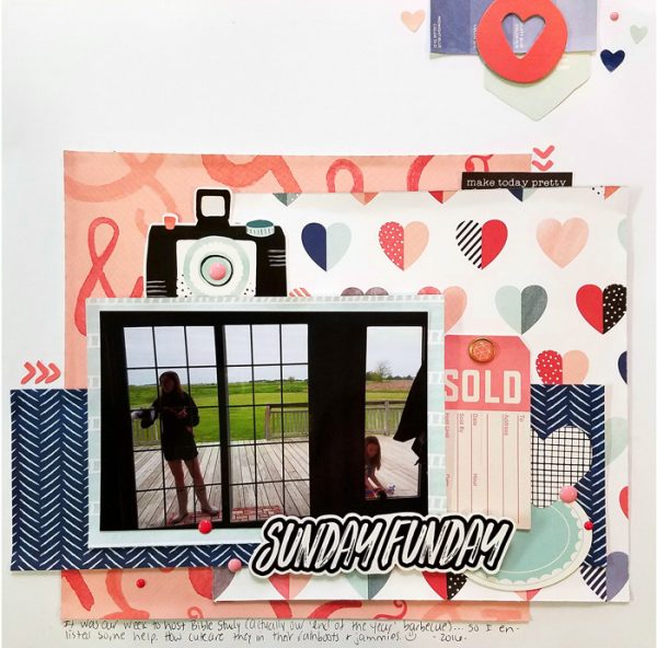
Sunday Funday by Nicole Mackin | Supplies: Cardstock: The Paper Studio; Patterned Papers: American Crafts (Dear Lizzy); Ephemera: American Crafts (Dear Lizzy); Stickers: American Crafts (Dear Lizzy); Label Sticker: Luxe Designs; Brad; My Minds Eye; Enamel Dots: My Minds Eye.
Debbie Hodge says, “This is a story about my sons disappearing on Cadillac Mountain soon after the start of our vacation. They did show back up, but not without worrying me some. For them, it was a good ‘brother’ adventure.”
“Be sure to look to your photos for your color choices and proportional color mixing. With four photos on this page and so much green and blue in those photos, the green became my gallon color and the blue my quart. I added a color not in the photos–orange–as my pint color. While it’s used in smaller amounts, it makes a great accent, catching the eye and moving it through the page.”
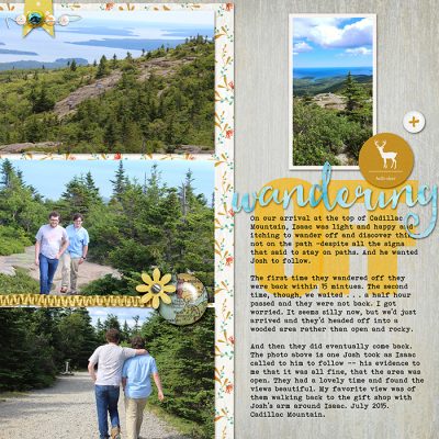
Wandering Off by Debbie Hodge | Supplies: Adrift by Basic Grey; Heart and Soul font; Paintshop actions by Just Jaimee; Hemp Ribbon by Katie Pertiet; Across the Miles by Amber Labau; Banners by Amy Martin; Drift Away by Sahlin Studio; Stapled Sequins by Kim Jensen; Tissue Alphas by Anna Aspnes

