
 Getting more photos onto your layouts is a challenge we frequently hear our readers face–and one we tackled in a recent video lesson at the Get It Scrapped membership (Skillful Storytelling-Picture Your Story #3).
For our readers hear, we present the creative team’s work with the ideas in that lesson: 6 design solutions for this challenge.
[hr]
use a grid
Summer Fullerton says, “Instagram is one of my current favorite layouts. I raided my daughter’s Instagram account and took a bunch of her self-portraits to create this project. I love seeing how she sees herself through her camera lens. I wanted this layout to be playful and fun just like the photos I was featuring.”
“To create the page, I started off with a 2 by 2 grid of squares. My grid holds a random mix of photos and stamped embellished squares. This grid design takes up approximately two-thirds of the layout while the title journaling block area fills the remaining third. Square Instagram photos are perfect for working with a traditional square grid design. These photos can be printed off in just about any desired size. The quality of my daughter’s photos were not the best so keeping the size smaller helps them not look as bad.”
A tip from Summer: “I often recommend that when your photos are not the best you turn them black and white and reduce the size. This can hide flaws. I wanted to keep the Instagram filters in place so I chose to leave the color of my photos as is.”

Instagram by Summer Fullerton | Supplies: Cardstock Bazzill, Pat- terned Paper Pebbles, Alphas Jillibean Soup, Buttons Fancy Pants; Washi tape Bella Blvd, Enamel Dots My Minds Eye, Decorative brad; Making Memories, Die Cut Pebbles, Tim Holtz Tiny Attacher, Silhou- ette Cutting System and Image, Digital Die Cuts Technique Tuesday,Clear Stamps Technique Tuesday, Ink Black VersaFine/VersMagic, misc twine and font Veteran Typewriter downloaded from the internet
use a casual blocked design
Debbie Hodge says, “These pics are from a visit to Texas with my son and mom. GIS Creative Team member Ronnie Crowley spent a day in in Waco with us and helped Josh pick out his new cowboy boots.”
“To get five photos onto the page, I started with a grid of four small photos and then blocked things out around that grid: journaling got a block, title got a block, a focal point photo filled another block and then patterned papers fill in the rest of the spaces.”
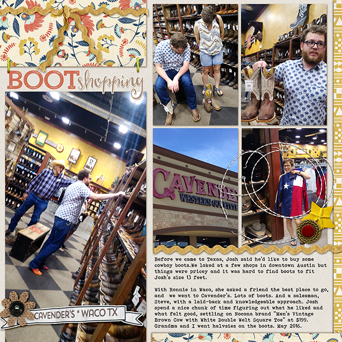
Boot Shopping by Debbie Hodge | Supplies: Kraft Essentials by Karla Dudley; Happy Campers by Celeste Knight; Stitched by Anna Circle Loop da Loops by Anna Aspnes; Walt’s Frontier Park by Scotty Girl; Stringbats 10 by Kim Jensen; Trend Rough Slab, Heart and Soul fonts
Kelly Prang says, “My daughter asked me to take some photos of her with our new puppy, Toby, to record how big he is getting. I got so many cute shots and I just couldn’t pick one or two, so I decided to use a page with LOTS of photos to show off our cute little Tobe-ster. Puppies grow so quickly that I know he will be much bigger before we know it!”
“I decided to try a casual blocked layout to fit all of these pictures on the page. I chose to hand-trim my photos (since I am a digital scrapbooker, I actually used hand-cut masks to clip my photos) and tried to continue with a whimsical design.”
A tip from Kelly: “Crop down to the important parts of your photos, use square images, start in the center then space photos out from the first one. I attempted to use a similar gutter/space between the photos, which was a bit difficult to keep even since I used the hand-cut photo masks.”

Happy by Kelly Prang | Supplies: Font-Prestige Elite Std; Wishing Well Creations-Everyday Life 2013-Hand Cut Mats’ American Craft Digitals-Crate Paper-Maggie Holmes-Bloom- all papers and elements; Allison Pennington-Well Read- label
reduce photo sizes
Amy Kingsford says, “This page records a handful of shots I took of my boys in front of a photobooth backdrop we made for a Halloween Party.”
“As an 8.5 “x 11″ scrapbooker I rarely try to get more than three photos on a page, but even then I’ve naturally grown accustomed to reducing the size of my photos to fit my canvas. For this particular page I got so many great shots of my boys goofing off with the different props, that I didn’t want to limit myself to just one or two photos on my page. So I chose six of my favorites, three of each of boy, and I shrunk them down and made my own photo strips to showcase them.”
A tip from Amy: “This option works great when it comes to scrapbooking a lot of photos from your phone or social media, especially when you have several similar shots of a subject.”

Photo Fun by Amy Kingsford | Supplies: Studio Calico: Blue Note Scrapbook Kit, Cuppa Card Kit; Dear Lizzy for America Crafts: Wood Veneer; Amanda Robinson Studio: camera diecut.
crop and group together in clusters
Christy Strickler says, “My husband and I took our son Trick or Treating at Sea World when he was little. I had a lot of photos from that day, many of which were blurry or not a great shot. I took the best of the bunch, printed t 4″x6″ and then cropped them down a bit more.”
“I printed the rest of the photos in a wallet size. The wallet prints come out on 8.5 x 11 inch paper on a grid. I left photos with like orientations attached to each other. This allowed me to group and cluster photos taken in the same areas together.”
“If you look closely, the page is divided into three sections. The upper right is my best photo but it’s in a band with smaller photos showing things we saw walking around the stadium area. The bottom left is trick or treating and the bottom right cluster are photos of the area around the harbor. The clusters are too large to work into distinct design areas on the page so instead I used scrap paper pieces to create a haphazard grid of the entire page. It’s a wonky grid but works.”
A tip from Christy: “I chose to pop up the best photos in an effort to call attention to them as well as to bring visual interest to the page.”

Trick Or Treat around Sea World by Christy Strikler | Supplies Cardstock: Reflections; Patterned Paper: Basic Grey, Crate Paper: Letters: Jillibean Soup: Stickers, Chipboard: Basic Grey; Other: Tape
Jana Oliveira says, “My son all the time asks to play ball because we are trying to teach him to kick–but, in reality, what he really wants is just to wander and lay down in the grass.”
“Using a lot of photos about a particular moment or story helps to make the page more full of details. I could have used one picture and told this story with longer journaling. But having a lot of pictures helps the viewer to really understand and be part of the story. Since I’m not great with multiple picture layouts or layering, I chose to start with a template that helped me to crop my photos in unique shapes and clustered them in a way that made the story more interesting to the viewer.”

No Ball by Jana Oliveira | Supplies: NBK Design: Laugh Often, Art Conversation 5 template; Blagosheva Gosheva: It’s a boy thing; Studio Basic: just the way you are.
feature one photo, crop the rest smaller
Devra Hunt says, “The women in this Book Club started as strangers to me, but ended up becoming my very good friends. This was the last gathering I attended before moving away.”
“The photos were taken on a cell phone in 2010. They are not very good quality, and could only be printed in a small size such as 2×3. I needed to get them onto one page so I could give them some meaning without them getting lost. I had one 4″x6″ photo given to me that I was able to crop and use as a larger focal photo. Now the small photos support the larger one, and have meaning of their own.”
A tip from Devra: “Using so many photos on a page can create a busy page with no focus. Printing the small photos all the same size gave them and the page some unity.”

Book Club by Devra Hunt | Supplies: Patterned Paper, Stickers, Die cuts, flair and alpha-Fancy Pants, pen-Micron, Adhesice-Recollections, EK Success
extend your canvas across two-pages
Marcia Fortunato says, “I recently went on a hike through St. Croix State Park to take photos of the beautiful fall colors. This layout showcases some of my favorite photos from the day. I took over 200 pictures that day, and I always have trouble choosing only a few favorites. Besides that, I wanted to include a lot of photos to give the feeling I had of a sort of sensory overload with all of the incredible beauty surrounding me!”
“A two-page layout allows double the space to fill with photos, so that was where I began. I also combined this with some of the other approaches. Some of my photos needed to be larger to maintain their impact. Others were detail photos that could be smaller. By arranging them in a loose grid and then being careful how they lined up across the page, I was able to include a variety of sizes while maintaining order.”
A tip from Marcia: “One tip that I have when deciding on photo arrangement is to consider leading lines within the photos – such as structural lines or horizon lines – and if possible try to align them in adjacent photos. This helps the viewer’s eye to flow smoothly through the many photos on the layout.”

Autumn In St. Croix State Park by Marcia Fortunato | Supplies: Patterned Paper: Shimelle (American Crafts), Echo Park; Cardstock: Neenah; Letters: Thickers (American Crafts); Embellishments: Shimelle, Echo Park, American Crafts; Stamps: Ali Edwards; Ink: Hero Arts.
Terry Billman says, “I found the Biltmore Gardens absolutely breathtaking. My husband and I strolled through the gardens at our own pace and hiked acres of perfectly manicured formal and informal gardens.”
“The double page spread allowed me to showcase several close up detailed photos, which relate to the larger photos in the background. I chose extending the photo of the Biltmore Estate (background) and blending a photo of the gardens (foreground) across two pages to portray the beauty and magnitude of elegance and charm of the 250 room mansion and breathtaking beauty of the gardens. A variety of closely cropped flowers were featured in the photos strips on the right. The larger framed photos layered over the canvas showcase the beautiful water gardens. I find blending photos across the two page canvas sets the scene for the layout and the smaller photos provide details.”

Biltmore Gardens by Terry Billman | Supplies: Anna Aspnes: Art Play Palette Airy, Art Play Palette Tangier, Light Leaks 3, Cool Glows 1, Artsy Layered Template 163, Different Strokes 8
