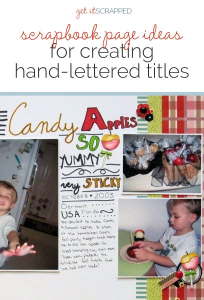
 Hand lettering is currently a trendy aspect of decor, stationary and graphic design.
Hand lettering is also a natural fit with scrapbook page titles. Our creative team shows you how they’re using hand lettering on their projects.
[hr]
Marie-Pierre Capistran says, “This page is about the the first time I saw my daughter dance with a boy. She was in kindergarten, and the teacher had taught them how to dance like this. When I arrived in the class and saw that, my heart literally melted and I almost cried.”
“I wanted this layout to be soft and to feel very personal as the story so touched my heart. I also wanted it to be elegant, to feel as if it were almost from another era since the children were dancing in such a grown up and old fashioned way.”
“To write my title, I used a plume and black India ink. I wanted it to feel really authentic. I added a feather die cut at the beginning of the pen mark–as if I had written the title with a feather.”
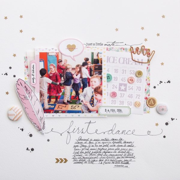
First Dance by Marie-Pierre Capistran | Supplies: Cardstock: Bazzill; Paper: Pretty Little Studio; Die cuts: Pretty Little Studio; Bingo card: Pretty Little Studio; Flair buttons: Pretty Little Studio; Brads: American Crafts; Paperclip and buttons from my stash.
Kristy T says, “This page shows the traditions we have developed each year when we go to the Royal Show, including games, rides, shows and ‘Following the Yellow Brick Road’ which involves stopping at fun activities all around the showground.”
“I wanted to create a title that was both bold and that wrapped around my photos, creating movement around the page to reflect our movement as we walk around the showgrounds. To create my hand-lettered title I used a Bo Bunny pearl paint pen and wrote directly onto the card, making sure to try to keep an even pressure on the pen so the paint came out at a steady rate. This was a quick way to create a title with great impact by using the black background. You can also do this using stickles or other glitter glue as long as it contrasts with your background paper.”
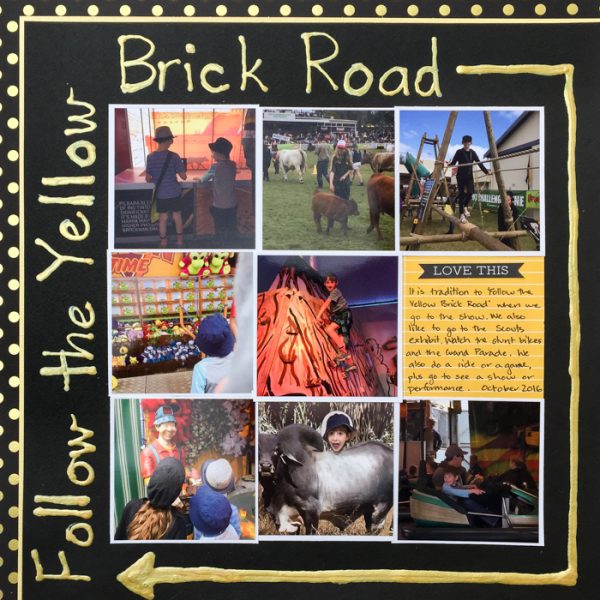
Follow the Yellow Brick Road by Kristy T | Supplies: Cardstock: Bazzill; Patterned Paper: Echo Park; Journalling card: Kaisercraft; Collectable: Kaisercraft; Pearl Paint pen: Bo Bunny.
Deborah Wagner says, “This page is for my friend’s son who is graduating next year. I was inspired by a paper layout in a magazine from years ago. Unfortunately, I cannot remember the artist, or the magazine; but the eye-catching hand-lettering stuck with me. Because mixing fonts can be problematic, choosing a dual font can make digital hand-lettering effortless. The font used on my page, Callpedia, has a script and a sans serif typeface. Doodles, and dingbats were paired with the font to add a little whimsy and humor to my page.
To make text look as if it was written on the wood–and not floating above it–I used techniuqes from a tutorial on advanced blending from PhotoshopEssentials.com.
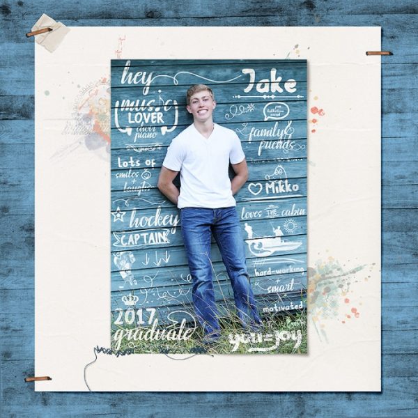
Hey Jake by Deborah Wagner|Supplies: Kim Brodelet – Charming, Standing Tall, Just Cruising, Simple Pleasures, Girls Time Out, A Little Quirky; Anna Aspnes – Art Play Palette Sports; Art Warehouse – Fishing Brushes, Water Sports Brushes; Fonts – Callpedia; Doodles and Dingbats – Amethyst, Angely Extras, Charms BV, Pea Jelene’s Doodles, Pea Betsey’s Doodles, Pea Deliah’s Doodles
Christy Strickler says, “The page records when we made homemade candy apples for my son’s preschool party.”
“I designed a handmade title with inspiration from hand-lettered menu and recipe signs. I pulled colors from the patterned papers to use in the title. I mixed hand-drawn block letters with my own print and script, making separate blocks within the lettering to add details like the date and place.”
“I also wanted a hand-drawn element on the page, so I drew the candy apples, colored them with alcohol ink markers and fussy-cut them. Since our apples and party treats were all homemade, a hand-lettered title and die cuts supported the story of the page well.”
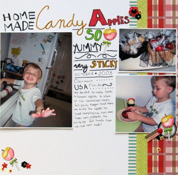
Homemade Candy Apples by Christy Strickler |Supplies Cardstock: Bazzill; Patterned Paper: Shimelle; Label: Ali Edwards; Markers: Chameleon, ArtStix; Other: sequins, enamel dots
Marcia Fortunato says, “I love fall, and I love taking pictures of the changing leaves–so much so that I have way too many photos of fall leaves! It’s hard to stop myself, and this layout is about my desire to take just one more fall foliage photo.”
“I wanted a bold script title for my layout, and although I could have found one on my computer and cut it out with my Silhouette cutter, sometimes it’s easier to just write it by hand. I also like having my handwriting on my pages. When I’m writing something by hand, I always practice first on scrap paper before trying it on the paper I plan to use. Here, the practice showed me that the medium-sized paint brush I first tried didn’t give as good results as a regular Sharpie marker with broadened downstrokes. The Sharpie marker gave me more control over my work.”
“To keep the layout cohesive, I also used cursive writing for my journaling and kept any other fonts on the page very simple so that they didn’t compete with the title. Since my title is flat, I also kept all of my other embellishments quite flat.”
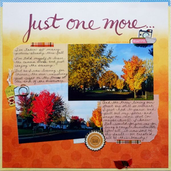
Just One More by Marcia Fortunato | Supplies: Patterned Papers: Just Jaimee for Cocoa Daisy, Life.Love.Paper for Studio Calico; Pens/markers: Sharpie, Precision Pen (American Crafts); Vellum: The Paper Studio; Embellishments: Crate Paper, Fancy Pants Designs, Shimelle (American Crafts), Simple Stories, Prima; Washi: Echo Park; Twine: Target; Stamps: Ali Edwards; Ink: Hero Arts.
Debbie Hodge says, “We don’t live near our relatives, and only a very few have ever come to our home. This page records a visit from a favorite cousin and her family this summer. I only got a couple of candid group shots, but they are great reminders of their time here.”
“While I make digital scrapbook pages, I still like getting handcrafted looks, and hand-lettered alphabets are a great way to add such touches with my titling. This alpha (Pronuncial by Just Jaimee) is a digital brush that comes in two parts: the outline and the scribbled fill. This means I added each letter’s outline and then each letter’s fill (which is in light blue). Though it wouldn’t be tough to line things up and space them out regularly, I prefer to jiggle them off their baseline and space casually with some overlaps.”
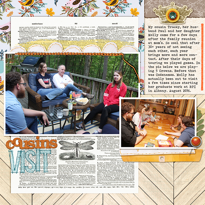
Cousins Visit by Debbie Hodge | These are the Days by Kaye Winiecki; Basic Paper ALpha Orange, King Me, Digitally Pressed 2 by Katie Pertiet; Embroider me, One of A Kind by Pink Reptile Designs; Dictionary Papers, Just Delicate by Lynn Grieveson; Pronuncial Alpha by Just Jaime; Trellis by Sara Gleason; Spring 2 by Forever Joy; Basic Labels by Paula Kesselring; Craft Market by Crate Paper; Bohemian Typewriter font

