A “question-and-answer” format is a quick and wonderfully character-revealing way to tell a scrapbook page story. Our creative team shows you their approach to designing with “Q&A” journaling on these pages.
[hr]
Kristy T says, “In Australia, we recently celebrated Father’s Day and the kids often bring home colorings and questionnaires they completed at school. I took some inspiration from the questionnaire from pre-primary and added my own to create a layout that captures my husband in his role as a Dad.”
“I stitched a loose grid for the foundation and included their answers shown in their favorite colors, plus added my thoughts about my husband and all asked him about his own thoughts about being a father. By including everyone’s thoughts the page is a great window into what things are like right now. ”
“I added the small alphas and stickers to add color,emphasis and interest to the page and having only one simple photo as the main focal point it is immediately clear what the page is about making it easier for the viewer to take the time to read through the large amount of text.”
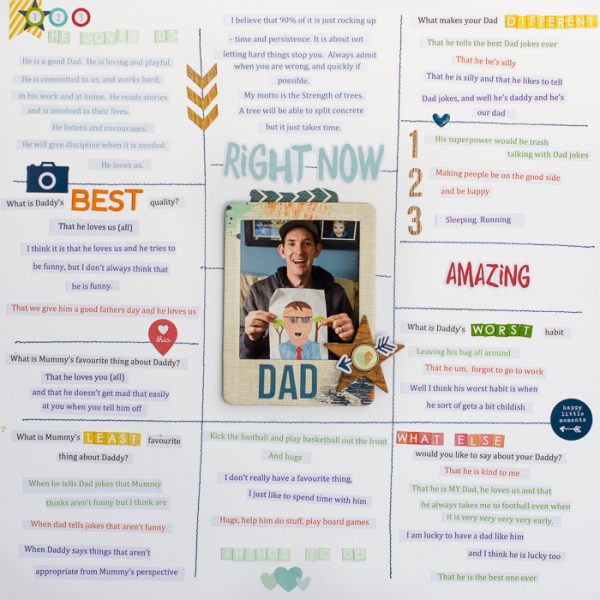
Right Now Dad by Kristy T | Supplies: Card: Artee; Alphas: Simple Stories, Jillybean Soup, Webster’s Pages; Chipboard: Simple Stories, October Afternoon; Stickers: Simple Stories; Brad: Simple Stories; Washi Tape: MME
Stefanie Semple says, “I am addicted to facebook quizzes and love finding out things like what color my soul is. When Sweet Shoppe Designs had a fun Would You Rather quiz I played along, surprising myself with the emotion behind my answers. I love giving cheeky answers and allowing my quirkiness to show through.”
“I used a bold black (arial) font for the questions and then contrasted that with a DJB font (Pinky swear) in pretty pink for my answers. I love handwritten fonts for their handmade nature.”
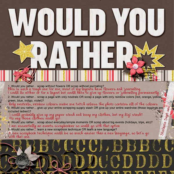
Would You Rather by Stefanie Semple. Amanda Yi Designs and Two Tiny Turtles : #be positive: Imperfection is real collection
Megan Blethen says, “We just started a new school year a little over a month ago, and I wanted to document what my boys were excited about and what they weren’t. This “Question-and-Answer” format worked perfectly to tell this story. I asked each one of my boys the same question and typed the question in black ink. Their answers are in red ink. I didn’t like the computer generated bullet points so I used sequins–I love the look of them!”
“I knew when I started the page I was going to use computer journaling because I wanted to text to be uniform for all three journaling sections. My handwriting is horrible and when I write a lot it gets even worse. I don’t often do computer journaling so this was a change from the norm for me.”
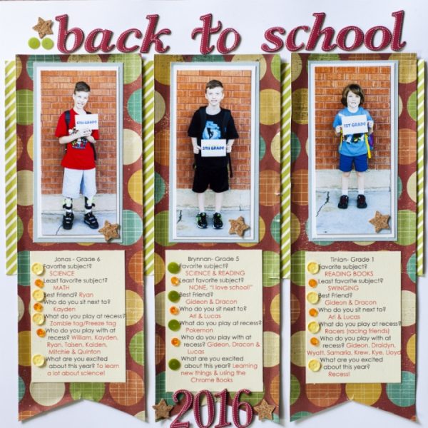
Back to School by Megan Blethen | Supplies: Papers – Close to my Heart White Daisy, We R Memory Keepers Hall Pass collection ‘Notebook Varnish’, Shimelle True Stories ‘Croissant’ and ‘Cappucino’; Embellishments – American Crafts Thickers ‘Marquise’, Spiegelmom Scraps Cork Confetti Stars, Spiegelmom Scraps ‘A Day in the Woods’ Sequin Mix
Devra Hunt says, “Sometimes getting a family dinner conversation started is just plain challenging. One night to get us talking, I started asking questions from a game of Would You Rather…? The questions I asked during dinner that night became the central idea, then focus of the page. It was a natural fit to place my son and husband’s answers into speech bubbles on either side of the questions.
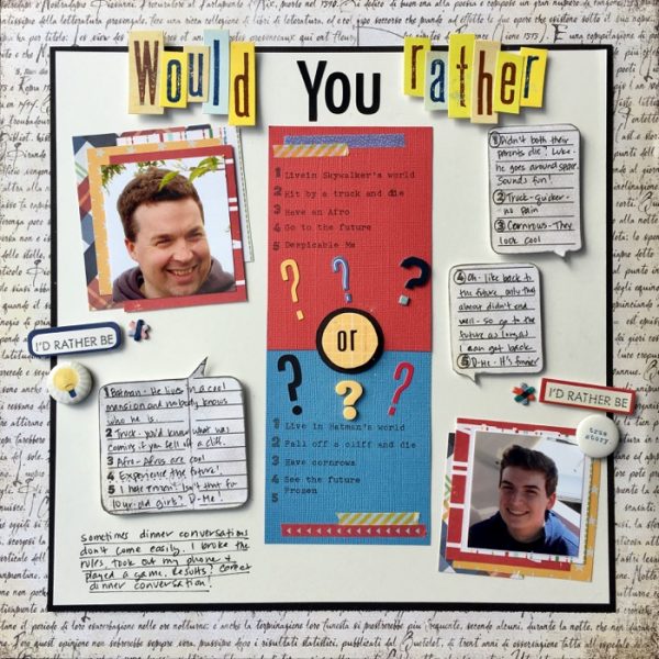
Would You Rather? by Devra Hunt | Supplies: cardstock-Paper Accents, Bazzill, Patterned Paper-Basic Grey, Simple Stories, October Afternoon, stickers-Lilly Bee, Stamps-Freckled Fawn, ink-Colorbox. chipboard-American Crafts, Flair-Shimelle, Alphas-October Afternoon, Doodlebug Design, Jillibean Soup, Lilly Bee, American Crafts, Washi-AmyTangerine, Pen-EK Success, Adhesive-Recollections, EK Success, typewriter-Royal
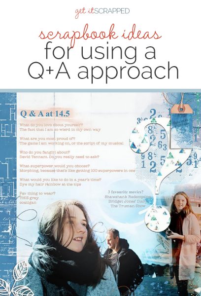
Lynn Grieveson says, “I try to do a “Q-and-A” for Daughter Two halfway through each year, and this challenge was a great reminder that I hadn’t yet done so. I had some photos taken last week so it was the perfect opportunity to use them as well.”
“The photos I had just taken were not of any specific event so this was a great way to use them on a layout in an extra-meaningful way and a fun way to capture more about her at this age, especially as now she is a teenager. She is often out and about on her own or with friends and out of the range of my camera!”
“As the main photo, I wanted to use had a lot of white space above it I could digitally blend it into the background. Because I wanted to use it large on the page, I decided to add my journaling on and around the photo. I did the title first, and as she is 14 and a half, I wrote it as 14.5 which then inspired me to then add lots of numbers to the page as a theme along with the large punctuation. Echoing the circular shapes in the punctuation and the numerical brush, I added the doodled arrow and the circle for extra journaling.”
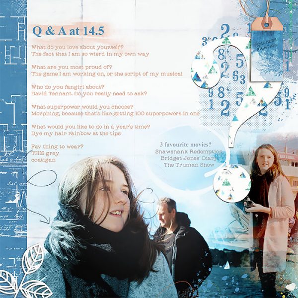
Q & A at 14.5 by Lynn Grieveson | Supplies: Honey I’m Home Kit, Iko Island Kit, Blue Skies Ahead Papers and Numerical Brushes (all mine from The Lilypad); Fonts: Times New Roman Bold and Catalina Typewriter.

