 Fashion, home interiors, and wedding trends all provide great starting places for checking out new and trendy color combinations.
Our Creative Team shares the color combos they’re pulling from those arenas and putting to work on their own pages.
[hr]
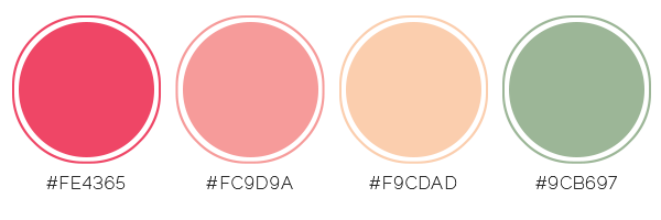
Deborah Wagner says, “This page shows my lovely daughter posing for me on the afternoon of her 8th grade formal. I saw this color palette on designbolts.com, and I loved how the colors complemented my daughter’s dress, and the outdoor setting.”
“After researching trendy color combos, I was surprised to find hundreds of color palettes thought of as the hottest picks for 2016. In the end, I picked the colors that suited the mood and personality of my layout.”
In my opinion, this quote from DesignBolts defines the magic of color perfectly “….it is never a blind game, if we look around, rainbow, butterfly and even sky gives us the implications that this world is full of insignia. In flowers, in orchards in nature what we find is the magic of God who has beautifully drawn this cosmos in all shades whether dark or light.”
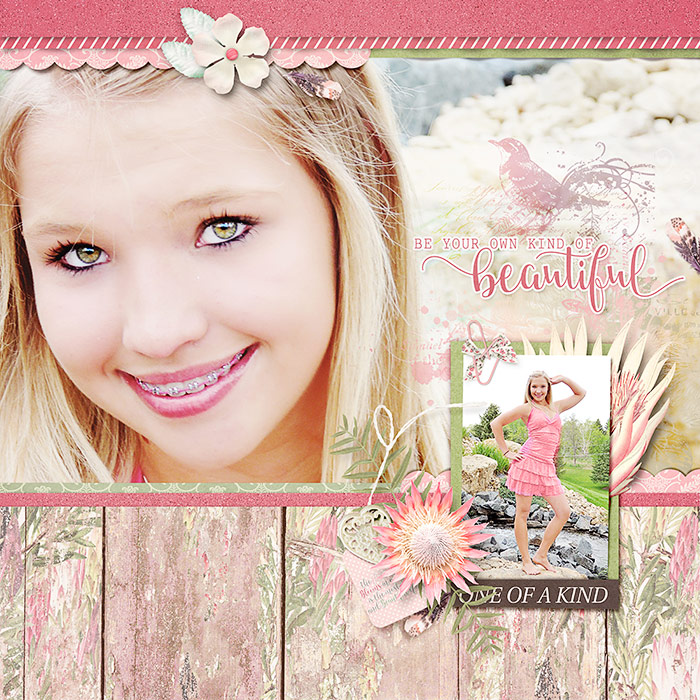
One of A Kind by Deborah Wagner |Supplies: KimB – Bloomin Marvelous, Positively Beautiful, That Old Bunny; Katie Pertiet – Christmas Letterbox Clusters
Shanna Hystad says, ” This page is about a recent family vacation to the Big Island of Hawaii. It highlights the kids and young adults in our family and the special time we had together.”
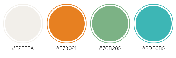
“The color combo I chose goes by a few descriptors, including: Orange and Turquoise, Aqua and Orange, Teal and Tangerine. These colors originally stood out to me when I was in the Starbucks store in Hawaii. There was a ‘Teal and Tangerine’ water bottle on the shelf that caught my eye. I loved the color combination. I know that the Starbucks designers are always on trend which is what made me decide to use this as my inspiration. Pinterest is full of photos featuring this color combo in weddings, home décor, clothing, and paint colors.”
“I wanted something bright and fun to compliment my tropical photos. I knew that I was going to use a white background which would make these colors pop even more.”
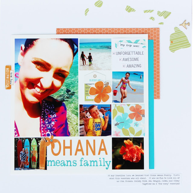
Ohana by Shanna Hystad | Supplies- Paper, Embellishments, Letters-Simple Stories-You are Here Collection, Simple Stories So Rad Orange Paper, Teal Paper-Making Memories, Wood Veneer Airplane-Studio Calico, Journaling Font-Traveling Typewriter.
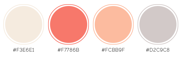
Cynthia T. says, ” I wanted to give our living room a fresh look, change the tired (at least for us) teals, and renew the energy without need of much work or money spent. After lots of research, Pantone’s ‘Peach Echo’ from this spring’s color forecast, seemed to be the perfect addition to complement the other colors already in our living room.”
“It seemed fitting to use my chosen home color palette to record the transformation on a scrapbook page. I found my final palette for this page at Concepts & Colorways, but my initial color research and inspiration also came from pantone, ko-te.com and Wayfair.com all of which are great resources for color inspiration.”
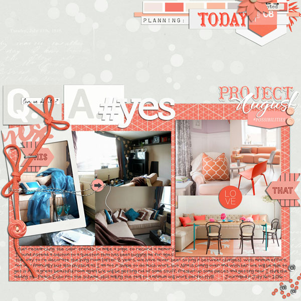
Project August: {Finding Peach Echo} by Cynthia Taylor. Sara Gleason: Stated Kit, The Lilypad: Memory Pockets Monthly: Adore, Memory Pockets Monthly: Bloom, Memory Pockets Monthly: Promise, Memory Pockets Monthly:: Q & A, Memory Pockets Monthly: Status, background paper by Dido: Shine Notion Set, left photos mine, palette & far left single armchair image: Concept & Colorways, the other trend color images from Wayfair.
Sian Fair says, “This page is about my son and daughter sharing a car now that they both have their driving test.”
“I chose a pairing of pink and kelly green after spotting it on pictures from catwalk shows this season. It’s a good fit for this story because it combines a traditionally masculine color with a feminine one for a story about the battle of the sexes.”
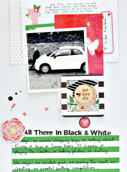
All There In Black and White by Sian Fair | Supplies: Journaling cards used to layer: Gossamer Blue; Alpha: Simple Stories; Ephemera: Fancy Pants, Wilna Furstenberg; Wood Veneer: BananaFish Studio for Gossamer Blue
Kelly Prang says, ” This is the story of my daughter and her first trip to the beach as a toddler. I had visions of a tranquil and introspective photoshoot, but when she felt the sand, she was out of there! She took off back up the boardwalk toward our car. I had to learn that I can not micromanage everything.”
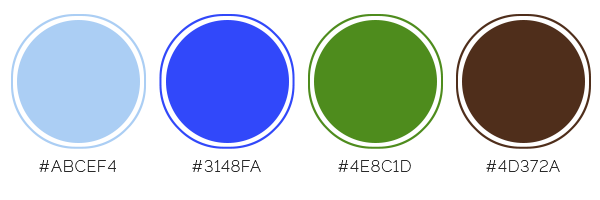
“I found my color scheme on The Knot, a site about wedding planning. They offer lots of mood boards and insights into color trends. I loved the soothing tones of pale blue, dark blue, green and brown. It felt like a perfect fit for my photos of sand, water and boardwalk. I also added lots of white to keep the calm mood.”
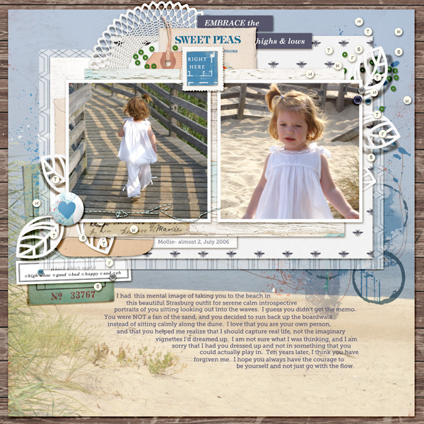
Embrace the Lows by Kelly Prang| Supplies: Allison Pennington: How Does Your Garden Grow?-paper, Lovely Day-stitches; Lynn Grieveson- Honey I’m Home: elements and paper; Little Butterfly Wings- Feeling Chatty- elements; Pink Reptile Designs: Optimistic- elements; Sahlin Studio: Highs and Lows- elements; One Little Bird: Soleil- doily; Paula Kesselring: Summerdays- elements; Valorie Wibbens: Sprinkles V43-elements; Sara Gleason: Per Diem- confetti scatter’ Font: Museo Slab
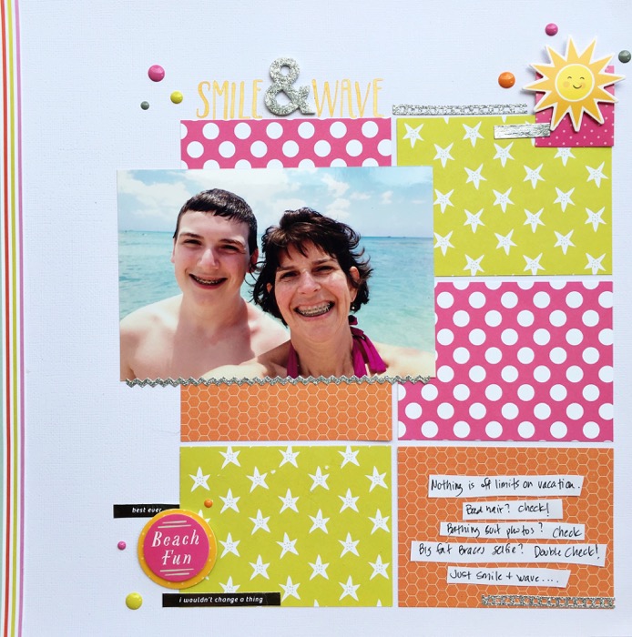
Devra Hunt says, “This family vacation was carefree, relaxing and full of silly selfies. A close-up of my son and me with our mouths full of braces is one of many taken that week.”
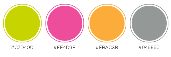
“I used a bright color combination of Chartreuse, Azalea and Carrot with touches of gray called Flashy, that I found on a wedding trend website called MagnetStreet. They describe this combination trend : “Chartreuse is boldly fun and the ultimate in uniqueness! Neons are nearly everywhere these days, and weddings are no exception. This palette shows that neon hues can still be classy and simple, especially when grounded with a neutral.”
“When I think of summer, I think of bright, warm colors. Here, they contrast the blue in the photo so it stands out. I used silver in place of gray. It adds more shine, like sun glistening on water.”

