 Have you heard the storywriting advice: Show, don’t tell?
It means that, rather than just coming out with your “big idea” (like, for example, hard work pays off) you need to instead show that actual hard work.
Here, we’re showing pages that have photos showing off story details that matter–and accompanying design choices that emphasize and support those details.
[hr]
Marie-Pierre Capistran says, “This page tells the story of the birthday cake I made for my daughter on her 5th birthday.”
“The details that are important in my photos are all the pieces I made to put on the cake. To emphasize the details I used three specific photos which gradually draw the eye of the viewer to the third photo where we see the details of the cake very well. I printed that photo with a white border and I adhered it with foam dots.”
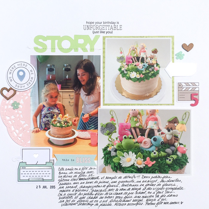
Unforgettable birthday by Marie-Pierre Capistran | Supplies: Cardstock: Bazzill; Paper: Dear Lizzy; Embellishments: Pinkfresh Studio, Citrus Twist Kits, Project Life; Alpha: American Crafts; Stamp: Mama Elephant.
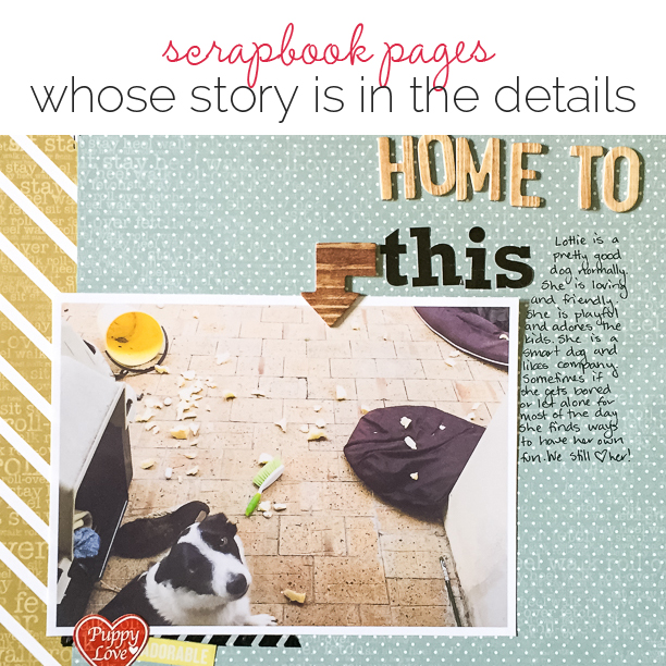
Kristy T says, “This page tells the story of the mess that I saw when I opened the back door to say hello to our dog Lottie.”
“I chose this photograph printed at 5″ x 7″ to show the details of the mess she had created and the ‘butter wouldn’t melt in my mouth’ look she greeted me with. To encourage the viewer to look into the photograph I used a long title with the contrasting font and colour for the word this. I want to entice the viewer to look and see what the ‘this’ is. I have used a simple design with a diagonal flow, a pointing arrow, and then one red element to draw the eye to our dog’s face. The patterned papers also have subtle text of dog related commands which also encourage the viewer to look closer at the overall page.”
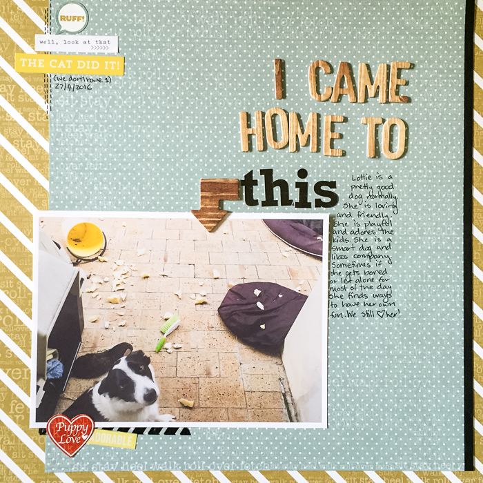
I Came Home To This by Kristy T | Supplies: Patterned Paper: Echo Park; Cardstock: Bazzill; Stickers: Echo Park, Simple Stories; Alphas: October Afternoon; Jillybean Soup; Chipboard: October Afternoon; Washi Tape: Kaisercraft, Pen: Artline
Stefanie Semple says, “The flowers from my Mom’s memorial service were brought home from the church and graced our lounge for just under 2 weeks.”
“I wanted to emphasize that the flowers were a blessing to me, unlike 22 years earlier when flowers filled our home after our daughter died. I didn’t cope with that and neglected to water them so they would die and I could get rid of them. I allowed the close-up photos to be the focal point, pulling colors from the flowers to select the kit and to recede into the background of the page. A few choice embellishments add to the floral richness.”
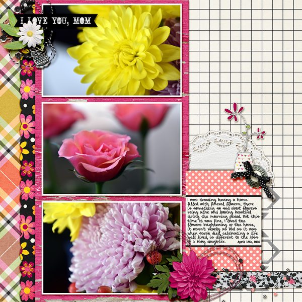
Love you, Mom by Stefanie Semple: Amanda Yi Designs & Melissa Bennet’s: A Mother’s Love; Scotty Girl Design’s: Deco Trims Simple Masks, One Little Bird Design’s: Shadow styles, Charmbox Studio’s resize for web action.
Marcia Fortunato says, “My layout is about the more subtle stories behind this photo, which was taken at my youngest son’s college graduation.”
“The details in my photo include my son’s graduation regalia, but there are also some details that wouldn’t necessarily be significant to anyone outside our family – the individual people, the flower on my granddaughter’s headband, the way that we are clustered–but to me they speak volumes.”
“I highlighted the details most obviously in my journaling, which pulls out and explains each detail. My title and the graduate silhouette state the obvious but also hint that there is more to the story. The patterned paper on the bottom gives a celebratory feel and also has phrases that support my story, and the embellishments give further support and emphasize that this was a special occasion and a special family.”
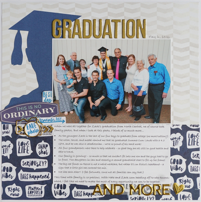
Graduation and More by Marcia Fortunato | Supplies: Patterned Paper: Pink Paislee, Just Jaimee for Cocoa Daisy; Cardstock: American Crafts, Neenah; Letters: Thickers (American Crafts), Studio Calico; Embellishments: American Crafts, Freckled Fawn, We R Memory Keepers; Stamps: Cocoa Daisy; Ink: Studio Calico; Pen: Le Pen (Marvy); Font: Bradley Hand ITC; Other: Silhouette die cut design.
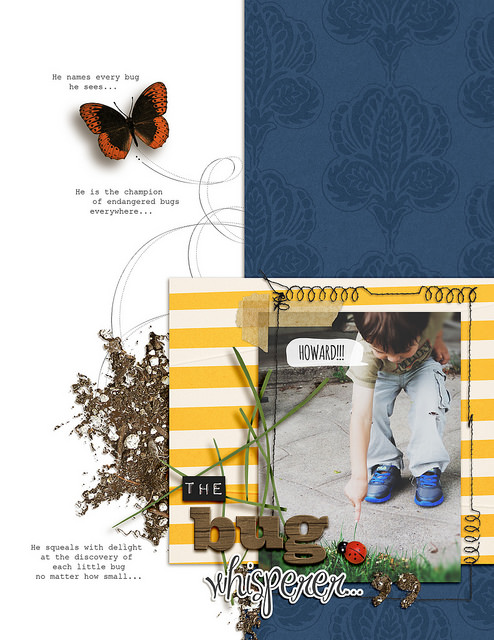
Amy Kingsford says, “This page is about my youngest son’s love of bugs. Every time he saw a bug he’d have to point it out and name it!”
“The photo itself is a close up of my youngest son pointing at a bug that he lovingly named Howard. Of course we can’t see the tiny lady bug in the photo, nor can we hear him yelling its newly given name, so these were details that I added to my page in an effort to reveal more of the story to the viewer and provide context. I also took details from my photo such as the dirt and grass elements and extended them out onto my canvas in order to set the setting for my story.”

