 Start your page with an idea, or notion, or message. A story or an emotion. Something! Then resolve to convey this intention with all of your design and element choices.
We’re pretty sure the scrapbook page storytelling will come more easily and you’ll be pleased with your outcome when you start this way. Our team shows you how it worked for them.
[hr]
Marcia Fortunato says, “At only two years old, my grandson has an uncanny knack for using and understanding tools. My intention with this page was to record this stage of his development so that we remember his interest in tools and building at this early age.”
“I didn’t have photos of him with the specific tool referred to in the title, so I selected other photos with similar activities. I chose a more structured design and used papers and embellishments that made me think of building (wood, rulers, hardware, etc.) or that referred to boys or men.”
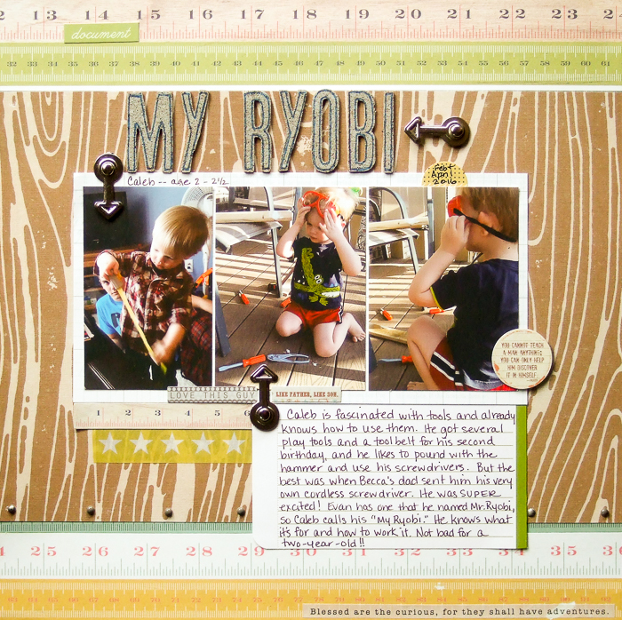
My Ryobi by Marcia Fortunato | Supplies: Patterned Paper: We R Memory Keepers, Cocoa Daisy (Valorie Wibbens Designs), Pink Paislee, Real Simple (journal card); Letters: Thickers (American Crafts) with Distress Paint (Ranger) and marker (EK Success); Metal arrows: The Paper Studio; Word stickers and washi: Fancy Pants Designs, We R Memory Keepers, Hello Forever; Enamel dots: Teresa Collins; Pen: LePen (Marvy).
[hr]
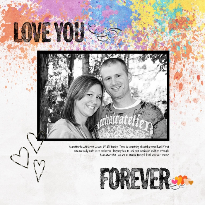
Summer Christiansen says, “This page is about how important family is, even with major differences. I wanted this page to be bright and happy, which is why I used the colorful paper. But I also wanted it to look scattered and imperfect, like all our families are. I am trying to evoke a feeling of happy, but not quite perfect.”
[hr]
Marie-Pierre Capistan says, “My intention with this page was to describe my father. I used many words and put in a lot of details about him, his personality, what he does, and what this means for our family.”
“The title is an inside joke that tells a lot about him. I added a smiley face at the end of it to give a sense of fun and laughter. I used very few embellishments and colors to keep the layout calm and simple–just like my dad. I added the crown, which is a symbol for a king and in relation to my dad it means that he’s taking care of us and also that he has a lot of charisma. He is loved and adored by everyone. The gold is also adding to these two characteristics.”
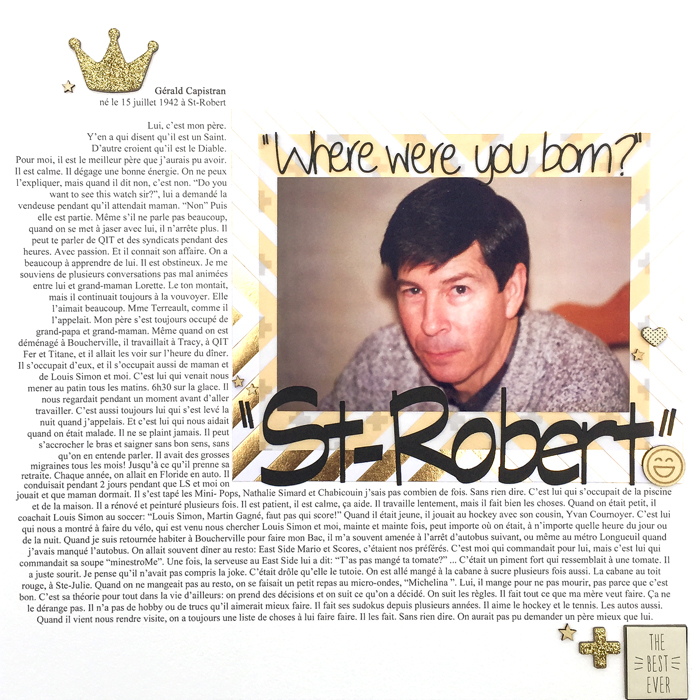
St-Robert by Marie-Pierre Capistran | Products used: Cardstock: Bazzill, Stampin’UP!; Patterned Paper: Teresa Collins; Chipboard pieces: Crate Paper; Wood Veneer: Freckled Fawn; Citrus Twist Kits.
[hr]
Deborah Wagner says, “My page was made to illustrate the love and joy our new granddaughter brings to our family.”
“I chose this template by Anna Aspnes because I needed places for several black and white photos, but I wanted the focal photo to take center stage. A color palette was the next decision, and I went with pink and gold. Pink for little girls and gold to add a mood of celebration. Every element was chosen carefully to let the viewers know what a miracle she is to us.”

LoveNotes by Deborah Wagner|Suppies: Anna Aspnes – FotoInspired Double Template No. 42, Love Glows No. 1, Art Play Palette Posy, Art Play Palette Vivacity, Art Play Palette Serenity, Art Play Palette Radiant, JazzedUp LoopDaLoops No. 1, Fabric Textures No. 1; KimB – Field of Dreams; Little Lam & Co – J’Adore Pocket Cards; Lynn Grieveson – Totally Trashed Love; Jen Barrette & Alison Pennington – Once Upon An Imagination; Mommyish – Stylin’ 171 Halftone Glitter
[hr]
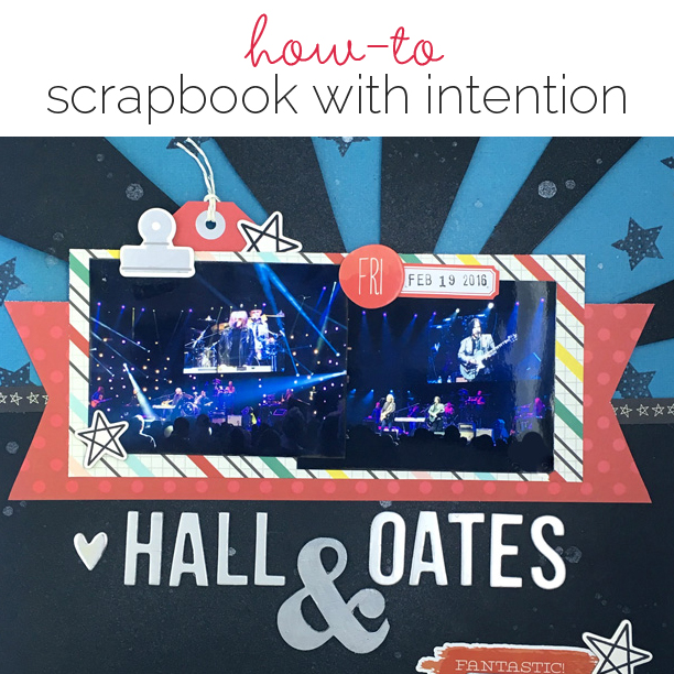
Gretchen Henninger says, “I wanted to capture the atmosphere of a concert my husband and I went to at Madison Square Garden. I mimicked the stage lights by using a starburst stencil and blue and black papers, with stars stamped in the background. I also chose silver alphas and embellishments to reflect light and energy on the dark background.”
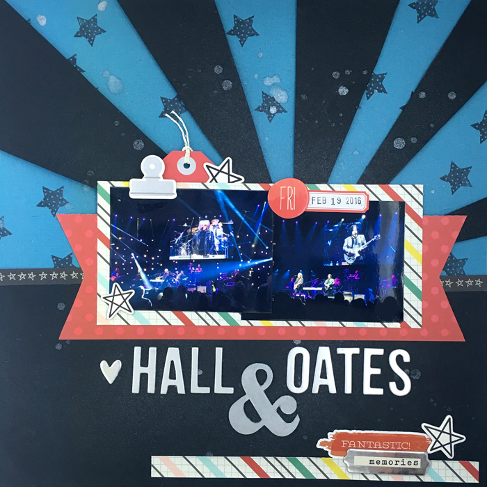
Hall and Oates by Gretchen Henninger | Supplies: Paper, Chipboard & Ephemera: Simple Stories (Life in Color); Alphas: American Crafts Thickers (Gilded); Twine: Lawn Fawn; Stamp: Fontworks (star); Spray Ink: Heidi Swapp Color Shine (tinsel)
[hr]
Stefanie Semple says, “My intention was to begin working through the loss of my mother with my ability to focus on doing things and making lists.”
“I used a series of journal cards to act as a title and to introduce the topic of the layout. My photos are disarrayed to mirror my emotional turmoil, while the stitches hold everything together, to denote my pretense at keeping everything sorted and organized.”
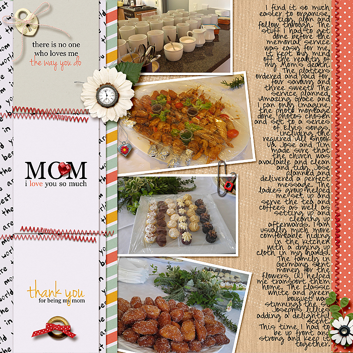
Mom by Stefanie Semple. Jady Day Studio, Shawna Clingerman & Studio Basic: Our journey together (kit) ; Sabrina’s Creations: Dear Mom journal cards and papers; Katie Pertiet : Clock Buttons Nr1, Chelles Creations: Stitch me up; Chaos Lounge: chain 2.
[hr]
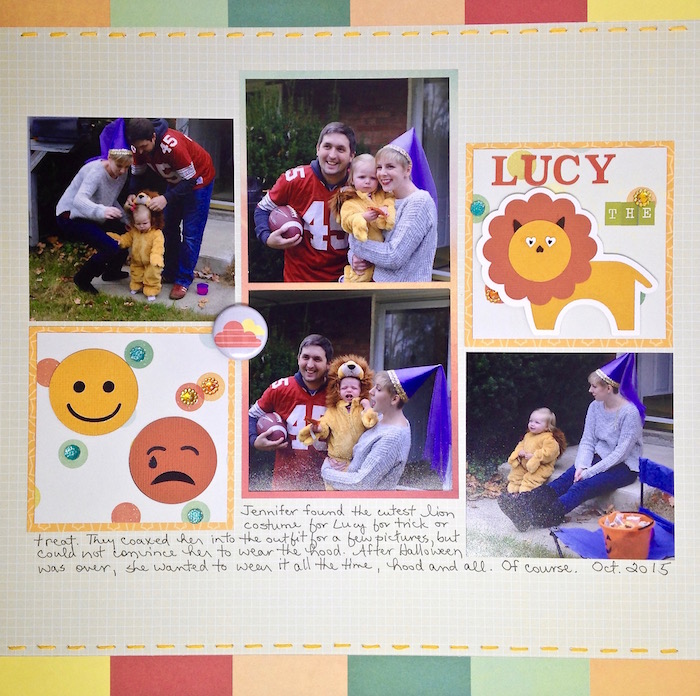
Sue Althouse says, “With this page I wanted to show my granddaughter’s mixed reaction to her first Halloween costume.”
“First, I chose photos featuring her different facial expressions. The die cuts and journaling (with an ironic twist) support the pictures. My color scheme conveys a positive mood. Even though there were a few tears, overall it was a happy day.”

