 Images that play up human scale can remind us how small we are in the world by placing people in an environment that dwarfs them. Or they can make our subjects look as if they are holding the world in the palm of their hand if you play tricks with perspective. The Get It Scrapped Creative Team shares great ideas for working with human scale in your photos and scrapbook page designs.
[hr]
Kristy T says, “This photograph was taken on a walk in Scotland. Since I love the photograph of the two little boys standing together looking out into the trees it was a great fit for a page about their relationship as brothers. By taking the photograph from a distance and framing the boys in the lower left part of the photograph I was able to show the contrast between the little boys and the great tall trees by capturing both in the frame. The trees to me are a good representation of how the boys are in the world right now – one is small, the other a little bigger and there is a whole world out there for for play and discovery as they grow older together.”
“The design of the page is simple. The large photograph shows details and conveys the trees’ scale. The journaling, title and some simple clouds in the top right corner to balance the design. The neutral colors add texture, and the simple black matting finishes the page without competing with the photograph.”
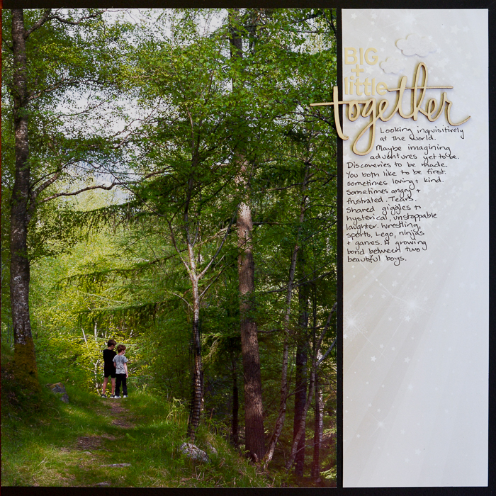
Big + Little Together by Kristy T| Supplies: Card: Bazzill; Patterned Paper: Websters Pages; Wood Veneer Shape: Teresa Collins; Alphas: Becky Higgins; Felt Shapes: Collective & Co.
[hr]
Audrey Tan says, “This page is about our trip to Agra, India. Our tour guide enjoyed getting us into various poses for perspective shots. Here’s one of them using the boys. Can’t say they were impressed though!”
“I used patterned papers with buildings in the background to continue the image from the photo and added an oversized bird to emphasize the theme of perspective.”
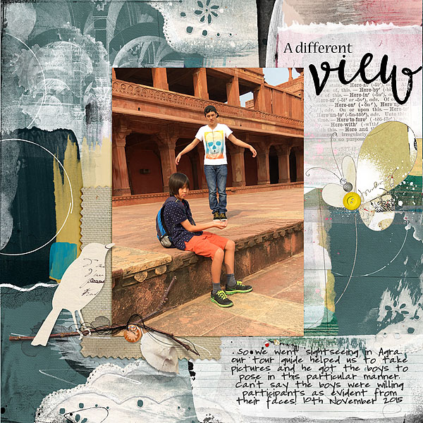
A Different View by Audrey Tan | Supplies: Anna Aspnes: ArtPlay Palette Living Well, Journal Transfer No2, Doily Edge Overlays No3, Fabulous Wordart Mix No1, Burlap Scraps No1, Artsy FlutterBys No1, MultiMedia Birds No1, See Wordart No1; Jen Maddocks Designs: Urban Grunge 9; Font: Pea Emily
[hr]
Christy Strickler says, “I have been experimenting with taking photos of my son with skyscrapers in the background. In order to get these photos, I have to lie down or squat low on the ground and photograph my son by looking upward. The photos don’t tend to come out well as my son often has the sun in his eyes and he blinks. In this particular photo, one of the buildings has an outcropping that extends over the walkway, looking as though it is leaning over my son.”
“I wanted to continue this movement of diagonal and then upward throughout the layout. To contribute to this, I placed the title and journaling on an angle. I also used a text paper on a slant upward. The patterned paper on the right side of the layout flows upward, and I cut one piece of paper into strips, and placed them unevenly to mimic buildings in a skyline. The canvas is a green print with triangles in an up-and-down flow.”
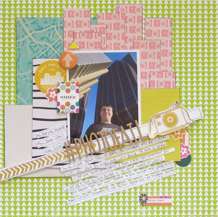
#PhotoFail by Christy Strickler |Supplies Patterned Paper: Studio Calico, Shimelle; Letters: American Crafts; Rub-ons: Dear Lizzy for American Crafts; Chipboard: PinkFresh Studio. Basic Grey; Die Cuts, Flair: Basic Grey
[hr]
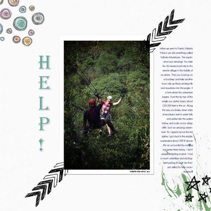
Summer Christiansen says, “On this page I tell about my adventure ziplining through the jungles of Puerto Vallarta, Mexico. Half way across my first line, 200 feet above the ground, I got stuck right in the middle!! To exaggerate this on my page, I tried to make the photo look suspended in the air with arrow elements.”
[hr]
Doris Sander says, “This layout is centered around photos from a cub scout hike and the thoughts I had about it while I was there. I couldn’t help watching the kids playing in this huge outdoor arena and thinking we are truly very small parts of this great big world.” Both her photos and her title conveys this very thought perfectly.
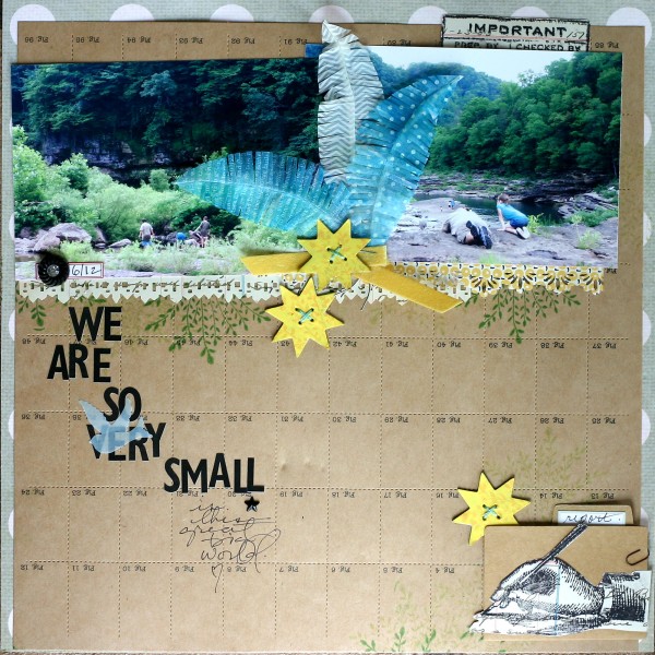
We Are So Very Small by Doris Sander | Supplies: patterned paper, perforated paper, alphabet stickers, chipboard elements, feathers, rhinestone brad, clear stamps, file folder, label sticker – Jenni Bowlin Studio, paper clip – Tim Holtz, ribbon – vintage, other – embroidery floss, vellum
[hr]
Amy Kingsford says, “This photo was taken by my husband who was trying to recreate a popular perspective shot involving Balanced Rock at Arches National Park and the page is an homage to our son who was such a trooper and made the best of the trip despite feeling ill.”
“To get this shot of our son ‘holding up the balanced rock’ we positioned him approximately 100 ft in front of the landmark so that his body covered much of the terrain on which the ‘balanced rock’ is perched. My husband got down low and used my telephoto lens which helped to diffuse some of the visual distance between my son and the rock. The hardest part was getting my son’s arms into exactly the right position to make it look as if he were holding up the rock. We had a ton of fun with the process though and were happy with the results!”
“To highlight this photo on my page I went with a full-width rendering and used a dramatic black-and-white filter to add drama. Then I used three groupings of hexagons which I clipped masculine patterned papers to, to frame the photo on my page. I purposely tipped the hexagons on end so that they mimicked the appearance of a ‘balanced rock.'”
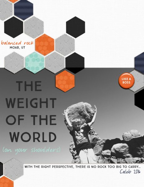
The Weight of the World… by Amy Kingsford | Supplies: Sahlin Studio: Like a Boss; Karla Dudley: Dad’s Day Cardstock; My Four Hens Photography: Heartistry Action Set; Fonts: True North and Courtney Dorkling

