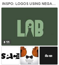
 Logos that make use of negative space to support their message are trendy now (take a look at a few here). This creative use of type and motive to convey meaning visually is a great source of inspiration for your own scrapbook page designs. See what our team has done with this inspiration and give it a try yourself.
Sue Althouse says, “This page is about two friends discovering they are not as crafty as they thought they were.”
“Using negative space to create logos makes me stop and think about a message cleverly woven into the shape text makes. I combined alliterating and very similar words (‘flip’ and ‘flop’) to create a playful layered title that suits the mood of my photos and story.”
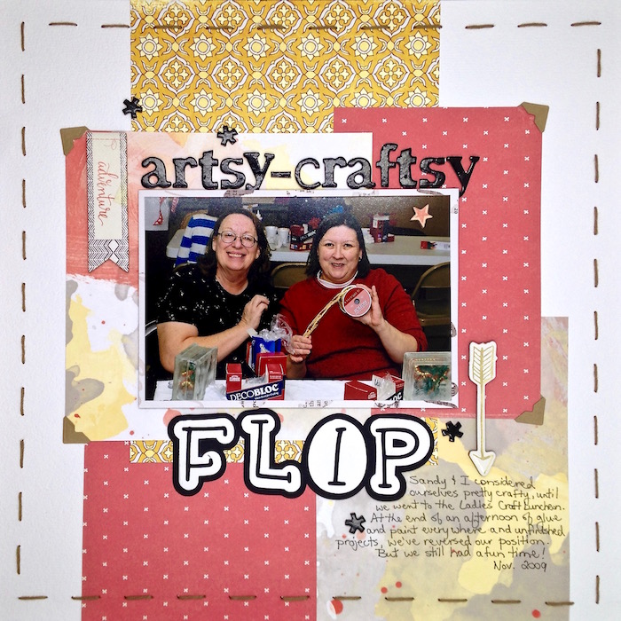
Artsy Craftsy Flip Fop by Sue Althouse | Supplies: Cardstock: Bazzill, Recollections; Silhouette Title: Monograms by Dresden Carrie; Alphabets: American Crafts; Chipboard Die Cuts: Crate Paper; Floss: We R Memory Keepers; Photo Corners: Scrapbook Adhesives
[hr]
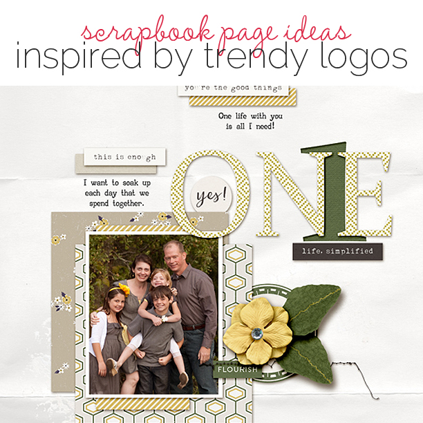
Kelly Prang says, “The story behind this page is just how blessed and lucky I feel to have one life with this amazing family.”
I have enjoyed seeing logos that bring two ideas together – like those included on this Get It Scrapped Pinboard. I used the negative space between the “N” and “E” in my own title “ONE” to show a numeral “1”, and emphasize the idea of one life=one family. At first, I tried the 1 on top of the word, but it was hard to understand, so I put it behind the text–it’s punched from the background with dark green layered below the cutout.”

ON(1)E by Kelly Prang| Supplies: Sara Gleason: NSD Grab Bag- Template, Good Things-elements; Allison Pennington: Mighty-paper; Mommyish: Such a Mess- Stitches; One LIttle Bird: Thrive- papers and elements, Shadow Styles; Just Jaimee: Acceptance- Background white paper; Fonts: AA Typewriter and Constantia
[hr]
Marcia Fortunato says, “I love photography and I love winter in the U.S. upper midwest, so I made a scrapbook layout that showcases both.”
“The example of logos creatively using negative space appeals to me. I feel that shaped negative space can reinforce the message of the words in a subtle or subconscious way. In my case, I used winterish elements – snowflakes and evergreen trees – cut out of my letters to enhance my title, and in the case of the snowflakes in particular, the entire shape was not needed since your mind will fill in the rest of the picture.”
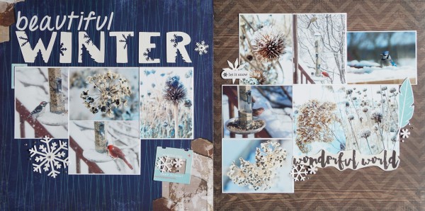
Beautiful Winter by Marcia Fortunato | Supplies: Patterned Paper: Bo Bunny, Pink Paislee, My Mind’s Eye; Cardstock: American Crafts; Letters: Darice, Silhouette cut (ED Minneapolis font, Canson watercolor paper, snowflake designs by Felicity Jane, Totally Jamie, Carta Bella, tree by Miss Kate Cuttables); Embellishments: die cut snowflakes – Memory Box, Inc., QuicKutz, Darice; other embellishments – Fancy Pants Designs, Doodle Bug, TPC Studio, Heidi Swapp.
[hr]
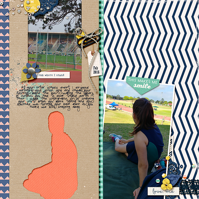
Stefanie Semple says, “This is about an inter-schools sports event with my daughter. I enjoyed her school cheering and creating patterns with the way they flashed their clothes, making different letters and patterns.”
“I love logos that create a scene within the text, using white space to trick the eye and make the brain re-look. Here the kraft paper on the left is an ‘H’ which is my daughter’s first initial. I used her sulky silhouette from the photo on the right paired with a photo of the school’s fans flashing an E, to create an over-sized monogram H.”
[hr]
Christy Strickler says, “I sometimes snap photos of my cats napping in weird positions.”
“As someone who likes to use a lot of patterned paper and embellishment clusters, I found this trend a bit difficult to translate to my scrapbook page as a whole. I went with a clean and simple design, which made for a quick page! I used patterned paper strips as brackets on clean white cardstock, which made my photo and title to pop against the white space. I used contrasting letters layered over my photo to give the appearance of it being cut from my photo.”
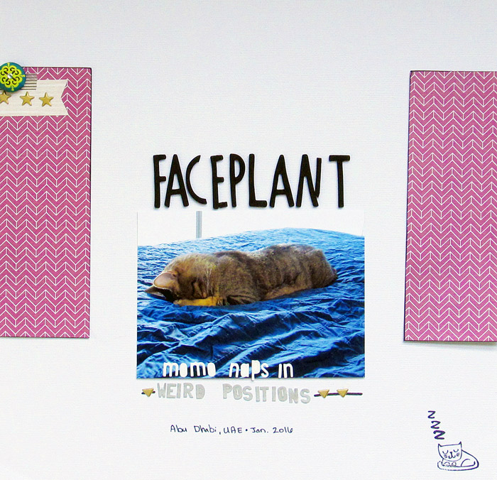
Faceplant by Christy Strickler |Supplies Cardstock: Bazzill; Patterned Paper: Heidi Swapp; Letters: Studio Calico, American Crafts, Basic Grey; Brad: Crate Paper; Stamp: Studio Calico; Ink: Colorbox; Other: Stickers, Tape
[hr]
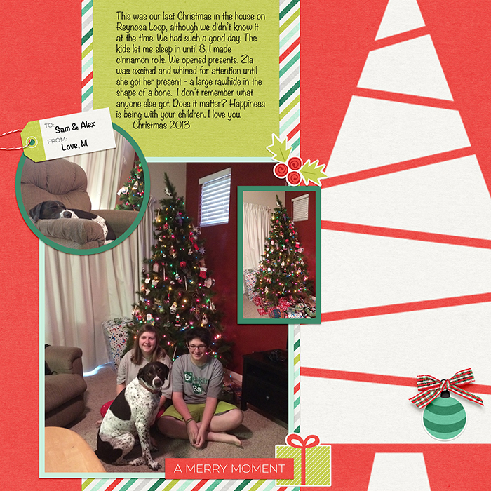
Jennifer Kellogg says, “I like this new logo trend using negative space. On my page I used white space that symbolizes a Christmas tree. It reminded me of a cut-out from a matte. Die-cut scrapping supplies like this were very popular back in 2000 when I started scrapbooking. And now what was once old is new again!”

