Including repetitions is a good way to work toward achieving unity in a visual design–and on a scrapbook page. Repetition without some variety, though can be dull. Check out a short video lesson on repetition below and then see how our Creative Team incorporated repetition into their own pages.
This video lesson comes from “Design Principles for the Scrapbook Page” which is a part of a Get It Scrapped Membership. We are doubling down on stepping up our design skills at the membership with the newest class “Confident Designer.” Click here to become a member today.
[hr]
Gretchen Henninger says, “I made this page to express my excitement over meeting Garrison Keillor, who has been my favorite storyteller since I was a young child. In order to show just how gaga I was, I used a heart motif for this page. I began by stenciling hearts onto the background, then layered a heart cut file and heart wood veneers. In addition to repeating the hearts, I repeated the stamped phrases love and love this.”
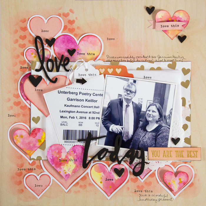
Love Today by Gretchen Henninger | Supplies: Paper: My Minds Eye (Necessities, Jubilee); Thickers: Dear Lizzy (Snapshots); Stickers: My Mind’s Eye (Market Street); Cut File: BasicGrey; Stencil and Die: Shimelle; Stamp: Fiskars (“love this”); Paint: Derwent Inktense Blocksl Ink, Liquitex (black acrylic): Tim Holtz Distres Ink (abandoned coral, black soot); Wood Veneer: Studio Calico
[hr]
Heather Awsumb says, “This page is about the tattoo that I got somewhat spontaneously–but also completely thought out–while on a recent trip.”
“The template I used (from Scrapbook Coach #21 and the extensive sketch and template library in the Get It Scrapped membership) originally had three photos–two 2″ x 3″ and a 4″ x 6″. I changed photos to three squares in order to use that as another point of repetition in my design. I also used repetition of color (pink) to create a visual triangle that moves the eye through the page from the photos to the title and journaling.”
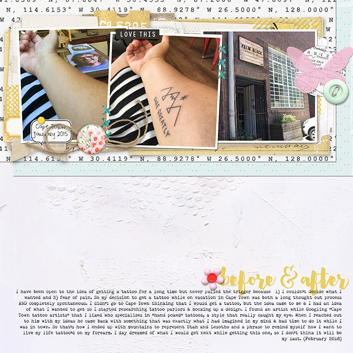
Before & After by Heather Awsumb | Supplies: Textured Gesso Papers by Just Jaimee; Sunshine, Viewpoint by Sara Gleason; Collage Stacks No 1, Little Layette Kit by Katie Pertiet; Brad Bonanza by Patti Knox; Scrapbook Coach 21 Top Heavy template
[hr]
Devra Hunt says, “mThis page is about how y son went to a Halloween party without a costume and came home looking like a creepy character from The Nightmare Before Christmas.”
“Throughout this page, I created repetition in texture with glitter, motif with skeletons, bats, stars and words, and lastly with the color orange in a variety of shapes, tones and patterns. By mixing how I used all of these elements, I created interest all over the page.”
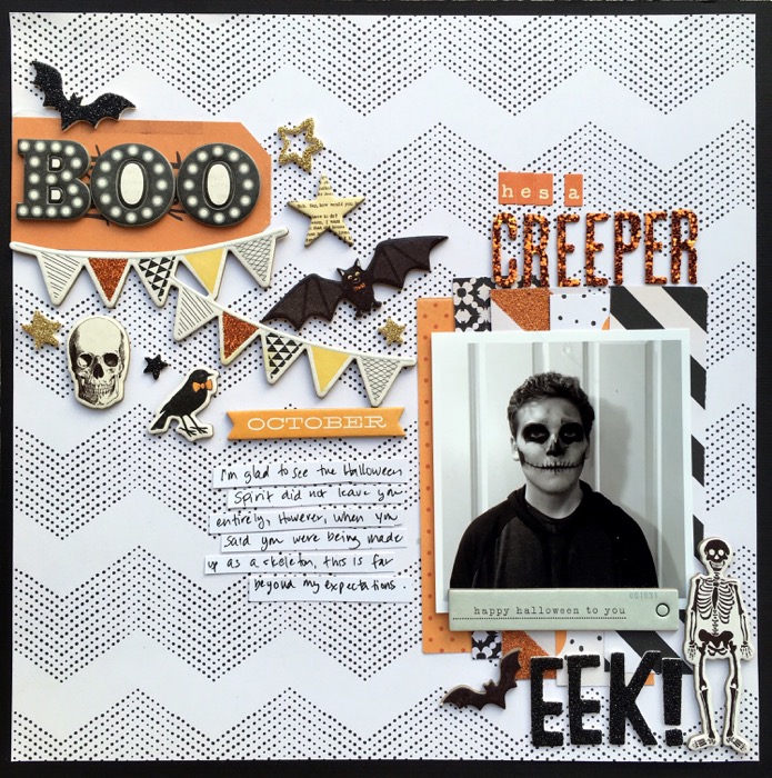
He’s a Creeper by Devra Hunt | Supplies-Cardstock-Bazzill, Patterned paper, chipboard-Crate Paper, Foam pieces & Alpha-Thickers by American Crafts, pen-Micron, adhesive-EK Success
[hr]
Jennifer Kellogg says, “This page is about my son. I repeated shape and color as design elements on this page. I used squares as a background and put the photos on square mattes. I also chose square tile letters for the title. I repeated the color of the heart on the stitching, faces of and the tag.”
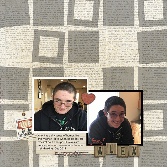
Faces of Alex by Jennifer Kellogg | Supplies: Wishing Well Creations: Die Cut Mats; Kimeric Kreations: Here & Now Kit; Traci Reed & Flergs: I Like Books Alpha; Font: Avenir.
[hr]
Karen Poirier-Brode says, “The layout is a story about my feelings about getting plastic surgery.”
“Here I used a template from the Get It Scrapped membership inspired by master designer Kim Watson who understands that repetition can be helpful when you’re using lots and lots of product. The key is to use a difference of scale and to think of variety and dimension. Little tricks help with emphases: For example, the white pen line around the title alphas and the inner parts of the lace doily makes those details stand out. It was fun to use some old school touches on this page, too. These include the colored wire in the button holes, the beads as accents, and the home-made button closure using a circle punch, and eyelet setting tool. I also like having my signature on my page with a paper clip holding a small photo or embellishment.”
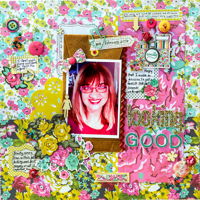
Looking Good by Karen Poirier-Brode | Supplies: MME, Kate & Co, “Cambridge Court” collection – papers, stickers, chipboard and dimensional embellishments, tag, brads, buttons; Stash – flair, veneer, paper clip, velvet ricrac; Paper Bliss – beads, roses, wire, buttons, Tim Holtz – envelope, AC Thickers – alphas
[hr]
Kelly Prang says, “This page is about my brother and his wife with their dog, Oliver. The three of them are so happy together, and I have loved the photos that they have posted together after the two humans returned from their two-year separation from their pup. Oliver lived with my parents while my brother and his wife were stationed in South Korea, and I think Oliver is VERY happy to be back with his Mom and Dad.”
“I use repetition with the hearts, the layers behind the photos, the word-art on top of the photos and with color. Pink, red and gold/tan near each photo unites the two clusters on my page.”
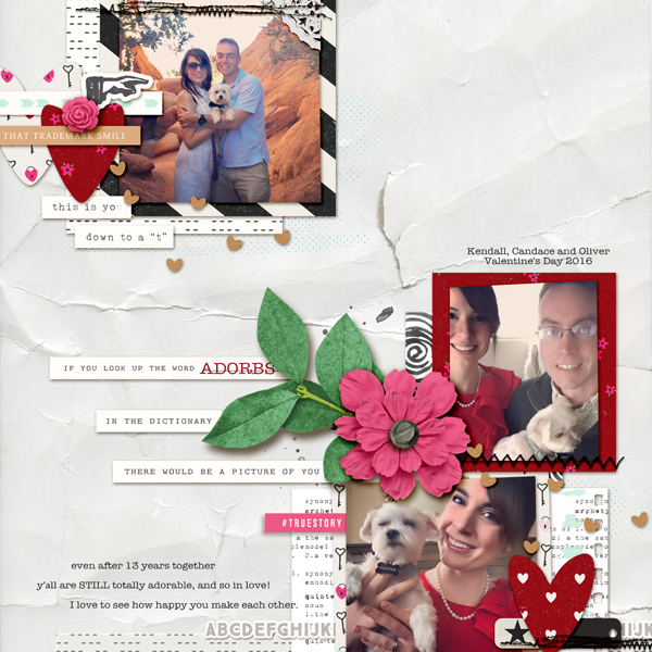
So Happy Together by Kelly Prang | Supplies: Valorie Wibbens: Topography No.12- template, Lost and Found- stitches; Allison Pennington: Resplendent- papers; Sara Gleason: Archetype- Elements and Journal Card; Paislee Press: Behind the Lens- journal cards; Pink Reptile Designs: Lovebug- elements; Amy Martin: Needed More Stitching- Stitches

