 The focal point is the center of a design. This doesn’t necessarily mean that it’s the vertical and/ or horizontal center (although it could be) but, rather, that it is the most important part (or parts) of a piece.
One effective approach to creating a focal point is to combine photo, title and embellishment to make a powerful cluster. See here how our team has done this.
[hr]
Heather Awsumb says “This page is about a trip to the zoo in Copenhagen while visiting my sister. My nephew was obsessed with the hippos.”
“My focal point is the photo in the lower left-hand corner of the page. Even though it has almost equal visual weight with the cluster above the addition of the title and large embellishment give it extra oomph to make it the focal point.”
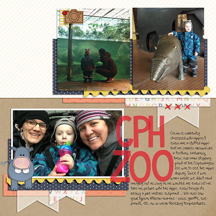
CPH Zoo by Heather Awsumb | Acetate Alphas No 5 by Heather Joyce; Summer Safari by Jacque Larsen; Brad Bonanza by Patti Knox; Around Here, Sunshine in my Soul, These Walls by One Little Bird; Flossy Stitches Red by Katie Pertiet.
[hr]
Sian Fair says “I came across the quote I had saved in an old notebook on the same day I had been looking at some pictures of a particularly memorable childhood holiday, so I paired them and added the title Baggage Claim.”
“To draw attention to my photo I lifted it up on a stack of layered journaling cards and papers, all with a 70’s look to them. I made it stand out, literally. (And then I underlined it with a ruler!)”
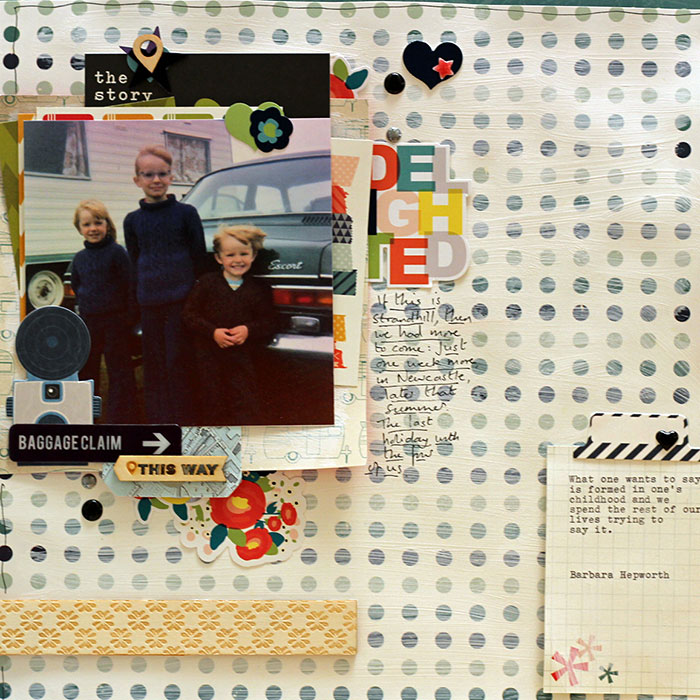
Baggage Claim by Sian Fair | Supplies: Patterned Paper: Pink Paislee and Shimelle for American Crafts; Journaling Cards:from a kit by Gossamer BLue; Stickers and ruler: Shimelle for American Crafts; Diecuts: Pink Paislee
[hr]
Ronnie Crowley says, “The basketball team recently spent an afternoon out of the gym spreading some Christmas cheer at the lower campus. The large photo is the obvious focal point with the cluster at the top providing an entrance point. Having part of the title as a flat layer on the photo and then a dimensional alpha provides visual interest and emphasis to the title. The third Santa also helps support this so it is the focal point.”
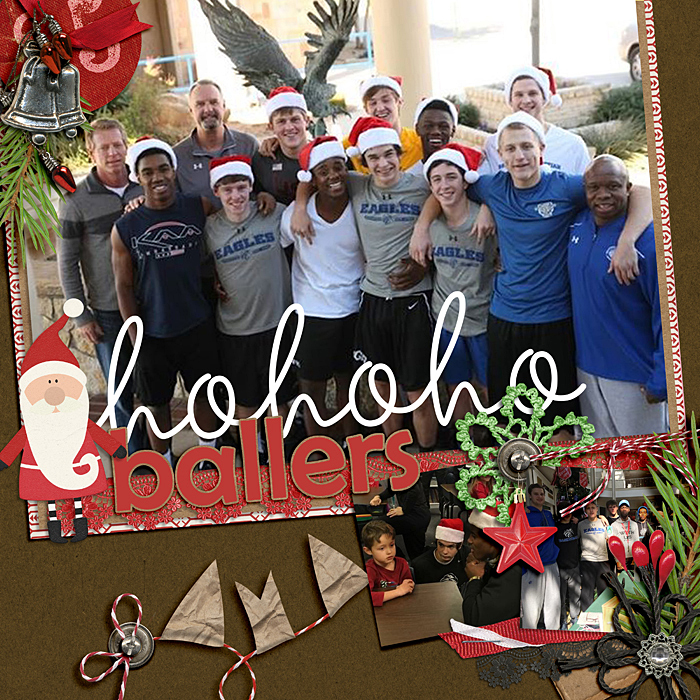
Hohoho Ballers by Ronnie Crowley | Supplies: Cathy Zielske – hoho designs; April Lisa – Picture Perfect 10; Danyale – Hangwcare, Kraft Santa; Mye De Leon – A Christmas to Remember
[hr]
Gretchen Henninger says “This is one of three layouts I am doing about our cats and their nicknames. Zoot is our middle child, but will always be the kitten in the family.”
“The focal point of the layout is the photograph in the top left. I added emphasis to this photograph by making it larger in size, layering it over several mats, and clustering the title and embellishments around it.”
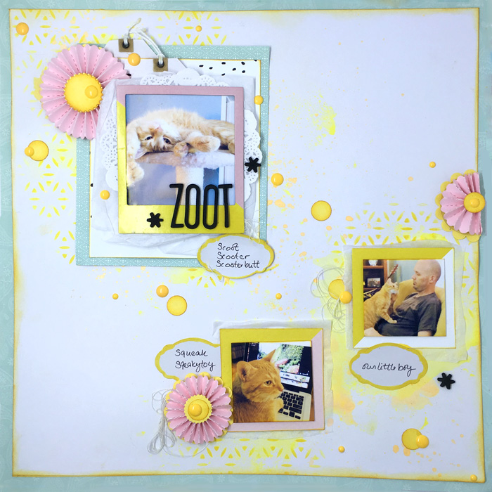
Zoot” by Gretchen Henninger | Supplies: Paper: Studio Calico (Seven Paper), Stamin’ Up!; Alphas: American Crafts Thickers (Adorn); Frame: Crate Paper (Poolside); Die: Tim Holtz (rosettes); Punches: Stampin’ Up! (scallop circle, 1/2″ circle); Labels: Recollections; Tags: Little Yellow Bicycle; Stencil: The Crafter’s Workshop; Ink: Tim Holtz Distress Ink (mustard seed, wild honey); Spray Ink: Heidi Swapp Color Shine (mustard); Enamel Dots: Doodlebug; Other: doily, sewing thread, gelatos
[hr]
Kelly Prang says, “I like to make pages that show comparisons of each of my children over time. This page shows photos of my daughter’s new favorite activity- taking selfies- and how I found older images of her that now look like she was practicing her signature head tilt all her life.”
“The focal point is the largest photo cluster- I added the title, vellum cloud, labels, a journaling area, floral spray, attachments, doily corner and patterned paper banners to draw attention to the middle right of the page. The other smaller photo clusters have a few of the elements for repetition, but are not as big or bold as the main photo cluster.”
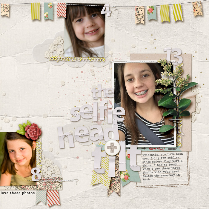
The Selfie Head Tilt by Kelly Prang | Supplies: Font: Bohemian Typewriter; Paislee Press: On My Desk- journal card, elements, Photo Booth- Papers and elements (banners); Amy Martin: Shaped Up Banners- template; Allison Pennington: Autumnal Stitches; Kim Jensen: Perforated Alpha, Ragged Edges; One Little Bird: Interlude- Elements; Valorie Wibbens: Sprinkles Freebie- Doily Corner, Rebecca Young: IBTFY- Vellum elements; Sara Gleason: What Fun- Scatter, Paperwhite- Confetti

