 Choosing and mixing patterned papers for the scrapbook pages is a wonderful part of creating layouts.
As you mix patterned papers, make your goal to achieve harmony in the relationships between: 1) scale, 2) density, 3) form, and 4) color. Much of the harmony will be achieved with an understanding of a final element: 5) proportion.
See how our team does this work on their pages here.
[hr]
Sue Alhouse says, “This page is about babysitting our granddaughter.”
“I selected three floral prints in small, medium and large scale motifs that share a common color scheme and placed them against a neutral white background. Working with the idea of gallon-quart-pint proportions, the largest print takes up the most space and holds the journaling and some embellishment. The medium and small prints are used in lesser amounts to support the photos, and contain the title and more embellishments. The two groupings help the mix work without overwhelming the page.”
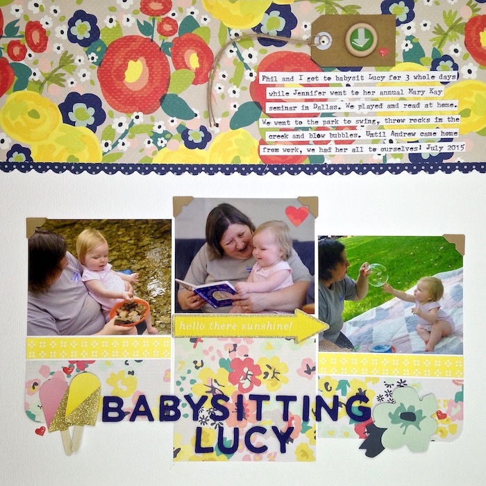
Babysitting Lucy by Sue Althouse | Supplies: Cardstock: Bazzill; Patterned Paper: American Crafts, Crate Paper; Border Punch: Fiskars; Alphabet, Wood Buttons, Enamel Dots: American Crafts; Die Cuts: Crate Paper; Kraft Tag: Fancy Pants; Photo Corners: Scrapbook Adhesives
[hr]
Celeste Smith says, “Mixing patterns has always come easily to me. I normally don’t even really think about it when I’m doing it! I tried to use a variety of patterns with different scales here: the larger cake print, the swatch card that looks like large stripes, the denser red polka dot and the lighter yellow polka dot. I mixed in some print patterns; the newspaper at the top and the Happy Birthday to you along the bottom. I find that when mixing prints it is best to have a background that is neutral or barely printed. I also took all of my patterns from a kit: if the designer believes these papers go together, this should give you confidence that they do!”
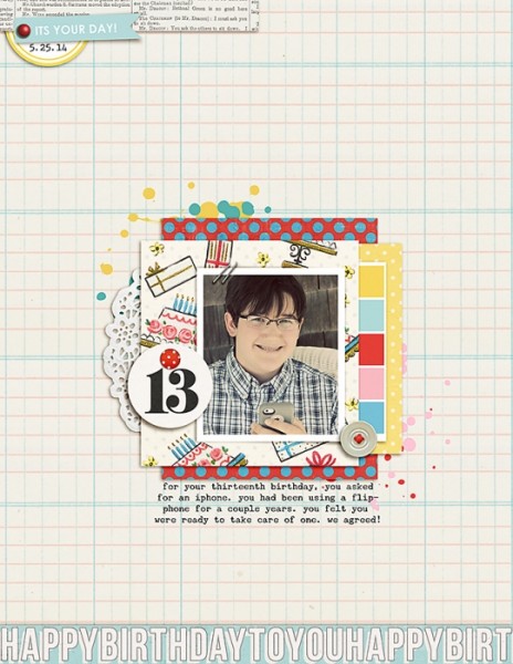
13 by Celeste Smith | Supplies: Sahlin Studio: Birthday Cake kit, Counting Down tags; Amber Labau: Hello Friends elements; Font: Underwood Champion.
[hr]
Kristy T says, “This page celebrates my my son at 5 years of age and the things little boys often do.”
“I used three different star papers on my page, plus two additional patterns. The tone-on-tone papers work well as the background layers. The multicoloured paper with the larger stars provides additional colour inspiration for the layout and adds a base for embellishments but was only used in a small amount so it is not overwhelming. The bright yellow and small star patterned paper provides the matting for the photo and was also used in a small amount due to the saturation of the color yellow.”
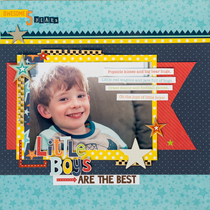
Little Boys are the Best by Kristy T| Supplies: Patterned Papers : Echo Park; Stickers: Echo Park; Chipboard : WOW; Wood: Prima; Chipboard Stickers: October Afternoon; Alphas:
[hr]
Kelly Prang says, “This is a page combining a childhood memory of my younger brother’s love for lambs with my own daughter’s lamb phase. In these photos, both of them are about three years old.”
“I used a few different scales and densities of pattern here. The large swiss cross is in the background; a lined ledger paper houses journaling card. There is also a small diagonal pinstripe and a paper with scattered hand-drawn stars. I attempted to keep the page from looking too busy by using the largest pattern as a frame around the page, and also tried to pick papers in a similar color scheme, with only blues and creams in the patterned paper.”
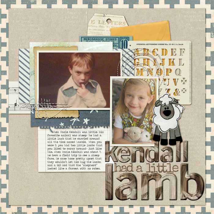
Kendall Had a Little Lamb by Kelly Prang | Supplies: Scrapbook Coach Get It Scrapped- Clustered template; Erin Kay- Woody Alpha; Litabells- Shine: stamped alpha (title), One Little Bird- Scenes- Ledger paper; Our Life- kraft cardstock; Createwings Designs- stitching; Taylormade- Cool and Calm papers; Michelline Martin- Little Things-paper; Forever Joy- Birds of a Feather- music score paper; Studio Rosey Posey- Map Paper (from Daily Digi’s My Life of Adventure collab); Little Butterfly Wings- Travel Edition- swiss cross paper; Jenni Bowlin- Diecut Perforated- letter stencil sheet; Tracey Martin- Summer-tag; Jacque Larsen- Bo Peep- lamb; Cluster Queen Creations- Little Things- manila envelope; Penny Springman- The Little Things- paperbit; SGD- Eclectic Embellies- Vintage ad paper (on tag); J Kneipp- Truly Madly Deeply- Vintage Label; Joyful Hearts Designs- Bloomin’ Paper Bits- notebook edge paper; Font: Traveling Typewriter
[hr]
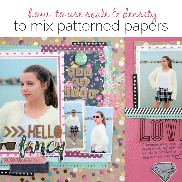
Katie Scott says, “My 12-year-old daughter is quickly becoming very interested in fashion and dressing up–even just to hang around the house.”
“I used two big bold patterns from the same scrapbook paper line so the colors worked together easily. I then picked several other patterned papers in medium prints that contained only one color and a neutral. Finally, I picked a few monochromatic papers with very small design to finish out the mix.”
“I added a 6″ x 12″ page to my 12″ x 12″ layout since I ran out of room for any journaling on my main page. I decided on an almost solid background for the supporting page since the main page had a bold patterned background.”
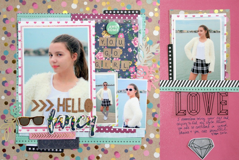
Hello Fancy by Katie Scott | Supplies: Patterned Paper: Simple Stories, Amy Tangerine, Dear Lizzy; Embellishments: Simple Stories, Amy Tangerine, My Mind’s Eye, Teresa Collins; Cork Letters: Crate Paper.
[hr]
Stefanie Semple says, “This pages is about how I have been hibernating to get through summer, turning the “aircon” on and doing as little as possible. How I hate this heat.”
“I love floral prints, bedding, and scrapbooking papers. I chose a small, tone-on-tone print for the background layer and then added colorful patterns to the right to balance out the design. The dark floral has more visual weight, so I used less of that, allowing the green strip to act as a divider between the dark print and the lighter background. The creamy background has a dense print but the color contrast is not that big, so it almost reads as a plain.”
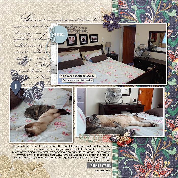
Summer heat by Stefanie Semple. KimB Designs: Yesterday once more (kit) and Sara Gleason: Start Here (kit)
Karen Poirier-Brode says, “This page is about my husband and my joy in our little great-grandson.”
“As the task for this page was scale. I looked for motifs in my PP stash with various themes like hearts, stars and flowers and after looking at my main photo decided on hearts. The collection was eclectic with a full page concentric heart contemporary paper in an orange red and a romantic themed heart paper in pink. I found a paper with both colors in a somewhat country quilt type motif and I had a variety of scale. I find the large motif papers difficult to work with and the papers were all over the place in style so “funky” was clearly the style for the page. Since the papers all came from the same paper pad I was fairly confident in my choices working forward.”
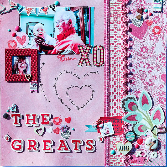
The Greats by Karen Poirier-Brode | Supplies: Alphas – Twinkle, AC; wood veneer, enamel dots,paper clips, washi tape, flair, glitter brads, ribbon – stash; banner flag and side trim to photo – paper packaging from Kate&Co. MME; chipboard, metal rimmed brads, stamps – Kate&Co., My Minds Eye; ink – Barn Door, Distress, Tim Holtz, Ranger; pen Faber-Castell, wire – PaperBliss; Harlequin leather frame – Making Memories; stickers – Family Ties, Photoplay, Kate&Co, MME, Like a Girl, Photoplay; die cuts – BoBunny, Our Lil Monster, Noteworthy, crate paper, Mia Collection ; patterned paper – crate paper

