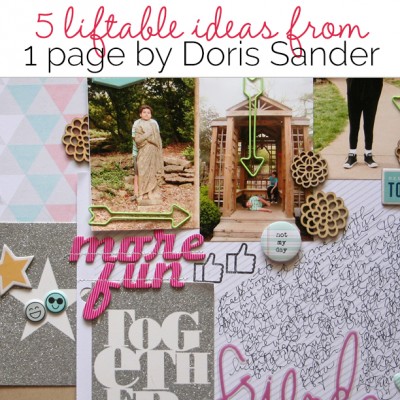
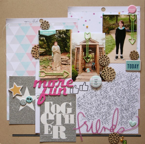
 It’s the accumulation of well-chosen and carefully crafted details that create a masterful scrapbook page. Check out 5 details on “More Fun Together” by Doris Sander and see if one or two of them can inspire scrapbook page ideas for your next page.
Doris says, “This page documents a day my son and I went to a local botanical garden with two of our good friends, another mother-son duo. We all enjoyed the flowers, of course, and my friend and I enjoyed the antics of our children. They are quite the pair when they’re together. As mine gets older, I appreciate more and more that he still has the same steady friends from his baby years and that I’m good friends with all the mothers of his good friends. This is a win-win in so many ways.”
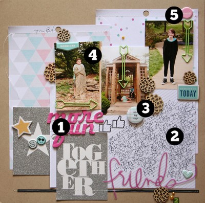
1. Combine alphas and a printed pocket card to create your title.
 The bright pink “more fun” rendered in alphas is a stand-out element on the page that immediately draws the eye and gives us a starting place in the story. We connect it with the text on the pocket card below for a title that reads: “More Fun Together.” It’s interesting. It involves the viewer. And it’s a great way to use those pocket cards.
2. Handwrite your journaling on a diagonal striped patterned paper.
A narrow tone-on-tone neutral stripe makes a great guide for hand-journaling. When it’s on a diagonal, your journaling placement is unexpected. Doris wrote in her journaling AFTER placing the paper and embellishments on it, working around these pieces and giving the block even more charm.
3. Use embellishments with text (and numbers) to support and tell more of your story.
Doris loves supporting theme with every piece on the page, and text-print elements are one of those supports she likes to use. The “not my day” flair below the photo of her son lying on the ground tells us there might have been a moment of trouble in this day. Combined with other pieces that say “good day” and “remember today” we understand the overall good tone. The number “2” way down at the bottom placed near the word “friends” and the two reinforce the idea of 2 friends.
4. Unite many blocks with a uniform size.
Doris used two 3″x4″ pocket cards along with three photos of this same size (which are easy to print side-by-side on a 4″x6″ photo printer). She didn’t place things in an orderly grid, though. Instead, they’re layered over larger patterned paper blocks in an unexpected composition. Their common size unites them, though, and makes this irregular arrangement work.
5. Create visual triangles of stand-out color.
Here the bright pink appears in only 3 spots on the page: the flair at top right, the “more fun” part of the title and the “friends” part of the title. These three spots create a visual triangle that guides the eye through the many pieces of this page.
Doris says, “I am happiest when I have a handful of small pretty things to scatter across my page. Much of my design balance relies on visual triangles, and small embellishments help me create this balance through color, texture, and dimension. On this page I’ve added wood veneer, flair, enamel dots, puffy stickers, paper clips, and chipboard. It’s a lot to add to the page, but, through careful placement, the design lets the story take center stage.”

More Fun Together by Doris Sander l Supplies: cardstock by Bazzill; patterned paper, glitter cards, word overlay by Heidi Swapp; stamp, flair, wood veneer, paper clip, enamel dots, puppy stickers, chipboard, rub-on by Freckled Fawn; chipboard letters by American Crafts

