 This lesson from Lynnette Penacho first appeared as a part of the membership class “Canvas.” For that class and over 60 more, join us.
When it comes to building the foundations of my digital scrapbooking layouts, I’m a HUGE fan of shapes. My shape tool is by far my most favorite in my digital scrapbooking arsenal–it’s the digital equivalent of paper punches. As far as I’m concerned, the more layered repeating shapes on a page, the better.
So today I’m going to get shape-happy and share my top five go-to methods for using shapes as the foundation of scrapbook page layouts.
1. Take It Vertical (or Horizontal)
Looking for an easy way to get lots of shapes and patterned papers on your page? Start with a simple rectangle that crosses your page edge to edge and then layer it with your repeating shape of choice. For a simple twist on this design, rotate your rectangle 90 degrees and take your shapes horizontally across the page.

Blessings by Lynnette Penacho | Supplies: Count Your Blessings by Zoe Pearn StraightLine Stitched White No 2 and Stitched by Anna Borders No 3 by Anna Apnes Font is DJB Lynnette by Darcy Baldwin
2. Layer It Up
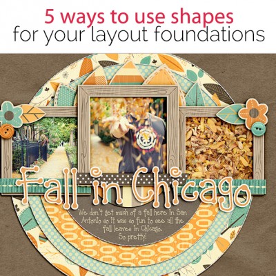
Layering shapes is my favorite trick on this list. Take a simple shape, like a circle, duplicate it, scale it up or down and then layer it on top of another shape. When combined with bold patterned papers, it makes for a eye-catching, layered look.

Fall in Chicago by Lynnette Penacho | Supplies: Birds of a Feather by Dani Mogstad Stitched by Anna Circles No 1 by Anna Apnes Font is DJB It’s Full of Dots by Darcy Baldwin
3. Embrace the Grid
Number three on this list is a trick I’m sure you’ve heard of before: blocking. Repeat a shape in a symmetrical grid-based pattern and fill it with photos, papers and embellishments. The great thing about blocking is it doesn’t have to be limited to only squares – you can place all shapes in a blocked, grid-based pattern: hearts, stars or even circles as I used on this page. Don’t forget to layer your blocked shapes for maximum impact!

A and L by Lynnette Penacho | Supplies: Isn’t She Lovely by Zoe Pearn Staple from Oodles of Tags by Julie Billingsley Blissful Stitches Square and Straight by Traci Reed
4. Frame It Out
Using shapes to frame important parts of your page is a great way to add shapes in a simple and subtle way. Don’t be afraid to mix and match different types of shapes – layering a circle or rectangle with a scalloped-edged shape adds fun and interest to the page.

I Believe by Lynnette Penacho | Supplies: X-Treme Acrylic Alpha by Traci Reed My Wish for Him by Kristin Cronin-Barrow Krafty Essentials by Libby Weifenbach Layered Up In You: Scallops by Lauren Grier Layered Up In You: Edges 2 by Lauren Grier Layered Up In You: Circles by Lauren Grier Border Basics: Line Stitches by Libby Weifenbach Monster Mash by Zoe Pearn Teeny Type Alpha by Zoe Pearn Don’t Leave Home Without It Alpha by Lauren Grier Font is American Typewriter
5. Go Big or Go Home
Want to make a really bold shape-statement on your page? Take a favorite shape, scale it up and make it the focal point of your page. You can even tie the large shape into your title or layer your shape with another shape like blocking or strips of paper and ribbon.

He and She by Lynnette Penacho | Supplies: Bloomed by ScrapKitchen Designs Fonts are Museo Slab and Grandby
Bringing It All Together
What’s especially great about all five of these methods is they can easily be combined to create shape-based foundations with maximum impact. Layer your vertically-based design with a scallop trim, frame out your blocked circle design with repeating circles or layer your big, bold shape with paper strips and ribbons. The possibilities are endless, and any way you combine them, you’re guaranteed to get an amazing page.
Happy Shape-lovin’ scrapping!

