 Alcohol inks are great for adding vivid and organic patterns to your scrapbook pages. Check out our pinboard of inkprint effects in fashion, decor and art and the ways our Creative Team have put these techniques to work on their own pages.
[hr]
Kiki Kougioumtzi says, “On this layout I talk about how my daughter started traveling the world from a very young age.”
“I used a background paper that already had bleeding paint as a design. On it, I drew a world map with my Silhouette Cameo which I then colored in with water soluble pastels. Then I diluted them with water, letting them bleed a little on the edges. This also made the pen marks bleed a little. I did the same thing with the stamped airplanes and clouds designs.”
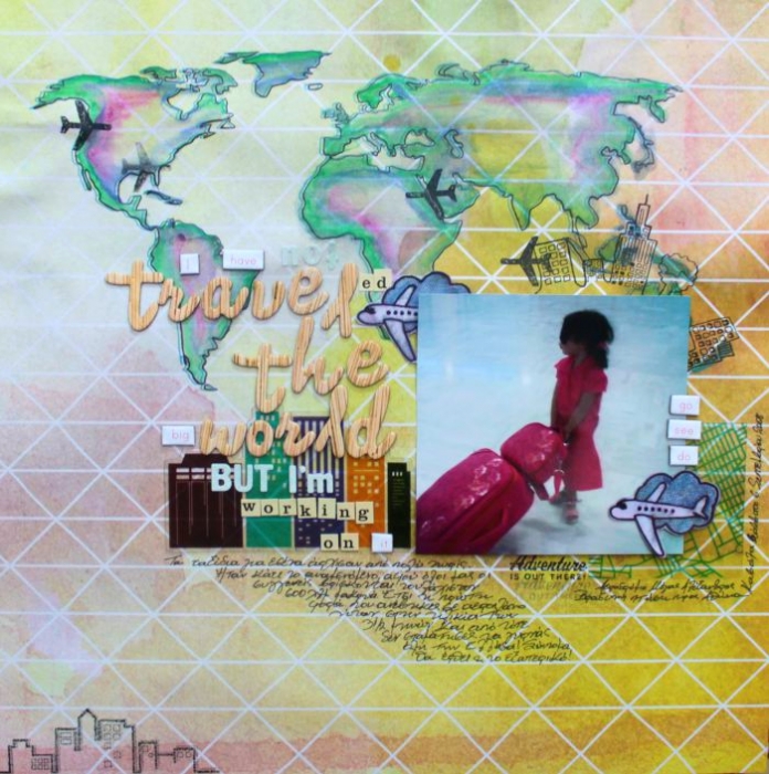
Travel the world by Kiki Kougioumtzi|Supplies:Pattern paper,chipboard words:Studio Calico;Die cuts:Basic Grey;Alphas:American Crafts,Basic Grey,Cosmo Cricket;Stamps:Studio Calico,American Crafts;Other:Silhouette Cameo,Tsukineko Memento ink,Caran D’Ache Neocolor II wax pastels.
[hr]
Summer Christiansen says, “This page is about my fabulous mascara! I bought it being a little leery of its name (I have a 7-year-old girl who is constantly in my makeup) but it is AMAZING. It is my favorite part of putting my face on! I couldn’t help but use it’s name to create some thought provoking words of my own!”
“For the background I took a picture in the PhotoBooth app on my ipad. I made sure that I was capturing something that had smaller clusters of objects (stadium bleachers, or a bush of flowers). You choose the filter before you take the pic. I chose “thermal camera” because it gives it an xray look and pulls out the primary colors. I pulled it into another app to apply textures and filters and it helped create a inkprint look.”
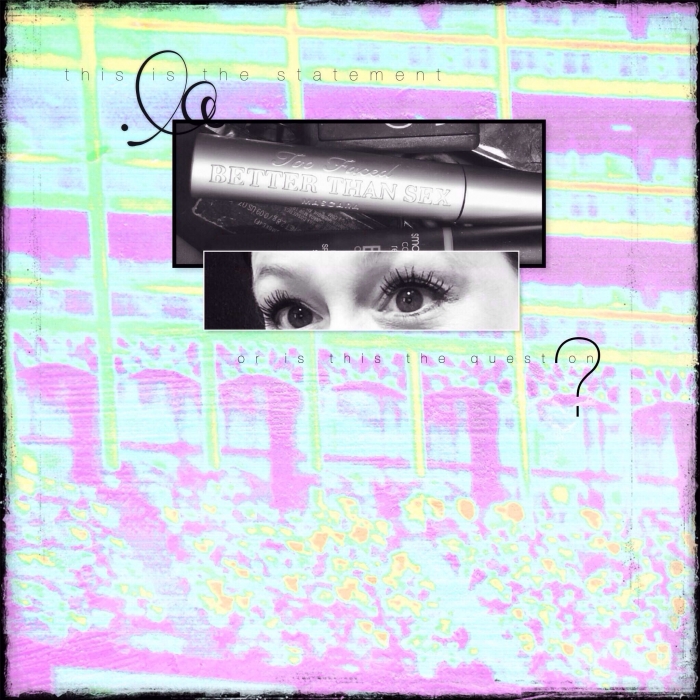
This is the statement by Summer Christiansen. Supplies: SuLu Digital Designs: background paper by Rhonna Designs App: text, swirl, and edges.
[hr]
Gretchen Henninger says, “This layout features some of the friends I have made through scrapbooking and the fun we have getting together to scrapbook.”
“The background was created with India ink. I first put the ink on a piece of plastic packaging, then pressed it onto the page. This technique allows the ink to flow into beautiful pools of color. My process is shown in this video. ”
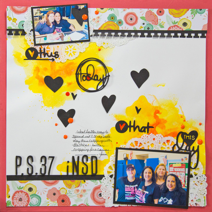
PS 37 iNSD” by Gretchen Henninger | Supplies: Paper: My Mind’s Eye (Rhonna Farrer Just Saying), Bazzill Cardstock; Alphas: American Crafts Thickers; Die Cuts: Rachel Hodge (Today), Wilna Furstenburg (Lots of Hearts); Punch: EK Success (notebook); India Ink: Dr. Ph. Marin’s; Ink: Studio Calico (clean slate); Stamp: Technique Tuesday; Enamel Dots: Doodlebug
[hr]
Terry Billman says, “Blessed Beyond Measure captures the precious moment of my granddaughter cuddling her new baby sister.”
“To get this look, I duplicated the rose photo several times. I blended each photo layer using a different opacity and a different brush to add texture. The rose to the center right of the photo was duplicated three times to achieve the bright, iridescent effect. I applied a normal blending mode to the bottom layer, screen blending mode to the middle layer, and soft light blending mode to the top layer. I layered several brushes of different shapes and sizes, with different opacities, and color intensities to achieve an ink print effect. The pink and green layers had varied blending modes on each brush layer to achieve a different intensity: normal, screen, overlay, and hard light. Photo glows add flare and movement, creating ambiance and depth.”
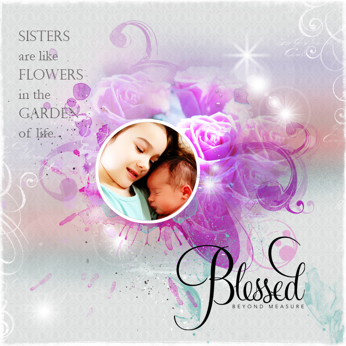
Blessed Beyond Measure created by Terry Billman| Anna Aspnes: Art Play Palette Crazy Life, Art Play Palette Kinder Magic, Art Play Palette Beautiful Day, Art Play Palette Seafoam, Art Play Palette Ablaze, Art Play Palette Generations, Art Play Palette Go See, Light Leaks 1, Watercolor Foto Blendz 6, Art Play Palette Weihnachtsbaum, Art Play Palette Posy, Art Play Palette Autumn Soul, Water Drops 2, Korners N Edges 7, Distressed Edge Overlay 9; Katie Pertiet: Watery Spots No. 7, Watery Spots No. 6, Letter Box Overlay No. 5; Cathy Zielski: Fancy Gratitude No. 1
[hr]
Judean Patten-Clark says, “This page features a photo of my daughters and me from last summer when we went blueberry picking.”
“I loved the vibrant colors in a floral inkprint by Maure Baushe on Etsy and wanted to recreate a similar look using Sharpies. Using colors from my photo, I colored on polyester fabric using the permanent markers then dripped rubbing alcohol over the top, allowing the colors to blend together. I love how the end result is always a surprise, resulting in an organic, colorful pattern.”
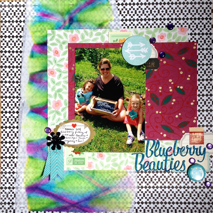
Blueberry Beauties by Judean Patten-Clark | Supplies: Patterned Paper, Stamp sticker, Metal Flower: Basic Grey; Handmade paper, Enamel Dots: Unknown source; Chipboard, Flair: Studio Calico; Ribbon: May Arts; Letter Stickers: American Crafts; Label Stickers: October Afternoon, Martha Stewart; Permanent Markers: Sharpie
[hr]
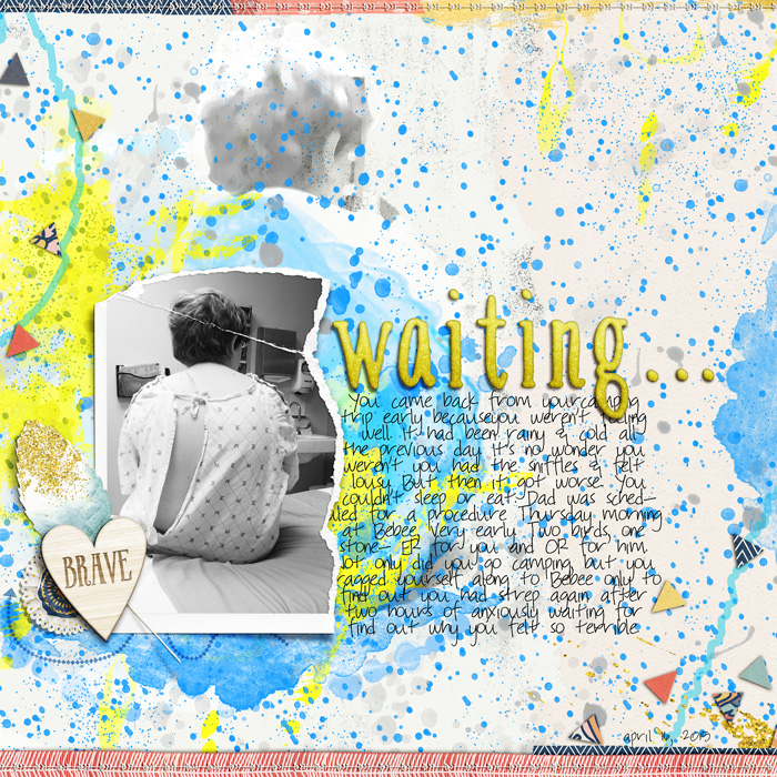
Carrie Arick says, “On this page, I tell the story of my son’s anxious waiting in the Emergency Room during his last bout of strep throat.”
“I used the Paint Daub filter in Photoshop CC on my large black and white photo, then masked the photo to blend away hard edges and objects. I used brushes liberally in saturated colors to ink the filtered photo and the rest of the canvas. I played with different stamp styles and opacity settings to enhance my digital ink.”

